/Search: 2015 one room challenge

Need a new search?

If you didn't find what you were looking for, try a new search!

THE ONE ROOM CHALLENGE | Week One: Luxe Laundry Room

And so it begins. A madcap adventure, a design dare, and a race to the finish line all wrapped into six short weeks. What is it, you ask? Well, I’m diving in head first today as a linking participant in the April 2015 edition of the One Room Challenge.

If you’re not familiar, this trademarked 6-week online design challenge, created by Linda of Calling It Home, rallies together design bloggers from far and wide across the blogosphere {some professional designers, some design-loving DIYers and decorators} to tackle one room and totally complete it in a mere six weeks. Today marks week one, and if you do the math with me here you’ll realize that this means I now in fact have a total of five actual weeks from today to complete my space.

*bites lip*

In the interest of inspiring you and reminding myself that there will be a whole lot of pretty at the end of this high-speed-train tunnel, let me start by sharing a bit of inspiration with you. We are renovating our laundry room for this challenge, and if I started by sharing the “before” photos, well, you might not want to read on! So first, some inspiration.

Left image via MHouseInc. Right image by photographer Sean Fennessy, styling by Lucy Feagins.

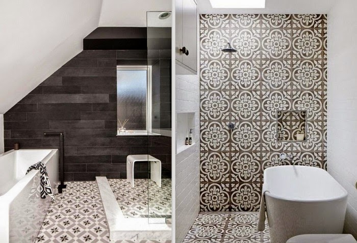
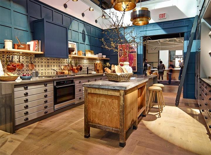
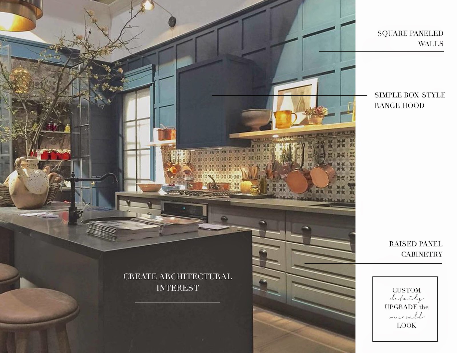
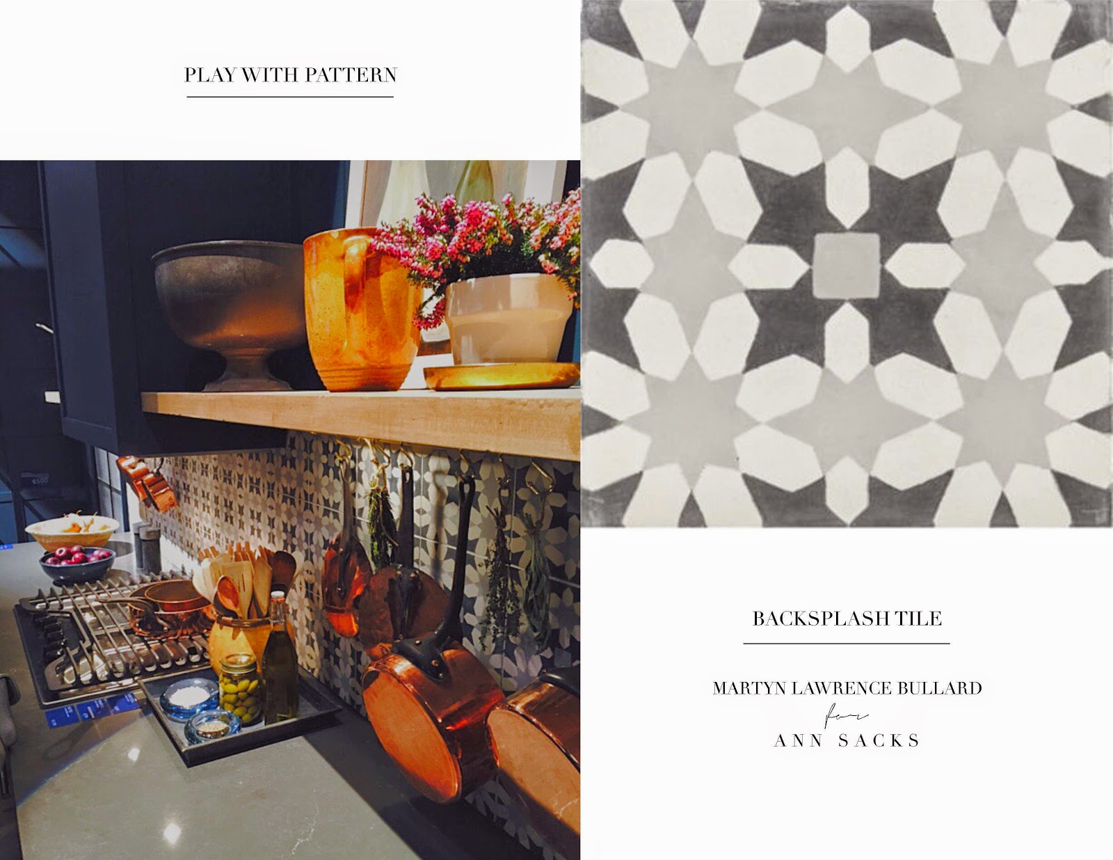
I’ve been cautiously curious {read: entirely obsessed} with encaustic cement tile for over a year now, which if you follow me on Pinterest you will know all too well. The references for me extend from the Spanish revivalist architecture in LA that I so adore, to bespoke dream kitchens in London, to the timeless and classic bistros of Paris, bien sûr. Even some of my favourite new local Toronto restaurants are strutting their tile-loving stuff with encaustic cement tile these days.

More than anything, I love that these hand-painted, patterned tiles tell a story of wanderlust, and they are the foundation for my design plan for our little laundry room.

It’s not a huge space, but I think the “after” might just convert me into a laundry lover. That’s the plan, anyway. Let’s just say that I love cooking, but laundry? Not so much. But that’s nothing a great design plan can’t fix, right?

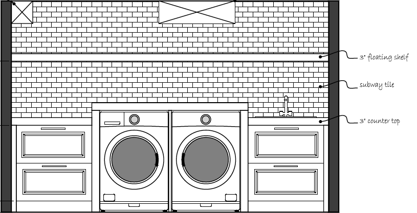
Here’s the main elevation so you can get a sense of where things are headed:

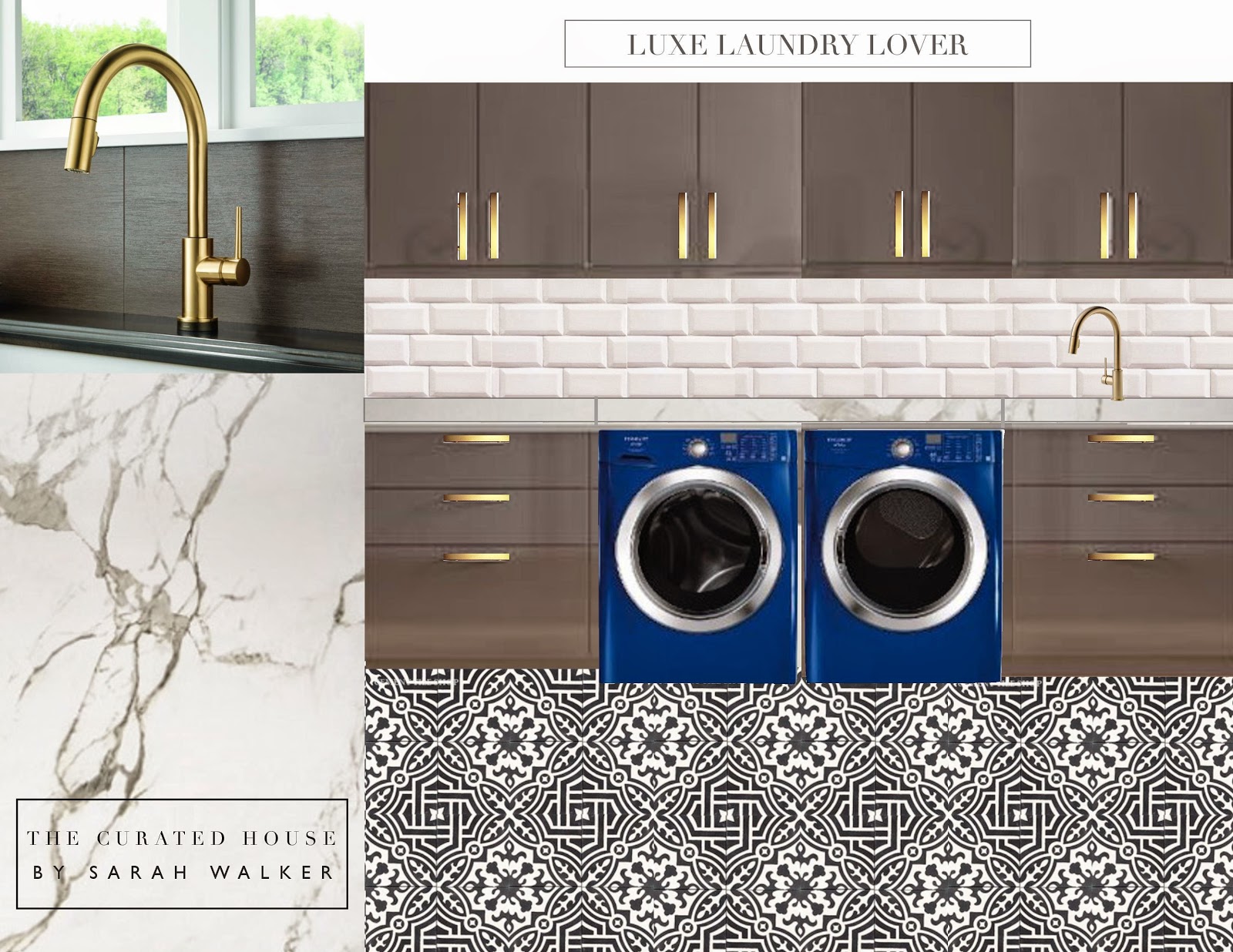
And here’s the finishes board thus far:

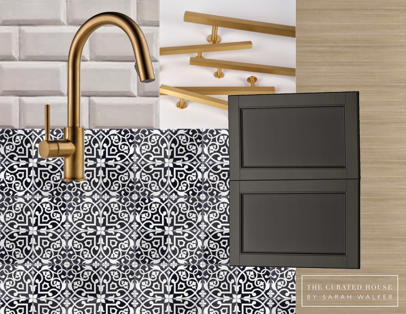
The direction has already changed a fair bit from the original concept, but here it is just for fun.

I’ve shifted gears for two reasons: ONE, I finally saw the high gloss grey cabinets in person and didn’t love the finish; and TWO, I wanted to simplify the sight lines of the uppers to avoid drawing attention to the HVAC and support beam intersecting with the main elevation. That and I absolutely love raw white oak and wanted to connect the dots with the plans I have for the other side of the room. Let’s just say one of the biggest problems in the space has presented the opportunity for a most beautiful solution. I love it when that happens.

But in the meantime, here’s where we are actually at, my friends. Feast your eyes on our beleaguered “before.”

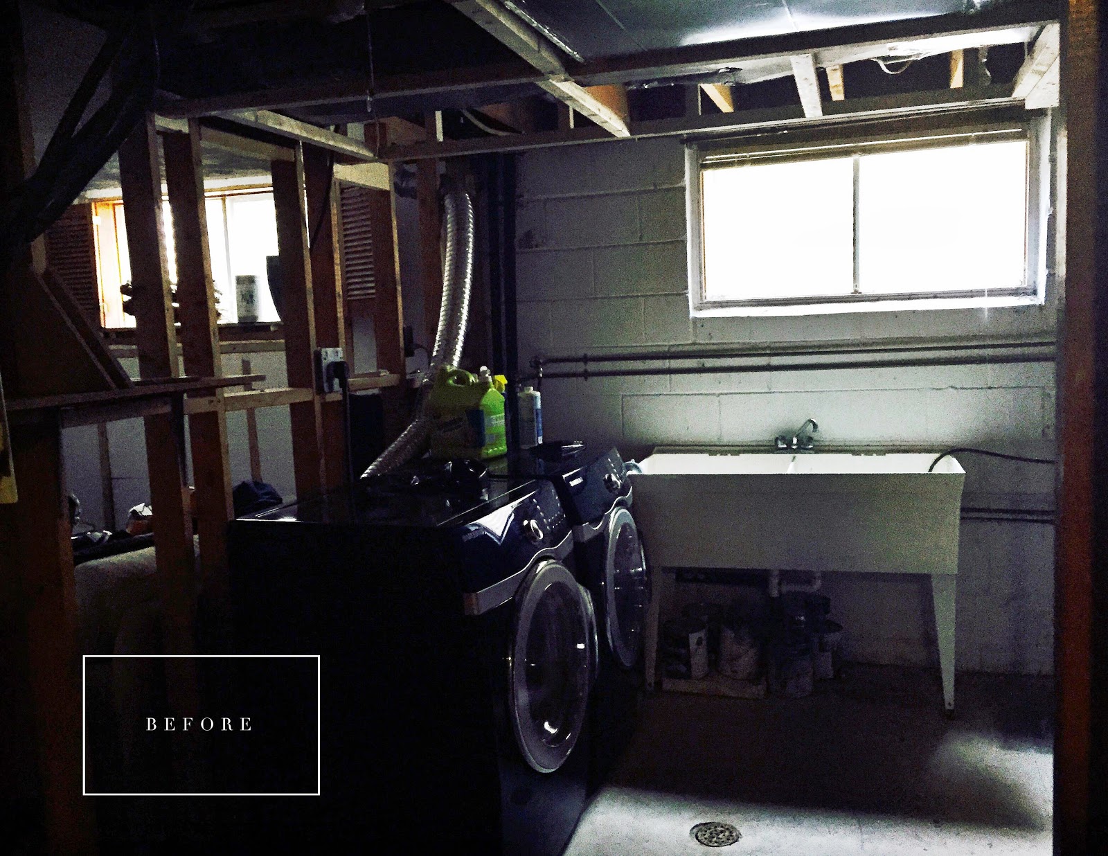
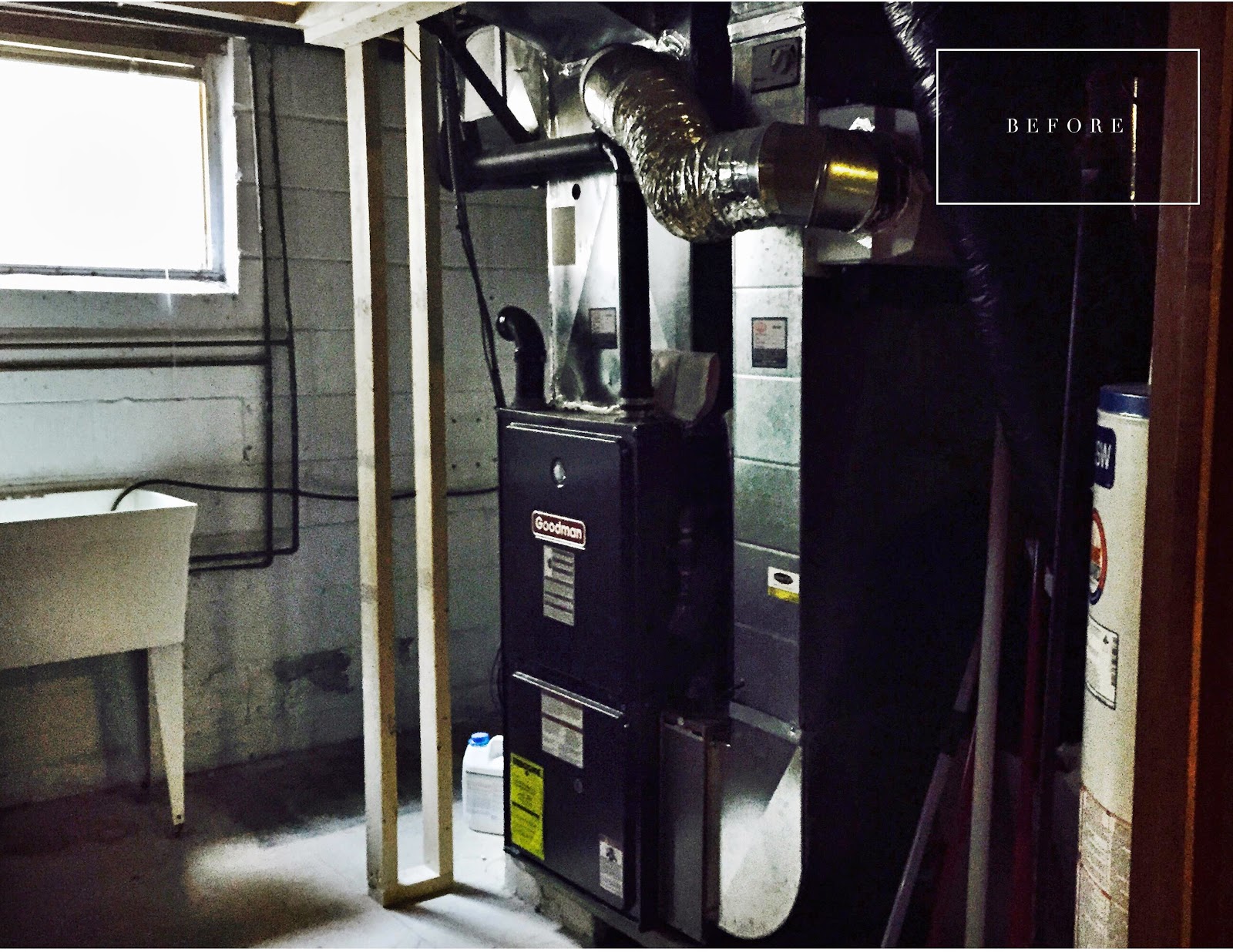
Bit of a dungeon, no? I cannot wait to lighten, brighten and pretty it up. Time to put the “fun” back in “functional.”

For now, we are busy little beavers burning the midnight oil as we prep to install the potlights, move some electrical and plumbing, and then install DriCore’s Subfloor R+ and SMARTWALL system over the weekend. We are really hoping the SMARTWALL is going to save us some time, and we are super excited about installing the insulation and drywall all in one fell swoop.

Yes, you read that right. We are just crazy enough to be doing the work ourselves. Six {ahem, five} weeks with a contractor and sub-trades to finish this space? Easy peasy. Six Five weeks with two of us and a laundry list of to-do’s to get done each week on top of our already very busy day jobs? Well, let’s just say the updates will be laced with a necessary dose of fearlessness, and we hope you’ll say a prayer for us as we launch into this daring little design adventure!

Oh yes, and be sure to check out the amazing list of bloggers and linking participants for the April 2015 edition of The One Room Challenge:

Coco + KelleyJana Bek * Autumn Clemons * The English Room * Vanessa Francis * Greige Design * Hi Sugarplum * I Heart Organizing * Jenna Sue Design * Stephanie Kraus * The Pursuit of Style * Julia Ryan * Savvy Home * Simple Details * Simply Grove * 6th Street Design * Jill Sorensen * Swoon Worthy * Waiting On Martha * Kimberly Shlegel Whitman * and my friend and linking participant Lisa Canning *

What room would you tackle if you had only six five weeks to complete it, start to finish? Are we totally crackers to take on the reno ourselves in such a short period of time? Probably. But we are also trusting it will all be worth it in the end. Hoping we all catch hold of some inspiration along the way.

xo
s.

By |April 2nd, 2015|14 Comments

HOW TO CUSTOMIZE AN IKEA KITCHEN | DESIGN LESSONS FROM THE TEAM AT CANADIAN HOUSE & HOME MAGAZINE

Photo via Global News

As a designer, I head to the Interior Design Show Trade Day every year for three main reasons:

ONE to see what new products and innovations are being introduced, TWO to get inspired, and THREE to connect with really great people in my industry.

This year, to my pleasant surprise, I found all three needs met in one place at House & Home‘s IKEA kitchen display. Setting the creative team at Canadian House & Home Magazine to the design challenge of customizing an IKEA kitchen – alongside the team at Style At Home who also designed a beautiful space – was a brilliant way for IKEA to introduce their new Sektion line of kitchen cabinetry to the Canadian market.

INNOVATION IS ON THE INSIDE

The new line is a huge move for IKEA in transitioning away from their popular Akurum line of kitchen cabinetry. From the little that I was able to see past the throngs of people in the booth, it’s the “guts” of the Sektion line that make it most exciting, with lots of highly customizable options and extremely functional inserts. {I caught a glimpse of a drawer with a tiered sliding spice rack in it that was truly fab!} The new door profiles and colour options are very current and on-trend with what’s happening in kitchen design right now.

Unfortunately for those who already have an Akurum kitchen, it appears as though the dimensions of the two lines are different, so you won’t be able to retrofit your Akurum with these enviable Sektion upgrades without a total kitchen redo. That said, they are still honouring their amazing 25 year warranty on the Akurum, so all is not lost.

The House & Home kitchen really felt like an English fitted kitchen to me, with an abundance of design details to surprise and delight. In addition to the herringbone wood floors you can see in the photo above {they had me at herringbone!}, they showcased a few of my favourite timeless design trends in this beautiful space. Take a peek at some of the design lessons we can learn from Suzanne Dimma and Sarah Harthill – the senior designers leading the team on this kitchen design on behalf of Canadian House & Home Magazine.

LESSON ONE: CREATE ARCHITECTURAL INTEREST

Image via Margot Austin on Pinterest

Let’s be honest, turning a basic convention-style booth into a quietly luxurious custom fitted kitchen is not for the faint of heart. Like a real home renovation or a new build, the task requires heaps of design vision and the courage to be unique. The first thing I loved is the way Suzanne and Sarah made the kitchen feel totally custom with the use of paneling.

Paneling, as I’m sure you know, is one of my timeless favourites. In fact, there are very few design projects I’ve done over the years that have not wound up with paneling in at least one room of the house. Why? It adds instant character and the kind of architectural interest that grounds the space and gives it a sense of history. Good bones, as we say. Always start with good bones.

The way Suzanne and Sarah integrated the simple, modern, box-style range hood into the paneling and wrapped the paneling around the room is brilliant. It truly connects both sides of the kitchen with the pantry that flanks the end wall, and it complements the raised paneling on the IKEA cabinetry Suzanne and Sarah chose without feeling too “matchy matchy.”

LESSON TWO: PLAY WITH PATTERN + COLOUR

If I could have secretly stuffed this stunning Martyn Lawrence Bullard for Ann Sacks tile into my handbag to use in my yet-to-be-reno’d laundry room without creating a scene, I would have done it in a heartbeat. Delicious. I love how this tile creates a sense of history while being extremely current. Think Paris bistro floors or an English hand-painted backsplash.

I also love the dove grey cabinets Suzanne and Sarah chose {this door style is called Bodbyn and will be available February 2nd} and how they contrasted the softness of the grey with the deep peacock colour on the paneling and range hood. The art of the mix is as much about creative contrast as it is about a mix of materials.

LESSON THREE: CREATE MOMENTS of DISCOVERY

Needless to say, my photo does not do this stunning little pantry justice. Mark my words, though. When the professional photos are released, people are going to be pinning the you-know-what out of this little space on Pinterest. Beyond the charming sense of organization {which makes me want to hire Suzanne and Sarah just to bring that kind of zen into my own real-life-with-kids…even if only in my pantry! It would become my little in-home European retreat…}, it’s the Peacock Garden wallpaper by Zoffany and the iron-framed French doors with egg-shaped brass knobs that make this pantry sing. I mean, who expects to see such a fantasy-world-come-to-life in the pantry? It’s delightfully unexpected. This kind of “discovery moment” as I like to call it makes you bite your lip and inhale quickly when you come upon it. Just the sort of thing to make a kitchen feel entirely bespoke and utterly special.

{And I was actually kind of serious about the pantry retreat thing. I can totally see myself hiding away and sipping tea in here whilst imagining myself on a European vacation. This is either a seriously sad statement about my need for a vacation or an incredible credit to my vivid imagination.}

You’ll have to wait for this kitchen to be featured in the magazine to see all of the delicious details that were so thoughtfully designed in this space. Watch for it in an upcoming issue of House & Home, where no doubt the source guide and the gorgeous photos will be worth the wait.

xo
s.

By |January 28th, 2015|7 Comments