/Sarah Walker The Curated House

About Sarah Walker The Curated House

This author has not yet filled in any details.
So far Sarah Walker The Curated House has created 396 blog entries.

The Curated Collection | Cy Twombly

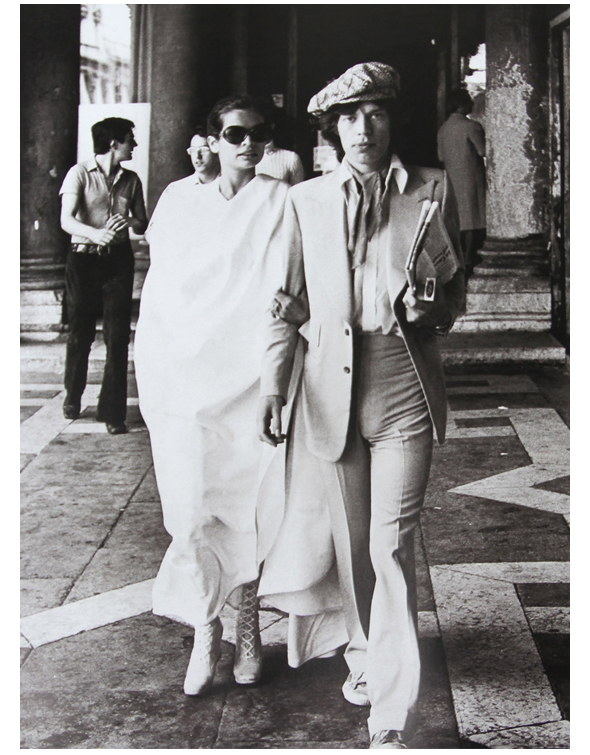
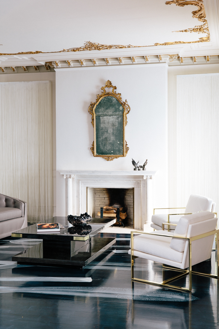
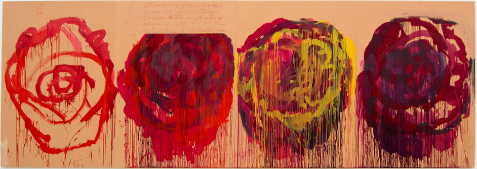
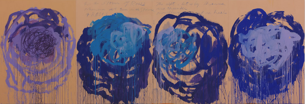
Remember the jaw-droppingly gorgeous floor from Catherine Kwong‘s rock ‘n’ roll lounge at the 2013 San Francisco Decorator Showcase? I can’t stop thinking about it, and more to the point, wishing I had a client courageous enough to allow me to make such unabashedly artistic gestures in their home. I loved Catherine’s process, and the storied and curated inspiration for her room – from Mick and Bianca Jagger and the rock ‘n’ roll glam culture they helped to create; to the hum and vibe of backstage life; to the iconic art of Cy Twombly, the direct inspiration for that inspiring floor.

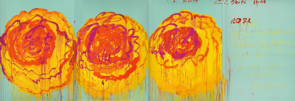
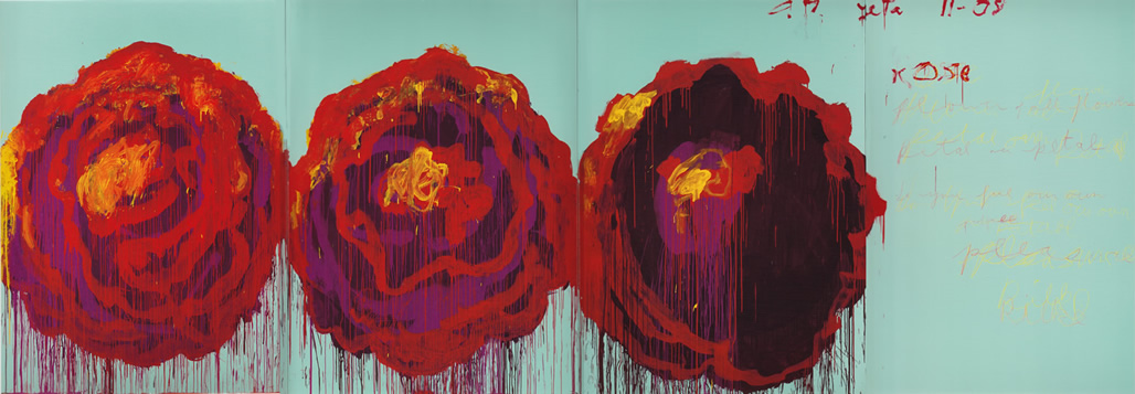
So today I’m taking some time to sit and savour – like sipping a fine wine – the artist who inspired Catherine’s spectacular art floor: Cy Twombly.

Born in 1928, Twombly was known for his large-scale, freely scribbled, calligraphic-style graffiti paintings. Painted on solid fields of mostly gray, tan, or off-white, it is their graphic simplicity bursting with emotion that sets them apart and has led to his work being exhibited and collected around the globe.

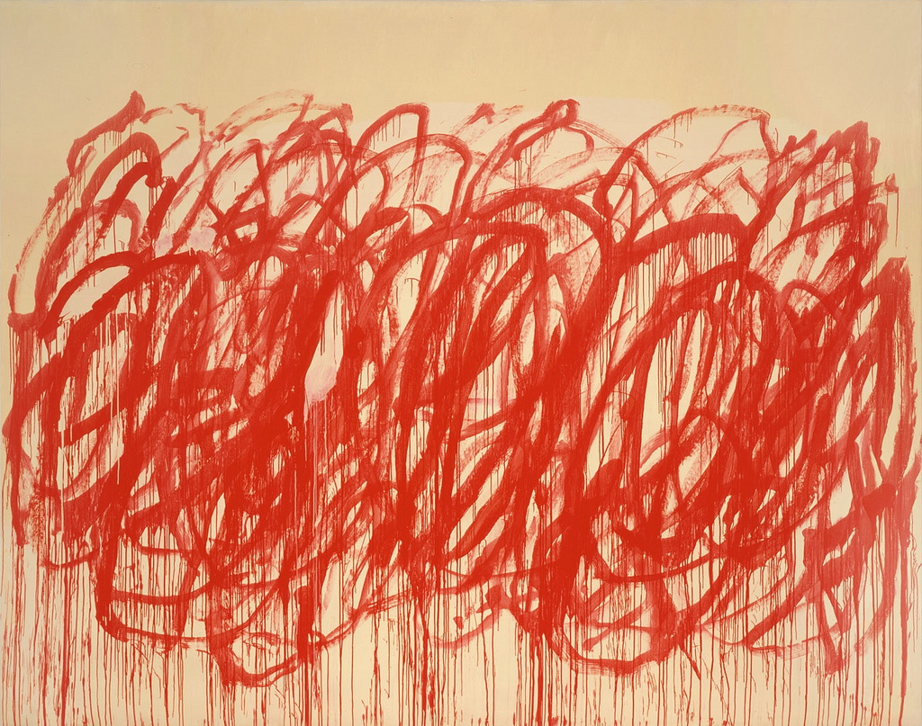
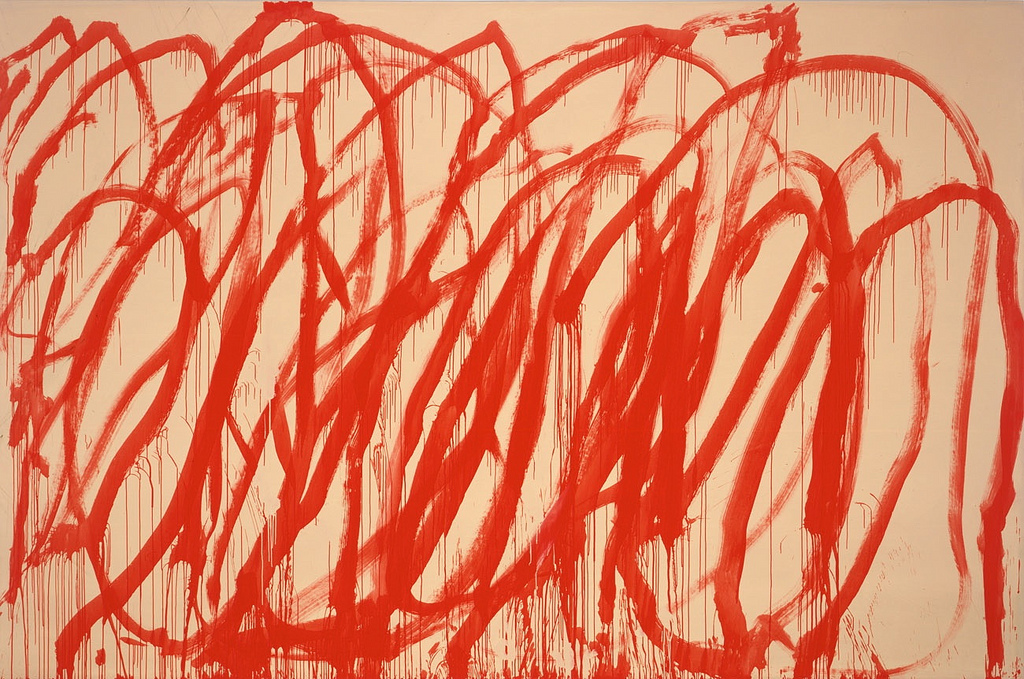
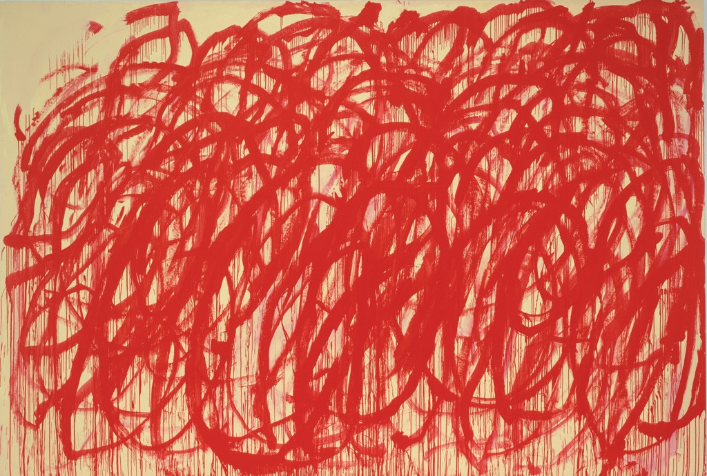
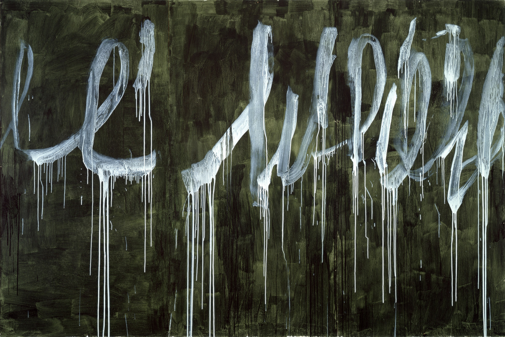
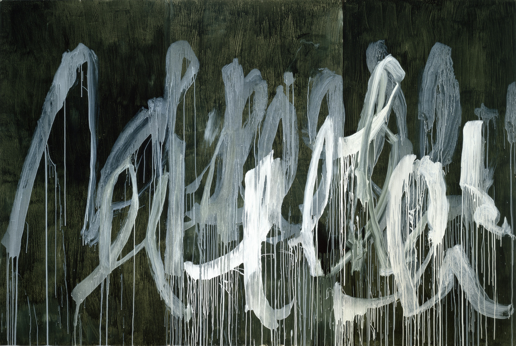
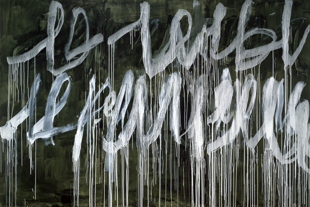
His approach to painting blurred the lines between painting and drawing, making lines and gestures subject matter unto themselves, holding their own next to traditional landscapes and figurative work.

Twombly was influential amongst his peers, and an agent of discomfort for critics in the postwar era of art. He had a capacity to polarize his audience – from discomfort to passionate admiration of his boldness.

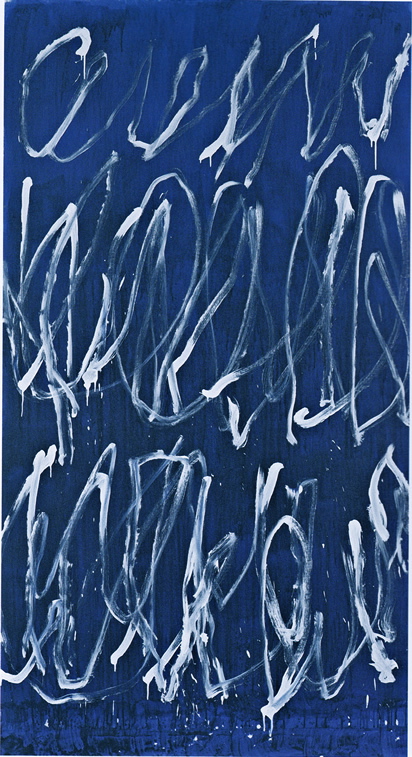
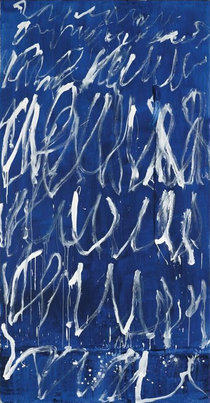
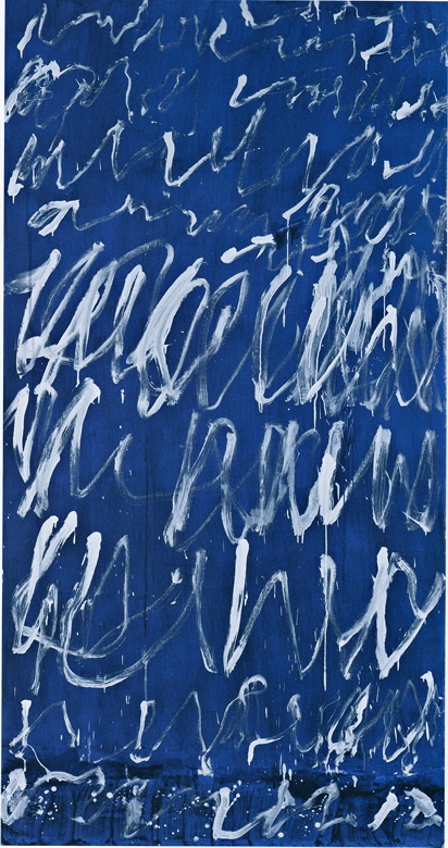
How do you respond to the gestural work of Cy Twombly? Confusion? Admiration?

My hope is he inspires all of us to push the boundaries of exploration and expression. He certainly succeeded with Catherine Kwong, and I tip my hat to them both.

Happy Monday!
xo
s.

By |April 29th, 2013|0 Comments

Foodie Friday | The Ultimate French Press by Espro

I am a coffee lover. Not an addict per se – one or at the most two cups in the morning is the maximum indulgence – but a lover of a really good cup. I much prefer quality over quantity in this department, and as such have long been a fan of French Press over drip brewed. The experience is a much richer, more aromatic coffee, but for years I’ve been wrestling with two problems: one, I regularly break the glass beakers; and two, I don’t enjoy the sludge in the bottom of my cup.

I have been searching for a double-walled stainless steel French Press for the last couple of years that would at least solve problem number one. I just hadn’t found one I loved. Well, to my great delight, I finally stumbled upon a French Press that in fact solves both problems with elegance and ease. Even better, the Espro Press is the creation of Canadian innovators. We are called the Inovation Nation for a reason! And to truly make them the hippest coffee kids on the block, co-founders  Bruce Constantine and Chris MacLean got it all started with a Kickstarter campaign.

The solution to problem one is self-explanatory, but how does Espro’s Coffee Press solve the problem of sludge in the bottom of the cup? 
With genius.
They’ve invented a micro-filter that is totally unique. Separated into two parts, it filters the coffee twice to allow all of the gorgeous body and flavour of the beans to emerge while leaving behind the grit.

The Espro Press is available in 3 sizes, but I love the 32oz and their genius fill lines, allowing you to brew either two or four cups at a time {or four to eight if you don’t use “bladder busting” sized mugs}.
 

Espro claims that their unique micro-filtration allows more of the natural oils from the coffee beans to emerge in the cup, so I decided to test it out. {Spoiler alert: they’re right}

I chose 3 different roasts from my local Whole Foods to see what flavours would come alive with my favourite new way to brew.

For my medium roast, I chose a single origin Ethiopian. Coffee is very important to the Ethiopian economy, with about 25% of Ethiopians deriving their income from coffee growing and harvesting.

This coffee is brighter and more acidic than I usually prefer, but I was wooed by the fruit-kissed, earthy roundness I experienced which was no doubt brought to the fore by Espro‘s micro-filtration.

For my medium-dark roast, I chose the organic Bel Canto Espresso.

A blend of heavy and nutty coffees from the Americas are mixed with a splash of Ethiopian beans for an elegant brewed cup of coffee. Of course this particular roast is amazing as Espresso. I like steeping it extra-long so it gets a bit syrupy and dramatic.

For my dark roast, I chose my go-to classic: the organic Italian Roast.

Just looking at these glossy, dark beans you get a sense of the hearty richness you can expect in your cup. This one was the most pleasant surprise because it was the roast most familiar to my palette. The rich, velvety depth of the roast was beautifully balanced by the sweetness and aromatics. Amazing.

My two top tips:
1. Choose a burr coffee grinder for a more even grind of your fresh beans, and keep the grind coarse
2. Steep the coffee for at least 4 minutes, stirring the beans into the water every 1-2 minutes, but letting them rest the last minute before you press.

Simply put, my daily coffee ritual will never be the same! Thank you, Bruce and Chris, for being such passionate innovators and for solving all our French Press dilemnas. Now all we’re left to do is enjoy connecting with good friends over a perfect cup.

xo
s.

By |April 26th, 2013|0 Comments

Catherine Kwong Design | 36th Annual San Francisco Decorator Showcase

I may have drawn a bit of blood when biting my lip in response to these images of the grand living room at this year’s San Francisco Decorator Showcase. Designed by Catherine Kwong, the decadent, rock ‘n’ roll lounge is filled with custom furnishings and finishes with a decidedly luxe aesthetic. Known for her signature elegance and modern point of view, Catherine Kwong‘s space is positively moan-worthy.

“The design was inspired by Mick and Bianca Jagger in the 1970’s – the young and wild, traipsing-to-Saint Tropez years,” said Catherine Kwong. “I was doing research for a client and discovered all of these beautiful old photos of Mick and Bianca that depicted a wild romance. They were impossibly stylish and full of excitement, with a bit of scandal, of course. So I designed this room for them; a place for late-night parties with rock royalty and the jet-set. I wanted the room to be just like Mick and Bianca: luxe and decadent, but with a rock ‘n roll edge.”

{image source}

The star of the room is the dramatic painted floor, which serves as a rich canvas for the room’s artful mix of luxurious textures, details and lines. Inspired by the iconic paintings of Cy Twombly, the floor was hand-painted in exuberant brushstrokes by decorative painting firm, Stancil Studios.

The ornate, gilded plaster ceiling that crowns the room provides a rich and detailed contrast to the dramatic and sweeping gestures of the edgy painted floor, casting a golden glow on an array of textures below. Kwong knew right away that she would keep the room’s original ceilings. “I loved the intricate detail of the original ceiling,” says Kwong. “It’s very traditional, which is not usually my style, but gorgeous, and really deserved a room that let it shine. The ceiling presented an interesting challenge: how do you design a room around such a classical and stately element, while still making the space feel fresh and modern?”

Kwong met the challenge with jaw-dropping style with her unexpected, fresh and beautiful mix of materials: Lacquered parchment with brass hardware. Polished stone with silk taffeta. Vintage Italian fringe light fixtures by Mario Yagi. Oversized doors punctuated with pyramid studs for total rock ‘n’ roll glam. A large black and white photograph by Henry Leutwyler {taken behind the scenes at the New York City Ballet and custom printed to fit the large wall}, the perfect homage to the energy of life backstage. The combined effect is stunning, sophisticated and outrageously glamorous.

“Last year was a game changer for Catherine. She launched her own design firm after apprenticing with New York designer Bill Sofield and San Francisco’s Paul Wiseman,” said Diane Dorrans Saeks, on her influential blog, The Style Saloniste. “I admire Catherine’s highly intelligent design–that is informed by her in-depth knowledge of design history, and her vibrant energy and sense of delight and fun.”

Catherine Kwong

“Last April, her dazzlingly stylish ‘Fashion Blogger Studio’ was a much-discussed room of the San Francisco Decorator Showcase,” continued Dorrans Saeks. “The living room she’s designed for this year’s Showcase is even more glamorous and undoubtedly lends an edge to the 2013 Showcase House.”

About the Decorator’s Showcase: Since 1977, the annual San Francisco Decorator Showcase has benefited San Francisco University High School’s financial aid program, and garnered a reputation as the West Coast’s premiere design show house event, renowned for featuring the work of the region’s top interior designers.

The canvas for this year’s event is a magnificent Georgian Pacific Heights mansion built in 1899 by Ernest Coxhead. The 8,000 square foot, historically significant home features a grand floor plan including spacious formal rooms, a dramatic stairway and sparkling 360-degree San Francisco Bay views. If you are in the area, I highly recommend making this a design excursion with friends. For more information, visit: www.decoratorshowcase.org.

{photo: Michael David Rose}

All images by Bess Friday except where noted.
Press release provided by Mullens PR.
I hope Catherine’s stunning space at the San Francisco Decorator Showhouse has inspired you to pursue the art of the mix with unabashed confidence! She is officially on my “design crush” list of interior designers to watch.
xo
s.

By |April 25th, 2013|0 Comments