/1st Dibs

Trendy Tuesday | Getting Creative With Coral

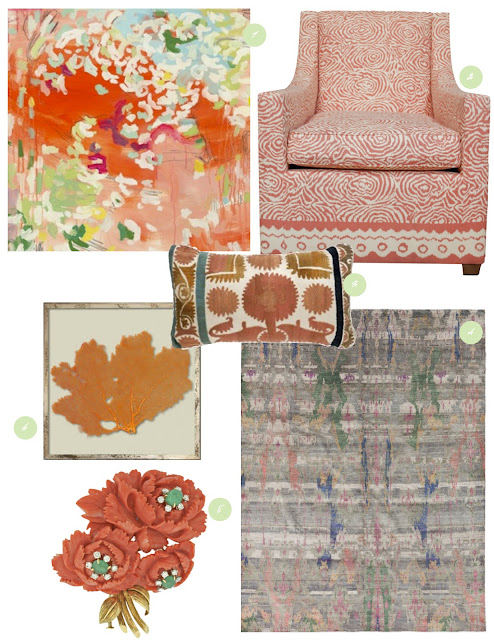
I feel like this season is made just for girls like me. Not only do I love the signs of life, but I love the fresh and vibrant shades of Spring! This season, runways have been spilling over with one of my favourite Spring hues: Coral. So, I thought I’d pull together a few of my favourite recent sightings of this warm and blushy hue.

ONE: Painting by Michelle Armas TWO: Blondel Coral Club Chair, 1st Dibs THREE: Vintage Coral Lamp Suzani Pillow, Madeleine Weinrib FOUR: Coral, blue and green Aquasilk Rug, ABC Carpet + Home FIVE: David Webb Carved Coral Brooch, 1st Dibs SIX: Coral Sea Fan, Karen Robertson

How will you be getting creative with Coral this season?

xo
s.

By |March 26th, 2013|0 Comments

Embracing Emerald | Pantone’s Colour of the Year

Each year, quietly gathered in a European capital, a secret meeting of representatives from various nations’ colour standards groups gather together to determine “The Colour of the Year.” After two days of presentations and debate, they choose a colour for the following year. I imagine these discussions to be quite lively and fascinating as the experts delve into the global zeitgeist and determine how to represent it in hue and value. Pantone then announces their “Colour of the Year” to the great anticipation of the fashion and design industries alike.

This year’s choice – Emerald Green – is a favourite of mine. Pantone describes it as: “Lively. Radiant. Lush. A color of elegance and beauty that enhances our sense of well-being, balance and harmony.” For me, Emerald speaks to the verdant and rejuvenating power of nature, freshness, hope, new life and treasures pulled up from deep within the earth.

ONE: Wallpaper by Zoffany  TWO: Green Tourmaline Ring by Sallyanne Lowe Jewellery  THREE: Vintage metal chair via ABC Carpet + Home  FOUR: Malachite decorative boxes by Rablabs  FIVE: Fine art photograph by David Graham White  SIX: Mohair upholstered Art Deco armchair via 1st Dibs  SEVEN: Faceted frosted glass table lamp by Arteriors

How will you embrace Emerald in your home and closet for 2013? I would love to hear all about your favourite sightings of it so far!

xo
s.

By |February 6th, 2013|0 Comments

Project: Kitchen Refresh | Lighting Option #2

Thanks so much for your feedback last week on Lighting Option #1 for my little kitchen refresh project! I’ve decided I want to nail down the lighting first before I move on to any of the other details. I really think the lighting will have a lot to say about the final direction of all of the rest of these little updates and help set the direction for the details.

OK, so I’m guessing you’ve all picked up on the  memo that brass continues to be HOTTER THAN HOT in design this year. There’s something sexy and glamorous about the use of it, even in the humblest of spaces. Just take this charming butler’s pantry below:

{image via Pinterest}
I’m totally in  L O V E  with the sophistication of the brass fittings and light fixture added to the mix of finishes in this clean and elegant kitchen below:
{image via Pinterest}

Fierce + fabulous, isn’t it? I could move into that kitchen tomorrow.

So my heart stopped momentarily when I came across this simple and modern pendant at Lamps Plus. I’m so in love with its warm and vintage antiqued brass patina that I want to bite it like its made of maple candy.

Seriously sexy, right? This fixture is totally a modern classic. Love at first sight. I would choose to pair it with accessories like this whimsical hand from Black Rooster Decor:

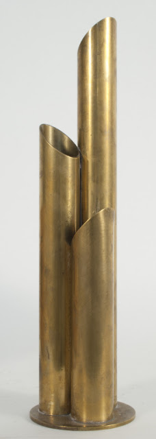
And this pair of Swedish 1930’s Bjork vases from 1st Dibs for a regular rotation of fresh flowers:

My dilemmas are two-fold.

ONE: I don’t want to change my cabinetry hardware. I like it a lot, and while I do believe it is possible to mix white and yellow metals successfully, I have a definite white-metal-dominance in my kitchen right now {for example, check out my Emeco counter stools below}.

TWO: I only have 8 foot ceilings. One of the things I  l-o-v-e  about this particular pendant is its long and lanky elegance. Unlike many pendants where the downrods make up most of the length, the shaft of this fixture is itself quite long. I don’t want to have a stubby little bit of downrod emphasizing my less-than-extravagantly-high ceilings. I worry that my ceilings and these pendants would each fail to do each other justice.

The thing is, I’m utterly smitten with this fixture! What do you think? Too many changes required? Too long for my rather pedestrian-height ceilings? Too much contrast with my cabinetry hardware, counter stools and statement of a stainless steel apron-front sink?

Can’t wait for your feedback!

xo
s.

By |January 24th, 2013|0 Comments