/Ann Sacks

Top Trends In Kitchen & Bath Design | Highlights from KBIS 2016

I’m still fresh off my recent trip to the Kitchen and Bath Industry Show with Modenus a couple of weeks ago and excited to talk with you today about some of my favourite trends.

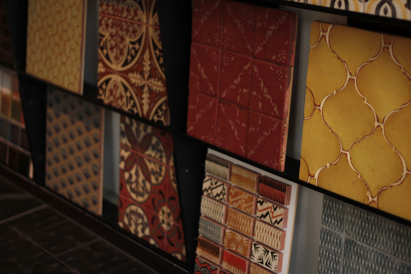
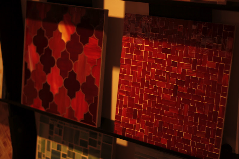
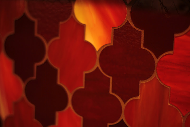
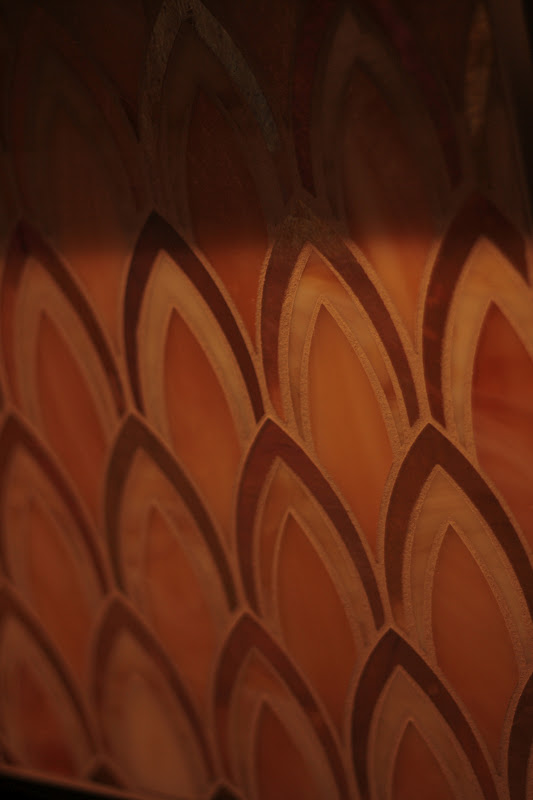
TEXTURE TOPS THE CHARTS


texture-kbis-2016


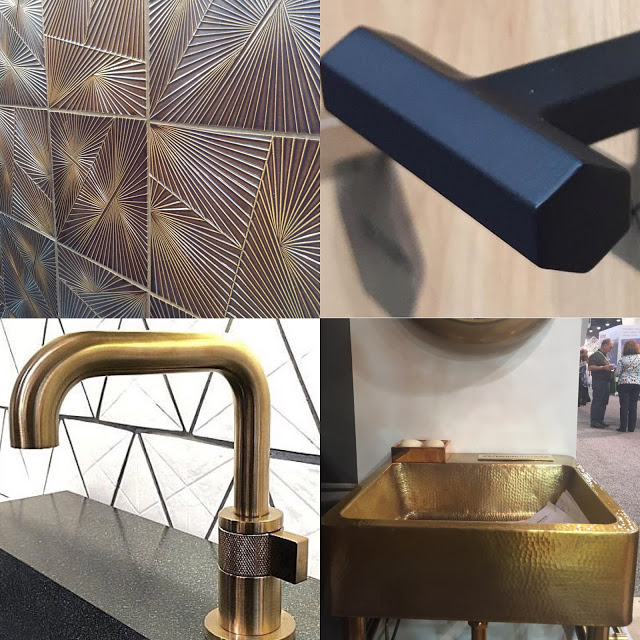
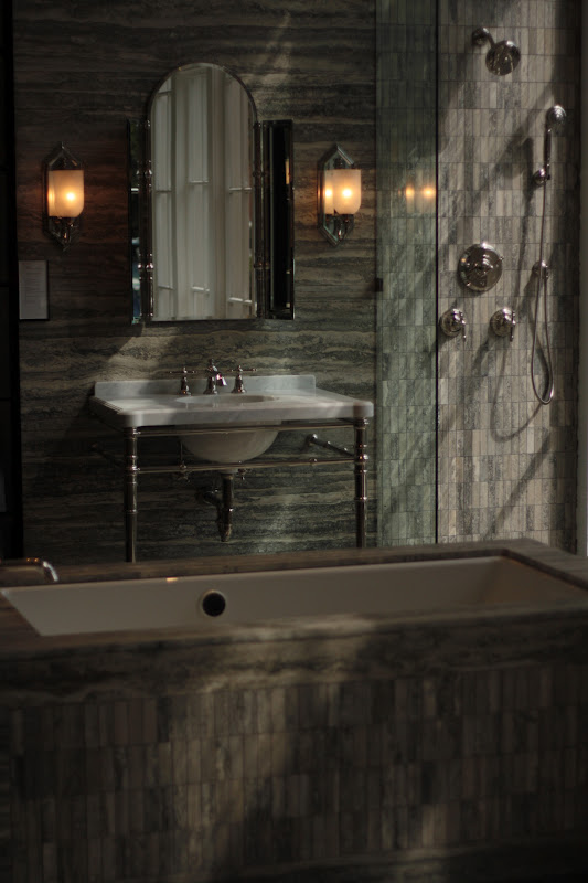
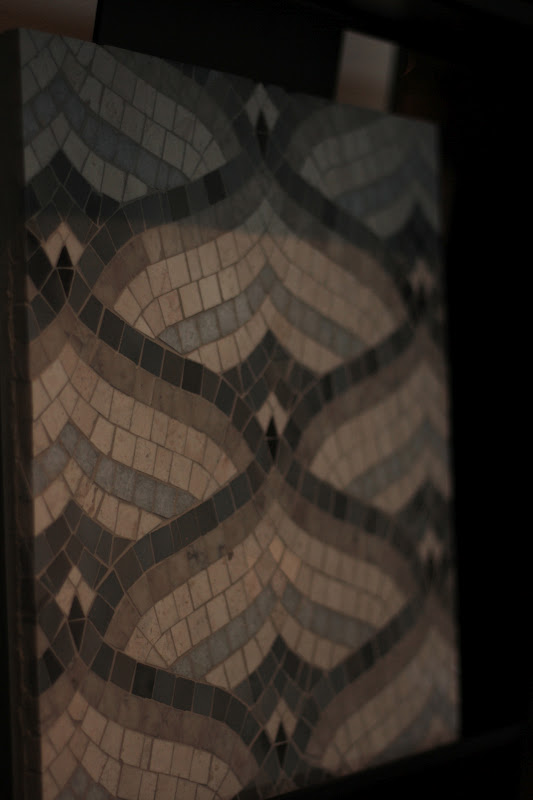
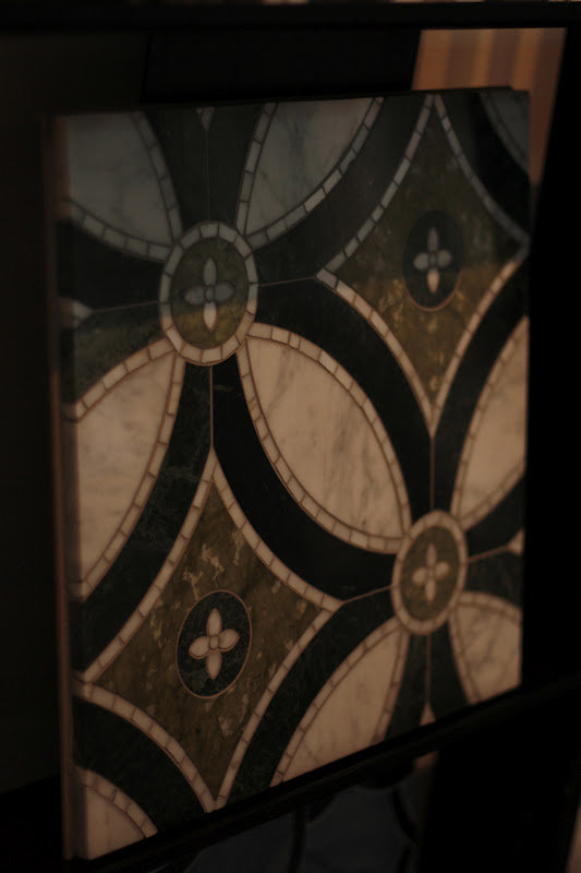
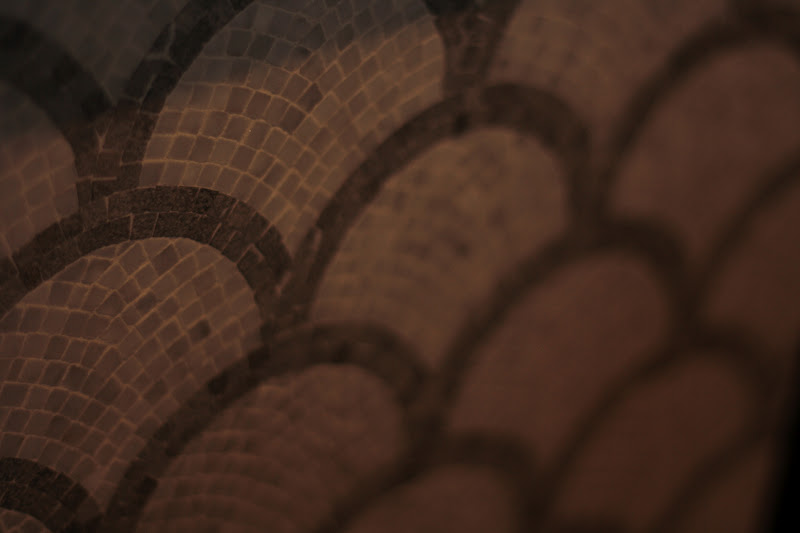
One of the strongest trends I saw at the show was texture. Clockwise from top left, we are talking about:

1/ Stunning Ann Sacks tiles inspired by Kelly Wearstler’s iconic string art
2/ Top Knobs‘ newly released faceted Serene Collection, which I’m dying to use on a project. The pulls feel so good in the hand.
3/ Thompson Traders‘ gorgeous hammered brass pedestal sink that simply has to make its way into one of my designs very soon. I thought I’d died and went to hammered heaven when I found this booth!
4/ The new Litze Collection from Brizo which is on my personal Lust List for my Designer Dream House. The perfect brass finish with articulated details and a touch of industrial texture on the valve makes me swoon.

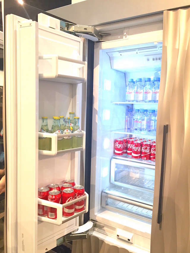
Textural elements were everywhere to be seen, offering designers the opportunity to awaken the senses in fresh ways. While texture is nothing new, we’re seeing unexpected applications in 2016, as with these carved panels on the face of Thermador‘s culinary preservation centre (below).

thermador-textured-refrigeration-panels

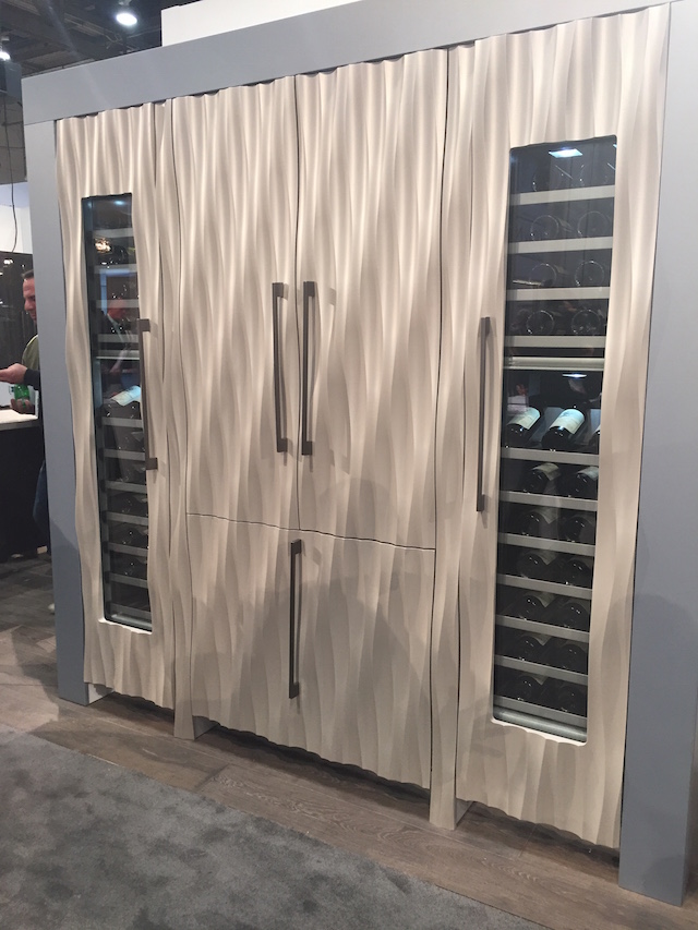
More than the texture, it’s the technical details that get me excited with Thermador‘s integrated refrigeration. Sometimes it’s what you don’t see that counts, like the hidden hinges (see below) that make it possible for the panels to be perfectly flush and fully integrated with surrounding cabinetry. Finally. No more working around unsightly hinges in cabinetry design.

(Cue: Designers everywhere rejoicing!)

thermador-hidden-hinge

PRETTY GETS PRACTICAL

Not surprisingly, brass and gold finishes and fixtures were stronger than ever at KBIS this year. Rest assured that brass is still boss. If you’re looking to integrate a metallic finish on custom cabinetry and want it to be as pretty as it is practical, you’ll need to know about Wilsonart‘s new metallic aluminum laminates. Available in sheets as large as 4’x10’ and in several colours and textures, the applications for this line are truly endless. I’m thinking a previously budget-busting custom modern brushed brass range hood becomes a designer’s best kept secret when created using this innovative surface.

Wilsonart-aluminum-sheeting-brass-brushed-brass-corrugated-brushed-brass
From Top To Bottom: Polished Gold Aluminum, Satin Brushed Gold Aluminum, Ribboned Satin Brushed Aged Gold

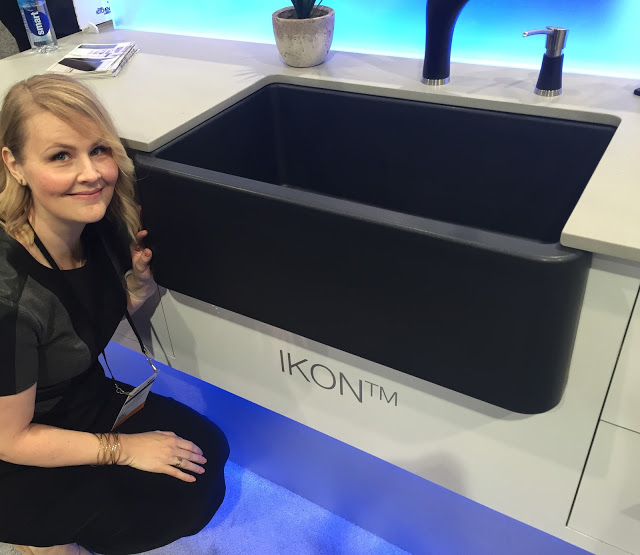
Also in the pretty and oh-so practical category is Blanco‘s latest introduction. The Ikon sink is made of SilGranit, the hardest composite material available on the market in sinks today. You can literally take a fork to this surface – with elbow grease and evil intentions – and still not leave a mark. My favourite colours in the Ikon are the Anthracite (below) and classic White.

blanco-ikon-sink-anthracite

Another innovative feature of the Ikon sink is the floating grid accessory, which can be used in a number of other sinks in Blanco‘s line up as well. From resting a colander on it (to keep food from sitting in liquids at the bottom of the sink while straining) to using it as a discrete perch for dishes to dry, the floating grid is a genius little accessory.

blanco-floating-grid
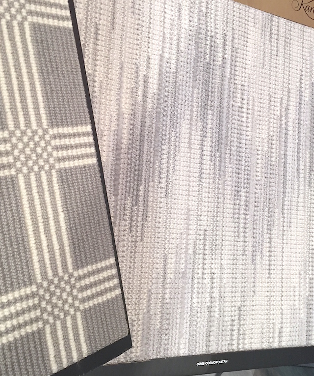
Last but not least in the pretty gets practical category, I’d say this is more of a practical gets pretty turnaround story. As a designer, I’ve always specified wool broadloom for both its hypoallergenic properties and its naturally stain-resistant nature. Until recently, most reasonably priced wool broadloom has only been available in very staid colour palettes and patterns, but Karastan‘s selection of wool broadloom makes the thought of creating a custom bound area rug or stair runner a much more enticing prospect. I mean, how gorgeous is the Cosmopolitan dove grey flame stitch pattern below?

karastan-wool-broadloom

Taking in the latest trends can prove daunting for some, leaving you overwhelmed and unsure of where to start. Stay tuned for my upcoming posts on where to begin when designing a new kitchen or bathroom.

xx
s.

By |February 9th, 2016|0 Comments

HOW TO CUSTOMIZE AN IKEA KITCHEN | DESIGN LESSONS FROM THE TEAM AT CANADIAN HOUSE & HOME MAGAZINE

Photo via Global News

As a designer, I head to the Interior Design Show Trade Day every year for three main reasons:

ONE to see what new products and innovations are being introduced, TWO to get inspired, and THREE to connect with really great people in my industry.

This year, to my pleasant surprise, I found all three needs met in one place at House & Home‘s IKEA kitchen display. Setting the creative team at Canadian House & Home Magazine to the design challenge of customizing an IKEA kitchen – alongside the team at Style At Home who also designed a beautiful space – was a brilliant way for IKEA to introduce their new Sektion line of kitchen cabinetry to the Canadian market.

INNOVATION IS ON THE INSIDE

The new line is a huge move for IKEA in transitioning away from their popular Akurum line of kitchen cabinetry. From the little that I was able to see past the throngs of people in the booth, it’s the “guts” of the Sektion line that make it most exciting, with lots of highly customizable options and extremely functional inserts. {I caught a glimpse of a drawer with a tiered sliding spice rack in it that was truly fab!} The new door profiles and colour options are very current and on-trend with what’s happening in kitchen design right now.

Unfortunately for those who already have an Akurum kitchen, it appears as though the dimensions of the two lines are different, so you won’t be able to retrofit your Akurum with these enviable Sektion upgrades without a total kitchen redo. That said, they are still honouring their amazing 25 year warranty on the Akurum, so all is not lost.

The House & Home kitchen really felt like an English fitted kitchen to me, with an abundance of design details to surprise and delight. In addition to the herringbone wood floors you can see in the photo above {they had me at herringbone!}, they showcased a few of my favourite timeless design trends in this beautiful space. Take a peek at some of the design lessons we can learn from Suzanne Dimma and Sarah Harthill – the senior designers leading the team on this kitchen design on behalf of Canadian House & Home Magazine.

LESSON ONE: CREATE ARCHITECTURAL INTEREST

Image via Margot Austin on Pinterest

Let’s be honest, turning a basic convention-style booth into a quietly luxurious custom fitted kitchen is not for the faint of heart. Like a real home renovation or a new build, the task requires heaps of design vision and the courage to be unique. The first thing I loved is the way Suzanne and Sarah made the kitchen feel totally custom with the use of paneling.

Paneling, as I’m sure you know, is one of my timeless favourites. In fact, there are very few design projects I’ve done over the years that have not wound up with paneling in at least one room of the house. Why? It adds instant character and the kind of architectural interest that grounds the space and gives it a sense of history. Good bones, as we say. Always start with good bones.

The way Suzanne and Sarah integrated the simple, modern, box-style range hood into the paneling and wrapped the paneling around the room is brilliant. It truly connects both sides of the kitchen with the pantry that flanks the end wall, and it complements the raised paneling on the IKEA cabinetry Suzanne and Sarah chose without feeling too “matchy matchy.”

LESSON TWO: PLAY WITH PATTERN + COLOUR

If I could have secretly stuffed this stunning Martyn Lawrence Bullard for Ann Sacks tile into my handbag to use in my yet-to-be-reno’d laundry room without creating a scene, I would have done it in a heartbeat. Delicious. I love how this tile creates a sense of history while being extremely current. Think Paris bistro floors or an English hand-painted backsplash.

I also love the dove grey cabinets Suzanne and Sarah chose {this door style is called Bodbyn and will be available February 2nd} and how they contrasted the softness of the grey with the deep peacock colour on the paneling and range hood. The art of the mix is as much about creative contrast as it is about a mix of materials.

LESSON THREE: CREATE MOMENTS of DISCOVERY

Needless to say, my photo does not do this stunning little pantry justice. Mark my words, though. When the professional photos are released, people are going to be pinning the you-know-what out of this little space on Pinterest. Beyond the charming sense of organization {which makes me want to hire Suzanne and Sarah just to bring that kind of zen into my own real-life-with-kids…even if only in my pantry! It would become my little in-home European retreat…}, it’s the Peacock Garden wallpaper by Zoffany and the iron-framed French doors with egg-shaped brass knobs that make this pantry sing. I mean, who expects to see such a fantasy-world-come-to-life in the pantry? It’s delightfully unexpected. This kind of “discovery moment” as I like to call it makes you bite your lip and inhale quickly when you come upon it. Just the sort of thing to make a kitchen feel entirely bespoke and utterly special.

{And I was actually kind of serious about the pantry retreat thing. I can totally see myself hiding away and sipping tea in here whilst imagining myself on a European vacation. This is either a seriously sad statement about my need for a vacation or an incredible credit to my vivid imagination.}

You’ll have to wait for this kitchen to be featured in the magazine to see all of the delicious details that were so thoughtfully designed in this space. Watch for it in an upcoming issue of House & Home, where no doubt the source guide and the gorgeous photos will be worth the wait.

xo
s.

By |January 28th, 2015|7 Comments

Ann Sacks | San Francisco

I have a confession to make. I am addicted to tile. One of my favourite aspects of working as an interior designer is playing with the shapes, textures, colours and dimension that can be created using beautiful tile products. The tiles that make me swoon are always natural stone, but a gorgeous glazed ceramic can make me just as giddy with the right application.

That is why I have a HUGE design crush on Ann Sacks. I was delighted to happen upon their San Francisco showroom on my visit to the Design District and just had to share a few shots of Ann’s jaw-droppingly beautiful tile creations with you. Just feast your eyes on some of the deliciously detailed creations this innovative luxury tile and plumbing purveyor has to offer.

 
Drawing upon the rich history of mosaic tile patterns while innovating with new materials use, patterns and manufacturing techniques, Ann Sacks is one of the premier sources for exquisite luxury tile products in North America. Be sure to peruse their site for a seemingly endless catalogue of detailed tile collections. Whether you are currently planning a bathroom or kitchen renovation or just love to explore forward-thinking interior design suppliers, Ann will have you dreaming about the possibilities in all shapes, textures and colours of tile imaginable.
xo
s.

By |September 20th, 2012|1 Comment