/brass

HOW TO CUSTOMIZE AN IKEA KITCHEN | LESSONS FROM THE DESIGN TEAM AT STYLE AT HOME

If there’s one thing I would say the amazing design team at Style At Home taught us at this year’s Interior Design Show, it’s that Paris really does hold all the secrets to a chic and gracious way of living. Walking into their award-winning customized IKEA kitchen booth felt like being transported into a grand French kitchen, where the boulangerie and bistro were both right at home. So today, I’m sharing a few design lessons we can take from Style At Home‘s beautifully customized space.


LESSON ONE: TAKE YOUR CUES FROM PARIS

Ask anyone where they want to travel and Paris is most likely near the top of their list. We’ve only been a couple of times and can’t wait to go back. Our dream? A summer in Paris with our kids. But in the meantime, why not bring Paris home?

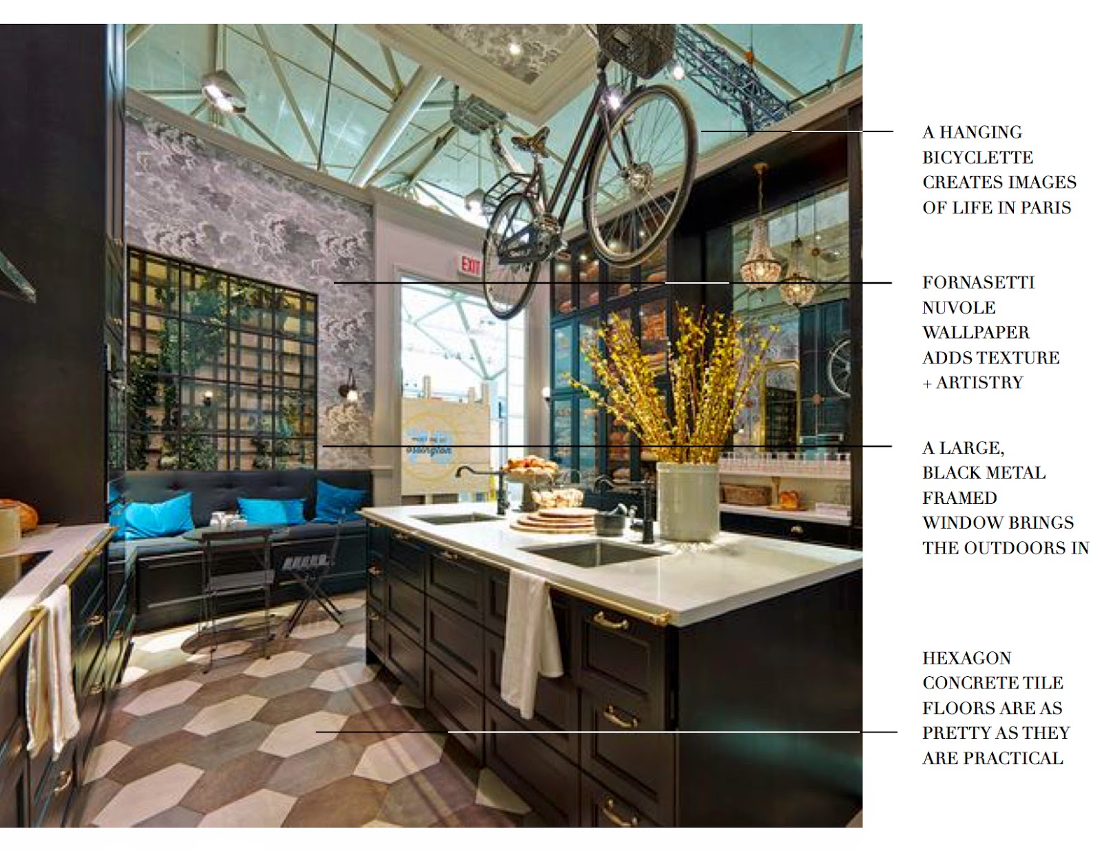
From the bicyclette suspended over the island to the large, metal-framed window to the hexagon concrete tile floors to {my favourite} the Fornasetti Nuvole wallpaper from Cole & Son, the touches of European wanderlust are everywhere in this kitchen. I feel both at home and compelled to travel all in one grand gesture, and that’s exactly how I want to feel in my own inspired space. I love the sense of playfulness and sophistication so easily married in this kitchen. Ça c’est parfait!


LESSON TWO: INTEGRATE AND CUSTOMIZE


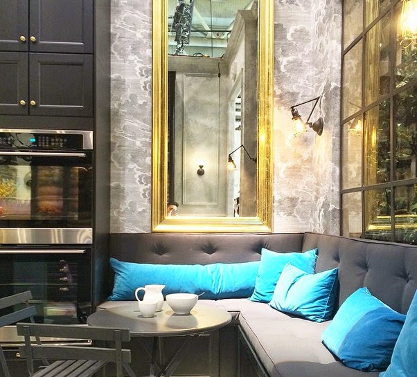
Image via @designmaze_tim on Instagram – go follow him!

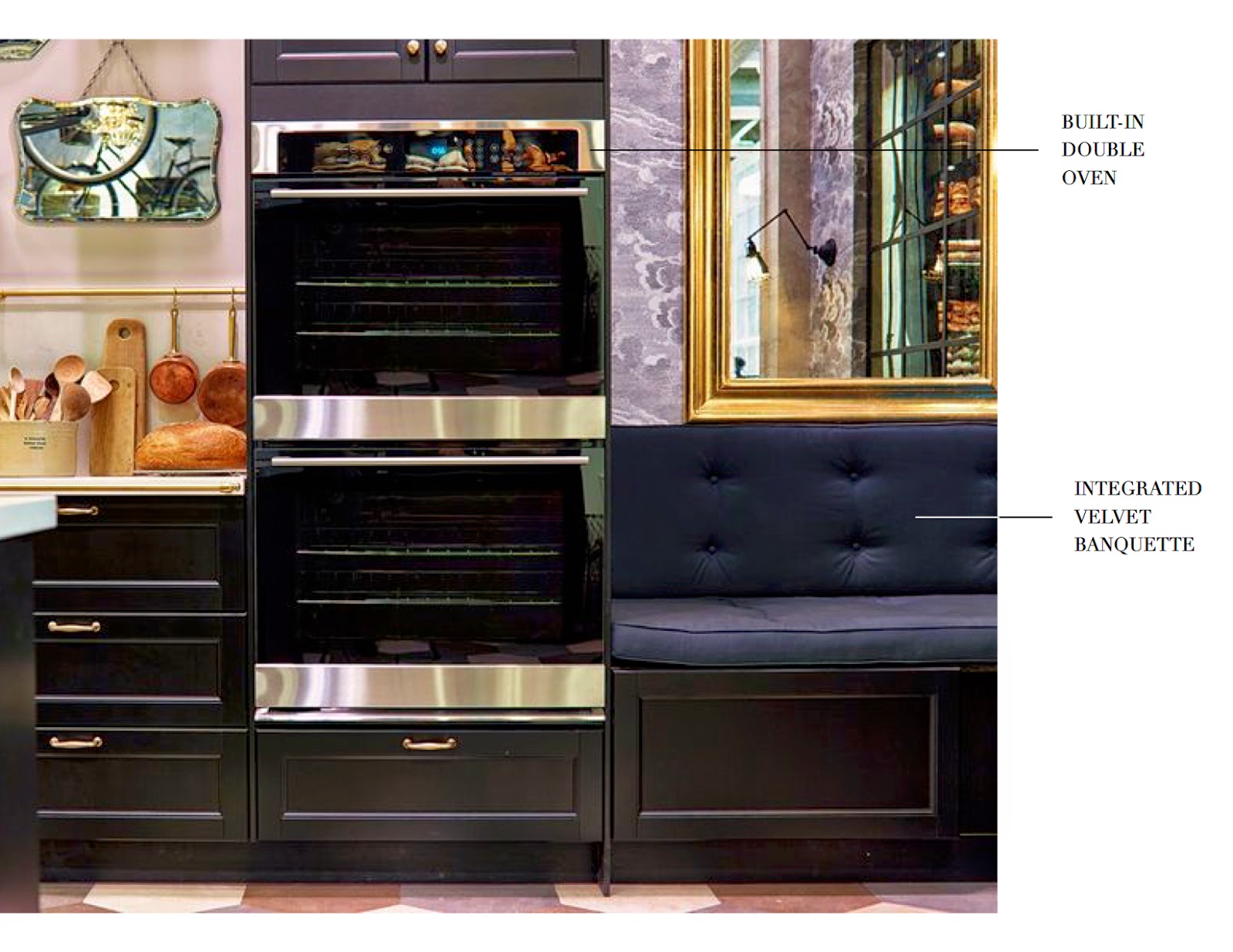
Integrating a custom-designed built-in banquette can make a kitchen and eating area feel larger and more functional. Rather than cutting kitchen cabinets short or living with the limitations of how many chairs will fit into a space, create more generous seating while giving the eye a simple focal point by designing a long and luxurious banquette. Not only will this maximize your space, but it’s also the perfect spot to lounge together and soak up some sun with your loved ones over a relaxed Saturday morning brunch!


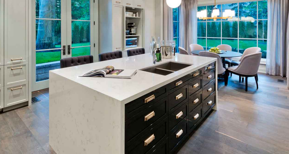
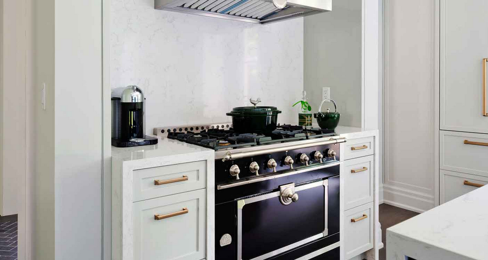
LESSON THREE: USE VINTAGE BRASS ACCENTS + ARTFUL FINISHES

One of the first details that made me bite my lip was the antique brass rail installed along the front edge of the countertops on both the range side and the sink side of the kitchen. Not only does this conjure images of a busy French bistro in all its glory, it’s as practical as it is pretty, allowing you to have a towel at the ready to wipe up hands and messes at any moment. After all, real cooks make real messes, n’est çe pas?

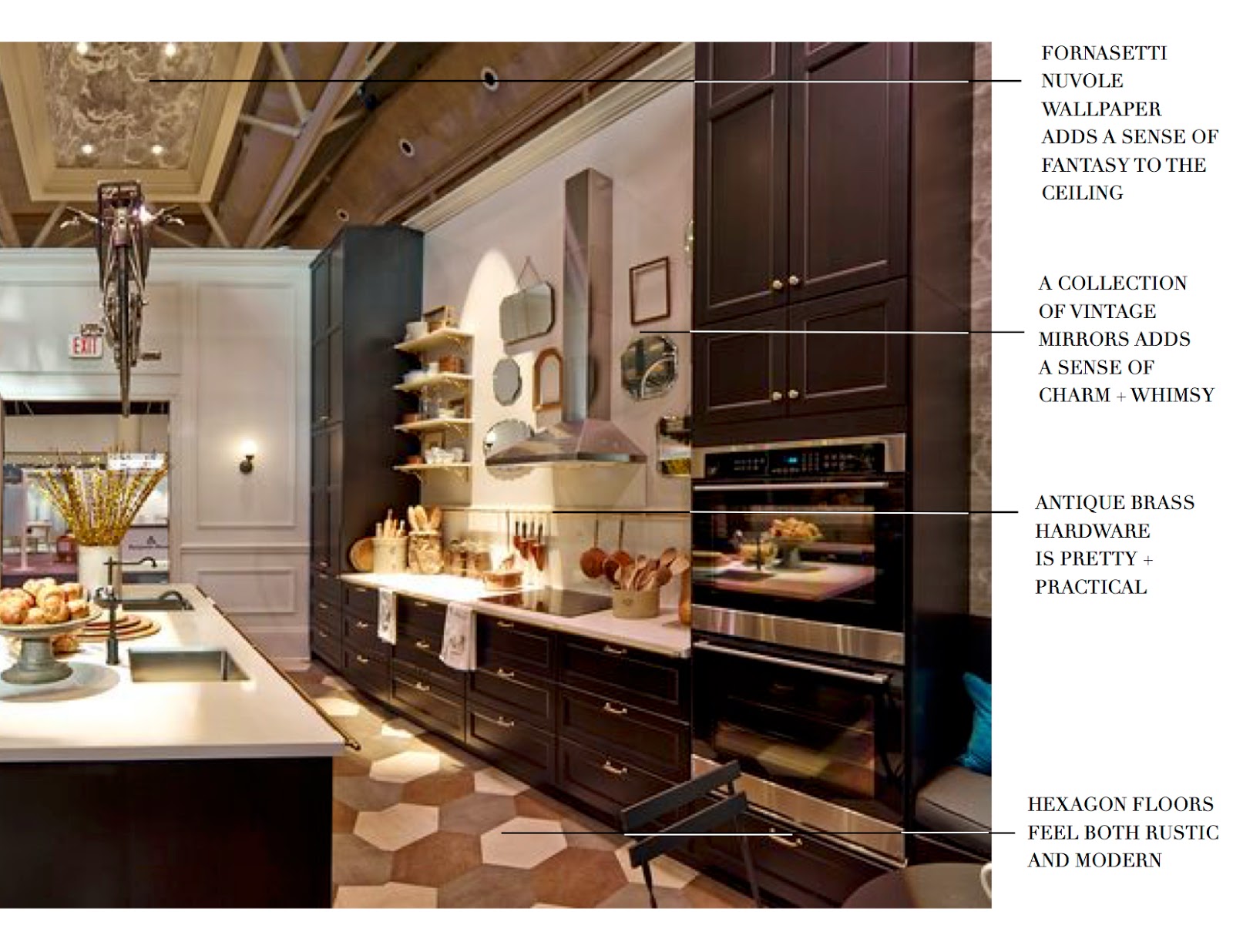
I also adore how the design team at Style At Home chose to create an artful gallery wall of antique mirrors around the range hood. The curated sensibility adds a charm and whimsy that make a brand new kitchen feel like it might have been there for decades. Brilliant.


LESSON FOUR: USE JUXTAPOSITION TO MAKE EVERY ELEMENT SHINE

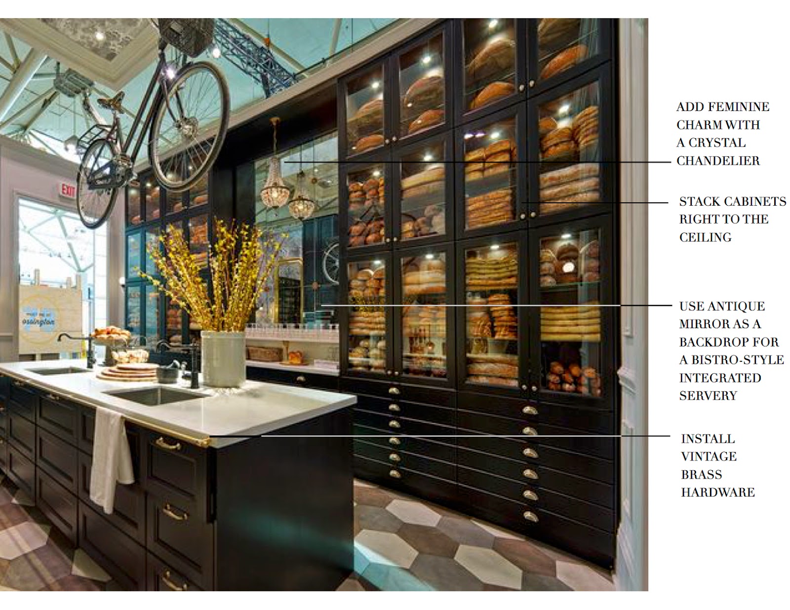
There were a lot of genius moves in this kitchen. One of them was to break up the dramatic full-height pantry wall with a built-in servery. Not only does it provide a practical nook for serving drinks to guests and cutting croissants for breakfast, but it also creates a balancing focal point on the wall opposite the range. The antiqued mirrored panels echo the statement made by the collection of mirrors installed around the range hood while also creating a sense of expansiveness and history in the kitchen. The crystal chandelier also nods at history and adds the feminine charm of a French coquette.

I don’t know about you, but I could move in at a moment’s notice – French press in hand – and I can assure you I would never want to leave. Many thanks to the team at Style At Home for the fuel to dream of bringing a bit more of Paris home again.

xo
s.

*All images via IKEA Canada except where noted.

By |March 4th, 2015|1 Comment

2014 Brian Gluckstein Princess Margaret Lotto Showhome | PART TWO

So yesterday I shared with you some of my favourite design features from this beautiful home through the lens of my personal Dream House Wish List. I think I’m going to have to make this a regular feature as the list of dream details keeps growing, and they are far too delicious to keep to myself! For now, more design love from the 2014 Princess Margaret Lotto Showhome designed by Brian Gluckstein.

A GREAT KITCHEN

The heart of every dream home is truly the kitchen. This is where family and friends gather, where meals are prepared and shared and where some of the most meaningful conversations of the day often take place. There should be a simpatico in the kitchen – a welcoming of the ebb and flow of people who make a house a home – matched with a comfortable calm that invites creativity and connection.

I love the high gloss black lacquer on the island cabinetry, which serves as a nice punch of contrast to the clean and serene waterfall countertop made of Cambria quartz.

The satin brass cabinetry hardware is a modern twist on a classic. I also love the retro feel of the brass and frosted glass pendants over the island {below}.

The Le Cornue range and hood vent offer a dramatic focal point, adding more contrast and a touch of French decadence to this kitchen.

And the collection of toasters from the 1930’s and ’40’s adds just the sense of quirky personality this kitchen needs!

A PLAYFUL SPIRIT

For me, every dream house absolutely has to have a sense of whimsy. We should never take ourselves too seriously, but especially not at home. After all, how can we have a house filled with laughter if we lose our playful spirit? Laughter is a must in my world! And in this house, the whimsy and lightheartedness I look for are best seen in the art found in the children’s bedrooms, all from Art Interiors. I love how the artwork plays off of the colourful bedding from the Gluckstein Home collection. Bright, cheerful colours for a bright and cheerful little life! It doesn’t hurt that navy and orange happens to be one of my favourite colour combinations.

Creamsicle anyone?
The effortless drape of the bouquet of tulips over the bed creates a casual beauty that’s perfect for this room!

I’m also in love with the GENIUS way that Brian concealed an awkward bulkhead in one of the bedrooms by creating this nautical-inspired built-in bunk bed {below}. Rumour has it the ladder was tucked away for safe keeping before the house was opened to guests because the adults on the team “may or may not” have been climbing up it and playing on the bunk beds themselves. That’s a good sign in my book! It’s all about keeping a childlike spirit alive.

How much is that doggy in the window? Love him!
Isn’t the craft room adorable? That whimsical dalmatian totally sets the tone!


DRAMA

To juxtapose that playful whit and lightheartedness, every dream home should have at least one moment of drama. Take, for example, the the theatre room on the lower level of this house. The dark walls, masculine furnishings, gallery wall of photography and eclectic, well-traveled spirit of the styling of the accessories all tell an interesting story and set the stage for the drama and intrigue that make for a perfect movie viewing room.


INGENUITY

One of the things I love most about being an interior designer is the opportunity to use my strategy gene to turn problems into solutions and even design features. Brian Gluckstein is the absolute master of this very brand of design magic. I love how he used his ingenuity to solve the problem of a home gym that was totally lacking in natural light. Not one to settle, Brian got creative and thought – what if one of the walls was “see through?” Literally! By encasing the wine cellar in glass instead of drywall and suspending the racking between the floor and ceiling so that it didn’t require a wall to anchor it, Brian created a giant window into the home gym that welcomes in a wash of natural light to keep the fitness buffs in this household feeling fresh and inspired. Genius!

Stay tuned for tomorrow when I’ll reveal my favourite space in this house and why I love it so!

xo
s.

By |October 1st, 2014|1 Comment

Project: Kitchen Refresh | Lighting Option #2

Thanks so much for your feedback last week on Lighting Option #1 for my little kitchen refresh project! I’ve decided I want to nail down the lighting first before I move on to any of the other details. I really think the lighting will have a lot to say about the final direction of all of the rest of these little updates and help set the direction for the details.

OK, so I’m guessing you’ve all picked up on the  memo that brass continues to be HOTTER THAN HOT in design this year. There’s something sexy and glamorous about the use of it, even in the humblest of spaces. Just take this charming butler’s pantry below:

{image via Pinterest}
I’m totally in  L O V E  with the sophistication of the brass fittings and light fixture added to the mix of finishes in this clean and elegant kitchen below:
{image via Pinterest}

Fierce + fabulous, isn’t it? I could move into that kitchen tomorrow.

So my heart stopped momentarily when I came across this simple and modern pendant at Lamps Plus. I’m so in love with its warm and vintage antiqued brass patina that I want to bite it like its made of maple candy.

Seriously sexy, right? This fixture is totally a modern classic. Love at first sight. I would choose to pair it with accessories like this whimsical hand from Black Rooster Decor:

And this pair of Swedish 1930’s Bjork vases from 1st Dibs for a regular rotation of fresh flowers:

My dilemmas are two-fold.

ONE: I don’t want to change my cabinetry hardware. I like it a lot, and while I do believe it is possible to mix white and yellow metals successfully, I have a definite white-metal-dominance in my kitchen right now {for example, check out my Emeco counter stools below}.

TWO: I only have 8 foot ceilings. One of the things I  l-o-v-e  about this particular pendant is its long and lanky elegance. Unlike many pendants where the downrods make up most of the length, the shaft of this fixture is itself quite long. I don’t want to have a stubby little bit of downrod emphasizing my less-than-extravagantly-high ceilings. I worry that my ceilings and these pendants would each fail to do each other justice.

The thing is, I’m utterly smitten with this fixture! What do you think? Too many changes required? Too long for my rather pedestrian-height ceilings? Too much contrast with my cabinetry hardware, counter stools and statement of a stainless steel apron-front sink?

Can’t wait for your feedback!

xo
s.

By |January 24th, 2013|0 Comments