/colour

2014 Brian Gluckstein Princess Margaret Lotto Showhome | PART TWO

So yesterday I shared with you some of my favourite design features from this beautiful home through the lens of my personal Dream House Wish List. I think I’m going to have to make this a regular feature as the list of dream details keeps growing, and they are far too delicious to keep to myself! For now, more design love from the 2014 Princess Margaret Lotto Showhome designed by Brian Gluckstein.

A GREAT KITCHEN

The heart of every dream home is truly the kitchen. This is where family and friends gather, where meals are prepared and shared and where some of the most meaningful conversations of the day often take place. There should be a simpatico in the kitchen – a welcoming of the ebb and flow of people who make a house a home – matched with a comfortable calm that invites creativity and connection.

I love the high gloss black lacquer on the island cabinetry, which serves as a nice punch of contrast to the clean and serene waterfall countertop made of Cambria quartz.

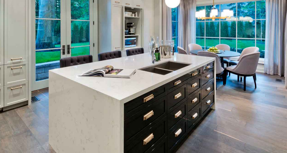
The satin brass cabinetry hardware is a modern twist on a classic. I also love the retro feel of the brass and frosted glass pendants over the island {below}.

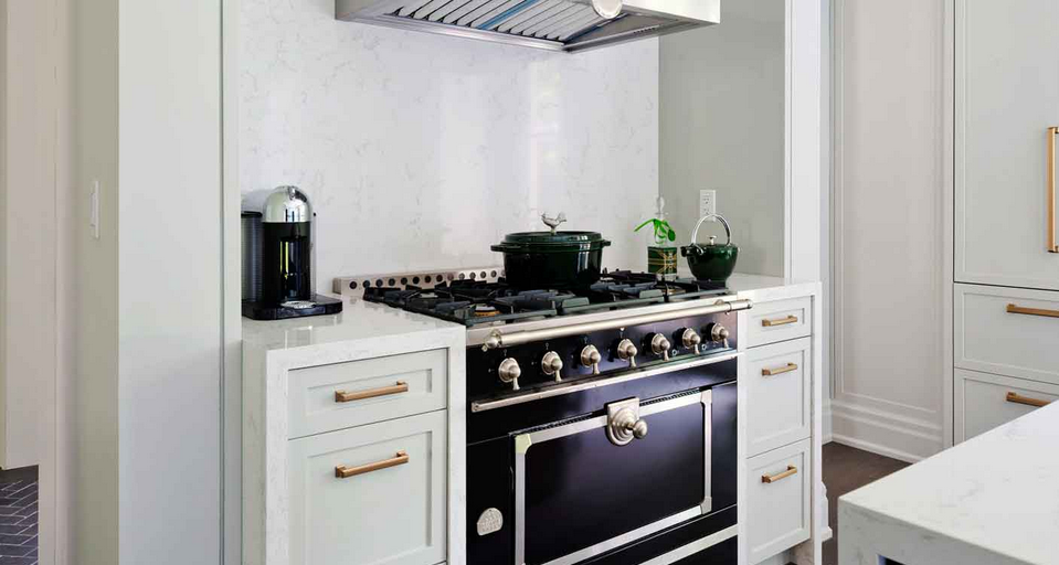
The Le Cornue range and hood vent offer a dramatic focal point, adding more contrast and a touch of French decadence to this kitchen.

And the collection of toasters from the 1930’s and ’40’s adds just the sense of quirky personality this kitchen needs!

A PLAYFUL SPIRIT

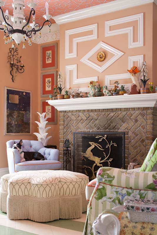
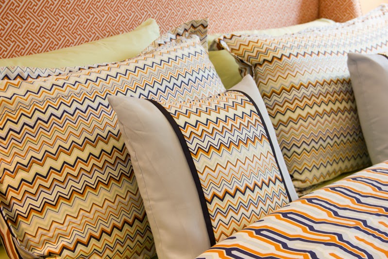
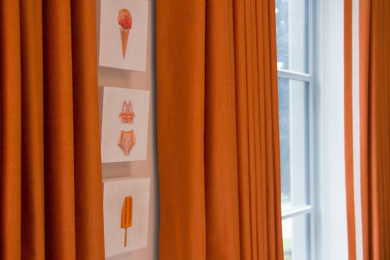
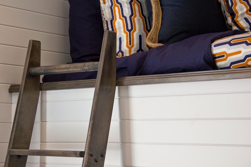
For me, every dream house absolutely has to have a sense of whimsy. We should never take ourselves too seriously, but especially not at home. After all, how can we have a house filled with laughter if we lose our playful spirit? Laughter is a must in my world! And in this house, the whimsy and lightheartedness I look for are best seen in the art found in the children’s bedrooms, all from Art Interiors. I love how the artwork plays off of the colourful bedding from the Gluckstein Home collection. Bright, cheerful colours for a bright and cheerful little life! It doesn’t hurt that navy and orange happens to be one of my favourite colour combinations.
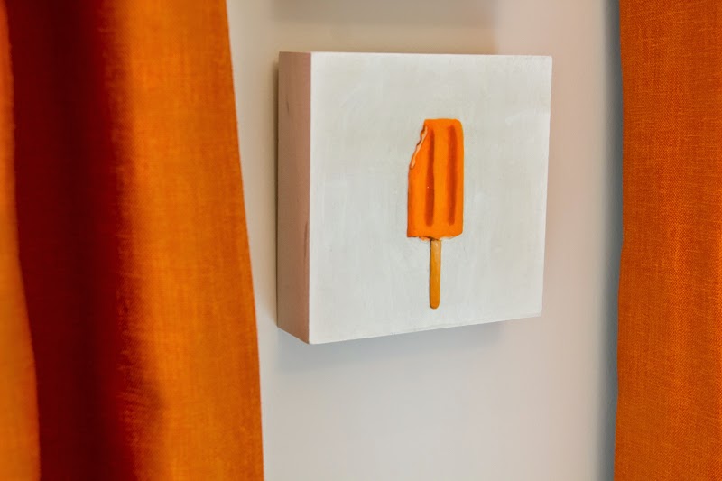
Creamsicle anyone?
The effortless drape of the bouquet of tulips over the bed creates a casual beauty that’s perfect for this room!

I’m also in love with the GENIUS way that Brian concealed an awkward bulkhead in one of the bedrooms by creating this nautical-inspired built-in bunk bed {below}. Rumour has it the ladder was tucked away for safe keeping before the house was opened to guests because the adults on the team “may or may not” have been climbing up it and playing on the bunk beds themselves. That’s a good sign in my book! It’s all about keeping a childlike spirit alive.

How much is that doggy in the window? Love him!
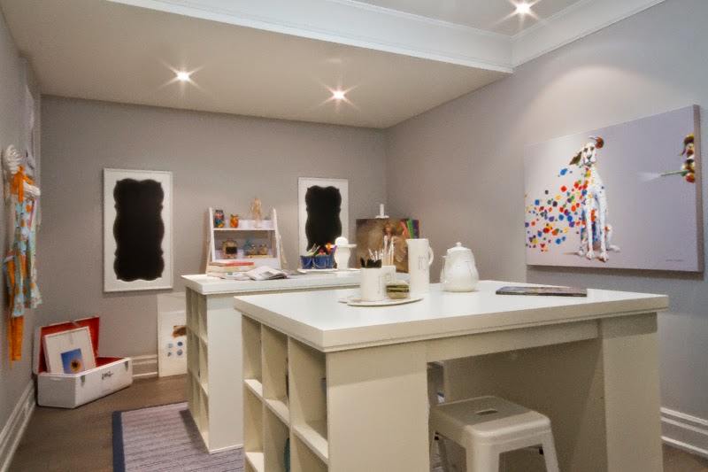
Isn’t the craft room adorable? That whimsical dalmatian totally sets the tone!
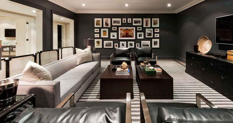
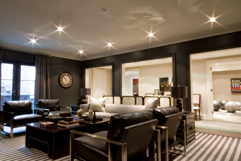

DRAMA

To juxtapose that playful whit and lightheartedness, every dream home should have at least one moment of drama. Take, for example, the the theatre room on the lower level of this house. The dark walls, masculine furnishings, gallery wall of photography and eclectic, well-traveled spirit of the styling of the accessories all tell an interesting story and set the stage for the drama and intrigue that make for a perfect movie viewing room.
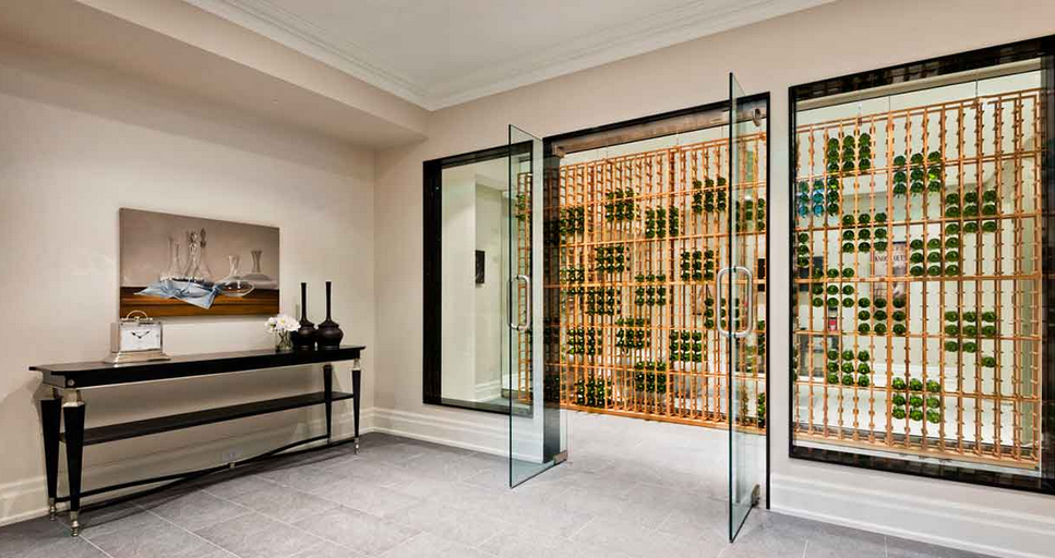

INGENUITY

One of the things I love most about being an interior designer is the opportunity to use my strategy gene to turn problems into solutions and even design features. Brian Gluckstein is the absolute master of this very brand of design magic. I love how he used his ingenuity to solve the problem of a home gym that was totally lacking in natural light. Not one to settle, Brian got creative and thought – what if one of the walls was “see through?” Literally! By encasing the wine cellar in glass instead of drywall and suspending the racking between the floor and ceiling so that it didn’t require a wall to anchor it, Brian created a giant window into the home gym that welcomes in a wash of natural light to keep the fitness buffs in this household feeling fresh and inspired. Genius!

Stay tuned for tomorrow when I’ll reveal my favourite space in this house and why I love it so!

xo
s.

By |October 1st, 2014|1 Comment

High Point Market Highlights | Madcap Cottage

Remember that announcement I made last week about the death of the matching furniture set? Well today’s post is an expansion on that announcement if you will. Today’s announcement?

Quirky is the new cool.

Yep, it’s true. In a design world where we now value personal expression over fitting in, a little quirk, a little whimsy and a heaping dose of the unexpected is just what the design doctor ordered, and the delightful gents at Madcap Cottage are leading the charge.

Decorating with pattern and creating a bespoke, unexpected mix with unique vintage finds are two of the hallmarks of John Loecke and Jason Oliver Nixon’s design aesthetic, and the Madcap Cottage booth in the Antique & Design Center showed off their signature style with aplomb. In fact, there are 3 Design Lessons that I think we should all take note of today as we enjoy these snapshots of their booth.


DESIGN LESSON #1 : EMBRACE PATTERN AND COLOUR
Can you say “pattern on pattern?” It’s de rigeur for this daring duo, whose fearless use of florals, geometrics, tribal patterns and colour is innately charming and all kinds of throwback fresh with an au courant edge that places them squarely on my “must watch” list. Like a box of decadent French bon bons, they never seem to stop at “just one” with their use of patterns and prints.
Take for example some of the details in this vignette. Thibaut’s Bungalow wallpaper from their new Resort Collection makes for a a cheery “hello” yellow backdrop to the grouping pictured above and below, and the Michael Taylor for Baker Furniture asian sofa pictured in this vignette is available through the Madcap Cottage 1st Dibs store here. Love the pillows? Then you’ll definitely want to check out the complete Madcap Cottage pillow collection.

I also loved the faux bamboo barrel back chair {below} that sat opposite the asian sofa in this grouping, yet another example of Jason and John’s unabashed use of pattern. I mean, pink leopard with a vintage floral on a faux bamboo chair, all sitting on a vintage kilim rug? Come. On.

DESIGN LESSON #2 : EXPRESS YOUR PERSONALITY WITH VINTAGE PIECES

Seems I wasn’t the only one making a beeline for the delightfully unexpected inspiration awaiting in the charming Madcap Cottage booth. In fact, I had to pause and stop at another booth on my way just so that I wouldn’t feel as though I was stalking Tobi Fairley {pictured below perusing the Madcap collection}. I was coming straight from Tobi’s session on the business of design that she had just finished delivering, and the session was packed with valuable insights on the changing landscape of the design industry.

I love the canopy cain chair that Tobi Style Spotted. It was my favourite piece in the booth as well, and I particularly love the hot coral piping on the Tony Duquette upholstery. Delicieux.
The Madcap Cottage booth was of course brimming with all sorts of amazing vintage finds just waiting to infuse your home with that quirky and unexpected “something” you’ve been searching for.
How charming is the Vintage Carousel Light {pictured above}? It’s got enough personality in and of itself to launch the design of an entire room. If only I didn’t already have a light fixture and design direction for the nursery this would have made the perfect jumping-off point!
DESIGN LESSON #3 : GALLERY GROUPINGS ARE WHERE IT’S AT

Of all the reasons I love them, I think my fondness for the clever curators of the Madcap Cottage collection is rooted in our shared love of all things British. Scouring the globe for unique finds, these two gems spend a great deal of time on my “family island” of the UK, and it shows in the decidedly English dose of debonaire to be seen throughout their booth.

Don’t you just love the way Thibaut’s “Shore Thing” wallpaper creates a dramatic canvas for this gallery of British gents in all their finery?

More than just purveyors of vintage finds, custom furniture and a signature pillow collection, Jason Oliver Nixon and John Loecke also offer design services where you can see all three of today’s design lessons come to life. Just feast your eyes on their use of pattern, colour, vintage finds and gallery groupings in these refreshingly unique spaces:

Thank you, Jason and John, for the abundance of inspiration! It was a delight meeting you both, and I hope our paths will cross again soon.

xo
s.

By |November 6th, 2013|0 Comments

The Curated Collection | Filippo Minelli

It was the simple, even austere, juxtaposition of the ethereal yet vibrant coloured smoke against the beauty of natural landscapes that first caught my breath and my attention. Stumbling upon the Silence/Shapes collection by Italian photographer Filippo Minelli felt like stumbling upon a treasure trove of modern photographic art.

Layered beneath the smoky veils of colour lies this fascinating artist’s statement:

Decontextualization of a violent tool changing quickly the surroundings, creating chaos, blinding the eyes, used in natural landscapes. The result proves that beauty can be found in clashing visions with an approach and aesthetic similar to romanticism. Showing the power of nature with the implication of religious aspects. Juxtaposing violence and beauty as a political statement.

I confess that the underlying statement about violence was lost on me until I read Minelli’s artist’s statement. For me, the striking contrast was enough to capture my admiration and attention with such arresting and unexpected beauty.

To my eye, these out-of-context, highly saturated puffs of transient colour create the kind of art I could see integrating into almost any interior space, offering a fiercely modern yet timeless edge.

What do you think of Minelli’s series? Can you envision one of his photographs in your space? What kind of energy do you think his work would bring to a room?

Happy Monday!

xo
s.

By |August 26th, 2013|0 Comments