ONE ROOM CHALLENGE: FALL 2015 | WEEK FOUR UPDATE
Oh me, oh my, does the time ever fly! It’s been such a busy, blurry week that I seriously lost track of what day it was and almost forgot to post today! It’s a sign of the times, my friends. Lots on the ol’ plate.
THE UPDATE
All kinds of good things have been happening around here, like our Metrie mouldings being transformed into a gorgeous fireplace surround and mantel. If you follow me on Instagram, you caught a couple of sneak peeks of that in process. My furniture maker is seriously the bomb diggity.
That baby is now installed and simply awaiting the mantel top to be truly complete, and friends, she’s a looker.
The custom herringbone nero marquina mosaic from Creekside Tile is in the process of being installed as we speak and I lerv it. So classy. So timeless.
This week was also kind of like Christmas, as those lovely faux bamboo chairs from 55 Downing St. arrived, and after a little cross border adventure with my friend Rachelle to pick them up, they are now safely at home and awaiting their paint job. Noah made a suggestion for a different direction on the paint colour for them and – sophisticated 12 year old that he is – I agree with him, so you’ll have to wait and see where that is headed.
The rug arrived and to be honest there are some problems with it, so I’m putting on my English heritage “stiff upper lip” and managing that sitch all calm, cool and collected like.
THE FRAMING
In much better news, the gorgy-gorg frames from Framed & Matted arrived and I’m sooooo happy!!
Framing can be such a massive expense for any project, especially if you want great customer service and you want things done right. I’m thrilled that the lovely Chrissy has chosen to partner with me on this project and I have to tell you, her product is as fabulous as her incredible customer service ethic. Framed & Matted is currently only available in the US, so to all of my design friends south of the border, take note! Framed & Matted is truly a top-notch resource to keep in your designer arsenal of awesome.
THE ART IS MY FAVOURITE PART
I cannot WAIT to get all of the art mounted in these gorgeous frames. I’ve given you little sneak peeks at a couple of the pieces on the mood boards, but let me properly introduce you to some of the beauties that will grace this space with their soulful inspiration.
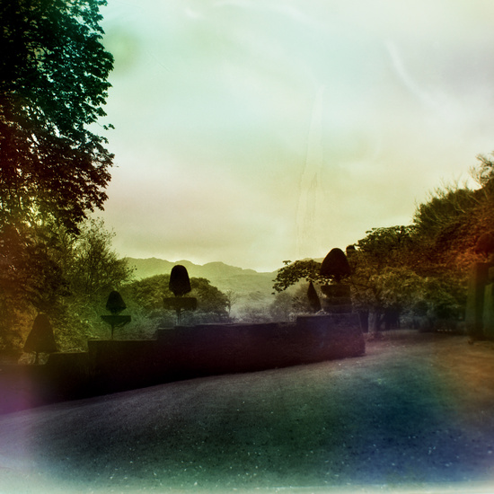
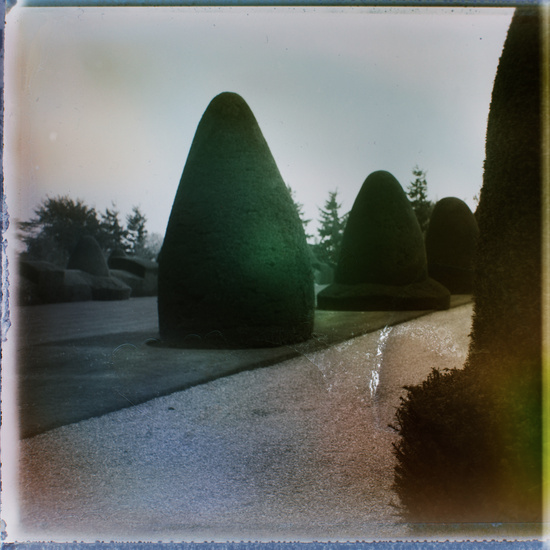
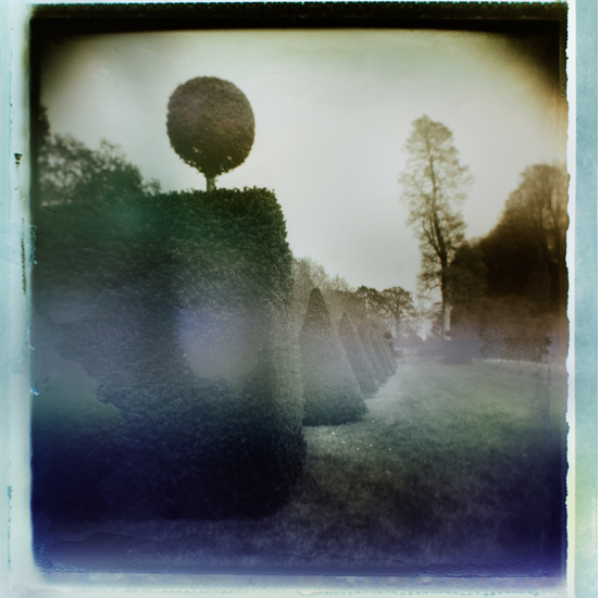
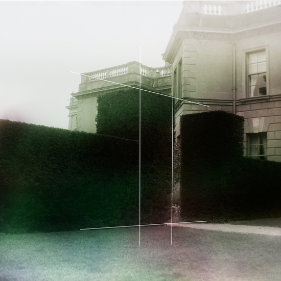
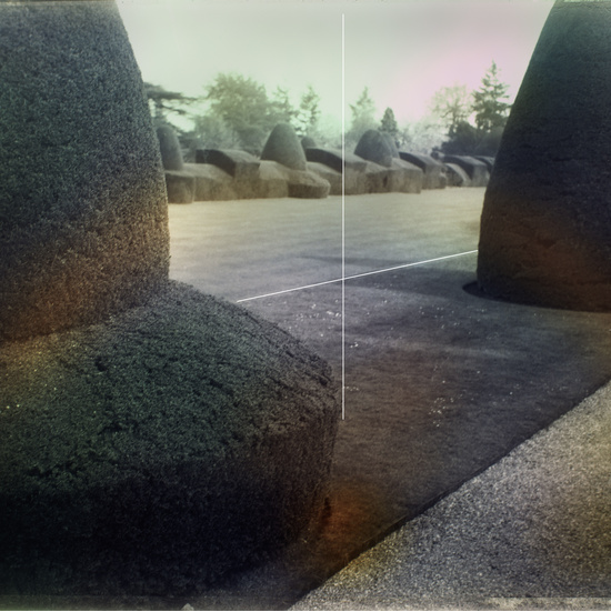
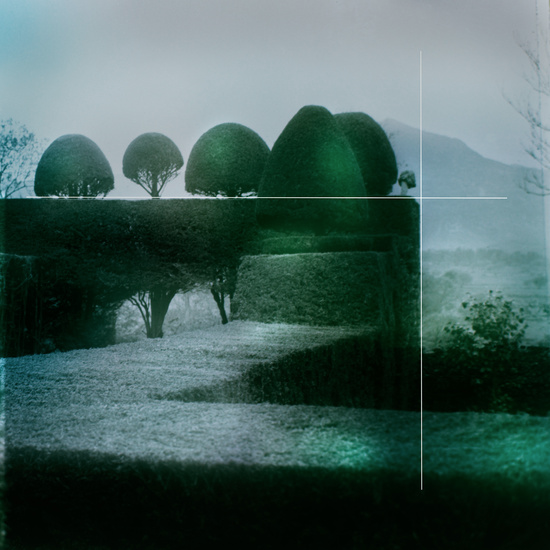
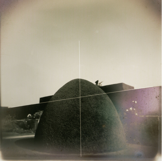
I have had this 12×12 stunner from fine art photographer David Graham White for awhile now and can’t believe it’s taken me this long to frame it up.
David’s process for this series is so inspiring: He photographed topiary gardens in the UK on old polaroid film, and then processed the polaroids using the heat from an old tube television, documenting the BBC channels that were playing as the polaroids processed. The heat flares from the television created the gorgeous and unpredictable saturation of colour that you see in the final works, and they tell the story of extreme control {topiaries} juxtaposed with the uncontrollable medium of television which invades our daily lives. We may attempt to control nature, but does media control us in the end? The intellectual dialogue behind these stunning works only serves to make them more beautiful to me.
Then there is this breathtakingly ethereal wonder from Zena Holloway.
I have truly been coveting this piece since I first laid eyes on it in Alessandra of Citizen Atelier‘s collection, and I’m still pinching myself that she has now come to live with us. I often struggle to feel at home with figurative artwork, but the ethereal sense of reverie and mystery in Zena’s work blurs the line between reality and fantasy in a way that I find utterly mesmerizing, transporting me to a place of imagination and wonder. For me, this piece is an elegant invitation to dream. Invitation accepted, Zena. Invitation accepted.
I really struggled with what to do with the art over the desk. I have a large shelf that used to house all of my product catalogues, but now that everything is available online I don’t need them cluttering up my space. Such a visual relief! In contrast to that utilitarian past, I wanted to make this space now feel airy and open and light, so I ordered three warm white frames from Framed & Matted. They will serve as the new home for a very happy little trio, starting with this incredible piece from Amy Friend.
This series, called Babushka, documents Amy’s deep bond with her grandmother. After her passing, Amy floated her grandmother’s nightgowns and scarves in water and captured their movement and essence in a most hauntingly beautiful, emotional way. I’m so honoured to have this piece in my home.
Complimenting the piece from Amy Friend are these two lovely limited edition prints from Minted.
I love how together they tell a story of wanderlust and adventure, of exploration and wonder. If I can instil those values in my boys I will be a very happy mama. If I can remember to live by them myself, I’ll be all the happier. I have no doubt this art will fuel me in achieving those goals – visual reminders of our core values of beauty, curiosity, gratitude and wonder.
I have one more piece to share with you – the one that will sit over the fireplace – but there’s a special project involved on that front and I can’t share it with you just yet. Stay tuned, as it’s all kinds of lovely.
THE GREAT SIDE TABLE DEBATE
So I picked up our Plan B side tables this week, and once out of the box discovered that they are way too pinky-copper for my liking. This photo belies the actual colour.
I’m all for mixing metals, but I need to actually like the shades of said mixed metals. So, back they go and it’s back to the drawing board for a rather close-for-comfort race to the finish line on this element of the room.
On the flip side, I picked up these beautiful acrylic column table lamps in brass from West Elm and they are perfection.
Classy, modern, timeless and just right for this room. I’m just waiting on the pair of Crane Floor Lamps from CB2 to come in and the lighting for the room will be officially checked off my list.
THE TO-DO LIST
I’m pretty sure I’m going to have to do at least one extra update post as I have a ton to get done this week and I want to make sure you don’t miss out on all the fun. So much of the action takes place right at the end of a project!
Here’s this week’s strike list:
- Paint the bamboo chairs
- Dive into my biggest DIY for this space: the custom pin board. I’ve got something pretty fabulous planned and am grateful to say I just yesterday found what I need for it, so stay tuned on that front.
- Finalize all of the styling, which is probably a 3-full-days kind of job to get it just right.
- Oh yes, and move all the old furniture out, move the new pieces in, get the drapery installed, hang the artwork, and somehow manage to continue doing my day job and care for my family in the midst of it all!
If you’re the praying kind, I’ll take it!
In the meantime, check out the progress of this ridiculously talented lot:
Apartment 34 | Arianna Belle | Because It’s Awesome | Coco+Kelley | Christine Dovey | Design Darling | Design Indulgence | Design Manifest | The English Room | Vanessa Francis | Hi Sugarplum | Honey We’re Home |Jojotastic | The Pink Clutch | The Pink Pagoda | Simplified Bee | Style Your Senses | A Thoughtful Place |Kimberly Whitman | The Zhush | Guest Participants
Can’t wait to catch you up on everything that’s about to unfold, so check back in soon and have a fabulous weekend!
xx
s.