/Design

Using Typography to Tell a Story

Today I have the pleasure of introducing you to the delightfully talented Melody Hansen, graphic designer extraordinaire and our guest poster for today! I have no doubt you will enjoy her thoughts on the branding of the cafés featured in Gabriela’s post.

Have you ever noticed the font used in a window display, or perhaps the posters that may decorate the walls of a restaurant? As a graphic designer, it is only natural that my eye would be drawn to the design that surrounds us. Everything from the choice of type to the placement of an image will affect the experience in great ways. Let us take the 3 coffee shops mentioned in Gabriela’s post.

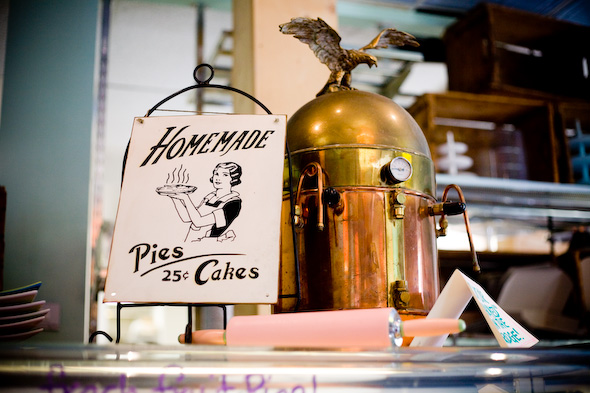
Wanda’s Pie in the Sky, for instance, is in the heart of Kensington Market and if you are a Torontonian reader or familiar with the area, you know that it is a quite unique and whimsical world of its own, if I may so myself. And so, the design that surrounds this café and pie shop is just that: whimsical.

Photos by Alyssa Bistonath

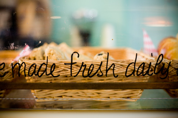
Typography is an art that plays an immense role in design and in our every-day lives. The way a letter connects to another will reflect the story it is attempting to tell. Yes, I do believe each letter – of any typeface ever created – tells a story, and the role of a designer is making sure the right story is being told for the right occasion. Through the type found in this little Kensington café, we are taken right back into our grand-mother’s kitchen with a youthful twist. The combination of the handwritten signs, the vintage posters, and the bright colors all work together to create an inspiring magical space.


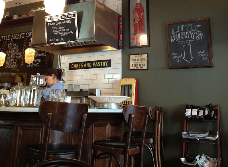
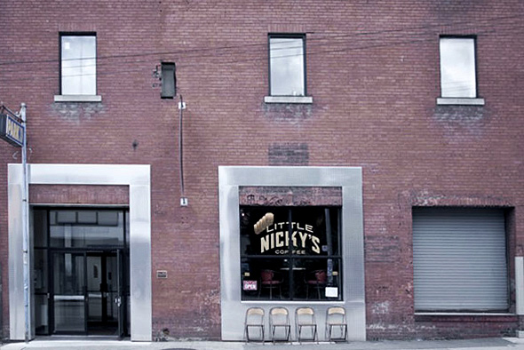
Little Nicky’s, a coffee shop telling a slightly different story, creates an environment through its design choices, as well. As soon as you enter, you know you are somewhere unique.

Photo by Cory VanderPloeg
Surrounded by bold and tall sans-serif type and wall decor from the 1950s, it certainly does not fail in creating an experience beyond the norm. I should also mention their packaging is one to swoon over, if you are like me and love anything stamped. Little Nicky’s is truly a must-see for any vintage design lovers.

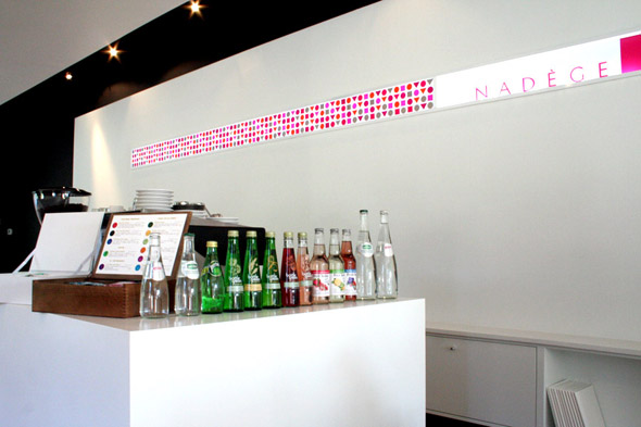
Last but certainly not least, Nadège Patisserie. You are welcomed in by the open white space, the very modern touches, and of course, by the pastries. The color focus is exactly where it should be: in the greens and reds of the macarons, the yellows and blues of the tarts, in the croissants and the pains-au-chocolat.

Photo by Dar Mustafa


Photo by Dennis Marciniak

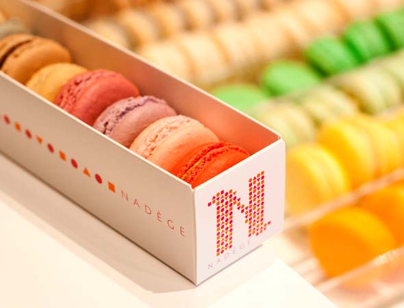
It’s evident that Nadège’s branding has been well thought out, and appeals in a way that can’t keep us away. A story of simplicity, sophistication, and refreshment in what it tells, and through the geometry (a fun reflection of the pastries and croissants if you might notice) and type choice of the logo, along with the website, everything is consistant and complete. A true successful design!


I hope these reflections have brought your attention to impact of design on our everyday lives. Perhaps along with me, you will find the story of each letter, shape and white space speaking to you even more clearly as you take note of these details.

– Melody 
By |September 6th, 2012|0 Comments

Home & Delicious

I’m a big fan of anyone creating beauty for the sake of inspiring the world. That is why I am truly head-over-heels for the Icelandic husband and wife team of photographer Gunnar Sverrisson and designer Halla Bára Gestsdóttir. Their newly launched online magazine, Home & Delicious {published out of Reykjavík, Iceland} is a veritable feast of design, food and photographic inspiration.

Here is just one of the stunning spaces featured in their recently released first issue. You can read all about the Icelandic artist who has made her family home in this stunning 17th century classic Italian structure in the full article.

That red-brick-paved, barrel-vaulted ceiling in the kitchen and living room has me swooning. The home feels like such a rich yet subtle canvas for the artist Maria to use as her backdrop to envision and create. It also feels like the kind of home that welcomes real life in its embrace and invites loved ones to linger in each other’s presence. Rather perfect if you ask me.
If you’d like to receive this beautiful magazine straight into your inbox, simply email info@homeanddelicious.com and include your preference of English over Icelandic. 
Happy Monday!
xo
s.

By |August 13th, 2012|0 Comments

Beautiful Process | The Andes House

I can only imagine that, like me, your heart was warmed by the authentic process showcased in the microdocumentary from Made in Mimbre featured in yesterday’s post.  You will be delighted to know that the resulting product does not end with wicker. In fact, this collaborative team – working under the name The Andes House – work in design, architecture and art.

I simply adore their philosophy. Material and Identity are fundamental elements for them as they understand and create for projects and products. The Material is the starting point for them, considering its potential and essential characteristics as they develop their products. And Identity is the voice they bring to the process and the final product, with a deep respect for the manner in which the objects are created. Origins and cultural context are celebrated and revered while married with modern design and technology. Truly beautiful.

Knowing their process of course makes me all the more adoring of the product. It doesn’t hurt that it’s also just plain gorgeous. Below are photos of their Las Doce collection, a line of household products made from single, solid pieces of wood. Mapuche artisans work on the exterior face of the product using traditional carving techniques. The interiors are then finished using an industrial CNC machine. Traditional and modern manufacturing techniques are married to create a product that truly capitalizes on the strengths of each.

I love this creative team’s view on the world and their design process, and I hope to take some of their creative vision into my own process as I consider raw materials and the potential they hold for my own designs.

xo
s.

By |August 10th, 2012|0 Comments