/home

How Reconnecting With Family Roots Can Lead To A Beautiful Product | A Gorgeous Giveaway from pamuk & co.

pamuk-2526-co-modern-bathroom

What do you get when you take a Canadian designer with a luxury background {think retail spaces for Gucci, Tiffany, Prada + Dior} and reconnect her with her Turkish roots? You get pamuk & co., a collection of Turkish linens that are as beautiful to use as they are beautifully made.

IMG_2205

If like me you love a meaningful {albeit bittersweet} story, lean in. Founder Jasmine’s father emigrated to Canada from Turkey when he was very young, and remarkably didn’t return to Turkey until 2009. On that fateful trip, while visiting his birthplace, he had a heart attack in his sleep. His life came full circle in a way that suddenly connected his daughter Jasmine with her Turkish roots for the very first time.

IMG_2203

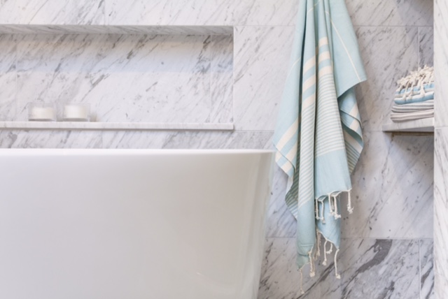
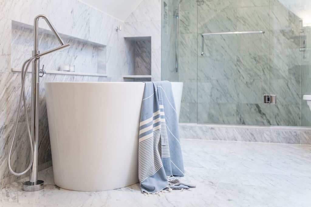
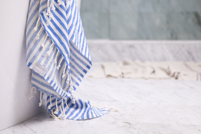
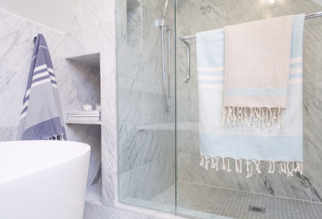
Jasmine immediately invested in meaningful relationships with her Turkish cousins – relatives she only met after her father’s passing. She quickly absorbed all she could about Turkish culture and language. Armed with Rosetta Stone and a year’s worth of classes, Jasmine became fluent in the language and – even more importantly – steeped in the culture. On one of her visits to Turkey, Jasmine became especially taken with the history and beauty of the peshtemal {what we know here in North America as turkish towels}. Seeking out the best sources for this beautiful product in Turkey, Jasmine met a family who has been weaving these luxurious linens for 5 generations, and thus pamuk & co. was born.

IMG_2202

People with meaningful stories usually have generous hearts, and Jasmine is no exception. One of you lucky lovers will win a set of 2 pamuk & co. towels for yourself! How you ask? Easy peasy.

G I V E A W A Y  D E T A I L S

1. Follow @thecuratedhouse and @pamuk_and_co on Instagram
2. Like the photo I’ve posted from the pamuk & co. collection
3. Tag two friends in the comments

For a second entry, just share the photo on your Instagram account including all the details on the giveaway. {Don’t forget to tag Jasmine and me in your post so we know about it!}

The winner will be announced on August 11th on Instagram. Best of luck to all you beautiful people!

xx
s.

By |August 4th, 2015|0 Comments

How To Design A Kid’s Room With Personality | Mastering The Art of The Mix

I can’t tell you how stoked I was to see Noah’s room featured on MyDomaine last week! As a deft curator of cool, MyDomaine is one of my benchmarks for rockstar design status, so the feature was definitely a design career highlight. It also never hurts to be described as an interior designer with “an incredible sense of style and an amazing ability to balance the old, new, bold, restrained, and playful” while being given the title of “coolest mom around.” Hey, I’ll take it!

PHOTO by ASHLEY CAPP

This bedroom was definitely all about the art of the mix. Noah’s a pretty sophisticated kid, so I knew it needed to reflect his passion for design and his love of details while having a vibrant, modern vibe and a hefty dose of vintage mixed in for good measure.

If you’re looking to create an eclectic space of your own – whether for a kid or a grown-up – here are some tips you can take to the bank.

No.1: TAKE YOUR CUES FROM THE BRIDE

PHOTO by ASHLEY CAPP

You know the old wedding superstition that a bride should always wear something old and new, something borrowed and blue? Well it totally applies to good design…at least, the first half does!

NEW: We totally fell in love the moment we laid eyes on the bold and vibrant duvet cover and shams from Aura Home {now available at The Bay for all my fellow Canadian design lovahs}. We knew they were the perfect choice to function as our modern centrepiece {OK, and our something blue *wink*}

OLD: Old can also mean traditional, or an older style, and I knew we needed to juxtapose those modern bed linens with some traditional touches. Enter a traditionally tufted headboard {covered in luscious black velvet from Kravet and beautifully upholstered by Barrymore}, and a gorgeous traditional rug from Kaarma. Hello lovelies!

VINTAGE: There’s old and then there’s antique, and nothing can take the place of the personality and style that real antiques add to a space. Would you believe I found these vintage French Art Deco side tables on eBay? Seriously the score of the century!

QUIRK-FEST: The whimsical deer head from Cardboard Safari {his name is Bucky} is the perfectly quirky mascot for the space, and he plays so nicely against the traditionally panelled feature wall.

Add some modern table lamps from West Elm and a naturally shed antler we picked up antiquing for an added dollop of quirk, and we can officially dub ourselves design mixologists!

The mix-master recipe? MODERN + TRADITIONAL + VINTAGE + QUIRK = PERFECTION.

No. 2: YOU’VE GOT SOUL BUT YOU’RE NOT A SOLDIER

PHOTOS by ASHLEY CAPP

If you’ve been following me for very long, you’ll know I’m a passionate believer in original art. As I always say, it’s the soul of the space. When it comes to kids’ rooms, though, that can be a scary investment for some as you know your kids’ interests and tastes will change. If that’s you, I have three suggestions for you:

ONE, start with smalls, like the two canvases you see on Noah’s dresser above. The outdoor hockey scene is by one of my favourite figurative artists, Elizabeth Lennie, and the piece on the left by Kelly Grace depicts an evening at the fair, complete with ferris wheel and food vendors. Not only are they fun and story-filled pieces full of life, but they are totally timeless and I’ll be happy to reabsorb them into my own collection should Noah ever tire of them.

TWO, art doesn’t just belong on walls. I love styling bookshelves and the tops of dressers with art to bring soul to every corner of a space. I also love the silver easel from Indigo as the perfect way to vary the heights of a grouping without hanging a single thing.

THREE, create a gallery wall with pieces that aren’t too precious so that it can evolve over time. Noah’s gallery wall is made up of vintage postcards of New York City bridges that I picked up at the Williamsburg Flea a few years ago, a mysterious moustached man from Mitchell Black, an inspiring quote/art print from Lisa Congdon, a stunning photograph of icebergs from Canadian photographer Irene Suchocki, and a reproduction vintage blueprint of a bridge I picked up from Touch of Modern. The grouping tells a story of Noah’s current interest in architecture and travel and our hope that he’ll always stay curious. The quote on the Lisa Congdon piece is by Thoreau and reads:

It’s not what you look at that matters, it’s what you see.


No. 3: NEVER UNDERESTIMATE THE MAGIC OF A GOOD WARDROBE
PHOTOS by ASHLEY CAPP
When it came time to plan out the storage for Noah’s space, we had some pretty big hurdles to overcome. There was just one very small closet shoved into the right-hand corner of the closet wall. It was totally awkward to the room layout and even worse, it just didn’t leave us enough space for all of Noah’s cool threads. Even moreso, the remaining wall space – which would typically be the right place for a dresser – came so far into the room that there wouldn’t have been any clearance to open his drawers.
Gratefully, there was another under-utilized closet on the other side of that wall facing into the hallway that connects Noah’s bedroom to his bathroom. Remember this hallway with the gorgeous chevron floors and dove grey panelled walls?
PHOTOS by ASHLEY CAPP
Well, we grabbed the closet from the hallway and flipped it into Noah’s room and – with one move of stealthy designer ju-jitsu floor planning – we tripled his storage space with two closets the size of his original and room for his dresser to sit in between. Yes, it required filling in the hardwood underneath his dresser {which was no small DIY feat} but it was totally worth it.
In actually fact, we more than tripled his storage space. The closets themselves are IKEA cabinets with all of the awesome organizational “guts” that they offer – think customized pants hangers and the like – and we broke both closets up into half-hanging which means double the storage per closet. So I guess we quintupled his storage? Awesome.
You’d never guess they were IKEA cabinets from the outside, and that’s because we customized them in three ways:
ONE, end gables. The end gables had to be super slim in this case to leave enough room for the dresser, so we just used some super-thin masonite and painted it out the room colour for a very simple fix to the non-paintable sides of the melamine cabinet’s exterior.
TWO, custom doors. MDF slabs + panel moulding + paint + an awesome hubby = modern classic custom doors to drool over! #winning
THREE, interesting door hardware. Finish off the gorgeous DIY doors with texturally interesting faux bone door pulls from Anthropologie and the finished product screams Paris apartment. Totally my vibe. The hardware on the dresser is also from Anthro. Paint It Like New! sprayed out his existing, yawn-worthy espresso stained dresser in Para Paints’ Jet Black, and the contrasting cream and brass pulls totally elevate the sophistication level from “so yesterday” to “on point” in a wink. 
So, are you ready to master the art of the mix? Which room are you tackling next? I’ve got my sights set on another space in our home and am just itching to get started. Soon I hope!
xx
s.
By |July 28th, 2015|0 Comments

HOW TO CUSTOMIZE AN IKEA KITCHEN | DESIGN LESSONS FROM THE TEAM AT CANADIAN HOUSE & HOME MAGAZINE

Photo via Global News

As a designer, I head to the Interior Design Show Trade Day every year for three main reasons:

ONE to see what new products and innovations are being introduced, TWO to get inspired, and THREE to connect with really great people in my industry.

This year, to my pleasant surprise, I found all three needs met in one place at House & Home‘s IKEA kitchen display. Setting the creative team at Canadian House & Home Magazine to the design challenge of customizing an IKEA kitchen – alongside the team at Style At Home who also designed a beautiful space – was a brilliant way for IKEA to introduce their new Sektion line of kitchen cabinetry to the Canadian market.

INNOVATION IS ON THE INSIDE

The new line is a huge move for IKEA in transitioning away from their popular Akurum line of kitchen cabinetry. From the little that I was able to see past the throngs of people in the booth, it’s the “guts” of the Sektion line that make it most exciting, with lots of highly customizable options and extremely functional inserts. {I caught a glimpse of a drawer with a tiered sliding spice rack in it that was truly fab!} The new door profiles and colour options are very current and on-trend with what’s happening in kitchen design right now.

Unfortunately for those who already have an Akurum kitchen, it appears as though the dimensions of the two lines are different, so you won’t be able to retrofit your Akurum with these enviable Sektion upgrades without a total kitchen redo. That said, they are still honouring their amazing 25 year warranty on the Akurum, so all is not lost.

The House & Home kitchen really felt like an English fitted kitchen to me, with an abundance of design details to surprise and delight. In addition to the herringbone wood floors you can see in the photo above {they had me at herringbone!}, they showcased a few of my favourite timeless design trends in this beautiful space. Take a peek at some of the design lessons we can learn from Suzanne Dimma and Sarah Harthill – the senior designers leading the team on this kitchen design on behalf of Canadian House & Home Magazine.

LESSON ONE: CREATE ARCHITECTURAL INTEREST

Image via Margot Austin on Pinterest

Let’s be honest, turning a basic convention-style booth into a quietly luxurious custom fitted kitchen is not for the faint of heart. Like a real home renovation or a new build, the task requires heaps of design vision and the courage to be unique. The first thing I loved is the way Suzanne and Sarah made the kitchen feel totally custom with the use of paneling.

Paneling, as I’m sure you know, is one of my timeless favourites. In fact, there are very few design projects I’ve done over the years that have not wound up with paneling in at least one room of the house. Why? It adds instant character and the kind of architectural interest that grounds the space and gives it a sense of history. Good bones, as we say. Always start with good bones.

The way Suzanne and Sarah integrated the simple, modern, box-style range hood into the paneling and wrapped the paneling around the room is brilliant. It truly connects both sides of the kitchen with the pantry that flanks the end wall, and it complements the raised paneling on the IKEA cabinetry Suzanne and Sarah chose without feeling too “matchy matchy.”

LESSON TWO: PLAY WITH PATTERN + COLOUR

If I could have secretly stuffed this stunning Martyn Lawrence Bullard for Ann Sacks tile into my handbag to use in my yet-to-be-reno’d laundry room without creating a scene, I would have done it in a heartbeat. Delicious. I love how this tile creates a sense of history while being extremely current. Think Paris bistro floors or an English hand-painted backsplash.

I also love the dove grey cabinets Suzanne and Sarah chose {this door style is called Bodbyn and will be available February 2nd} and how they contrasted the softness of the grey with the deep peacock colour on the paneling and range hood. The art of the mix is as much about creative contrast as it is about a mix of materials.

LESSON THREE: CREATE MOMENTS of DISCOVERY

Needless to say, my photo does not do this stunning little pantry justice. Mark my words, though. When the professional photos are released, people are going to be pinning the you-know-what out of this little space on Pinterest. Beyond the charming sense of organization {which makes me want to hire Suzanne and Sarah just to bring that kind of zen into my own real-life-with-kids…even if only in my pantry! It would become my little in-home European retreat…}, it’s the Peacock Garden wallpaper by Zoffany and the iron-framed French doors with egg-shaped brass knobs that make this pantry sing. I mean, who expects to see such a fantasy-world-come-to-life in the pantry? It’s delightfully unexpected. This kind of “discovery moment” as I like to call it makes you bite your lip and inhale quickly when you come upon it. Just the sort of thing to make a kitchen feel entirely bespoke and utterly special.

{And I was actually kind of serious about the pantry retreat thing. I can totally see myself hiding away and sipping tea in here whilst imagining myself on a European vacation. This is either a seriously sad statement about my need for a vacation or an incredible credit to my vivid imagination.}

You’ll have to wait for this kitchen to be featured in the magazine to see all of the delicious details that were so thoughtfully designed in this space. Watch for it in an upcoming issue of House & Home, where no doubt the source guide and the gorgeous photos will be worth the wait.

xo
s.

By |January 28th, 2015|7 Comments