/house

Design Find | Phil Cuttance | Faceture

You know me. I am a sucker for brilliant design, especially when it is handmade and bespoke. My motto? Beautiful process, beautiful product. And that is why I’m quietly {or not-so-quietly} losing my mind over Phil Cuttance‘s Faceture collection of modern vases. 

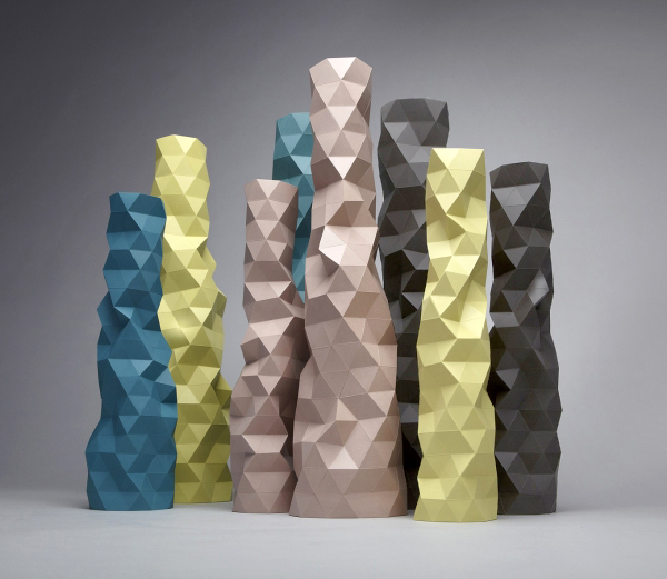
With an almost pixelated, digital aesthetic, these triangle-composed structures are equally as mesmerizing as they are individually unique. How is that possible? The beauty of process.

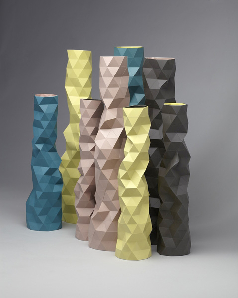
First, the mould is hand-made. Cuttance scores and cuts a sheet of 0.5mm plastic, folding and taping it into the overall shape of the piece that is to be cast. The mould’s final shape and strength are dictated by which triangular facets are popped in and out. This highly intuitive stage in the process happens every time the mould is prepared for the next object, resulting in a collection in which no two pieces are alike. A water-based casting resin is then mixed and cast in the mould where it sets solid.

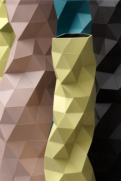
The resin is poured into the hollow mould and rolled around to coat and encase the sides, controlled on a casting jig on a machine. The material soon sets, creating a hollow, solid object. Then another, different coloured resin is poured into the same mould and swirled around inside over the first. {I love the surprise of discovery with the contrasting colours peeping out from inside the vase.} When this second layer of resin has set, the mould is removed to reveal the solid set cast piece. The casting appears with sharply accurate lines, a visual surprise considering the lo-fi, hand-made process from which it came. The mould is then cleaned and ready for re-use.

 Each Faceture vase is handmade, unique, and numbered on the base, making them very collectible.

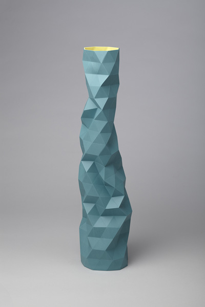
To me, the finished product looks like something architect Frank Gehry might create – the simple elegance of inspiration found in a crumpled piece of paper transformed into triangular pixels of arresting form and structure.

I am officially longing for a pair of these stunningly unique vases to flank my Mekal sink in my kitchen. Wouldn’t they offer a poignant and perfectly modern edge to my kitchen refresh project? Methinks so. I’m officially in  l – o – v – e  love. In fact, I’m pretty sure I’ll be dreaming in triangles as I drift off tonight.

I hope you’ve been as inspired by Phil’s brilliant process and stunning product as I have. Still swooning.

xo
s.

By |April 4th, 2013|0 Comments

Trendy Tuesday | Getting Creative With Coral

I feel like this season is made just for girls like me. Not only do I love the signs of life, but I love the fresh and vibrant shades of Spring! This season, runways have been spilling over with one of my favourite Spring hues: Coral. So, I thought I’d pull together a few of my favourite recent sightings of this warm and blushy hue.

ONE: Painting by Michelle Armas TWO: Blondel Coral Club Chair, 1st Dibs THREE: Vintage Coral Lamp Suzani Pillow, Madeleine Weinrib FOUR: Coral, blue and green Aquasilk Rug, ABC Carpet + Home FIVE: David Webb Carved Coral Brooch, 1st Dibs SIX: Coral Sea Fan, Karen Robertson

How will you be getting creative with Coral this season?

xo
s.

By |March 26th, 2013|0 Comments

The Curated Collection | Paulette Tavormina

Art is meant to elicit a response. To move you. To draw your attention to pain or beauty; to provoke thought or emotion. To filter the world into a more meaningful experience. To heighten and distill what is beautiful and unique in the world, and perhaps even make you gasp just a little bit.

“Figs and Morning Glories”

And food? Well food is sustenance. But much more than that, it is comfort. It is a means of expressing love. It is a way of showing honour and celebrating. It is the foraging and forming of nature into beauty and meaning for our bodies and our palettes. It is a way of making everyday life an art form in and of itself.

“Crabs”

Married together, these two forms of sustenance – food for both body and soul – meet in the stunning work of New York photographer Paulette Tavormina.

“Yellow Cherries and Crab Apples”

Weaving together a contemporary medium with an old world aesthetic, Tavormina’s dramatic photographs harken back to the sumptuous lighting and decadent details of 17th century Old Master still life paintings. The vibrant saturation and contrast in the images brings the masterfully styled food and flora to life, elevating the everyday to the status of extraordinary.

“Watermelon Radishes”
“Pears”

“I have long been fascinated by the magic of everyday objects, the majesty and delicacy of nature, and the world of culinary delight,” said Tavormina. “I have blended decades of photography and food styling with a love of 17th century Old Master paintings to create these still-life photographs. My greatest influences have been Francisco de Zurbaran, Adriaen Coorte and Giovanna Garzoni, in particular Zurbaran’s mysterious use of dramatic light, Coorte’s unique placement of treasured objects and Garzoni’s masterful composition and color palette. The works of these artists remind us of the irretrievable passing of time – tempus fugit.”

“Sour Cherries”
“Cranberry Beans”

Tavormina’s work can be found in museums, corporate and private collections and have been exhibited all of the world including shows in New York, Paris, London and Moscow. This current collection is showing at MARCH in San Francisco until June 1st and can be purchased by contacting owner and curator Sam Hamilton.

Wishing you a Monday filled with light and contrast and the time to drink in the sumptuous, decadent details in the everyday.

xo
s.


By |March 25th, 2013|2 Comments