/house

The Curated Collection | David Graham White

In a world where our need to control and predict outcomes drives our obsessions as much as our fears, David Graham White‘s photography speaks straight to the heart of culture with a haunting beauty that is deeply profound.

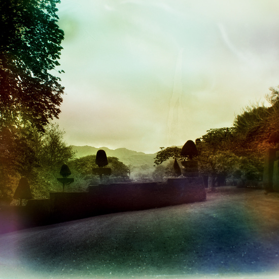
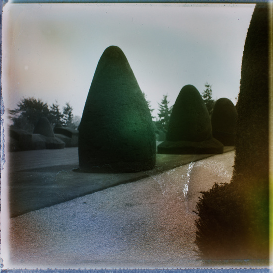
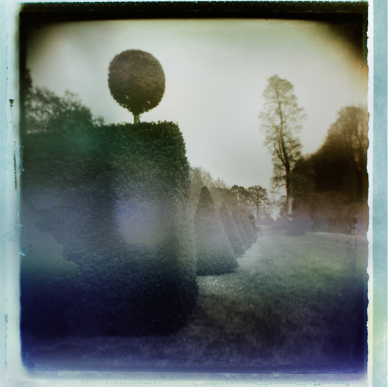
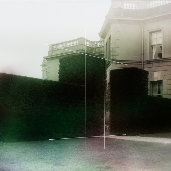
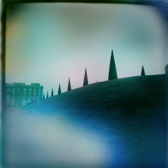
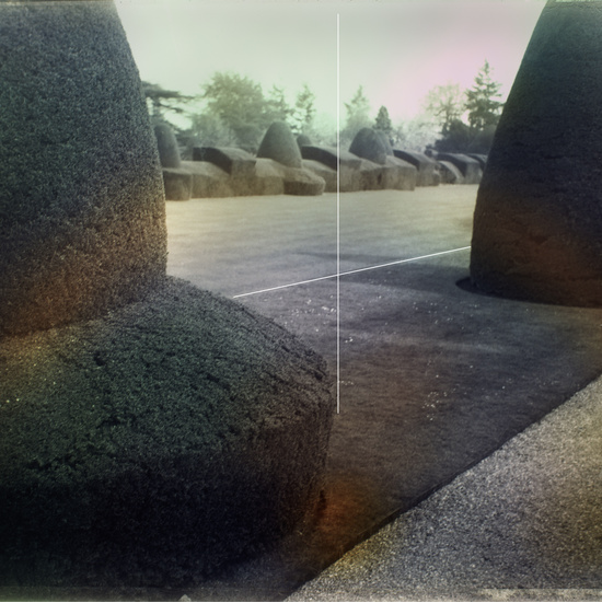
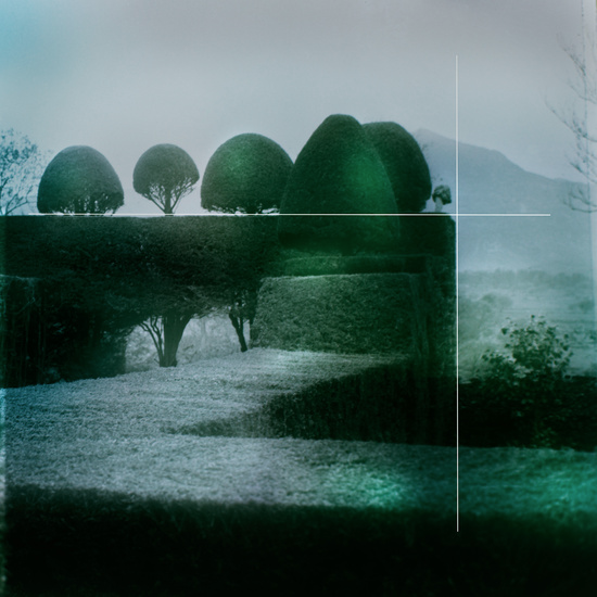
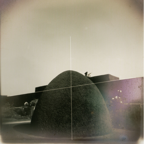
In this series, entitled “In The Garden I Felt Safe,” Canadian photographer David Graham White explores the exacting precision of topiaries in the Welsh landscape. Historically viewed as symbols of power, wealth and control, topiaries also allude to a magical, other-worldly fantasy where nature is harnessed with “corsets and stays” and where mazes lead into the depths of our imaginations. The tension between beauty and fear – held together in this horticultural form – is somehow mesmerizing.

Even more mesmerizing is David’s process. The images are photographed as Polaroid negatives and then processed using the light from the flickering images on a television to replace the enlarger. The unpredictability of where the light flares will show up on the TV screen imbues the images with compelling movement and saturation of colour. Ethereal and uncontrolled forms are mysteriously woven into the precisely controlled landscapes of David’s images as the analogue Polaroids are transformed by coming in contact with the post-modern digital era television.

David says, “Television reflects culture from the inside out as it reports on the spectacular world around us. [It] serves as the mouthpiece of material culture generating need for its products to fill as it celebrates the elite and famous. Fear becomes a commodity that is bought and sold on the backs of its viewers. In the end we are left looking for a way through the maze back to a safe place where we can rest.”

Limited edition prints of David’s stunning photographs are available through Art Interiors. As you reflect on his images, his process and the statement David is making with this series, perhaps you will consider what it is that makes you feel safe, what it is that you are trying to predict and control, and what it is that has you in “corsets and stays” right now.

I’ve been thinking about these things a great deal lately, thanks to inspiration like David’s work and this TEDtalk from Brené Brown. I’m coming to believe that it is indeed what makes me vulnerable that also makes me beautiful.

Happy Monday!
xo
s.

By |January 28th, 2013|0 Comments

Project: Kitchen Refresh | Lighting Option #2

Thanks so much for your feedback last week on Lighting Option #1 for my little kitchen refresh project! I’ve decided I want to nail down the lighting first before I move on to any of the other details. I really think the lighting will have a lot to say about the final direction of all of the rest of these little updates and help set the direction for the details.

OK, so I’m guessing you’ve all picked up on the  memo that brass continues to be HOTTER THAN HOT in design this year. There’s something sexy and glamorous about the use of it, even in the humblest of spaces. Just take this charming butler’s pantry below:

{image via Pinterest}
I’m totally in  L O V E  with the sophistication of the brass fittings and light fixture added to the mix of finishes in this clean and elegant kitchen below:
{image via Pinterest}

Fierce + fabulous, isn’t it? I could move into that kitchen tomorrow.

So my heart stopped momentarily when I came across this simple and modern pendant at Lamps Plus. I’m so in love with its warm and vintage antiqued brass patina that I want to bite it like its made of maple candy.

Seriously sexy, right? This fixture is totally a modern classic. Love at first sight. I would choose to pair it with accessories like this whimsical hand from Black Rooster Decor:

And this pair of Swedish 1930’s Bjork vases from 1st Dibs for a regular rotation of fresh flowers:

My dilemmas are two-fold.

ONE: I don’t want to change my cabinetry hardware. I like it a lot, and while I do believe it is possible to mix white and yellow metals successfully, I have a definite white-metal-dominance in my kitchen right now {for example, check out my Emeco counter stools below}.

TWO: I only have 8 foot ceilings. One of the things I  l-o-v-e  about this particular pendant is its long and lanky elegance. Unlike many pendants where the downrods make up most of the length, the shaft of this fixture is itself quite long. I don’t want to have a stubby little bit of downrod emphasizing my less-than-extravagantly-high ceilings. I worry that my ceilings and these pendants would each fail to do each other justice.

The thing is, I’m utterly smitten with this fixture! What do you think? Too many changes required? Too long for my rather pedestrian-height ceilings? Too much contrast with my cabinetry hardware, counter stools and statement of a stainless steel apron-front sink?

Can’t wait for your feedback!

xo
s.

By |January 24th, 2013|0 Comments

Design Find | Armadillo Co Rugs | Australia

Today I thought I’d share a little eye candy with you in the form of some beautiful, flat-woven rugs hailing all the way from the warm shores of Australia. On first glance, you’ll see why the classic and modern patterns and highly saturated colours of Armadillo & Co‘s rugs caught my attention. But when you read their story, that’s when you’ll really fall in love.

I’m torn between the “Casablanca” burnt-red-on-cream {second from top}, the “Crosscut” red and orange and natural grey directly above and the goldenrod, grey and cream “Persia” below as my favourites. 

Gorgeous, right? These pieces are all from their Designer Collection. Modern and graphic yet classic and timeless, these rugs could make just about any house feel like home.

But I promised you a good story today, didn’t I? Yes, yes. Theirs is a delightful one. Because this story {similar to that of Heavenly Organics} is a story of a business that cares for people. You see, their products are completely fair trade, and Armadillo & Co treats their artisans like extended family – with the kind of care, respect and love they would a father, mother, brother or sister. They select their artisans for both their hands and their heart, seeking out those who are both skilled and sensitive to their design aesthetic while carrying on an intricate tradition of weaving that has been passed down through many generations. Their wages are above average and integral to the health and well-being of their local community, and the lineage of handicraft they preserve in the work they do now.

They are working in meaningful ways to redeem an industry that has historically abused the people to create the product. As supporters and advocates for “Care & Fair,” they are working to ensure that child labour in the carpet production industry becomes a thing of the past by helping to finance local education and purchasing play equipment for the local school in the region of India where their rugs are woven.

{When purchasing any rug or carpet made in India, look for the ‘KALEEN’ label. Issued by the Carpet Export Promotion Council 
of India, it guarantees that child labour was not used in manufacture.}

So happy to find a company that meets my “beautiful process, beautiful product” standards! So happy to be sharing them with you today.

Stay cozy and be kind to one another!

xo
s.

By |January 23rd, 2013|1 Comment