For the Detailistas: My Dining Room
So as it turns out, I am not alone. I believe that details are a love language, and it appears that you do too, as many of you have already been asking about details from a couple of my first posts! Remember the post about my garden peonies? Well many of you Detailistas out there noticed the art and furniture in my dining room and wanted to know more…so it is of course my pleasure to oblige! Here is the photo that started the questions:

And here, my lovely friends, are the answers! First, the ART! (that’s always my favourite place to start)
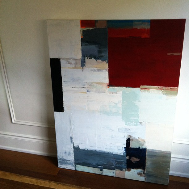
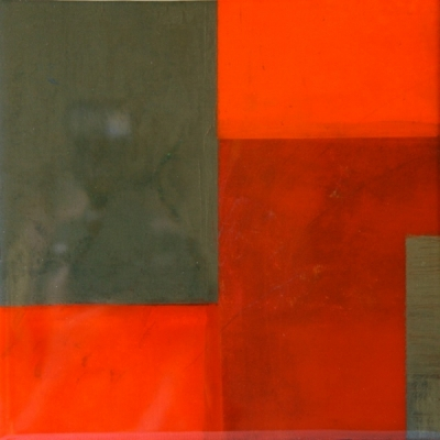
This piece by Kathleen Weich came to us from Art Interiors a few years ago now. I love the palette, the texture and the movement in it. Here are a few close up shots so you can see more of the delightful details:
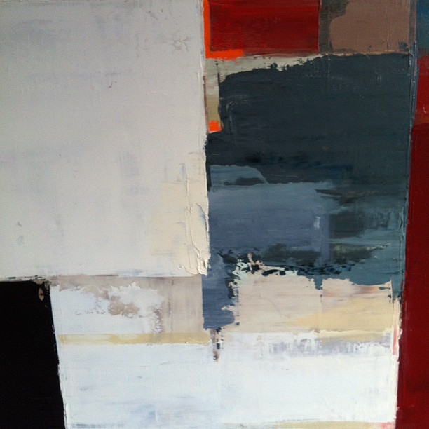
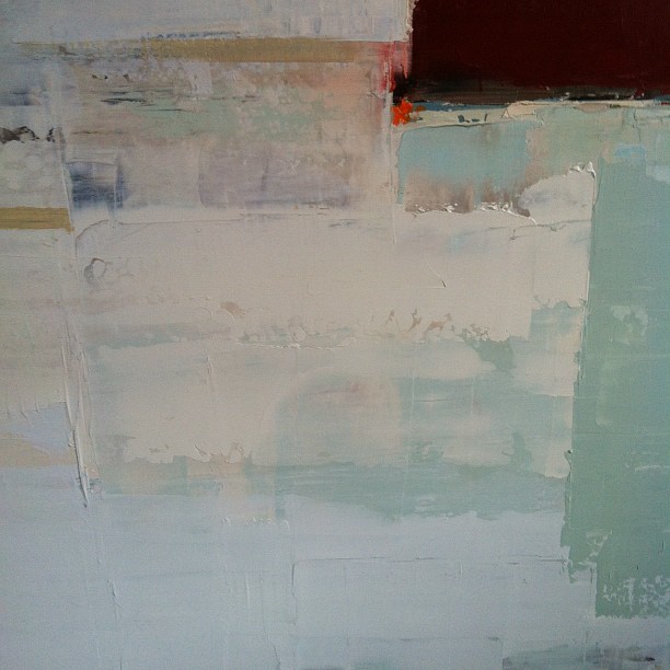
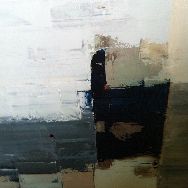
We engage with this piece every day, and it speaks quite elegantly to the other art we have in the space. I think it makes the dining room quite special with its modern and sophisticated statement.
Next, the chairs! These Louis Ghost chairs – designed by Parisian designer Philippe Starck in 2002 – are an iconic design classic from Italy’s Kartell. They are a truly modern twist on design history: a reinvention of the classic Louis XVI armchair now done in this transparent lucite, a material invented in 1931 by Dupont. These chairs have been called a postmodern triumph of technical innovation and historical style. If you’ve been to visit Versailles, they should feel familiar to you (minus the ornate, small-scale print fabrics and gilded woodwork, of course).
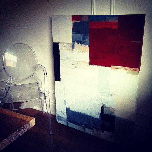
For me, they are a perfect juxtaposition against my classic panel moulding and my clean-lined, contemporary, live-edged white oak dining table. The panel moulding carries across the shared dining room and living room wall, breaking it up and giving it the dimension it needs to frame and define each space. At a cost of $70, it was a great investment! Now here’s the table:

This live-edge, solid European raw white oak table actually came from Crate + Barrel! It fits the space perfectly and we love the raw wood…or at least we do now. When the table first arrived, the almost dusty looking raw wood finish made me giddy. I loved the quiet, driftwood-coloured palette and the organic simplicity. Then we ate at the table. No matter what meal we ate, we left indelible “evidence” behind in the form of grease marks and stains. No amount of scrubbing would remove them. I was losing my mind! Rings and drip marks on this perfect slab of nature would not do!
First, I had my furniture maker sand it and put on a coat of water-based finish. We got about a week out of that before this very thirsty table once again began to absorb every stain.
My next move was a stroke of genius if I may say so myself. I decided to go with the “if you can’t beat ’em, join ’em” rule of life, pulled out a beautiful Tuscan olive oil and poured it all over my table. I let it sit for a couple of hours, wiped up the excess with some paper towel, et voilà! My beautiful table was circle-and-drip-free and restored to it’s simple perfection. Now we oil it every few months. The oil soaks into the thirsty wood but prevents other grease and finger marks from making me crazy. Sanity restored!

Last but not least, this simple, rectangular drum-shade light fixture came from Restoration Hardware. I’ve used it on a few design projects for clients and find it to be very harmonious. It casts a beautifully distributed, even glow on the table due to the frosted acrylic base and the large rectangular linen shade. Its clean lines and simplicity don’t fight the art, the paneling or the furnishings while still complimenting the proportions of the room and anchoring the table quite nicely.
So there you have it! The details for all you Detailistas out there. Hope this provides some inspiration for your next design project.
xo
s.
P.S. Feel free to post your questions and comments in the comments section below each post. I’d love to get our dialogue off of FB and onto the blog so we can share it with everyone!