/Melody Hansen

Thanksgiving Table Décor | Part 3 | Menus + Linens


PHOTO BY GABRIELA HANSEN

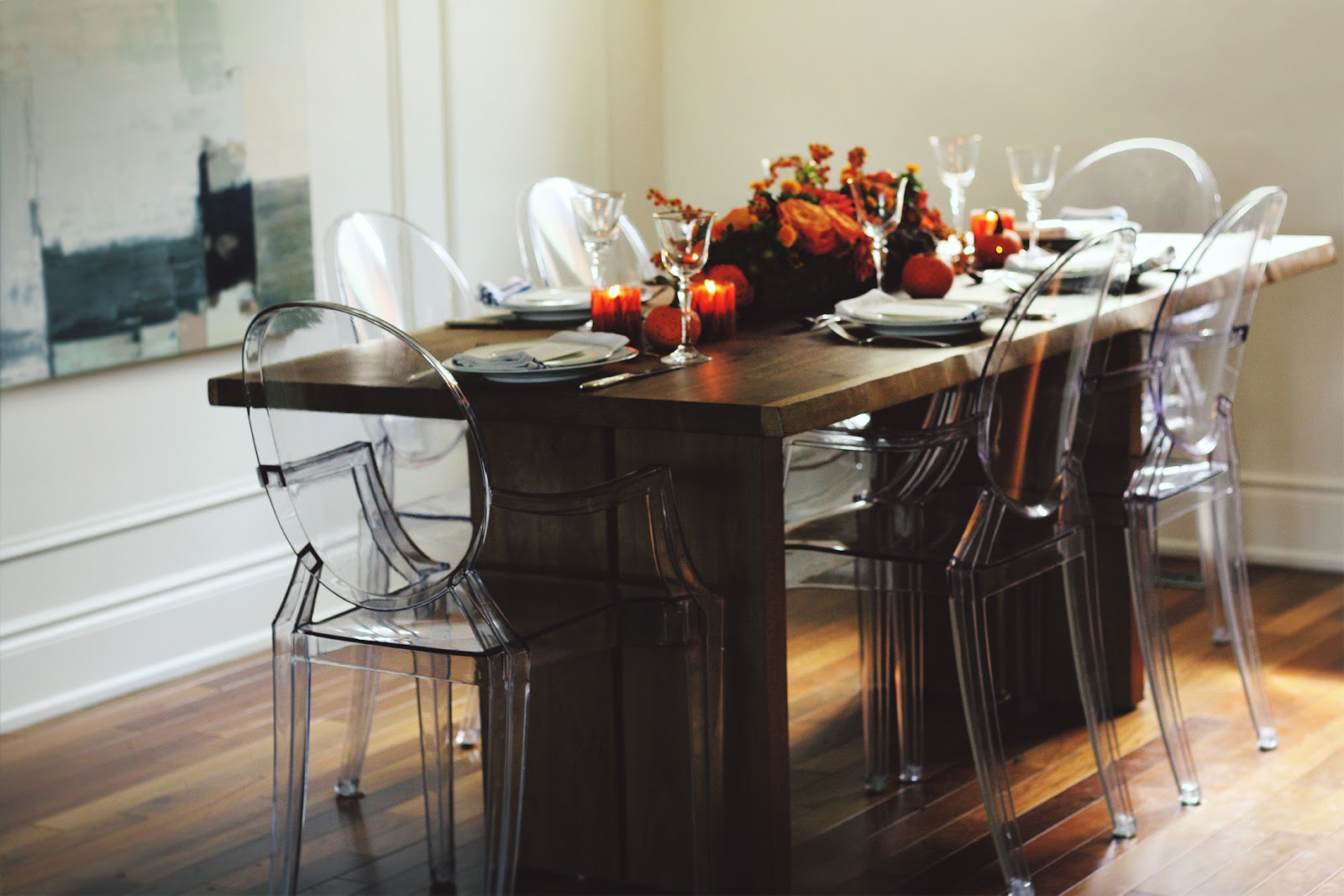
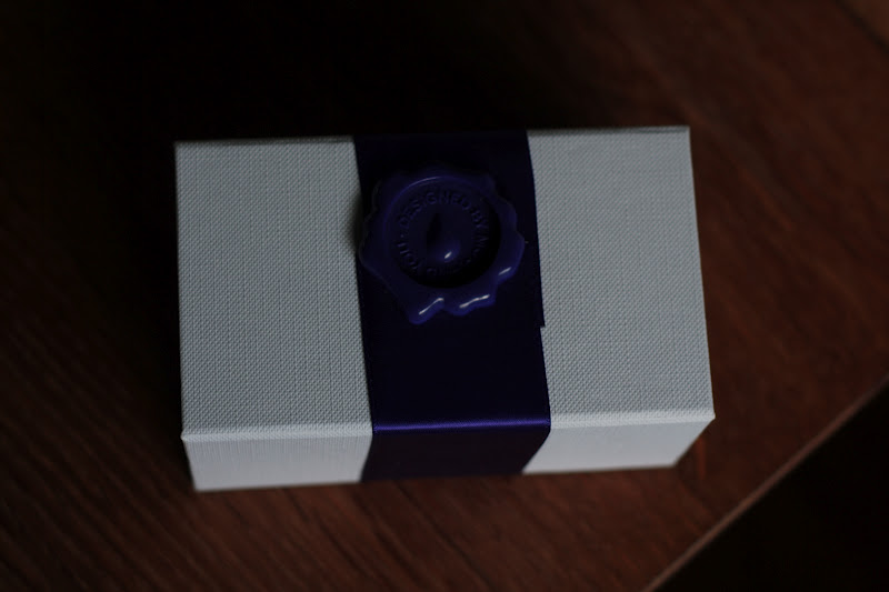
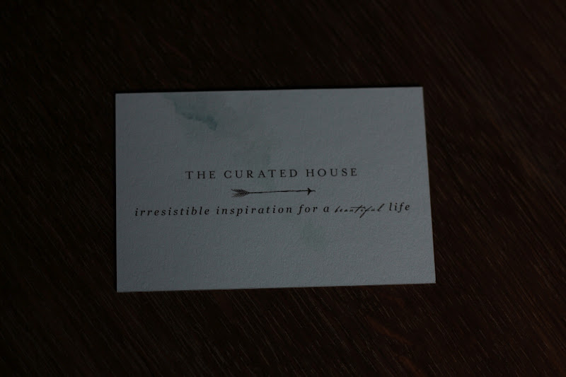
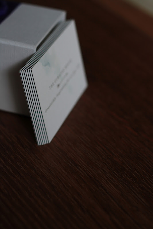
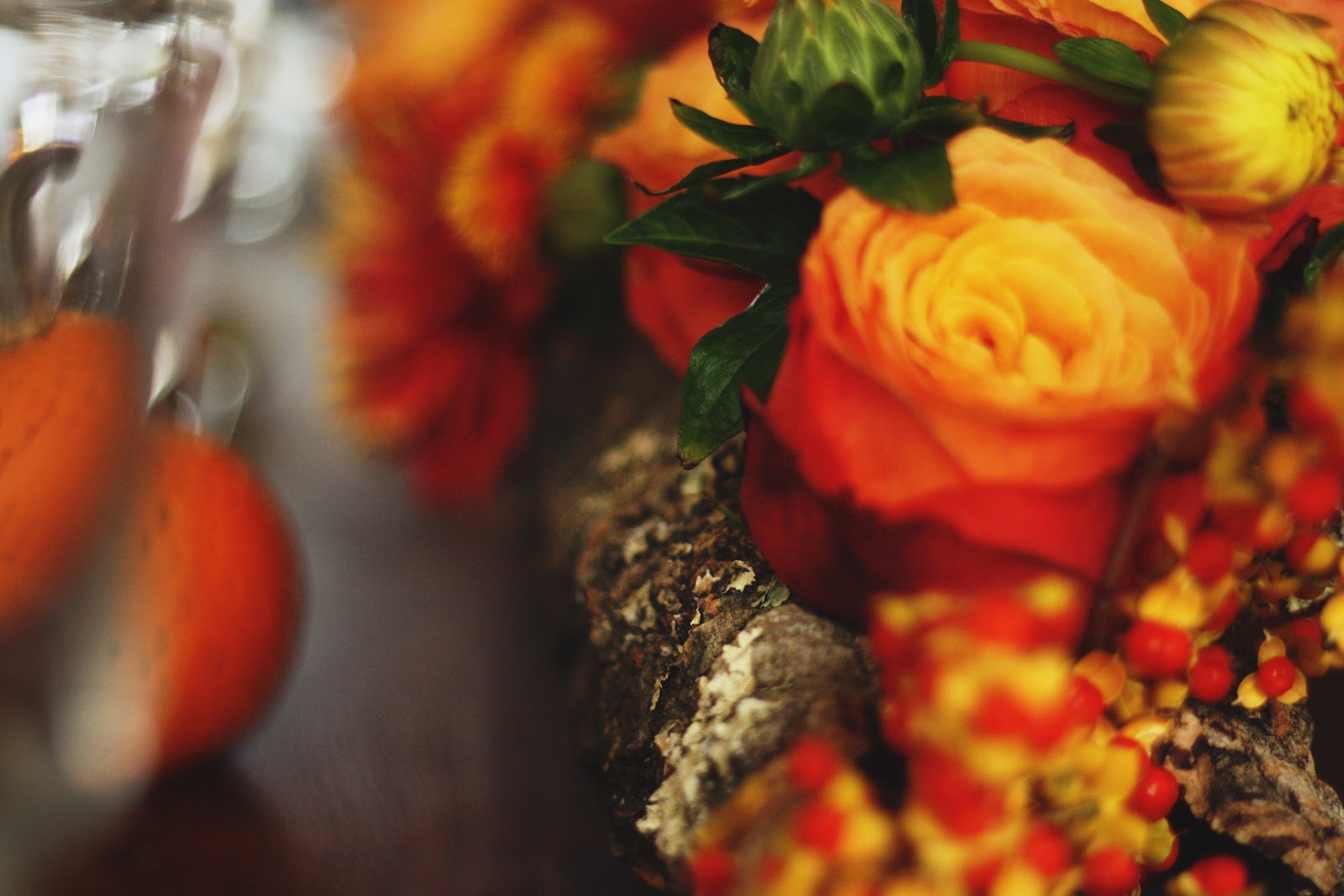
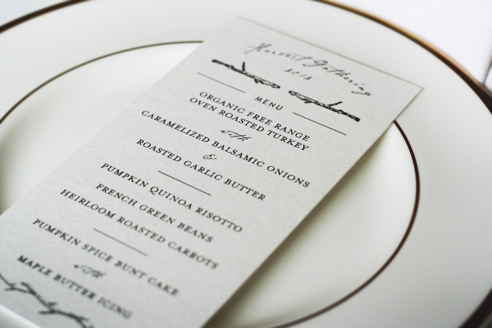
I love it when all of the lovely details start to come together. With the floral centrepiece and Moroccan-inspired “punched tin” mini pumpkins complete, it was time to finish the place settings. I love a simple yet layered place setting, and I am a big fan of the use of beautiful typography to set the mood for the special meal. Enter my lovely friend Melody Hansen, who graciously offered to design menus for this year’s Harvest Gathering in order to give it an extra special touch of thoughtful detail and design.

PHOTO BY GABRIELA HANSEN

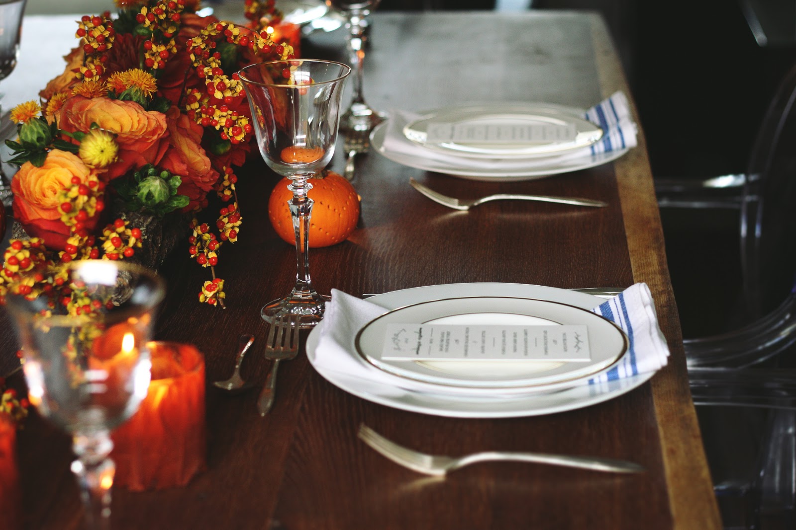
I love collaborating with people who understand my aesthetic. The natural and organic simplicity of Melody’s hand drawn illustrations framing the top and bottom of these elegant menus were the perfect choice to communicate the casual elegance of our seasonal celebration. The watercolour paper on which we chose to print the menus had the same quality as a natural linen fabric – simple yet substantial and sophisticated.

PHOTO BY GABRIELA HANSEN

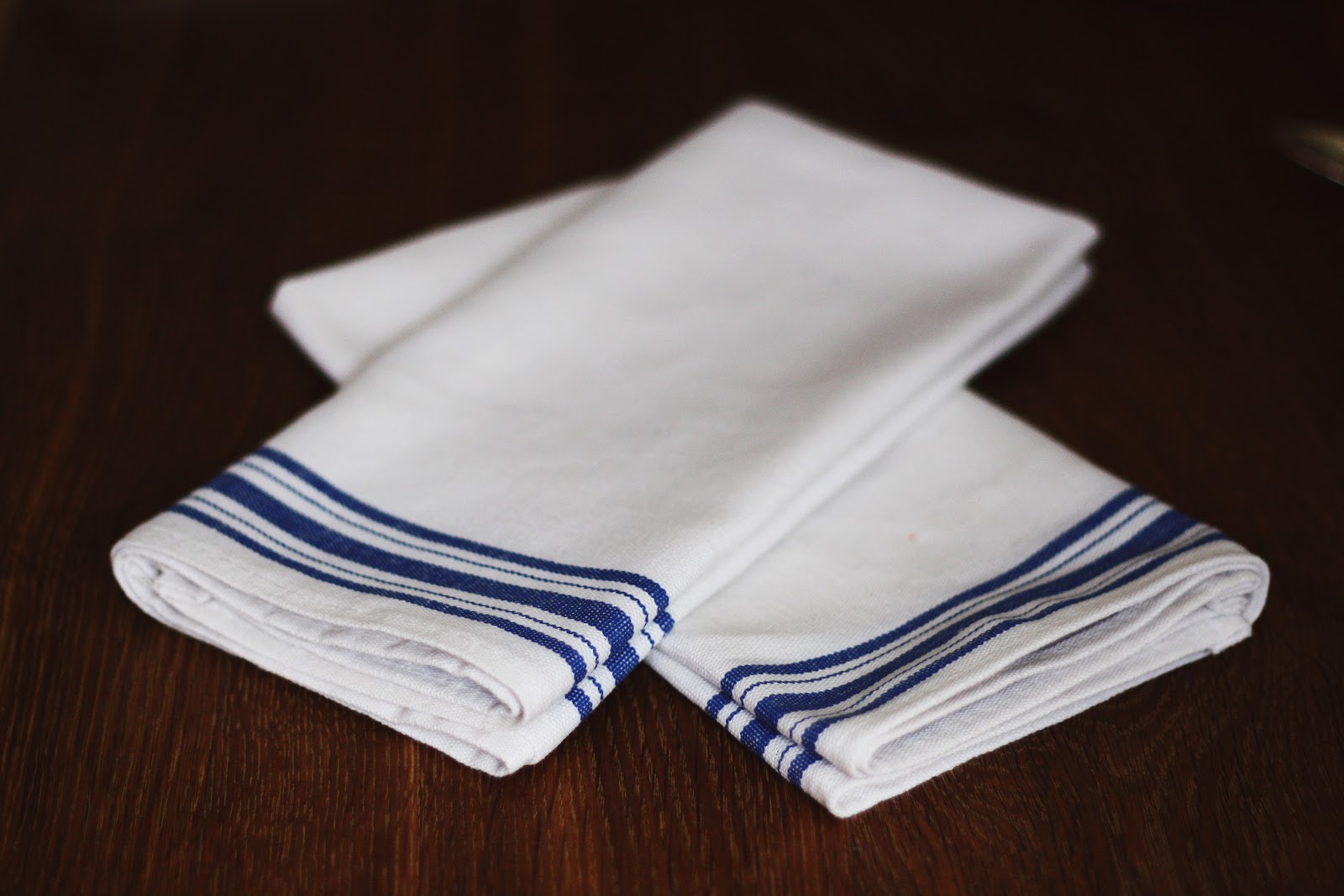
I’m a big believer in linen napkins – firstly because they are better for the environment, and secondly because they make the meal feel more elegant. That said, I didn’t want the table linens to feel formal. With 14 people sitting around the extended table that we added, I also needed to come up with an option that was cost effective. The solution? $5/yard fabric from Designer Fabric Outlet, a bit of time in front of my sewing machine, and voila! French bistro style cotton-linen blend table napkins that were the perfect bridge between formal and casual, just like the menus.

PHOTO BY GABRIELA HANSEN
With the table settings complete, tomorrow I’ll dive into the food preparations. Can’t wait to share some of my favourite Harvest recipes with you!
xo
s.
By |November 7th, 2012|4 Comments

New Business Cards | MOO

I’m pretty sure I’ve confessed this to you before, but I am addicted to paper products. I love the feel of a good, heavy paper in my hand, the texture of a watercolour paper ready to be painted, and the potential of what can be created out of humble little torn-edged pieces. So it was important to me that the paper for my new business cards play a key role in their loveliness. Enter MOO.

I just love it when small things come in great packaging. Here’s how my MOO Luxe business cards arrived. {There were more in another package along with it.}

I love the wax seal and the linen-textured box. So unexpected! Even better, look what I found inside!

My lovely graphic designer friend Melody took some watercolours I did up {including the herringbone pattern on the back of the cards} and laid up something simple yet sophisticated. I just love them!

One of the awesome details that MOO offers in their Luxe line – in addition to paper so thick you want to bite it – is painted edges. For someone who is all about the details, this is like candy. Yum!

From the simplicity of laying them up online to the lightning fast shipping to the print quality to the details like painted edges and bite-ably thick paper, I am thrilled. I would highly recommend MOO for your next run of cards!

Wishing you the happiest of weekends, friends, filled with time spent with the ones you love. Gathering, eating, laughing, creating memories. Isn’t that what weekends are for?

xo
s.

By |September 28th, 2012|0 Comments

Using Typography to Tell a Story

Today I have the pleasure of introducing you to the delightfully talented Melody Hansen, graphic designer extraordinaire and our guest poster for today! I have no doubt you will enjoy her thoughts on the branding of the cafés featured in Gabriela’s post.

Have you ever noticed the font used in a window display, or perhaps the posters that may decorate the walls of a restaurant? As a graphic designer, it is only natural that my eye would be drawn to the design that surrounds us. Everything from the choice of type to the placement of an image will affect the experience in great ways. Let us take the 3 coffee shops mentioned in Gabriela’s post.

Wanda’s Pie in the Sky, for instance, is in the heart of Kensington Market and if you are a Torontonian reader or familiar with the area, you know that it is a quite unique and whimsical world of its own, if I may so myself. And so, the design that surrounds this café and pie shop is just that: whimsical.

Photos by Alyssa Bistonath

Typography is an art that plays an immense role in design and in our every-day lives. The way a letter connects to another will reflect the story it is attempting to tell. Yes, I do believe each letter – of any typeface ever created – tells a story, and the role of a designer is making sure the right story is being told for the right occasion. Through the type found in this little Kensington café, we are taken right back into our grand-mother’s kitchen with a youthful twist. The combination of the handwritten signs, the vintage posters, and the bright colors all work together to create an inspiring magical space.


Little Nicky’s, a coffee shop telling a slightly different story, creates an environment through its design choices, as well. As soon as you enter, you know you are somewhere unique.

Photo by Cory VanderPloeg
Surrounded by bold and tall sans-serif type and wall decor from the 1950s, it certainly does not fail in creating an experience beyond the norm. I should also mention their packaging is one to swoon over, if you are like me and love anything stamped. Little Nicky’s is truly a must-see for any vintage design lovers.

Last but certainly not least, Nadège Patisserie. You are welcomed in by the open white space, the very modern touches, and of course, by the pastries. The color focus is exactly where it should be: in the greens and reds of the macarons, the yellows and blues of the tarts, in the croissants and the pains-au-chocolat.

Photo by Dar Mustafa


Photo by Dennis Marciniak

It’s evident that Nadège’s branding has been well thought out, and appeals in a way that can’t keep us away. A story of simplicity, sophistication, and refreshment in what it tells, and through the geometry (a fun reflection of the pastries and croissants if you might notice) and type choice of the logo, along with the website, everything is consistant and complete. A true successful design!


I hope these reflections have brought your attention to impact of design on our everyday lives. Perhaps along with me, you will find the story of each letter, shape and white space speaking to you even more clearly as you take note of these details.

– Melody 
By |September 6th, 2012|0 Comments