/Project Debonaire Young Sir

How To Design A Kid’s Room With Personality | Mastering The Art of The Mix

I can’t tell you how stoked I was to see Noah’s room featured on MyDomaine last week! As a deft curator of cool, MyDomaine is one of my benchmarks for rockstar design status, so the feature was definitely a design career highlight. It also never hurts to be described as an interior designer with “an incredible sense of style and an amazing ability to balance the old, new, bold, restrained, and playful” while being given the title of “coolest mom around.” Hey, I’ll take it!

PHOTO by ASHLEY CAPP

This bedroom was definitely all about the art of the mix. Noah’s a pretty sophisticated kid, so I knew it needed to reflect his passion for design and his love of details while having a vibrant, modern vibe and a hefty dose of vintage mixed in for good measure.

If you’re looking to create an eclectic space of your own – whether for a kid or a grown-up – here are some tips you can take to the bank.

No.1: TAKE YOUR CUES FROM THE BRIDE

PHOTO by ASHLEY CAPP

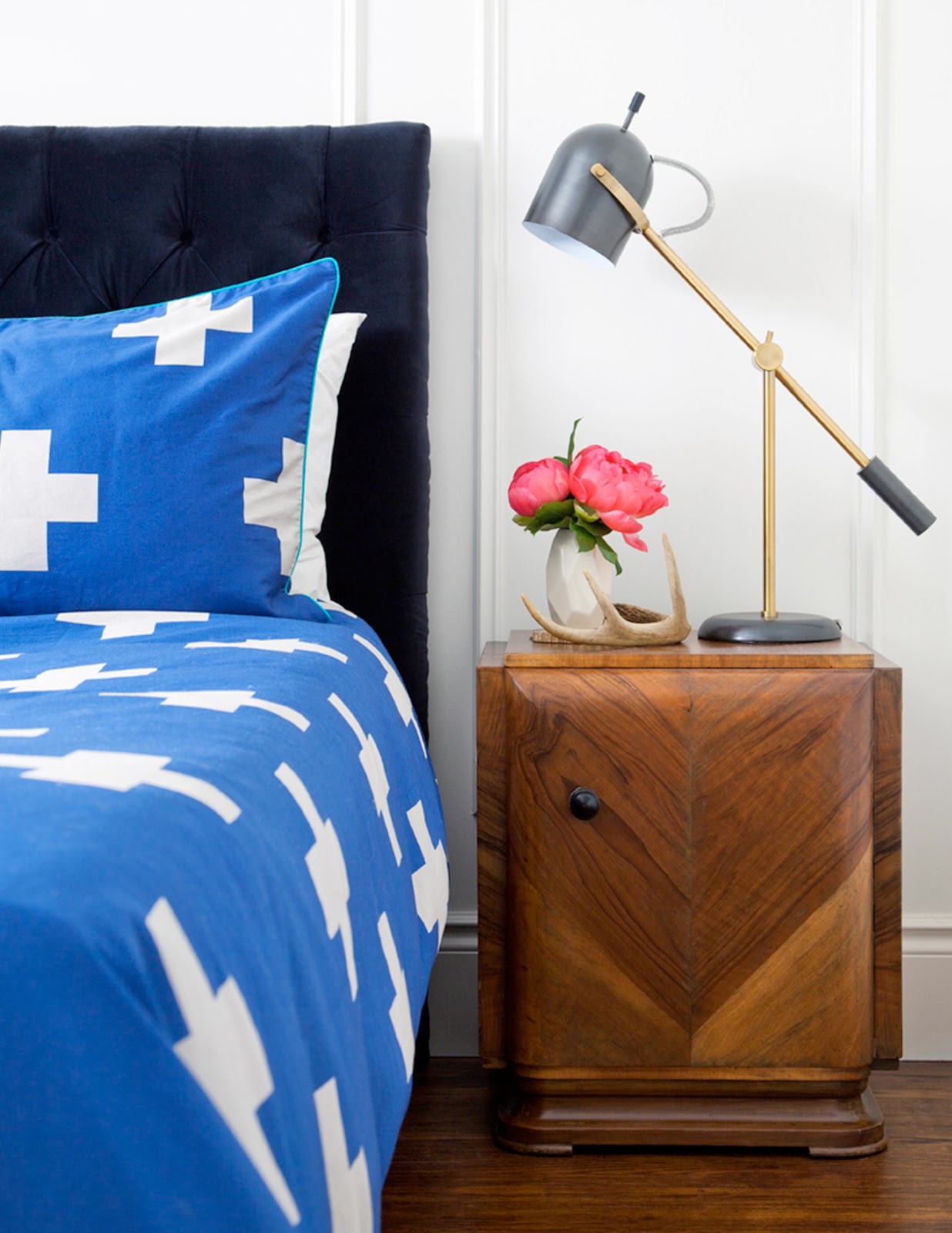
You know the old wedding superstition that a bride should always wear something old and new, something borrowed and blue? Well it totally applies to good design…at least, the first half does!

NEW: We totally fell in love the moment we laid eyes on the bold and vibrant duvet cover and shams from Aura Home {now available at The Bay for all my fellow Canadian design lovahs}. We knew they were the perfect choice to function as our modern centrepiece {OK, and our something blue *wink*}

OLD: Old can also mean traditional, or an older style, and I knew we needed to juxtapose those modern bed linens with some traditional touches. Enter a traditionally tufted headboard {covered in luscious black velvet from Kravet and beautifully upholstered by Barrymore}, and a gorgeous traditional rug from Kaarma. Hello lovelies!

VINTAGE: There’s old and then there’s antique, and nothing can take the place of the personality and style that real antiques add to a space. Would you believe I found these vintage French Art Deco side tables on eBay? Seriously the score of the century!

QUIRK-FEST: The whimsical deer head from Cardboard Safari {his name is Bucky} is the perfectly quirky mascot for the space, and he plays so nicely against the traditionally panelled feature wall.

Add some modern table lamps from West Elm and a naturally shed antler we picked up antiquing for an added dollop of quirk, and we can officially dub ourselves design mixologists!

The mix-master recipe? MODERN + TRADITIONAL + VINTAGE + QUIRK = PERFECTION.

No. 2: YOU’VE GOT SOUL BUT YOU’RE NOT A SOLDIER

PHOTOS by ASHLEY CAPP

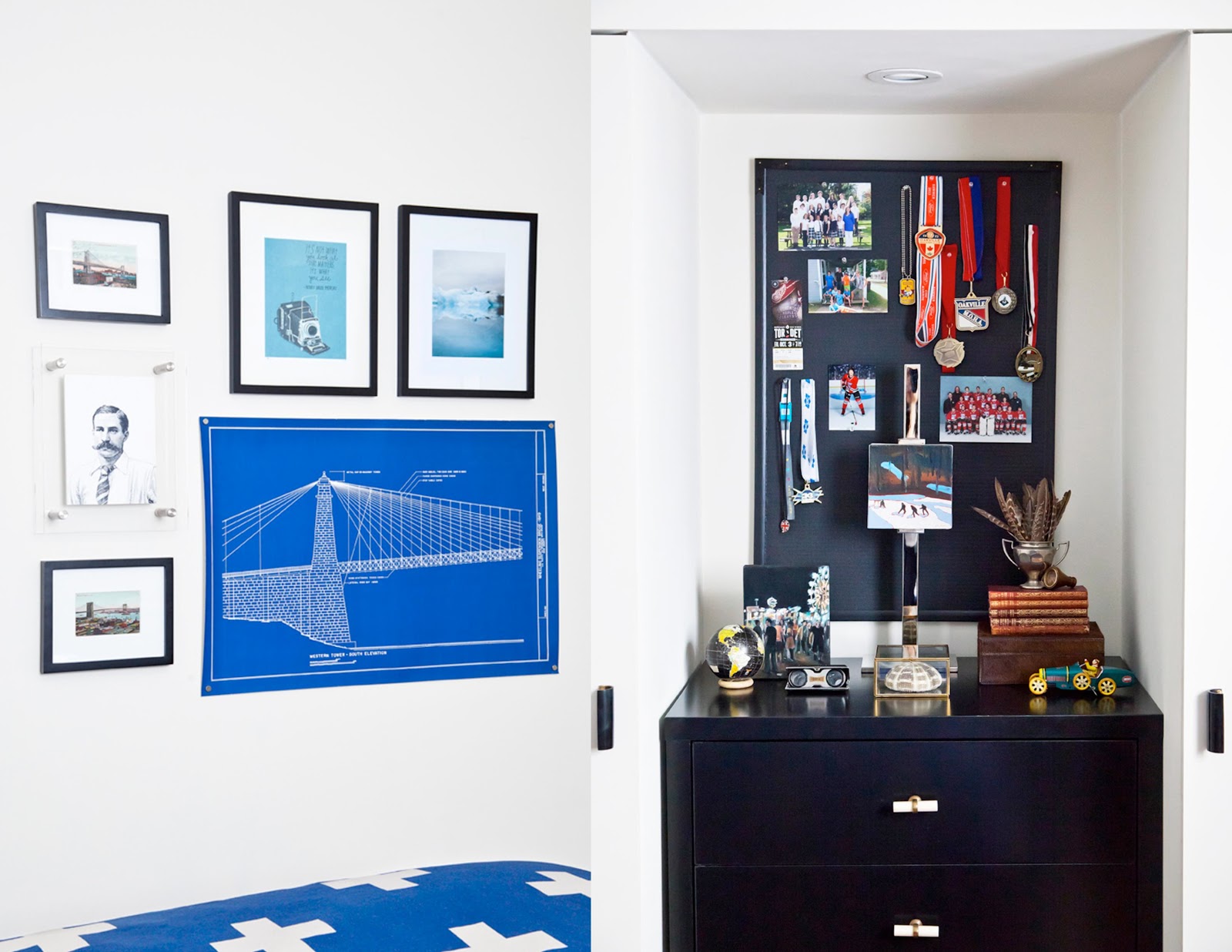
If you’ve been following me for very long, you’ll know I’m a passionate believer in original art. As I always say, it’s the soul of the space. When it comes to kids’ rooms, though, that can be a scary investment for some as you know your kids’ interests and tastes will change. If that’s you, I have three suggestions for you:

ONE, start with smalls, like the two canvases you see on Noah’s dresser above. The outdoor hockey scene is by one of my favourite figurative artists, Elizabeth Lennie, and the piece on the left by Kelly Grace depicts an evening at the fair, complete with ferris wheel and food vendors. Not only are they fun and story-filled pieces full of life, but they are totally timeless and I’ll be happy to reabsorb them into my own collection should Noah ever tire of them.

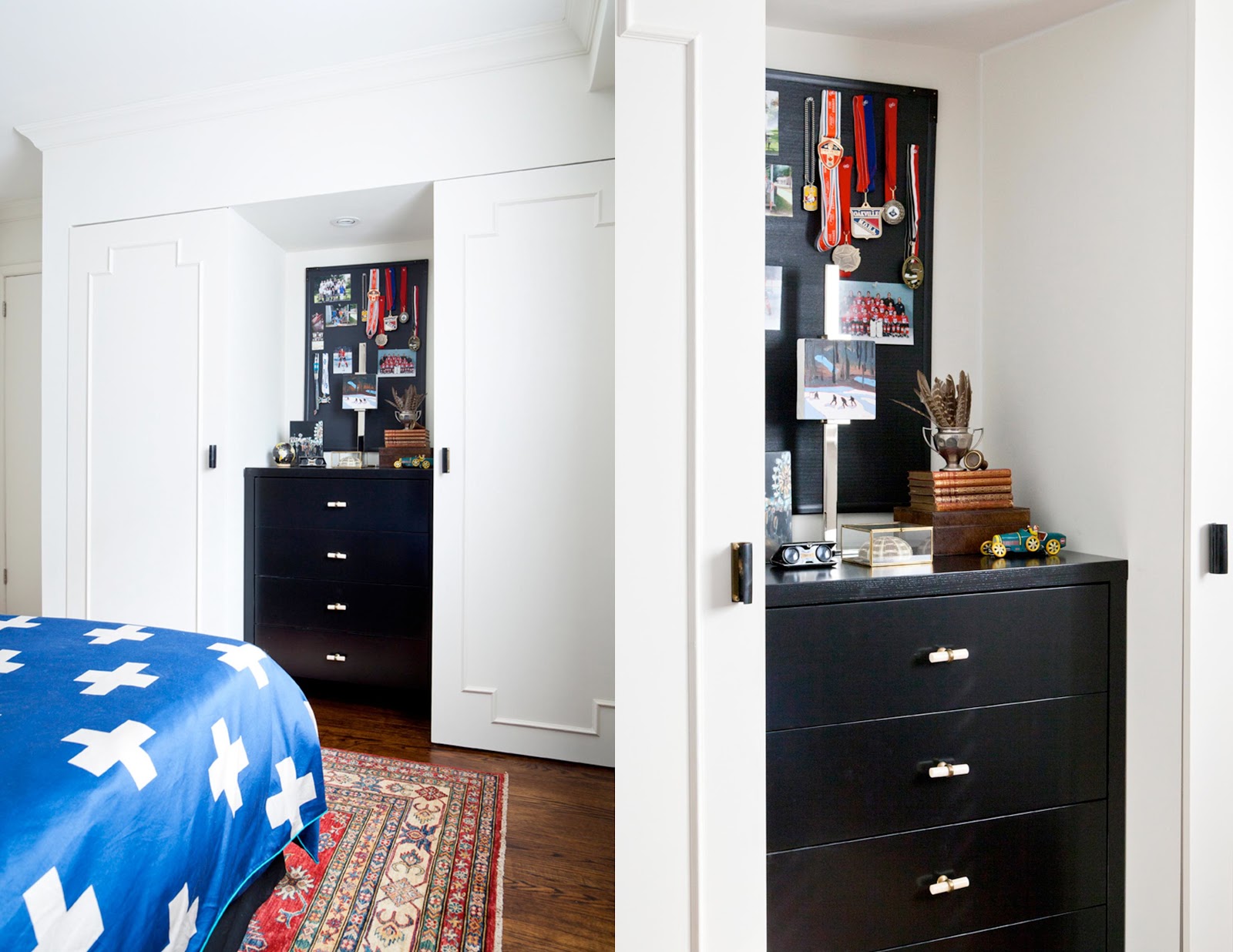
TWO, art doesn’t just belong on walls. I love styling bookshelves and the tops of dressers with art to bring soul to every corner of a space. I also love the silver easel from Indigo as the perfect way to vary the heights of a grouping without hanging a single thing.

THREE, create a gallery wall with pieces that aren’t too precious so that it can evolve over time. Noah’s gallery wall is made up of vintage postcards of New York City bridges that I picked up at the Williamsburg Flea a few years ago, a mysterious moustached man from Mitchell Black, an inspiring quote/art print from Lisa Congdon, a stunning photograph of icebergs from Canadian photographer Irene Suchocki, and a reproduction vintage blueprint of a bridge I picked up from Touch of Modern. The grouping tells a story of Noah’s current interest in architecture and travel and our hope that he’ll always stay curious. The quote on the Lisa Congdon piece is by Thoreau and reads:

It’s not what you look at that matters, it’s what you see.


No. 3: NEVER UNDERESTIMATE THE MAGIC OF A GOOD WARDROBE
PHOTOS by ASHLEY CAPP
When it came time to plan out the storage for Noah’s space, we had some pretty big hurdles to overcome. There was just one very small closet shoved into the right-hand corner of the closet wall. It was totally awkward to the room layout and even worse, it just didn’t leave us enough space for all of Noah’s cool threads. Even moreso, the remaining wall space – which would typically be the right place for a dresser – came so far into the room that there wouldn’t have been any clearance to open his drawers.
Gratefully, there was another under-utilized closet on the other side of that wall facing into the hallway that connects Noah’s bedroom to his bathroom. Remember this hallway with the gorgeous chevron floors and dove grey panelled walls?
PHOTOS by ASHLEY CAPP
Well, we grabbed the closet from the hallway and flipped it into Noah’s room and – with one move of stealthy designer ju-jitsu floor planning – we tripled his storage space with two closets the size of his original and room for his dresser to sit in between. Yes, it required filling in the hardwood underneath his dresser {which was no small DIY feat} but it was totally worth it.
In actually fact, we more than tripled his storage space. The closets themselves are IKEA cabinets with all of the awesome organizational “guts” that they offer – think customized pants hangers and the like – and we broke both closets up into half-hanging which means double the storage per closet. So I guess we quintupled his storage? Awesome.
You’d never guess they were IKEA cabinets from the outside, and that’s because we customized them in three ways:
ONE, end gables. The end gables had to be super slim in this case to leave enough room for the dresser, so we just used some super-thin masonite and painted it out the room colour for a very simple fix to the non-paintable sides of the melamine cabinet’s exterior.
TWO, custom doors. MDF slabs + panel moulding + paint + an awesome hubby = modern classic custom doors to drool over! #winning
THREE, interesting door hardware. Finish off the gorgeous DIY doors with texturally interesting faux bone door pulls from Anthropologie and the finished product screams Paris apartment. Totally my vibe. The hardware on the dresser is also from Anthro. Paint It Like New! sprayed out his existing, yawn-worthy espresso stained dresser in Para Paints’ Jet Black, and the contrasting cream and brass pulls totally elevate the sophistication level from “so yesterday” to “on point” in a wink. 
So, are you ready to master the art of the mix? Which room are you tackling next? I’ve got my sights set on another space in our home and am just itching to get started. Soon I hope!
xx
s.
By |July 28th, 2015|0 Comments

Project Debonaire Young Sir | Hallway Reveal

I am so excited to be sharing the beginnings of the reveal on all of Graham’s hard work in what we are now affectionately calling Noah’s pied-à-terre. Between the gorgeous bathroom {which is nearly done!}, his delicious bedroom {which is about 60-75% complete!} and this delightfully simple yet sophisticated hallway which connects the two, he might just be moving into the nicest part of the house when it’s all said and done!

I’ve trained him into understanding how lucky he is by saying, “Noah, repeat after me…I am spoiled” such that now all I have to say is “Noah, repeat after me…” and he replies with “I know, I know! I’m totally spoiled!”

It really does make my heart happy to be giving him such a beautiful space to move into now that we are taking over his old room for the new nursery. He’s a visual kid and is really into details {no idea where he gets it from!} so this feels like we are speaking his love-language in a really special way.

One more thing before I get to the photos: as a designer, I often find that hallways are overlooked opportunities in many homes, feeling more like wasted space or simply traffic areas rather than design moments given thoughtful attention to detail. I wanted to avoid that sense of visual neglect in this little hallway, and I think I can safely say “mission accomplished.” It’s clean, simple and classy, and the truth is, I rather love it.

The success of this space is really about 3 things: Pattern, Dimension and Colour.

PATTERN

The sense of pattern and texture is derived from the simple but decadent herringbone pattern of the floor. Using a simple striated porcelain tile {still can’t get over how much it looks like natural stone!}, we created this pattern out of about a thousand off-cuts and a lot of hard work on Graham’s part, and it was SO worth the effort. The floor is subtle and yet a total statement-maker. {Have I mentioned he is my own personal super-hero?}

DIMENSION

The dimension for this hallway is all about the paneling. Simple applied moulding can totally transform a space from yawn-worthy to yes! Adding architectural detailing is one of my favourite things to do in my clients’ spaces, and this is really the poor man’s version of the high-end custom raised paneling I often design for luxury homes. That said, it still creates major impact and takes the look from flat to fabulous, turning a small and boring hallway into an interesting experience.

COLOUR

I am a huge lover of a cream and dove grey colour palette. There’s something very elegant and soothing about this combination, and the French and Scandinavian references in this palette are truly classic. So taking my cues from the tile floor, I chose the gorgeous Pavillion Gray from Farrow + Ball for the baseboard, walls, applied moulding and crown moulding. With floor-to-ceiling dove grey gorgeousness, the feeling is one of being enveloped in quiet sophistication. I literally exhale and feel calmer just looking at it!

One quick designer’s side note: If you are going to use applied moulding to create paneling, please, please, please don’t paint it out a contrasting colour. It should be the same colour as the wall. Always. Some rules are made to be broken. This one is not.

I can’t thank Farrow + Ball enough for generously providing the paint for this project. I have used Farrow + Ball for many years on my design projects and love their amazing, historically-referenced colour palette. The saturation and sophistication of colour is like no other line out there. The truth is, I am not usually the one doing the painting on my design projects, so I’ve always chosen them for their premium quality, VOC-free healthy status and their gorgeous colour palette. But can I tell you, the paint applies like a dream? We chose semi-gloss for everything, which could have been a bit of a risk when painting it over old plaster rather than properly wood-panelled walls. Not with Farrow + Ball. This clay-based paint adheres beautifully and was very forgiving of our less-than-perfect plaster, as well as the old wood door at the end of the hall.

The only thing left to do for this hallway is replace the light fixture, which is on my to-do list for the New Year.

For now, though, the bathroom {the door on the left}, Noah’s room {the door on the right} and the nursery take top priority. It’s starting to feel like we are in the home stretch, and with 6 weeks left until my due date, that feels just about right!

Wishing all of my American friends an amazing Thanksgiving today, brimming with gratitude and gorgeous food, good conversation, enough laughter to make your ribs hurt, and memories made to carry with you into the next year.

xo
s.

By |November 28th, 2013|1 Comment

Decorating a Nursery with Groupings of Original Art

I must apologize for not posting this last week as I’d promised. Real life got all kinds of “real” and…well…you know what they say about best laid plans. But it’s Monday morning, the sun is shining, and there is a fresh and happy week ahead of us! What better way to start that week than with some inspiration on how to use original art in your nursery design?

The lovely Patricia from Art Interiors sent me some wonderful inspiration images showcasing pieces from their gallery installed in children’s rooms, and let’s just say I’m in l-o-v-e. I know I might sound like a broken record here, but I really do believe in carving out room in your decorating budget for original art whenever and wherever you can. Original art has the ability to transform a space from pedestrian and boring to personal and dynamic in a way that little else can. Just feast your eyes on these inspiring spaces and you’ll see what I mean!

This first nursery {above} feels quiet, sophisticated and perhaps a little bit quirky; whereas this second children’s room {below} feels bold and fun and unexpected.

This little girl’s room {below} is all kinds of charming, and the solo piece that greets you as you enter suggests she will grow up into a very interesting and sophisticated lady.

I’m totally crazy for the grouping in this sweet baby girl’s nursery {above}. The diversity and juxtaposition of the pieces creates such an interesting sense of story, and the pieces they have collected can easily be built upon and rearranged over time.

Is it just me, or does the art totally make these spaces come alive?

Not only did Patricia send over some inspiration of art groupings that have already been installed in children’s rooms, but she also kindly pulled together three fresh groupings for us – all created with a baby boy’s nursery in mind – to get the creative juices flowing using pieces that are currently available at The Festival of The Smalls.

Grouping Number One {above} is a delightful mix of hip and fresh with a healthy dose of vintage throw-back for good measure. I particularly love the hockey player by Patrick Lajoie {left} and the hipster playing with the viewfinder by Kelly Grace {top right}.

Grouping Number Two is given a more modern edge with the photograph by Emilie Rondeau {left}. My favourite piece in this grouping is the cyclist by Sara Caracristi {bottom left}, but I love the play of colour and texture that keeps the eye moving and engaged amongst all the pieces in this dynamic grouping.

Grouping Number Three {above} is really a marriage of the first two. Anybody remember Marigold? Oh my goodness that takes me back! And the vintage Fisher Price record player {top right by Kelly Grace} was seriously one of my all-time favourite toys when I was a kid! The abstract colour-blocked piece by Richard Herman is fresh and lends a modern edge to the nostalgic vibe of some of the other pieces.

Today’s visual design lesson really builds upon last week’s 3 Tips For Buying Original Art: buy what you love; start small and build over time; and be open to diversity! As you can see from the groupings above, an interesting mix will add energy and intrigue to a space in refreshingly unexpected ways. And remember what we learned from the gents at Madcap Cottage? Gallery groupings are totally where it’s at.

Can’t wait to get working on my groupings for Project Debonaire Young Sir and Project Nursery. Goodness, I have so much to do! But believe you me, the art groupings are already floating around in my head like happy little dreams. Just have to get the spaces ready so I have fresh walls on which to hang the art!

Wishing you a happy Monday, brimming with inspiration and fresh perspective.

xo
s.

By |November 18th, 2013|0 Comments