/Sherwin Williams

Project Nursery Update | Getting the Bones Right | Wall Paneling, Paint Colour + Curtains

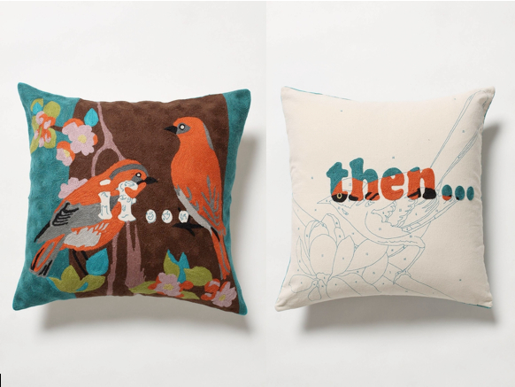
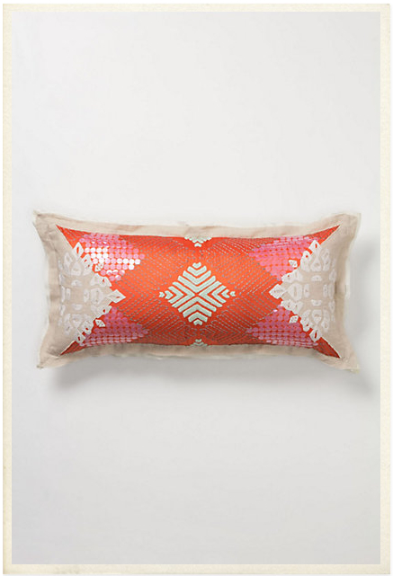
You may remember my post from a few weeks ago on where to start for inspiration when decorating. The advice I shared in that post really does apply to almost any room in the house {save kitchens and bathrooms}, but the nursery is a lovely example. Working with this gorgeous rug and incredibly charming and slightly whimsical Thom Filicia for Kravet fabric, I knew we were off to a great start.

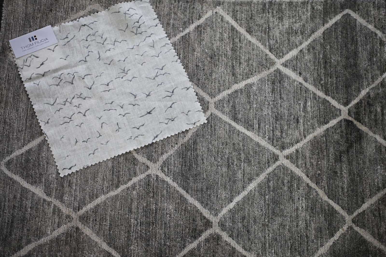
The mood I wanted to create in the nursery was something of a quirky elegance; a whimsical sophistication. I knew I wanted a quiet colour palette to soothe and calm both baby and me, so the grey and cream colour palette offered the perfect place to start.

To up the sophistication factor, we opted to keep the walls very simple while still making a statement. Enter one of my favourite go-to wall treatments: paneling. Some applied moulding added to the new baseboard and crown give this room a sense of “bones” and presence without working too hard. It creates just the kind of elegant backdrop I want for the kind of new eclecticism I envision.

Sherwin Williams very generously provided me with my all-time favourite go-to paint for the walls, ceiling, baseboard and trim: Creamy 7012. The walls, paneling, crown and ceiling were all painted flat, but the baseboards, casing and doors are done in a semigloss. I love this colour because it is a warm white without being yellow, and yet it has more depth to it than some of the other go-to warm whites commonly used. Even better, we used Sherwin Williams’ Harmony VOC-free paint to ensure a happy, healthy environment for the sweet babe.

{Side note: I wanted to see the floors sanded and stained in the nursery to match the floors in the rest of the house, but the time and effort required as well as the fumes it would have produced nixed that decision. Another project for another time.}

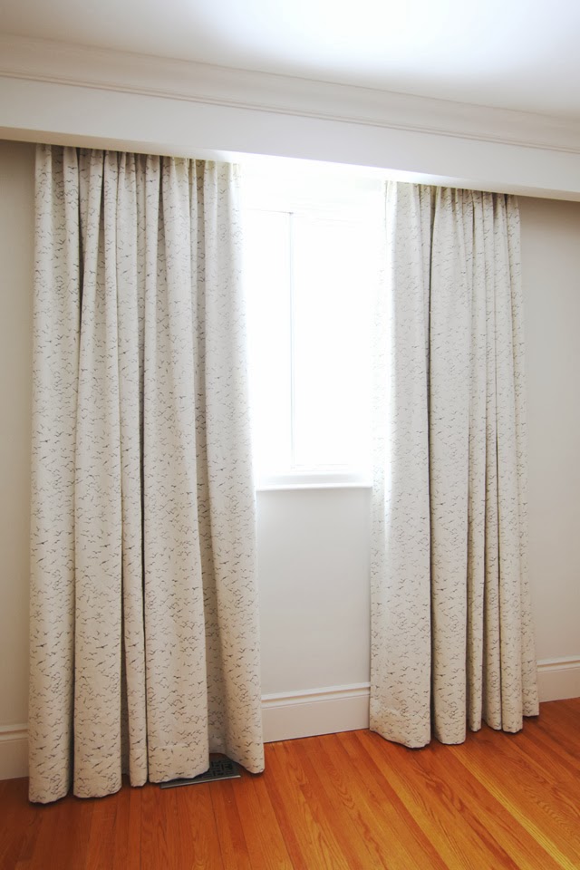
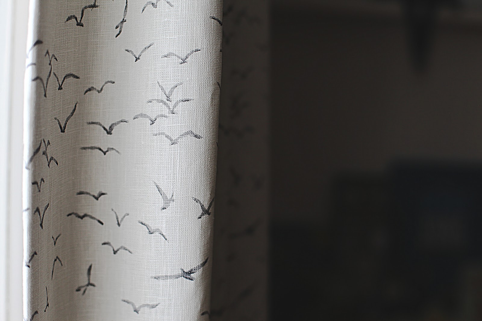
Once the painting was done it was time for the custom curtains to go up. I can’t begin to tell you how much I  l-o-v-e  these drapery panels! The Thom Filicia linen fabric – an incredibly generous gift from my kind and lovely friends at Kravet – is both lighthearted and elegant and will transition through many years of living. I would happily use this print in a living room or a grown-up bedroom just as much as a nursery, and I love the sense of freedom connoted by all the birds in flight. I have no doubt we will be living with these gorgeous linen panels for many years.

Working together with the feature wall of books and art in the reading nook, things are really starting to feel inspired. I just know I’m going to enjoy spending countless hours in here with my little one!

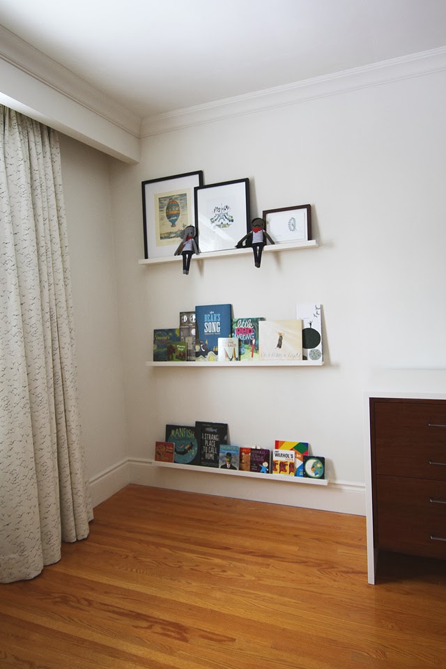
There is still more artwork to be installed, and of course the rug, crib, chair and ottoman need to be put in place, so stay tuned! More sneak peeks ahead…

xo
s.

By |January 8th, 2014|0 Comments

Working with Colour: How To Pick A Palette

Longing for more colour in your life but not sure where to start or how to find your perfect palette? When decorating a new space, I recommend starting with 2 things: your rug and original art.

As the soul of the space, art speaks to all of the other furnishings and finishes and often provides an inspiring palette you would never find on a strip of paint chips. With a beautiful piece of original art communicating the intended mood and taking centre stage, paint colours on the walls can be more subdued, taking a back seat to the more sophisticated focal point of the artwork. Much of my home is painted a very subtle cream (Sherwin Williams Creamy 7012), but it is brought to life by our small and treasured collection of original art.

I thought I’d offer up an example today that features one of the hottest colours of the season (and my favourite accent colour of the moment): Tangerine Tango. This mouth-watering red-ish orange will definitely add a dynamic energy to any space and was named Pantone Color Institute’s colour of the year for 2012.

Maya Foltyn “Downtown” via Art Interiors

For my tastes, this bold colour would be too strong to paint a room or even a wall with it, but I wouldn’t hesitate to bring it into my space through a small (or even large) accent via a piece of original art like this dynamic modern painting above from Maya Foltyn.

A stunning arrangement of Orange Ranunculus and Kumquats via Style Me Pretty
Tangerine Tango livening up a classic dining chair
an otherwise neutral space comes to life thanks to dynamic orange accents
love the way these stacked Hermès boxes punctuate an otherwise casual white bedroom – via French By Design

If a large, statement piece of original art is not quite in your budget at the moment, I have three suggestions!

ONE: start by collecting smalls! I have many canvases that are as small as 5×5 punctuating my home throughout on bookcases or in small groupings on walls. Here’s an example from my space, a lovely 12×12 modern acrylic I gave my husband for Christmas several years ago:

Painting by Kathleen Weich (via Art Interiors)

Not only are small canvases surprisingly reasonable, they add a sense of story as we curate our collection over time.

TWO: watch for “Make Something Mondays,” coming soon to The Curated House! I promise to offer inspiration and options a-plenty.

And THREE: decorative cushions are a wonderful way to infuse a pop of colour into what might otherwise be a neutral space (they also have a much smaller price tag attached). They are of course easily changed with the seasons, so the colour-commitment-phobes in our midst can breathe a sigh of relief and dive into this trend head-first.

For example, if Tangerine Tango has whetted your appetite for all things orange, why not pull it out of a whimsical pillow like this “If…Then…” crewel-work piece from Anthropologie?

“If…Then…” pillow available at Anthropologie

Or this delightfully sequined, more sophisticated linen loveliness called the Sailendra Pillow, also from Anthropologie?

Sailendra pillow available at Anthropologie

At the end of the day, my advice this season is to find your adventurous side and express yourself with a splash of something fabulous. Be it through art or accents, you can enrich your home with the joy of colour. Your conversations are bound to be livelier and your mood will lift along with the rising temperatures!

xo
s.

By |June 18th, 2012|0 Comments