/story

Magnetic Wallpaper Ignites the Imagination | Sian Zeng

I have a confession to make. I am a huge fan of stories. I think storytelling is a precious art form and that children should be taught from a very young age to tell them, to listen to them, and to always create them in their imaginations. Stories are what connect us with each other and with history. Stories connect us to deeper meaning and greater thought and higher inspiration.

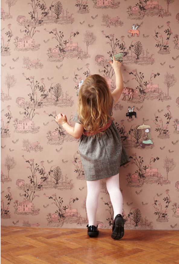
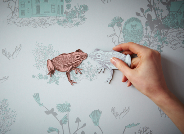
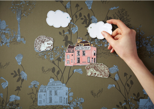
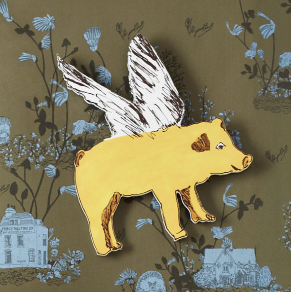
It is my love of story that has caused me to fall head-over-heels for this product I’m sharing with you today. Yes, the illustrations are delightful. Yes, the magnetic concept is ingenious. But it is the power to ignite the imagination that holds the key to my heart with this one. Feast your eyes {and your imaginations} on this brilliant wallpaper collection. Aptly named “Magic and Fun,” this uniquely interactive wall covering by Sian Zeng invites visual narratives that evolve through interaction.

Can’t you just picture the hours upon hours of storytelling that would take place on these walls? Friends would always want to come and play at your house so as to continue writing their scripts and plays. And bedtime stories would take on an entirely grander dimension of creativity and interplay.
A lovely stage for the imagination, it is easy to see how every fairytale ever told might come to life on the walls of a room “dressed for the theatre” in Sian Zeng‘s paper.
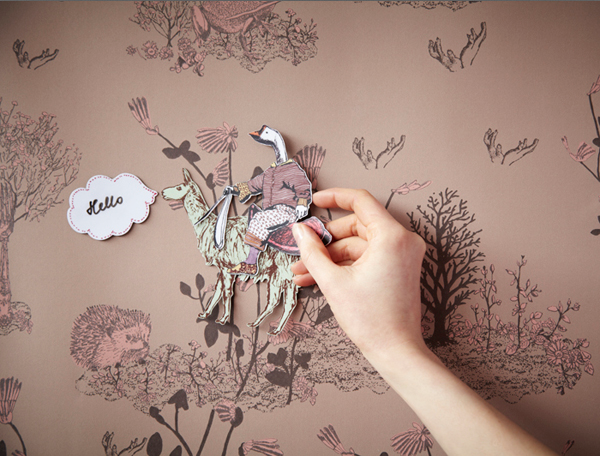
All images via Sian Zeng

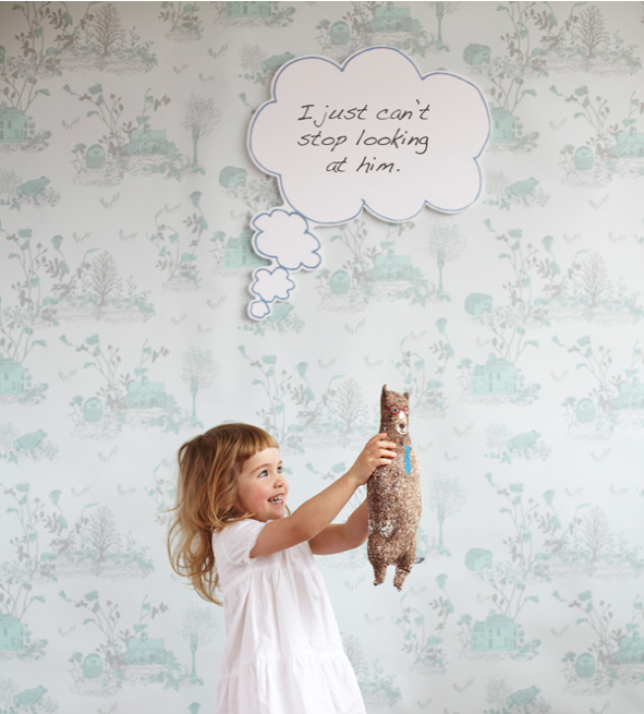
In my imagination, the dry-erase thought bubble {shown above} would create endless opportunities for hilarious photo shoots. Wouldn’t it be fun to wallpaper a dining room with a paper from the Magic and Fun collection? Just think of how much everyone’s ribs would hurt after the laughter that would ensue from telling stories with friends over dinner, creating “thought bubbles” for each other throughout the night? Your home and hospitality would no doubt be the talk of the town.

How do you keep your imagination alive? What materials or collections have encouraged you to think outside the box lately?

xo
s.

By |October 4th, 2012|0 Comments

Using Typography to Tell a Story

Today I have the pleasure of introducing you to the delightfully talented Melody Hansen, graphic designer extraordinaire and our guest poster for today! I have no doubt you will enjoy her thoughts on the branding of the cafés featured in Gabriela’s post.

Have you ever noticed the font used in a window display, or perhaps the posters that may decorate the walls of a restaurant? As a graphic designer, it is only natural that my eye would be drawn to the design that surrounds us. Everything from the choice of type to the placement of an image will affect the experience in great ways. Let us take the 3 coffee shops mentioned in Gabriela’s post.

Wanda’s Pie in the Sky, for instance, is in the heart of Kensington Market and if you are a Torontonian reader or familiar with the area, you know that it is a quite unique and whimsical world of its own, if I may so myself. And so, the design that surrounds this café and pie shop is just that: whimsical.

Photos by Alyssa Bistonath

Typography is an art that plays an immense role in design and in our every-day lives. The way a letter connects to another will reflect the story it is attempting to tell. Yes, I do believe each letter – of any typeface ever created – tells a story, and the role of a designer is making sure the right story is being told for the right occasion. Through the type found in this little Kensington café, we are taken right back into our grand-mother’s kitchen with a youthful twist. The combination of the handwritten signs, the vintage posters, and the bright colors all work together to create an inspiring magical space.


Little Nicky’s, a coffee shop telling a slightly different story, creates an environment through its design choices, as well. As soon as you enter, you know you are somewhere unique.

Photo by Cory VanderPloeg
Surrounded by bold and tall sans-serif type and wall decor from the 1950s, it certainly does not fail in creating an experience beyond the norm. I should also mention their packaging is one to swoon over, if you are like me and love anything stamped. Little Nicky’s is truly a must-see for any vintage design lovers.

Last but certainly not least, Nadège Patisserie. You are welcomed in by the open white space, the very modern touches, and of course, by the pastries. The color focus is exactly where it should be: in the greens and reds of the macarons, the yellows and blues of the tarts, in the croissants and the pains-au-chocolat.

Photo by Dar Mustafa


Photo by Dennis Marciniak

It’s evident that Nadège’s branding has been well thought out, and appeals in a way that can’t keep us away. A story of simplicity, sophistication, and refreshment in what it tells, and through the geometry (a fun reflection of the pastries and croissants if you might notice) and type choice of the logo, along with the website, everything is consistant and complete. A true successful design!


I hope these reflections have brought your attention to impact of design on our everyday lives. Perhaps along with me, you will find the story of each letter, shape and white space speaking to you even more clearly as you take note of these details.

– Melody 
By |September 6th, 2012|0 Comments