/Uncategorized

Kips Bay Showhouse 2016 | Kati Curtis & The Path To Enlightenment

Kati Curtis

Transported. That is the first word that came to mind when I laid eyes on the space that my friend Kati Curtis designed for this year’s Kips Bay Boys & Girls’ Club Decorator Showhouse. Even through photos, the visual experience felt like a personal journey, and to my ears, the soundtrack was undoubtedly “The Lark Ascending.”

As it turns out, I was indeed picking up on what Kati was communicating through her work which she has aptly titled “The Path To Enlightenment.”

Kati Curtis

Kati Curtis

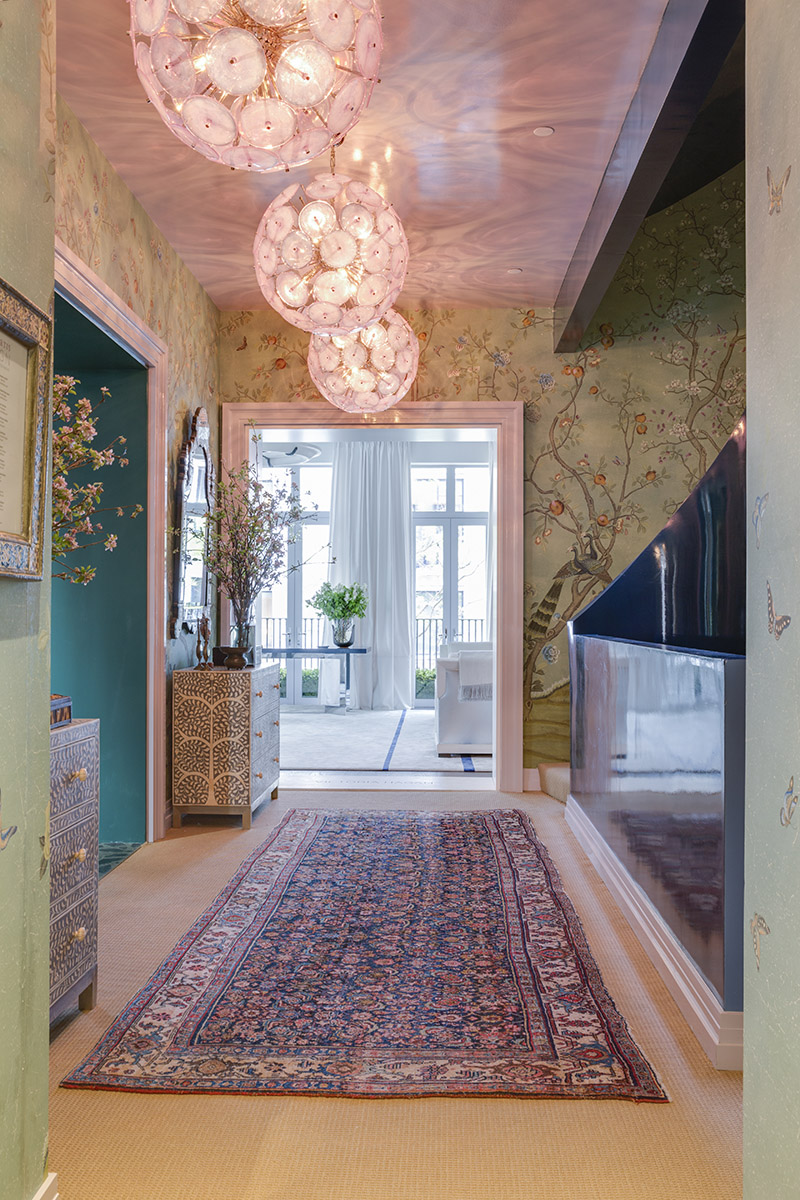
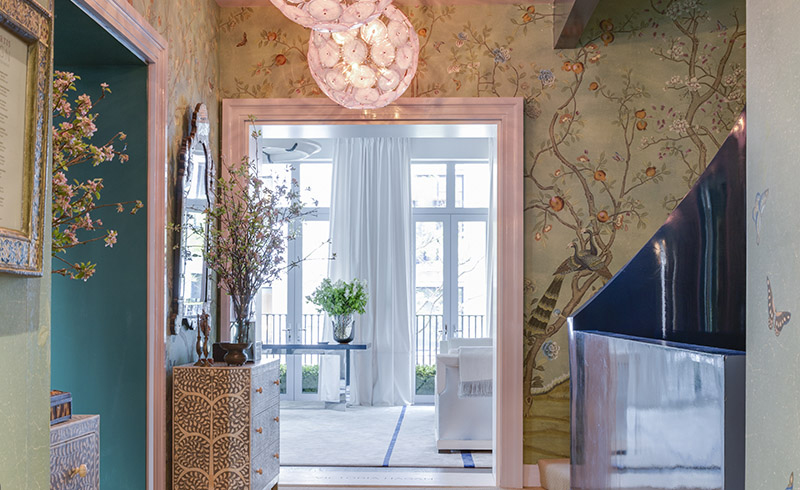
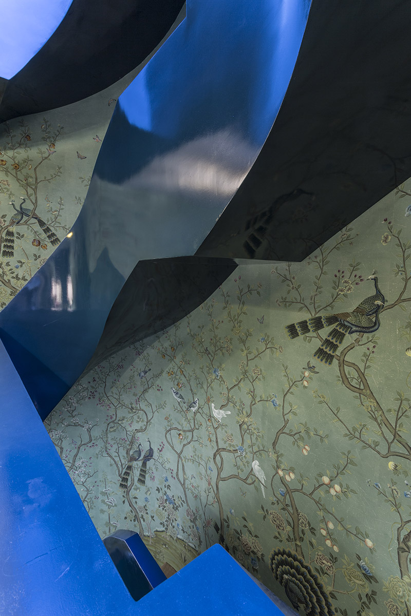
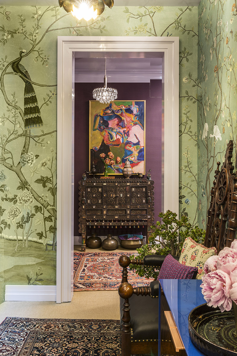
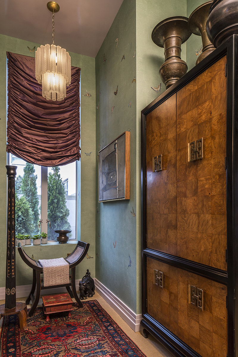
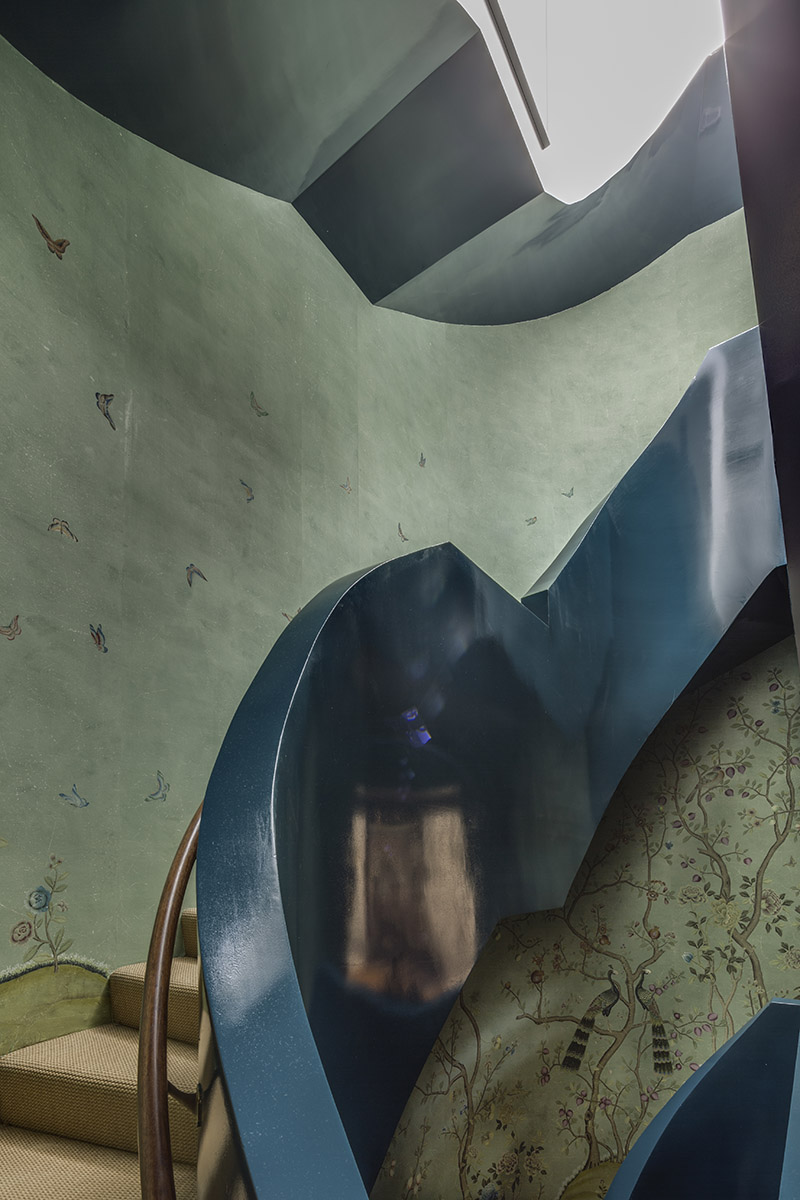
The journey Kati crafted for us begins on the 3rd Floor of the modern New York City townhouse. Curtis wanted the experience to feel like the visual feast for the senses one might encounter walking into the Garden Of Eden – layers upon layers of beauty and detail, representing the distractions that often meet us on our path to enlightenment. The centrepiece and visual narrator for the entire journey through the 3 floors of Curtis‘ design is the stunning deGournay St. Laurent wallpaper, which was selected, customized and installed for this project in a mere 7 weeks, something of a major miracle in the design world.

Each designer comes into their designated space at the Kips Bay Showhouse with far less time than usual for a project of this scale. That may be the understatement of the century. Curtis learned of her honoured appointment on March 17th and was photographing for the New York Times by May 7th, but she didn’t let that brief window of time stop her from shooting for the stars. The question she asked herself was simply “what would I do in my wildest dreams?” and then, with all the daring and bravado of a skilled and experienced artist, she dove in head first.

Kati Curtis

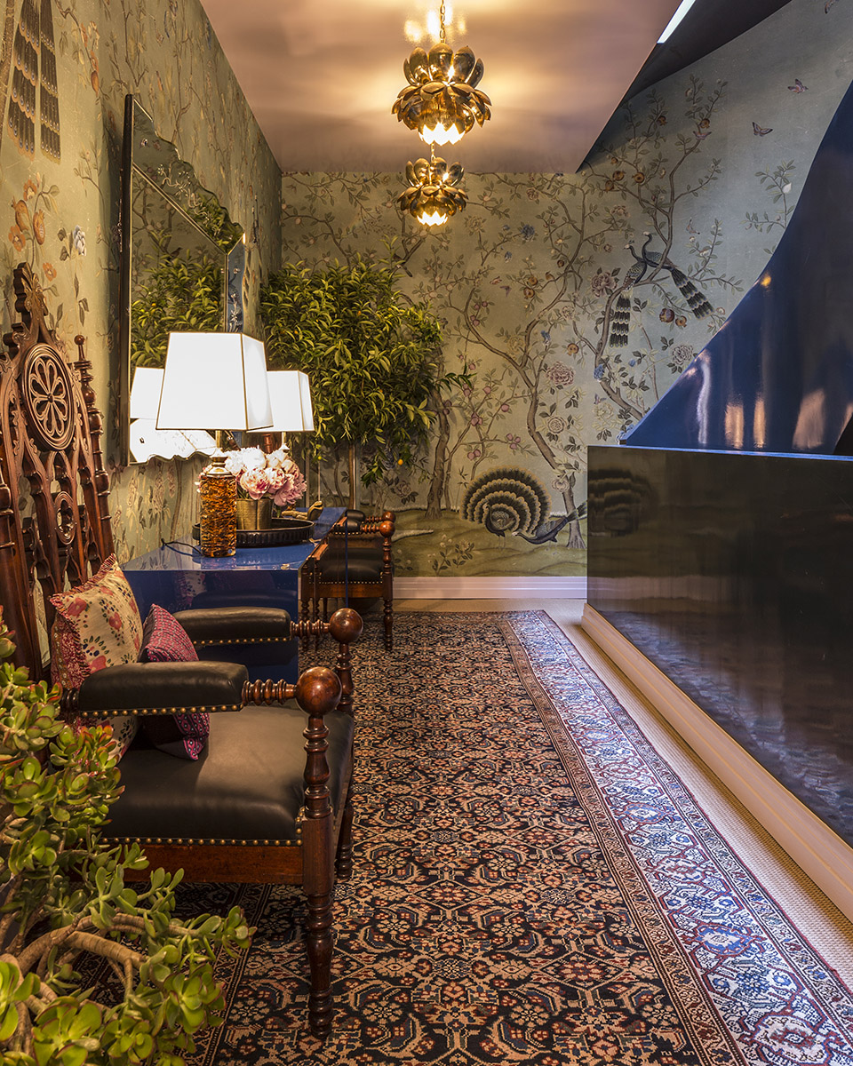
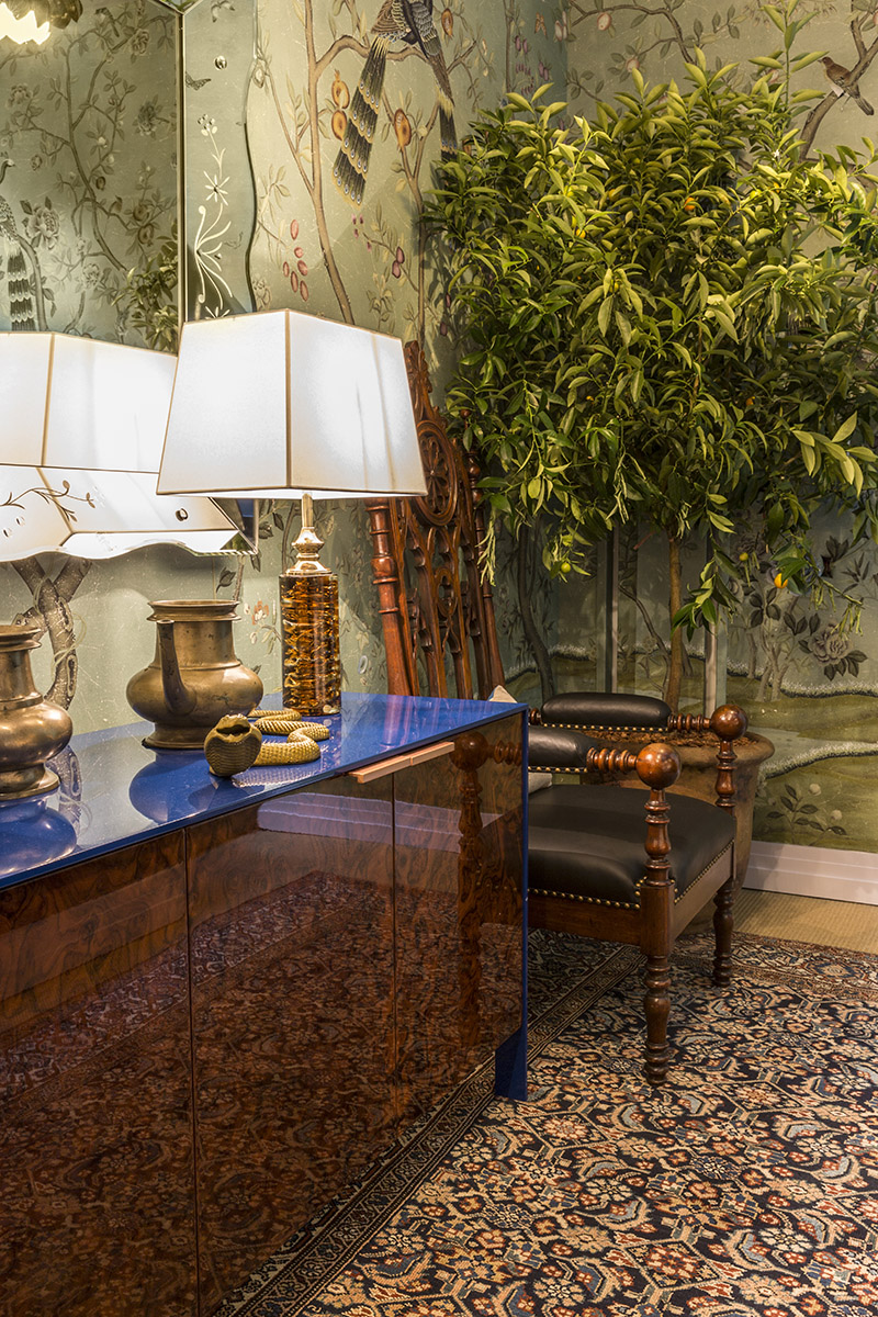
Sculptural but strange, the staircase itself was perhaps the biggest design dilemma when Curtis first entered the totally unfinished new construction, and she found herself engaged in a dialogue of sorts with this raw concrete element. Should she highlight it or find a way to make it disappear? Her final design choice is brilliant: a high gloss finish in Farrow & Ball’s Hague Blue which reflects the iridescence of the Murano glass chandeliers and captures reflections of the wallpaper, furnishings and skylight above. The vibrant blue is repeated in the waterfall surround on the sexy, modern burled-wood chest which anchors the main focal point of the 4th Floor, a more masculine vignette with almost intimidatingly strong high-back gothic chairs flanking it on either side.

Kati Curtis

Kati Curtis

The first two of the three floors of the staircase that Kati designed also offer discovery moments by way of a meditation alcove on the 3rd Floor and an adjoining hallway that Curtis filled with black and white photos of the children for whom this charitable fundraising Showhome is created each year.Kati Curtis

Kati Curtis

Kati Curtis

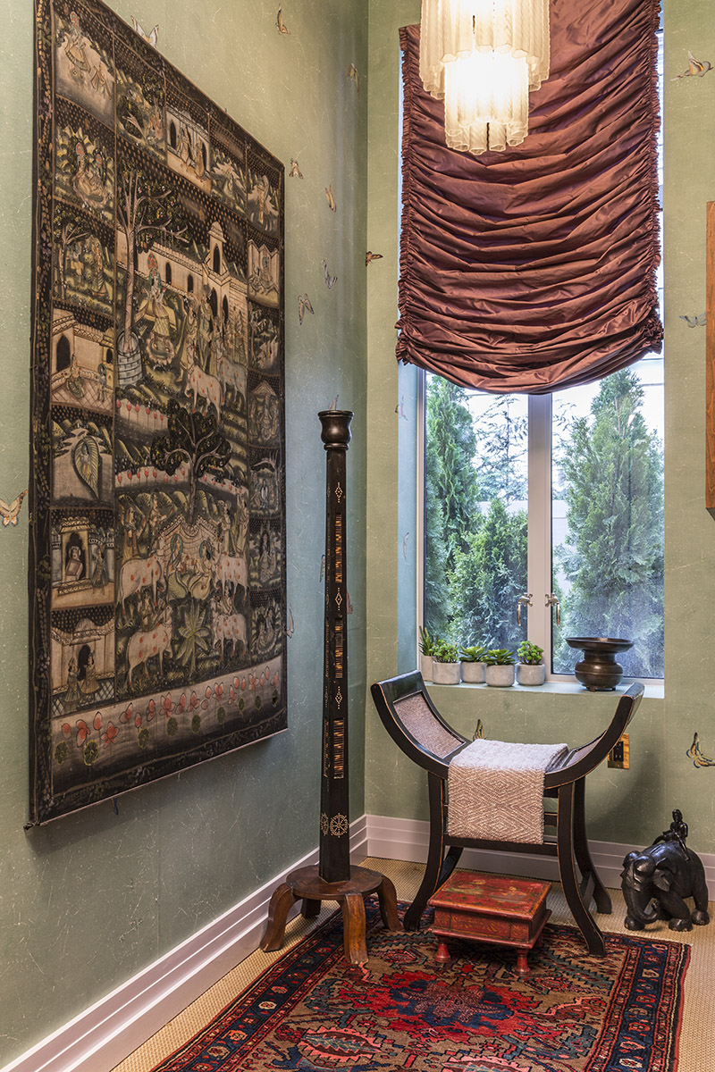
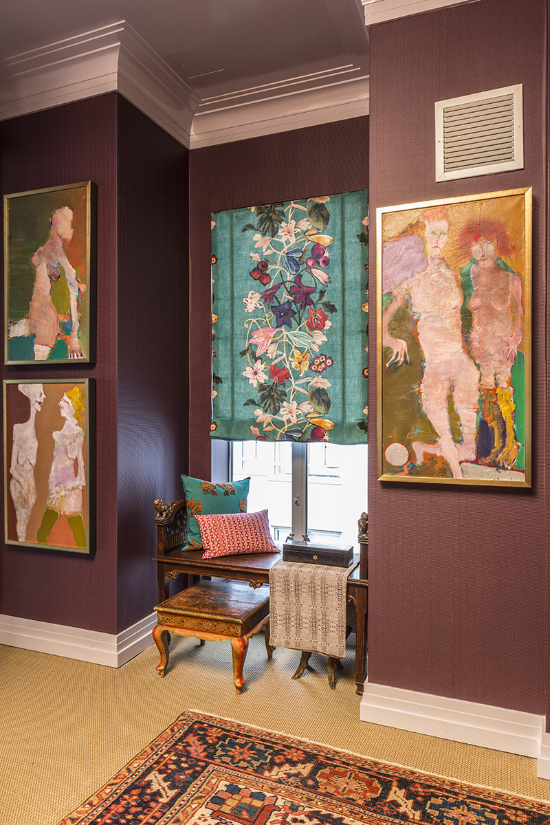
Clad in a deep purple burgundy bamboo motif Dedar wallpaper, the adjoining hallway on the 4th Floor became a gallery where Curtis chose to display the colourful and vibrant works of New York artist Martin Sumers. Sadly, Sumers work had remained undiscovered in his lifetime, but through friend and gallery owner Gillian Bryce of Gillian Bryce Fine Art in Atlanta, Curtis discovered and fittingly reclaimed this New Yorker’s work and “brought him home.” Kati’s keen eye understood the value of Sumers’ incredible works, which are now in high demand by savvy art collectors as the values for each of his pieces continue to soar.

Kati Curtis

As with any spiritual journey, the final ascension throws off the beauty of distractions that were previously present in the form of the cranes, peacocks, flora and fauna on the lower floors. The visual journey ends with a delicately fluttering kaleidoscope of butterflies that disappear into nothing but the tea-stained ground of the spectacular deGournay paper, perhaps a metaphor for the peace and clarity Curtis hopes to achieve for herself and her clients through her work.

Kati Curtis

The Kips Bay Boys & Girls’ Club Decorator Showhouse is in its final days of showing to the public. If you’re in New York, be sure to make time for a visit to drink in all of the delicious details in person. Thank you, Kati, for sharing your transcendent vision with all of us.

Be sure to pop back next week for more design inspiration for living a beautiful life! Until then, enjoy the weekend with the ones you love.

Sarah-Signature

By |June 8th, 2016|1 Comment

My Top Picks From The Second Annual Design Exchange Design Auction

When it comes to my love for the Design Exchange, I really have two passions fanning the flame. The first is obvious: as a designer, I’m passionate about the pursuit of design excellence and am grateful there is an organization dedicated to preserving and supporting our design heritage as Canadians. Despite what some may think, our design identity is very unique, and I’m grateful to Shauna Levy and the Design Exchange team for their commitment to standing up as a voice for the Canadian design community.

The second passion fanning the flame is perhaps less obvious but of equal importance to me: motherhood. As a mom of two boys, I believe it’s my duty to shape them into well-cultured young men who understand the value of beauty and its importance in shaping society. Knowing that the Design Exchange is committed to educating young minds and empowering them to become design thinkers is so meaningful to me, especially because it reminds me I’m not alone in my mission to raise children who have fully embraced their creative voice.

So when, for the second year running, I was asked to share my favourite picks from the upcoming Design Exchange Design Auction, it was a resounding and immediate heck yes from me! I mean, an opportunity to savour great design while sharing about an incredible organization supporting the Canadian design community? Sign me up.

Without further ado, here are my top picks for the incredible items that will be up for auction at this year’s Design Exchange Design Auction.

the-curated-house-design-exchange-design-auction-top-picks.001

ONE: Warren Platner Chair, donated by Hollace Cluny | TWO: Scribble Table by ii by iv Design, donated by ii by iv Design | THREE: Round French Oven in Pink by Le Creuset, donated by Le Creuset Canada | FOUR: Lassen Line Candleholder, donated by Hopson Grace | FIVE: Giant Dora Maar Vase by Jonathan Adler, donated by Jonathan Adler | SIX: Elk Chair designed by Gus*, donated by Style Garage

I’m very sad to say that my job as a mom will prevent me from attending this year’s auction as I’ll be busy celebrating the end of the school year with my oldest at what will no doubt be the coolest party for 13 year olds ever. But that doesn’t mean that you can’t be there, rubbing shoulders with the who’s-who of the Canadian design scene! Trust me when I say that all the big names are there. It’s a fashion show and a design auction all wrapped up in one, and it is definitely not to be missed! The GREAT news is, I’m giving away a pair of tickets, and entering is easy peasy:

  1. Make sure you’re following both me and the Design Exchange on Instagram.
  2. Check out the full list of auction items here and post your favourite on Instagram including the tags #thecuratedhouseXdesignexchange and #dxda in your post.
  3. Come back and comment on this post to let me know you’ve entered!

I’ll announce the winner in next week’s post and will make you pinky-swear to tag me in your Instagram posts of this swishy event. Can’t wait to see which auction items are your fav’s!

Sarah-Signature

By |June 1st, 2016|0 Comments

Copper Crush | How To Incorporate Copper Into Your Home

DSC_4810a

If my recent One Room Challenge reveal didn’t show all my cards, I’m here to completely show my hand and say that I have a designer’s crush on copper. It’s a timeless classic metallic that has been used for centuries, and yet it’s coming back on the scene in a big way right now as a modern accent that is both warm, welcoming and edgy. I’m still blown away by how adding just a few touches of copper in my kitchen has made such a huge impact. Here’s my favourite little vignette:

my-kitchen-coopper-accents

Simple. Classic. Modern. Timeless.

Love, love, love.

Today I thought I’d share just a few of my favourite ways to incorporate copper into your home. Each one is simple and easy to integrate without totally redesigning your space, and most are quite reasonably priced with something for every budget on the list.

copper-crush-the-curated-house

ONE: I love these simple, modern marble drink coasters set in a copper holder, the perfect hostess gift and an elegant statement on any coffee table. // TWO: Did you catch this copper flatware from West Elm in my dining room refresh? So simple and elegant. A warm and welcome addition to any dinner party. // THREE: I’ve been in love with this Blu Dot Copper Counter Stool ever since I first laid eyes on it at Her Majesty’s Pleasure in Toronto. Modern simplicity at its best. // FOUR: This elegant Duet Vase in Nero Marble and Copper by Michael Verheyden is available through Avenue Road. It’s the height of simple sophistication. // FIVE: The decadence of this copper pendant, designed by Jorn Utzon and available through Mjolk, is found in its Danish simplicity and elegant form. Three of these beauties suspended over an island would make a stunning Scandinavian-inspired statement.

So what do you think? Are you crushing on copper like me? Tell me if you love it or hate it and where you’d use it in the comments below, and be sure to come back next week for more fabulous inspiration for living a beautiful life.

Sarah-Signature

By |May 25th, 2016|2 Comments