
So it’s been one week since the One Room Challenge reveals broke the internet, and I’m still not even remotely caught up on everyone’s gorgeousness yet. While I play catch up, I thought I’d share some of my favourites with you thus far along with a few design lessons we can take away from each one.
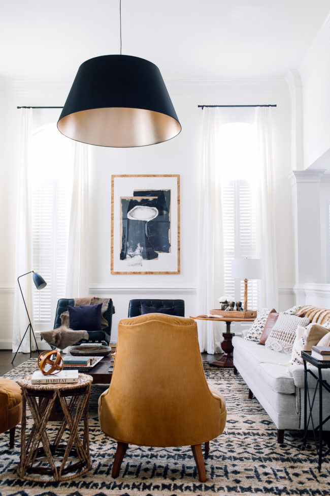
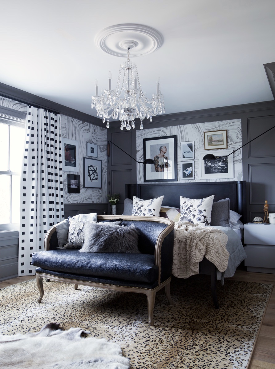
I love absolutely everything about Claire Brody‘s transformation (you must see the befores to truly appreciate it!). From the neutral palette to the layers of texture and pattern to mix of old and new to the bold artwork, light fixture and rug, this room has it going on. I also love that the room feels like it could have been this way for years – it’s inviting and approachable and feels like it tells a story. That takes talent. But the number one design lesson we should all takeaway from this room is: SCALE MATTERS. If that rug was smaller, if that art was smaller, if that light fixture was smaller…the whole thing would feel off. Balance isn’t just about symmetry. It’s about scale too. Brava, Claire. I feel like we should be design neighbours! I’d be visiting for tea or bringing over a bottle of wine on the regular.
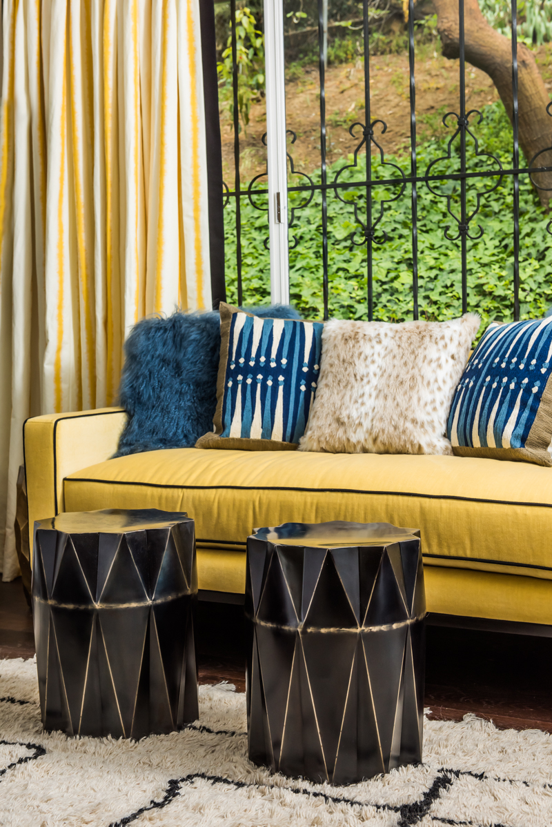
I love Jill Sorensen‘s space pretty hard. I had to show you two photos for the takeaway from her space, which is this: BOLD COLOUR SCHEMES REQUIRE DISCIPLINE. What does that mean, you ask? Jill’s palette is a mix of gold, royal blue, black and white, and she disciplined herself to repeat the mix in variations of dominance throughout the entire space. Repetition is KEY with a colour scheme that features more than one strong colour choice, and Jill absolutely nailed it here. Also, that greek key Moroccan-inspired rug from her collection is the bomb.

I’ve had a fellow designer’s crush on Naomi from Design Manifest for a year now. What I love about her aesthetic is that she creates classic foundations with expressive details. And that’s really our takeaway from her space: GO CLASSIC ON THE BIG STUFF, GO BOLD WITH THE SMALL STUFF. That may not always translate literally. What I mean is this: cabinetry, countertops, backsplash and appliances are all big ticket items that you’re not likely going to change on the regular, whereas the paint on your counter stools, cabinetry hardware and the fabric used to make a small roman shade can easily be changed up when you tire of your current accents. Know where to be daring and know where to be timeless so that your space speaks to your personality but leaves you with the flexibility to evolve the look over time.
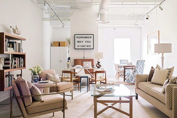
I absolutely love the layered, neutral-but-never-boring space that Mandy and the team over at Waiting On Martha created for their new office space. The number one detail that stole my heart is the sign behind the desk which reads, “Remember Why You Started.” And that’s our takeaway: ALWAYS INCLUDE SOMETHING THAT SPEAKS TO YOUR HEART. Good design should tell your story. It doesn’t necessarily have to do so with words as in this example, but it should ground you and remind you of who you are and what matters to you. Major props to Mandy for getting this so right.
Christine Dovey refined the design plan for her master ensuite over two rounds of the One Room Challenge, and honestly, you can tell. There’s a lot of love in all those layers of texture and pattern play and the mix of modern and vintage. It’s sexy and sophisticated and glamorous. The takeaway from Christine’s space? MASTERING THE MIX TAKES TIME. Take the time to really work out your design plans and keep editing until your space goes beyond beautiful to something bespoke and unexpected. You’ll be glad you did.
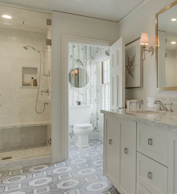
Cristin from the Simplified Bee‘s bathroom floor may just have made me stumble. That’s right, I’m here to confess to everyone listening that I am coveting that geometric marble gorgeousness with total abandon, and I don’t care who knows it. The design takeaway from this stunning bathroom makeover? MASTER BATHROOM FLOORS WERE MADE TO BE DROOLED OVER. If there is anywhere to embrace bold pattern in a big investment item, it’s on your Master Bathroom floor. This one happens to be bold and classic, sophisticated and timeless all at once, and that’s the benchmark for this kind of design statement. To. Die. For.
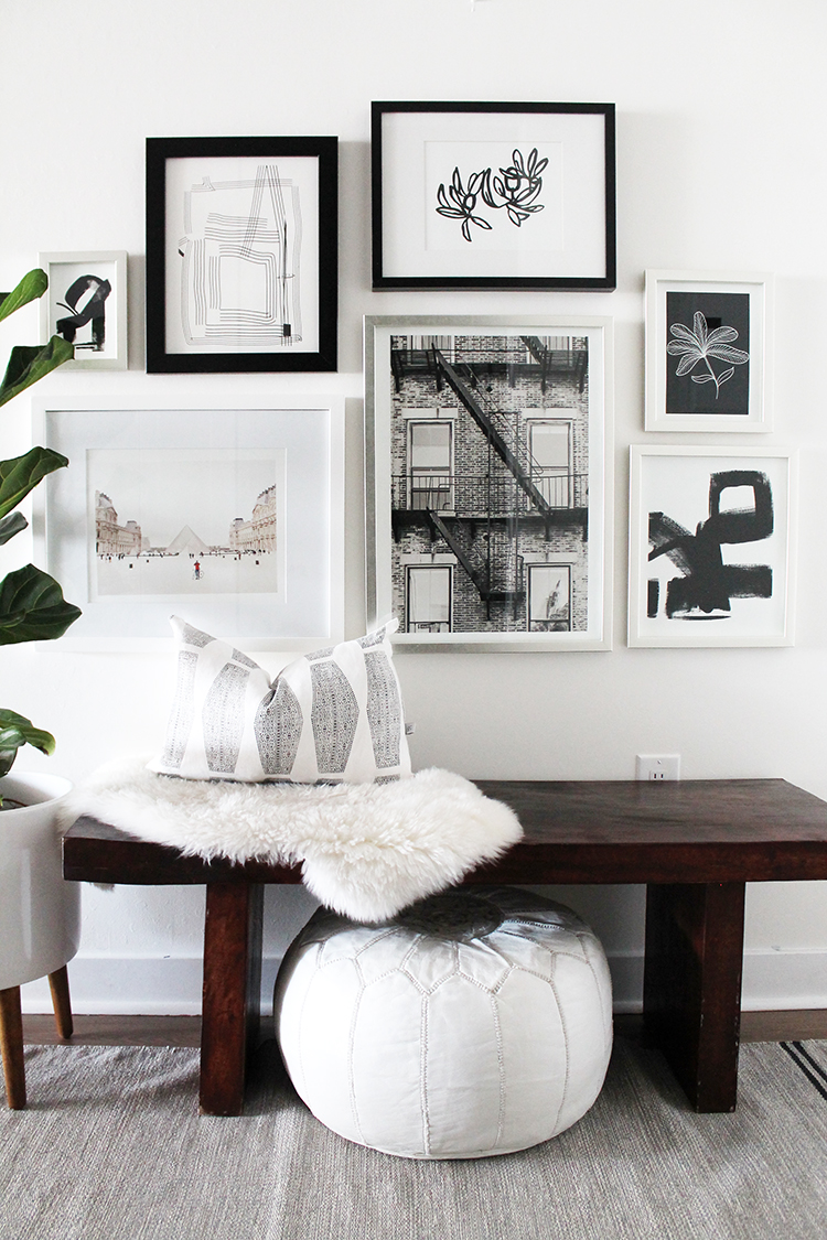
I absolutely love the effortless cool of The Vault File‘s front entry. That Moroccan pouf and lambskin layered on the warm wooden bench add a touch of bohemian comfort for me, and the gallery wall is totally my jam. And that’s where our takeaway lies with this space: CHOOSE ONE ELEMENT TO CREATE COHESION IN A GALLERY WALL. In this case, all of the art is black and white (with the exception of the photograph of the Louvre on the bottom left which has so much white that it doesn’t fight the scheme). This is a really easy way to make it work. If you’re ready to dive into installing your own gallery wall but don’t know how to hang it without sweating right through your shirt, go get this downloadable guide to installing art like a pro.
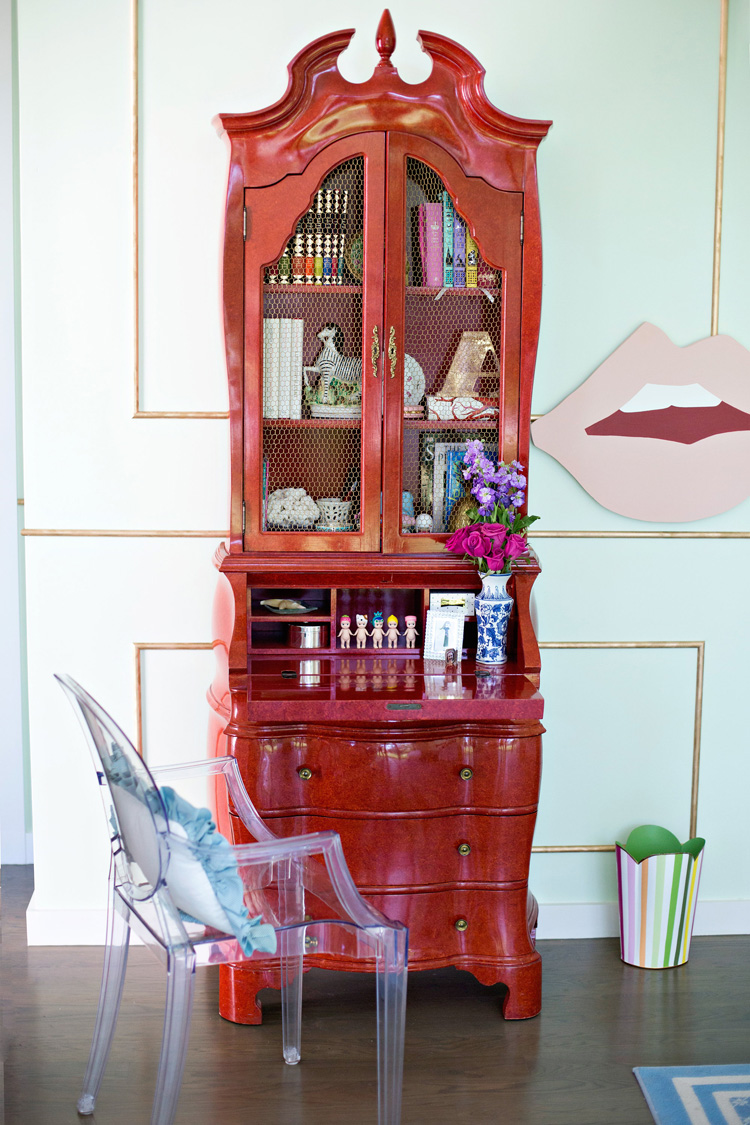
The mint, pink and red colour palette of Mimosa Lane’s kids’ room makeover is all kinds of fun, but that Chinese secretary in lipstick red next to the giant pink lips? Genius. Total styling genius. And those luscious lips are telling us exactly what we should be taking away from this room: ALWAYS TRY TO INCLUDE SOMETHING QUIRKY. As designers it can be really easy to take ourselves too seriously. Okay, as human beings it can be really easy to take ourselves too seriously. Including a necessary dose of quirk keeps things fresh and interesting and keeps us from getting too stale.
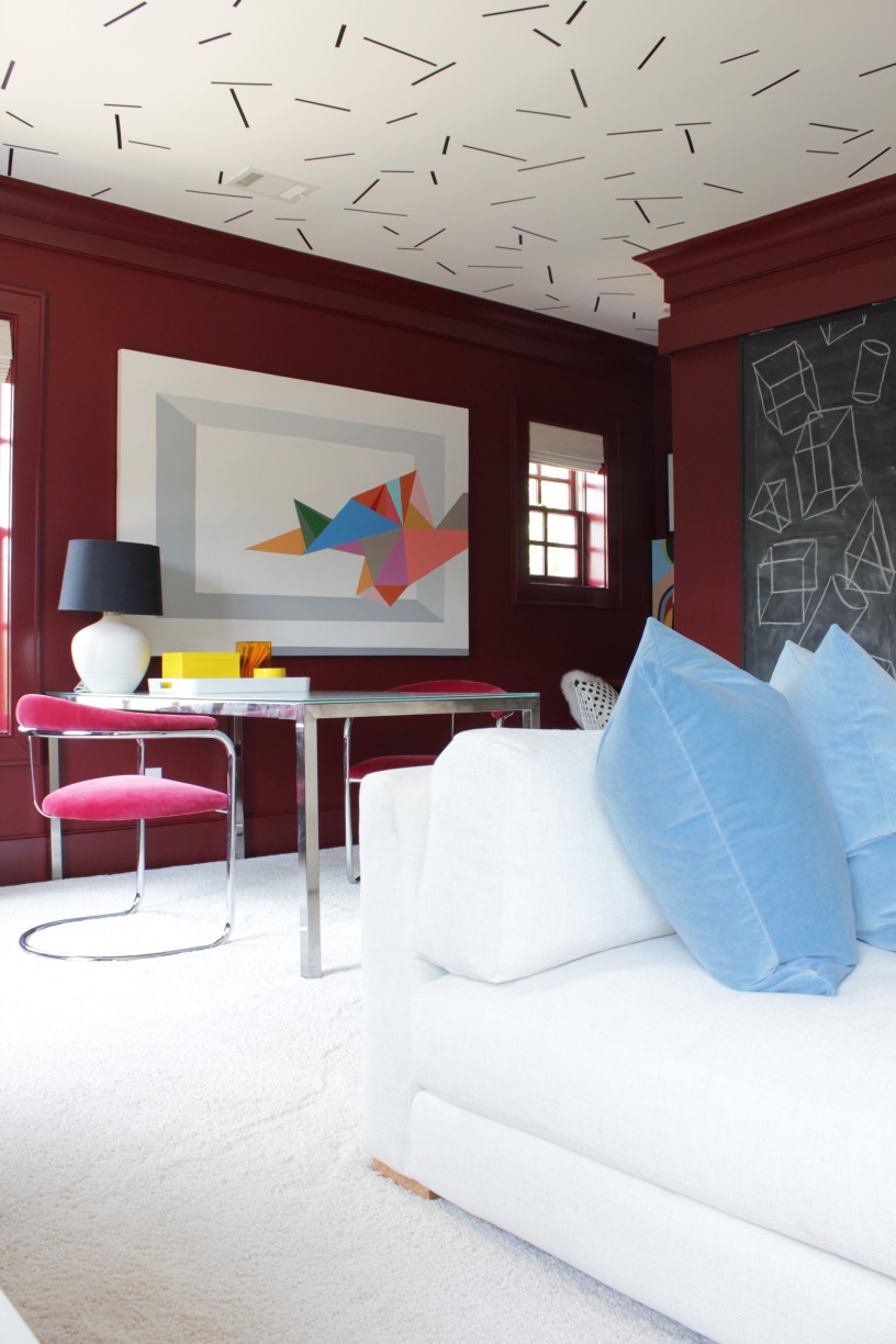
I’m totally crushing on all of the geometry and colour-blocking going on over at The Painted House‘s playroom makeover. It’s not just anyone who can pull of this mix of bold colours, but Angela has nailed it with her signature offbeat style. She’s also heralding a truth that is showing up in all kinds of corners of the design universe: THE 80’s ARE COMING BACK, BABY. You don’t have to get on board with it, but if you decide to, consider Angela your expert guide on how to go back in time with style.
I want to give myself the freedom to post, oh I don’t know, a dozen more of these ORC round-ups because I seriously haven’t scratched the surface of all the linking participants yet. In the meantime, I hope you got something out of these design takeaways! Be sure to come back next week for more inspiration for living a beautiful life.


I love your teaching moments in your blog posts. I just started following many interior design blogs and am beginning to feel like I understand my style and can figure out what I’m doing when decorating my own house (somewhat). For me, I think scale is the hardest challenge.
Scale is definitely professional territory, Liz! It requires consideration of the mass volume of the space, an awareness of light play and form and the intersection of lines from all angles. Be patient! And don’t be afraid to hire someone for a consult if you get stuck. xx Sarah
Thank you so much for including me in this roundup, Sarah!!!! I so appreciate it! Love all of these takeaways!
I just love your work, Claire! To admire it is to learn from you. Thanks for sharing your brilliance with the world! xx