/Sarah Walker The Curated House

About Sarah Walker The Curated House

This author has not yet filled in any details.
So far Sarah Walker The Curated House has created 396 blog entries.

My Top Picks From The Second Annual Design Exchange Design Auction

When it comes to my love for the Design Exchange, I really have two passions fanning the flame. The first is obvious: as a designer, I’m passionate about the pursuit of design excellence and am grateful there is an organization dedicated to preserving and supporting our design heritage as Canadians. Despite what some may think, our design identity is very unique, and I’m grateful to Shauna Levy and the Design Exchange team for their commitment to standing up as a voice for the Canadian design community.

The second passion fanning the flame is perhaps less obvious but of equal importance to me: motherhood. As a mom of two boys, I believe it’s my duty to shape them into well-cultured young men who understand the value of beauty and its importance in shaping society. Knowing that the Design Exchange is committed to educating young minds and empowering them to become design thinkers is so meaningful to me, especially because it reminds me I’m not alone in my mission to raise children who have fully embraced their creative voice.

So when, for the second year running, I was asked to share my favourite picks from the upcoming Design Exchange Design Auction, it was a resounding and immediate heck yes from me! I mean, an opportunity to savour great design while sharing about an incredible organization supporting the Canadian design community? Sign me up.

Without further ado, here are my top picks for the incredible items that will be up for auction at this year’s Design Exchange Design Auction.

the-curated-house-design-exchange-design-auction-top-picks.001

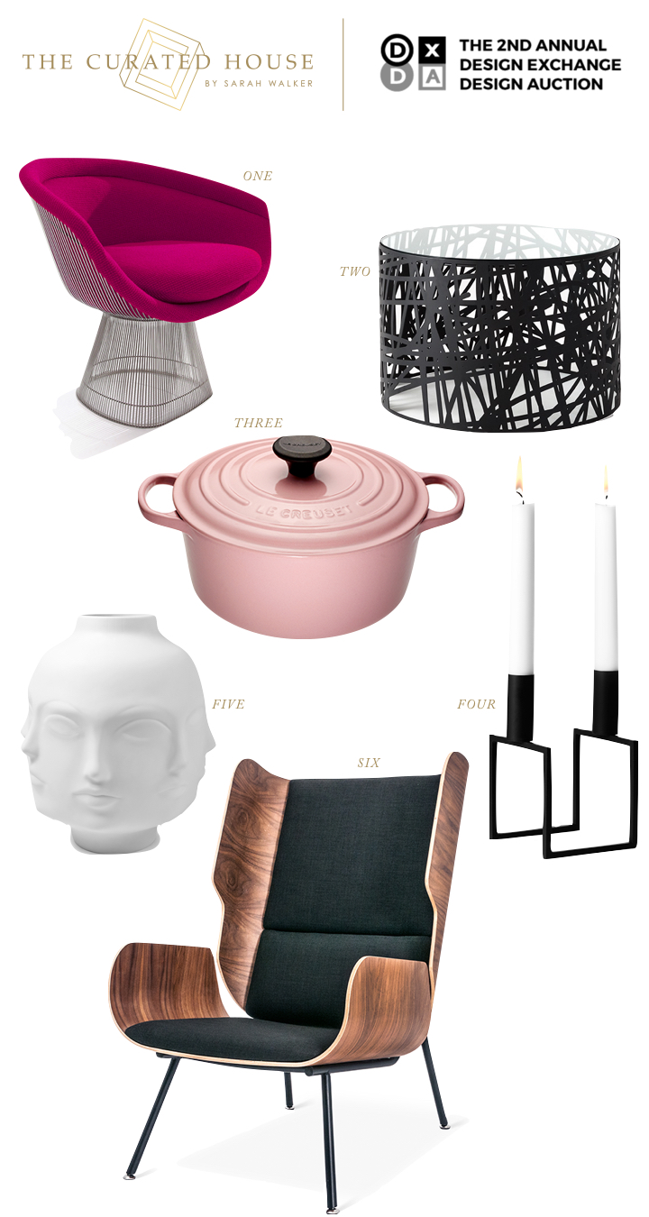
ONE: Warren Platner Chair, donated by Hollace Cluny | TWO: Scribble Table by ii by iv Design, donated by ii by iv Design | THREE: Round French Oven in Pink by Le Creuset, donated by Le Creuset Canada | FOUR: Lassen Line Candleholder, donated by Hopson Grace | FIVE: Giant Dora Maar Vase by Jonathan Adler, donated by Jonathan Adler | SIX: Elk Chair designed by Gus*, donated by Style Garage

I’m very sad to say that my job as a mom will prevent me from attending this year’s auction as I’ll be busy celebrating the end of the school year with my oldest at what will no doubt be the coolest party for 13 year olds ever. But that doesn’t mean that you can’t be there, rubbing shoulders with the who’s-who of the Canadian design scene! Trust me when I say that all the big names are there. It’s a fashion show and a design auction all wrapped up in one, and it is definitely not to be missed! The GREAT news is, I’m giving away a pair of tickets, and entering is easy peasy:

  1. Make sure you’re following both me and the Design Exchange on Instagram.
  2. Check out the full list of auction items here and post your favourite on Instagram including the tags #thecuratedhouseXdesignexchange and #dxda in your post.
  3. Come back and comment on this post to let me know you’ve entered!

I’ll announce the winner in next week’s post and will make you pinky-swear to tag me in your Instagram posts of this swishy event. Can’t wait to see which auction items are your fav’s!

Sarah-Signature

By |June 1st, 2016|0 Comments

Copper Crush | How To Incorporate Copper Into Your Home

DSC_4810a

If my recent One Room Challenge reveal didn’t show all my cards, I’m here to completely show my hand and say that I have a designer’s crush on copper. It’s a timeless classic metallic that has been used for centuries, and yet it’s coming back on the scene in a big way right now as a modern accent that is both warm, welcoming and edgy. I’m still blown away by how adding just a few touches of copper in my kitchen has made such a huge impact. Here’s my favourite little vignette:

my-kitchen-coopper-accents

Simple. Classic. Modern. Timeless.

Love, love, love.

Today I thought I’d share just a few of my favourite ways to incorporate copper into your home. Each one is simple and easy to integrate without totally redesigning your space, and most are quite reasonably priced with something for every budget on the list.

copper-crush-the-curated-house

ONE: I love these simple, modern marble drink coasters set in a copper holder, the perfect hostess gift and an elegant statement on any coffee table. // TWO: Did you catch this copper flatware from West Elm in my dining room refresh? So simple and elegant. A warm and welcome addition to any dinner party. // THREE: I’ve been in love with this Blu Dot Copper Counter Stool ever since I first laid eyes on it at Her Majesty’s Pleasure in Toronto. Modern simplicity at its best. // FOUR: This elegant Duet Vase in Nero Marble and Copper by Michael Verheyden is available through Avenue Road. It’s the height of simple sophistication. // FIVE: The decadence of this copper pendant, designed by Jorn Utzon and available through Mjolk, is found in its Danish simplicity and elegant form. Three of these beauties suspended over an island would make a stunning Scandinavian-inspired statement.

So what do you think? Are you crushing on copper like me? Tell me if you love it or hate it and where you’d use it in the comments below, and be sure to come back next week for more fabulous inspiration for living a beautiful life.

Sarah-Signature

By |May 25th, 2016|2 Comments

My One Room Challenge Favourites | Style Takeaways From The Spring 2016 Edition

So it’s been one week since the One Room Challenge reveals broke the internet, and I’m still not even remotely caught up on everyone’s gorgeousness yet. While I play catch up, I thought I’d share some of my favourites with you thus far along with a few design lessons we can take away from each one.

claire-brody-ORC-spring-2016-reveal

I love absolutely everything about Claire Brody‘s transformation (you must see the befores to truly appreciate it!). From the neutral palette to the layers of texture and pattern to mix of old and new to the bold artwork, light fixture and rug, this room has it going on. I also love that the room feels like it could have been this way for years – it’s inviting and approachable and feels like it tells a story. That takes talent. But the number one design lesson we should all takeaway from this room is: SCALE MATTERS. If that rug was smaller, if that art was smaller, if that light fixture was smaller…the whole thing would feel off. Balance isn’t just about symmetry. It’s about scale too. Brava, Claire. I feel like we should be design neighbours! I’d be visiting for tea or bringing over a bottle of wine on the regular.

JillSorensen_2710 JillSorensen_2717

I love Jill Sorensen‘s space pretty hard. I had to show you two photos for the takeaway from her space, which is this: BOLD COLOUR SCHEMES REQUIRE DISCIPLINE. What does that mean, you ask? Jill’s palette is a mix of gold, royal blue, black and white, and she disciplined herself to repeat the mix in variations of dominance throughout the entire space. Repetition is KEY with a colour scheme that features more than one strong colour choice, and Jill absolutely nailed it here. Also, that greek key Moroccan-inspired rug from her collection is the bomb.

Design-Manifest-Kitchen-Black-cabinets-white-shiplap

I’ve had a fellow designer’s crush on Naomi from Design Manifest for a year now. What I love about her aesthetic is that she creates classic foundations with expressive details. And that’s really our takeaway from her space: GO CLASSIC ON THE BIG STUFF, GO BOLD WITH THE SMALL STUFF. That may not always translate literally. What I mean is this: cabinetry, countertops, backsplash and appliances are all big ticket items that you’re not likely going to change on the regular, whereas the paint on your counter stools, cabinetry hardware and the fabric used to make a small roman shade can easily be changed up when you tire of your current accents. Know where to be daring and know where to be timeless so that your space speaks to your personality but leaves you with the flexibility to evolve the look over time.

waiting-on-martha-spring-ORC-2016-reveal

I absolutely love the layered, neutral-but-never-boring space that Mandy and the team over at Waiting On Martha created for their new office space. The number one detail that stole my heart is the sign behind the desk which reads, “Remember Why You Started.” And that’s our takeaway: ALWAYS INCLUDE SOMETHING THAT SPEAKS TO YOUR HEART. Good design should tell your story. It doesn’t necessarily have to do so with words as in this example, but it should ground you and remind you of who you are and what matters to you. Major props to Mandy for getting this so right.

christine-dovey-ORC-spring-2016-reveal

Christine Dovey refined the design plan for her master ensuite over two rounds of the One Room Challenge, and honestly, you can tell. There’s a lot of love in all those layers of texture and pattern play and the mix of modern and vintage. It’s sexy and sophisticated and glamorous. The takeaway from Christine’s space? MASTERING THE MIX TAKES TIME. Take the time to really work out your design plans and keep editing until your space goes beyond beautiful to something bespoke and unexpected. You’ll be glad you did.

simplified-bee-ORC-spring-2016-reveal

Cristin from the Simplified Bee‘s bathroom floor may just have made me stumble. That’s right, I’m here to confess to everyone listening that I am coveting that geometric marble gorgeousness with total abandon, and I don’t care who knows it. The design takeaway from this stunning bathroom makeover? MASTER BATHROOM FLOORS WERE MADE TO BE DROOLED OVER. If there is anywhere to embrace bold pattern in a big investment item, it’s on your Master Bathroom floor. This one happens to be bold and classic, sophisticated and timeless all at once, and that’s the benchmark for this kind of design statement. To. Die. For.

the-vault-files-ORC-spring-reveal-2016

I absolutely love the effortless cool of The Vault File‘s front entry. That Moroccan pouf and lambskin layered on the warm wooden bench add a touch of bohemian comfort for me, and the gallery wall is totally my jam. And that’s where our takeaway lies with this space: CHOOSE ONE ELEMENT TO CREATE COHESION IN A GALLERY WALL. In this case, all of the art is black and white (with the exception of the photograph of the Louvre on the bottom left which has so much white that it doesn’t fight the scheme). This is a really easy way to make it work. If you’re ready to dive into installing your own gallery wall but don’t know how to hang it without sweating right through your shirt, go get this downloadable guide to installing art like a pro.

mimosa-lane-ORC-spring-2016-reveal

The mint, pink and red colour palette of Mimosa Lane’s kids’ room makeover is all kinds of fun, but that Chinese secretary in lipstick red next to the giant pink lips? Genius. Total styling genius. And those luscious lips are telling us exactly what we should be taking away from this room: ALWAYS TRY TO INCLUDE SOMETHING QUIRKY. As designers it can be really easy to take ourselves too seriously. Okay, as human beings it can be really easy to take ourselves too seriously. Including a necessary dose of quirk keeps things fresh and interesting and keeps us from getting too stale.

the-painted-house-ORC-spring-2016-reveal

I’m totally crushing on all of the geometry and colour-blocking going on over at The Painted House‘s playroom makeover. It’s not just anyone who can pull of this mix of bold colours, but Angela has nailed it with her signature offbeat style. She’s also heralding a truth that is showing up in all kinds of corners of the design universe: THE 80’s ARE COMING BACK, BABY. You don’t have to get on board with it, but if you decide to, consider Angela your expert guide on how to go back in time with style.

I want to give myself the freedom to post, oh I don’t know, a dozen more of these ORC round-ups because I seriously haven’t scratched the surface of all the linking participants yet. In the meantime, I hope you got something out of these design takeaways! Be sure to come back next week for more inspiration for living a beautiful life.

Sarah-Signature

By |May 18th, 2016|4 Comments