/Art Interiors

“Ocean” Master Ensuite – Part 1 – Creating Texture with Tile

Today I thought I’d show you a stunning master ensuite that I had the privilege of designing for the loveliest of clients. She’s a woman with exquisite taste, is thoughtful and kind, and she trusts me implicitly {read: THE BEST}.


This was a renovation project, and as such, the floor plan wasn’t really up for negotiation. Moving the plumbing stack for the toilet would have just been too costly, and that was really the only change we would have considered (swapping it with the shower). Thankfully it was a generous space to start with and we were content with the placement of all the key elements. Our biggest change in the end was to add a 2-way fireplace…but I’m getting ahead of myself.

Regardless of whether you are renovating or redecorating, I always say you should start from your inspiration point and work your way out. As you’re coming to learn about me, I start with art whenever possible, but with a bathroom I start with the tile and the vanity design. Tile is not just tile anymore, my friends. Tile is an opportunity to work with colour and texture in some really inspired ways, especially if you think outside the box.

In the case of this bathroom, “outside the box” was about how we used the tile that captured our hearts: a Vein-Cut Ocean Travertine. We fell in love with it for its quiet, watery palette, but my creative imagination was already one step ahead with the excitement of what could be done with it.

What I love about the Vein-Cut stone is the linear grain structure. While it still has some natural swirl and variation, it has a much cleaner, more contemporary feel than Cross-Cut stone. This worked beautifully for this Master Ensuite where we wanted a warm but modern feel to the space.

Rather than just lay it straight, I chose to have the 12″ x 24″ tiles cut into 2.5″ wide planks (like hardwood flooring planks). I then designed a tile carpet, and the inset of the carpet was carefully crafted out of these 2.5″ x 24″ planks to create a stunning yet subtle, beautifully textured herringbone pattern. (Confession: I am addicted to all things herringbone!)

I designed the herringbone tile carpet to be bordered with a combination of 5/8″ x 5/8″ moonstone mosaics (5 rows) and then on either side of that, a single strip of 5/8″ x 6″ moonstone to create a clean finish. The remaining outer portion of the floor was set with uncut 12″ x 24″ tiles.

The photo above shows you one of my favourite details with the vanity. We used the same travertine in 1 1/2″ thick slab for the countertops (double the standard thickness of 3/4″). I wanted the vanity to feel like a furniture piece, so I decided to set the stone down into the top of the centre, raised drawer section to mimic a leather damper on an old fashioned desk. The beveled wood edge that slopes off from the stone inset is a simple but extremely elegant detail.

The placement of the tub over the border edge of the tile carpet really makes the tile carpet feel like an area rug in the middle of the space. I love this effect. It takes the plumbing fixtures and cabinetry to a whole new level while anchoring each element, tying them together as with an area rug in an elegant living room.

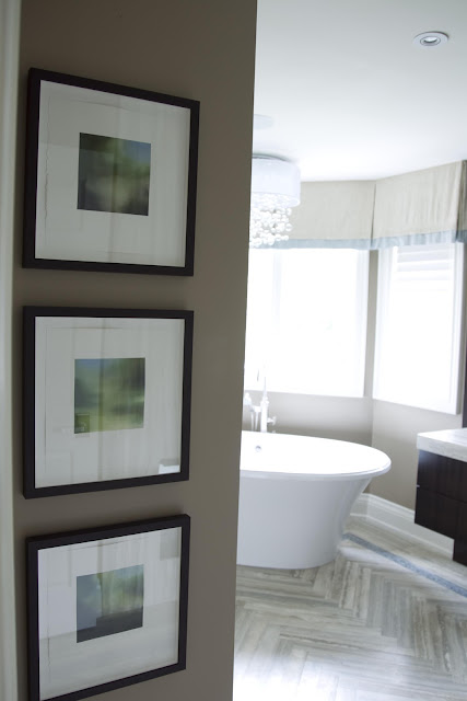
This photo shows our grouping of 3 small pieces of art leading into the bathroom (all from a series by David Gillanders via Art Interiors). For this project, the art was one of our finishing touches rather than our starting point, but the watery, blue-green palette is just perfect for the tile’s inspirational story line. I love how these 3 smalls connect so beautifully with the quiet colour and texture of the tiles.

Not to be forgotten, the shower was yet another opportunity to showcase tile in an interesting way. I made use of the linear grain on the walls to create a greater sense of depth by using the grain horizontally to push the eye away. The shower floor is a tumbled version of the same 5/8″ x 5/8″ mosaic. Always go for tumbled on the shower floor whenever possible – it has better grip and you won’t find yourself slipping as often! I absolutely love the beautifully framed and beveled shower cubby and the cantilevered solid stone shower bench (in the photo above). The floating effect of the bench mimics the “his and hers” floating sink cabinets on the vanity. This repeated floating element plays well off of the watery, suspended feeling of the colour palette. It takes the cliché of “spa bathroom” to a whole new level of sophistication in my book.
 

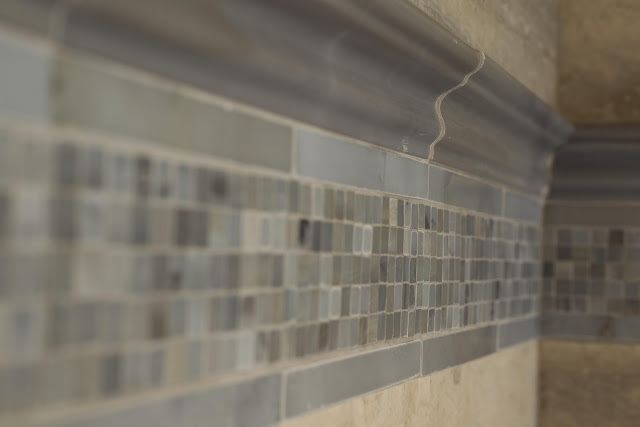
The shower’s tile inset reflects the border on the main floor’s tile carpet with the addition of a chair rail in the natural polished moonstone. So delicious you could almost bite it! I love the dimension the chair rail gives this shower detail.

Tomorrow I’ll share a bit more about the vanity and reveal the amazing 2-way fireplace we created. It’s a stunner! Can’t wait to share it with you.

xo
s.

All photos courtesy of Jordan Fretz

By |July 3rd, 2012|1 Comment

For the Detailistas: My Dining Room

So as it turns out, I am not alone. I believe that details are a love language, and it appears that you do too, as many of you have already been asking about details from a couple of my first posts! Remember the post about my garden peonies? Well many of you Detailistas out there noticed the art and furniture in my dining room and wanted to know more…so it is of course my pleasure to oblige! Here is the photo that started the questions:

And here, my lovely friends, are the answers! First, the ART! (that’s always my favourite place to start)

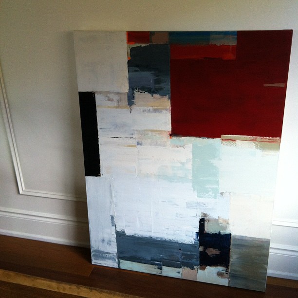
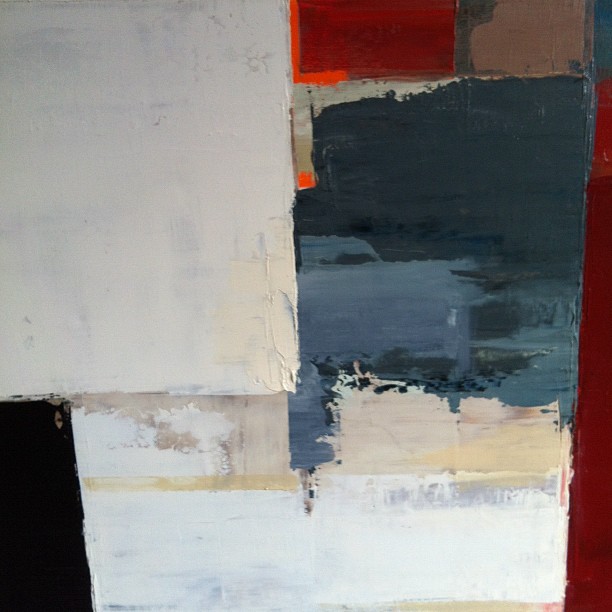
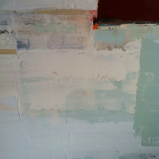
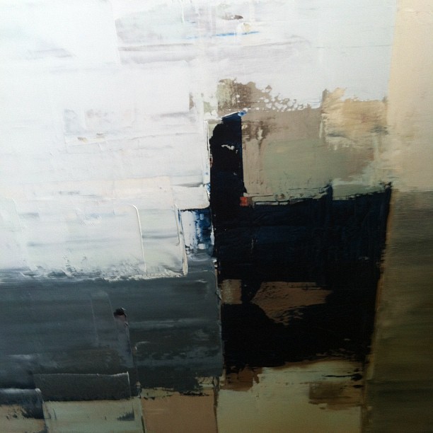
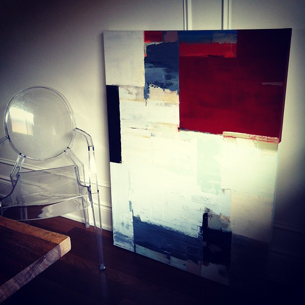
This piece by Kathleen Weich came to us from Art Interiors a few years ago now. I love the palette, the texture and the movement in it. Here are a few close up shots so you can see more of the delightful details:

We engage with this piece every day, and it speaks quite elegantly to the other art we have in the space. I think it makes the dining room quite special with its modern and sophisticated statement.

Next, the chairs! These Louis Ghost chairs – designed by Parisian designer Philippe Starck in 2002 – are an iconic design classic from Italy’s Kartell. They are a truly modern twist on design history: a reinvention of the classic Louis XVI armchair now done in this transparent lucite, a material invented in 1931 by Dupont. These chairs have been called a postmodern triumph of technical innovation and historical style. If you’ve been to visit Versailles, they should feel familiar to you (minus the ornate, small-scale print fabrics and gilded woodwork, of course).

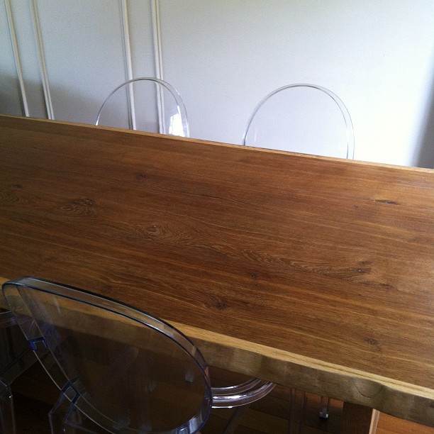
For me, they are a perfect juxtaposition against my classic panel moulding and my clean-lined, contemporary, live-edged white oak dining table. The panel moulding carries across the shared dining room and living room wall, breaking it up and giving it the dimension it needs to frame and define each space. At a cost of $70, it was a great investment! Now here’s the table:

This live-edge, solid European raw white oak table actually came from Crate + Barrel! It fits the space perfectly and we love the raw wood…or at least we do now. When the table first arrived, the almost dusty looking raw wood finish made me giddy. I loved the quiet, driftwood-coloured palette and the organic simplicity. Then we ate at the table. No matter what meal we ate, we left indelible “evidence” behind in the form of grease marks and stains. No amount of scrubbing would remove them. I was losing my mind! Rings and drip marks on this perfect slab of nature would not do!

First, I had my furniture maker sand it and put on a coat of water-based finish. We got about a week out of that before this very thirsty table once again began to absorb every stain.

My next move was a stroke of genius if I may say so myself. I decided to go with the “if you can’t beat ’em, join ’em” rule of life, pulled out a beautiful Tuscan olive oil and poured it all over my table. I let it sit for a couple of hours, wiped up the excess with some paper towel, et voilà! My beautiful table was circle-and-drip-free and restored to it’s simple perfection. Now we oil it every few months. The oil soaks into the thirsty wood but prevents other grease and finger marks from making me crazy. Sanity restored!

Last but not least, this simple, rectangular drum-shade light fixture came from Restoration Hardware. I’ve used it on a few design projects for clients and find it to be very harmonious. It casts a beautifully distributed, even glow on the table due to the frosted acrylic base and the large rectangular linen shade. Its clean lines and simplicity don’t fight the art, the paneling or the furnishings while still complimenting the proportions of the room and anchoring the table quite nicely.

So there you have it! The details for all you Detailistas out there. Hope this provides some inspiration for your next design project.

xo
s.

P.S. Feel free to post your questions and comments in the comments section below each post. I’d love to get our dialogue off of FB and onto the blog so we can share it with everyone!

By |June 27th, 2012|10 Comments

Working with Colour: How To Pick A Palette

Longing for more colour in your life but not sure where to start or how to find your perfect palette? When decorating a new space, I recommend starting with 2 things: your rug and original art.

As the soul of the space, art speaks to all of the other furnishings and finishes and often provides an inspiring palette you would never find on a strip of paint chips. With a beautiful piece of original art communicating the intended mood and taking centre stage, paint colours on the walls can be more subdued, taking a back seat to the more sophisticated focal point of the artwork. Much of my home is painted a very subtle cream (Sherwin Williams Creamy 7012), but it is brought to life by our small and treasured collection of original art.

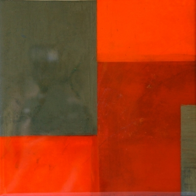
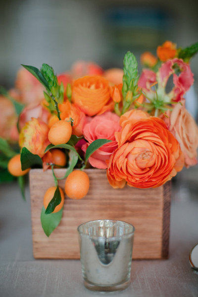
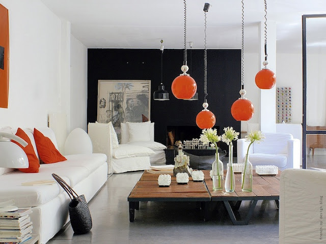
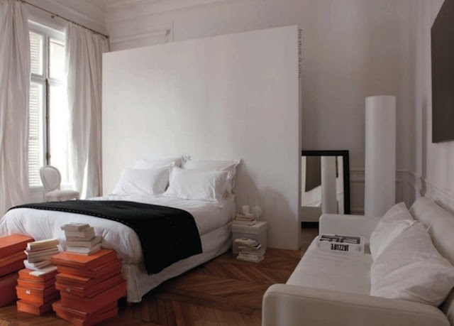
I thought I’d offer up an example today that features one of the hottest colours of the season (and my favourite accent colour of the moment): Tangerine Tango. This mouth-watering red-ish orange will definitely add a dynamic energy to any space and was named Pantone Color Institute’s colour of the year for 2012.

Maya Foltyn “Downtown” via Art Interiors

For my tastes, this bold colour would be too strong to paint a room or even a wall with it, but I wouldn’t hesitate to bring it into my space through a small (or even large) accent via a piece of original art like this dynamic modern painting above from Maya Foltyn.

A stunning arrangement of Orange Ranunculus and Kumquats via Style Me Pretty
Tangerine Tango livening up a classic dining chair
an otherwise neutral space comes to life thanks to dynamic orange accents
love the way these stacked Hermès boxes punctuate an otherwise casual white bedroom – via French By Design

If a large, statement piece of original art is not quite in your budget at the moment, I have three suggestions!

ONE: start by collecting smalls! I have many canvases that are as small as 5×5 punctuating my home throughout on bookcases or in small groupings on walls. Here’s an example from my space, a lovely 12×12 modern acrylic I gave my husband for Christmas several years ago:

Painting by Kathleen Weich (via Art Interiors)

Not only are small canvases surprisingly reasonable, they add a sense of story as we curate our collection over time.

TWO: watch for “Make Something Mondays,” coming soon to The Curated House! I promise to offer inspiration and options a-plenty.

And THREE: decorative cushions are a wonderful way to infuse a pop of colour into what might otherwise be a neutral space (they also have a much smaller price tag attached). They are of course easily changed with the seasons, so the colour-commitment-phobes in our midst can breathe a sigh of relief and dive into this trend head-first.

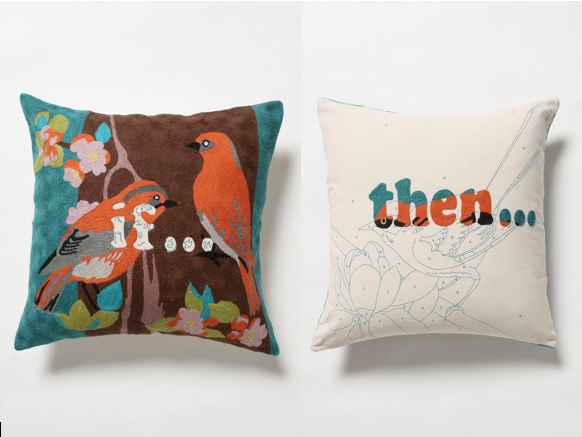
For example, if Tangerine Tango has whetted your appetite for all things orange, why not pull it out of a whimsical pillow like this “If…Then…” crewel-work piece from Anthropologie?

“If…Then…” pillow available at Anthropologie

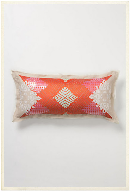
Or this delightfully sequined, more sophisticated linen loveliness called the Sailendra Pillow, also from Anthropologie?

Sailendra pillow available at Anthropologie

At the end of the day, my advice this season is to find your adventurous side and express yourself with a splash of something fabulous. Be it through art or accents, you can enrich your home with the joy of colour. Your conversations are bound to be livelier and your mood will lift along with the rising temperatures!

xo
s.

By |June 18th, 2012|0 Comments