/herringbone

Kitchen Confidential: Replace or Reface?

After sharing the TOP 10 LIST for planning your kitchen renovation yesterday, I thought I’d share an interesting project I did with the loveliest of clients a couple of years ago.

Kitchen update following PHASE 2

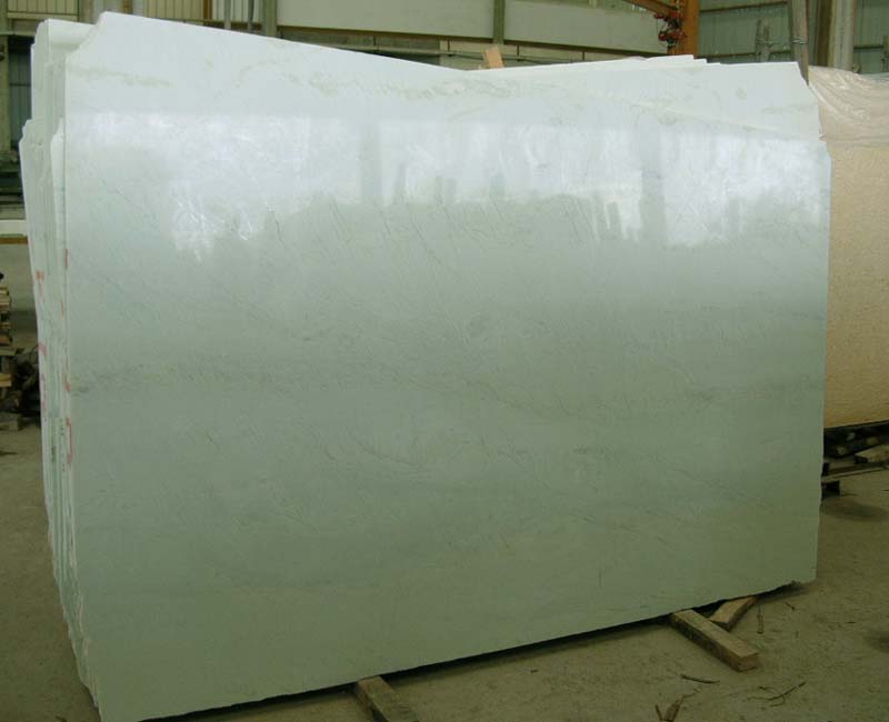
I’ve had the privilege of working with this client over a number of years, actually. When they first purchased this home, they weren’t ready to do a full redo on the kitchen but they REALLY hated their countertops. We sourced some gorgeous Ming Green granite, paired it with a sparkling yet classic back-painted glass subway tile for the backsplash, and created a very lovely kitchen refresh for Phase 1 of this kitchen renovation (sorry…no image of Phase 1 available!).

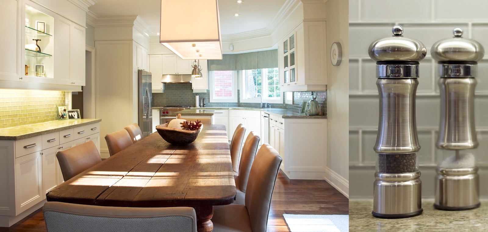
A few years later, my client was ready to build off the work we had already done. The cabinets were functional, but the door profile was very dated. The 80’s home also had unsightly bulkheads above the cabinets and the overall look of the kitchen was still unfinished. Clearly it was time for Phase 2.

Rather than removing the cabinets and wasting the investment they had made a few years earlier with the ming green granite counters and back- painted glass subway tile backsplash, we chose to simply reface the kitchen cabinets instead of replacing them. We chose a double-step Shaker profile for the doors and end gables. We also added two new beveled glass doors to lighten and brighten the feel of the kitchen. We then hid the unsightly bulkhead by installing a frieze mould, frieze board and a substantial crown moulding around the top of the cabinets to finish the look of the kitchen and offer a much stronger architectural presence. This design choice was possibly one of the most transformative changes to the kitchen, as it gave the space a completely custom built look. The doors were custom sprayed in a controlled booth while the face frames of the cabinetry, the frieze and the crown were all professional sprayed with lacquer on-site for a flawless finish.

We then installed these gorgeous pulls and coordinating knobs from Restoration Hardware in a brushed nickel finish for a classic, sophisticated look.

Duluth Pulls from Restoration Hardware

We updated the lighting with two new pendants over the island and this gorgeous rectangular drum shade chandelier from Restoration Hardware. (You may remember this light fixture from my own dining room!)

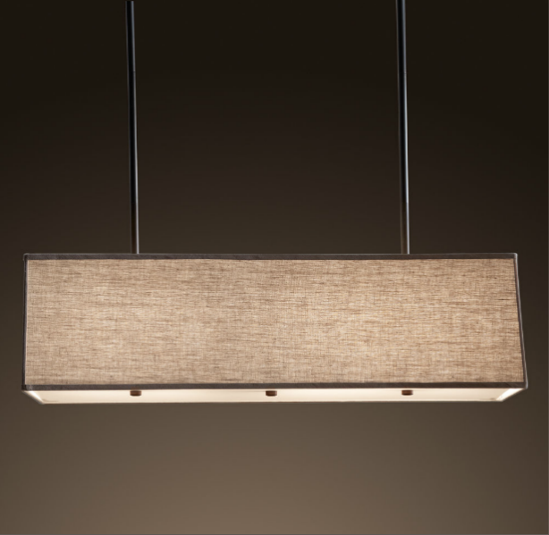
Rectangular Shade Pendant from Restoration Hardware

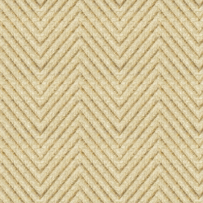
The chandelier anchors a STUNNING antique harvest table from Quebec. It is surrounded by chairs that I had custom upholstered in a combination of a Kravet bone and tan herringbone weave on the outside backs and a buttery soft tan leather on the inside back and seats. Truly delicious!

I hope this kitchen’s two stage renovation has inspired you with the possibilities of what can be done! The final budget for the kitchen was 1/4 to 1/3 of what it would have cost if we had ripped out all the cabinets and replaced them, but I think the end result is simply beautiful.

xo
s.

By |July 24th, 2012|3 Comments

“Ocean” Master Ensuite – Part 1 – Creating Texture with Tile

Today I thought I’d show you a stunning master ensuite that I had the privilege of designing for the loveliest of clients. She’s a woman with exquisite taste, is thoughtful and kind, and she trusts me implicitly {read: THE BEST}.


This was a renovation project, and as such, the floor plan wasn’t really up for negotiation. Moving the plumbing stack for the toilet would have just been too costly, and that was really the only change we would have considered (swapping it with the shower). Thankfully it was a generous space to start with and we were content with the placement of all the key elements. Our biggest change in the end was to add a 2-way fireplace…but I’m getting ahead of myself.

Regardless of whether you are renovating or redecorating, I always say you should start from your inspiration point and work your way out. As you’re coming to learn about me, I start with art whenever possible, but with a bathroom I start with the tile and the vanity design. Tile is not just tile anymore, my friends. Tile is an opportunity to work with colour and texture in some really inspired ways, especially if you think outside the box.

In the case of this bathroom, “outside the box” was about how we used the tile that captured our hearts: a Vein-Cut Ocean Travertine. We fell in love with it for its quiet, watery palette, but my creative imagination was already one step ahead with the excitement of what could be done with it.

What I love about the Vein-Cut stone is the linear grain structure. While it still has some natural swirl and variation, it has a much cleaner, more contemporary feel than Cross-Cut stone. This worked beautifully for this Master Ensuite where we wanted a warm but modern feel to the space.

Rather than just lay it straight, I chose to have the 12″ x 24″ tiles cut into 2.5″ wide planks (like hardwood flooring planks). I then designed a tile carpet, and the inset of the carpet was carefully crafted out of these 2.5″ x 24″ planks to create a stunning yet subtle, beautifully textured herringbone pattern. (Confession: I am addicted to all things herringbone!)

I designed the herringbone tile carpet to be bordered with a combination of 5/8″ x 5/8″ moonstone mosaics (5 rows) and then on either side of that, a single strip of 5/8″ x 6″ moonstone to create a clean finish. The remaining outer portion of the floor was set with uncut 12″ x 24″ tiles.

The photo above shows you one of my favourite details with the vanity. We used the same travertine in 1 1/2″ thick slab for the countertops (double the standard thickness of 3/4″). I wanted the vanity to feel like a furniture piece, so I decided to set the stone down into the top of the centre, raised drawer section to mimic a leather damper on an old fashioned desk. The beveled wood edge that slopes off from the stone inset is a simple but extremely elegant detail.

The placement of the tub over the border edge of the tile carpet really makes the tile carpet feel like an area rug in the middle of the space. I love this effect. It takes the plumbing fixtures and cabinetry to a whole new level while anchoring each element, tying them together as with an area rug in an elegant living room.

This photo shows our grouping of 3 small pieces of art leading into the bathroom (all from a series by David Gillanders via Art Interiors). For this project, the art was one of our finishing touches rather than our starting point, but the watery, blue-green palette is just perfect for the tile’s inspirational story line. I love how these 3 smalls connect so beautifully with the quiet colour and texture of the tiles.

Not to be forgotten, the shower was yet another opportunity to showcase tile in an interesting way. I made use of the linear grain on the walls to create a greater sense of depth by using the grain horizontally to push the eye away. The shower floor is a tumbled version of the same 5/8″ x 5/8″ mosaic. Always go for tumbled on the shower floor whenever possible – it has better grip and you won’t find yourself slipping as often! I absolutely love the beautifully framed and beveled shower cubby and the cantilevered solid stone shower bench (in the photo above). The floating effect of the bench mimics the “his and hers” floating sink cabinets on the vanity. This repeated floating element plays well off of the watery, suspended feeling of the colour palette. It takes the cliché of “spa bathroom” to a whole new level of sophistication in my book.
 

The shower’s tile inset reflects the border on the main floor’s tile carpet with the addition of a chair rail in the natural polished moonstone. So delicious you could almost bite it! I love the dimension the chair rail gives this shower detail.

Tomorrow I’ll share a bit more about the vanity and reveal the amazing 2-way fireplace we created. It’s a stunner! Can’t wait to share it with you.

xo
s.

All photos courtesy of Jordan Fretz

By |July 3rd, 2012|1 Comment