/interior design

The Cosmopolitan Closet Of Your Art Deco Dreams | Les Ensemblier at Kips Bay Show House 2016

“Design must seduce, shape, and perhaps more importantly, evoke an emotional response.” I love this quote from artist April Greiman and couldn’t agree more. Good design is about more than just beauty. That’s why the foundational design philosophy at iconic Canadian design firm Les Ensembliers resonates so deeply with me. Their mission is to build meaning into beauty, and they do so with a refined elegance that is truly breathtaking.

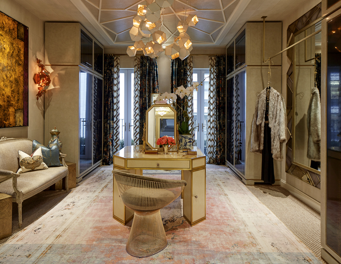
So when your mission is to imbue meaning into your design work, where do you begin when starting with a concrete box, no architectural details, no client’s story to tell in the space, and only one month to design and execute? If you are the brilliant partners at Les Ensembliers – architect Maxime Vandal and interior designer Richard Ouelette – you begin with the classical elements of style, proportion and space planning and a trusted partnership with the construction team at Best & Co.

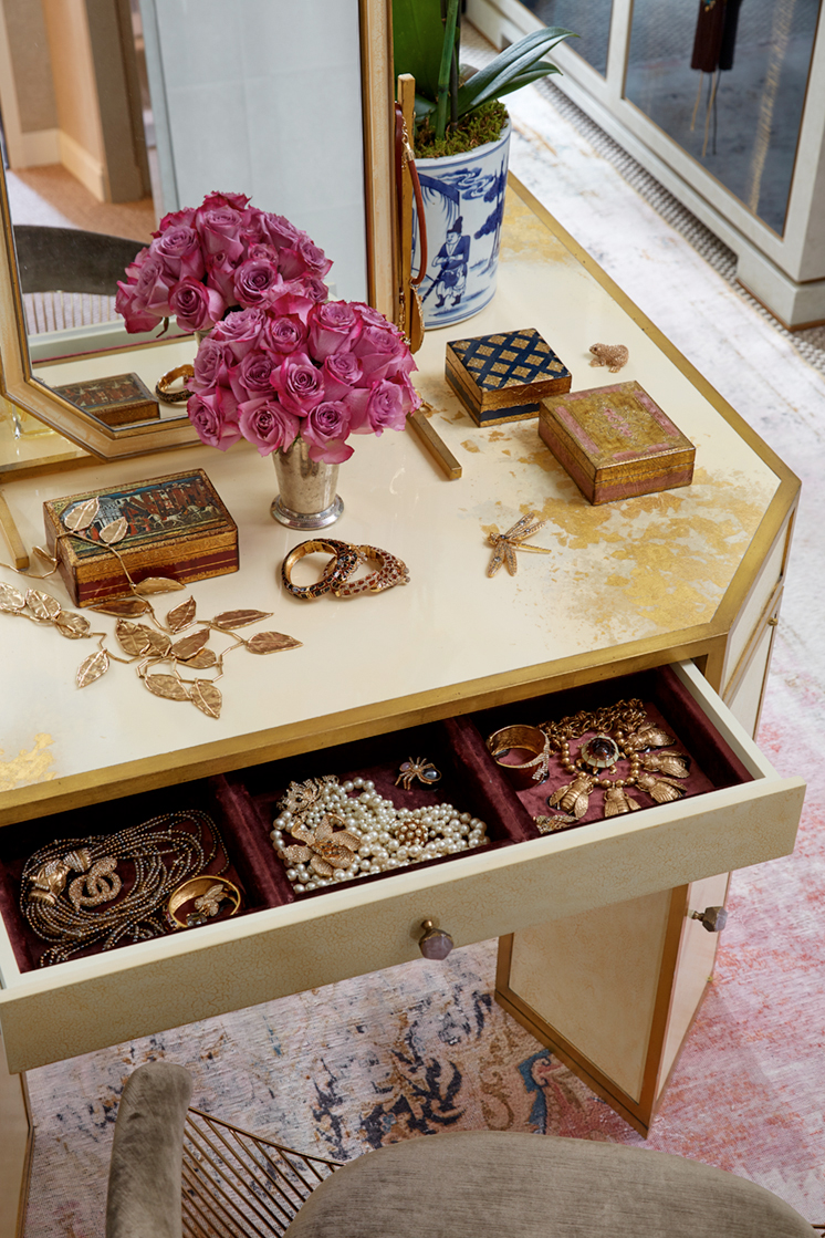
“We had to imagine our own story for the dressing room, so we envisioned what we would do if we were designing Lauren Bacall’s private retreat, the secret place where she would keep her most prized collection of treasured things. It became a secret garden, like the inside of a jewel box.”

KipsBay2016_LesEnsembliers_B_004_Build

KipsBay2016_LesEnsembliers_H_008

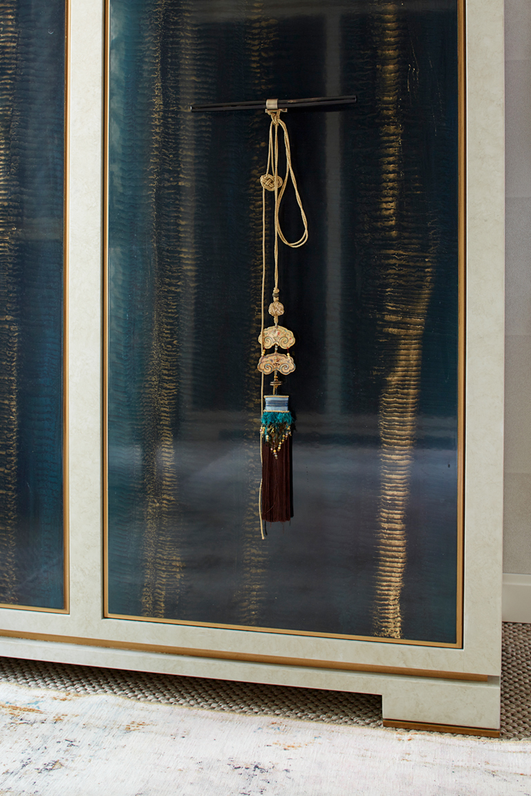
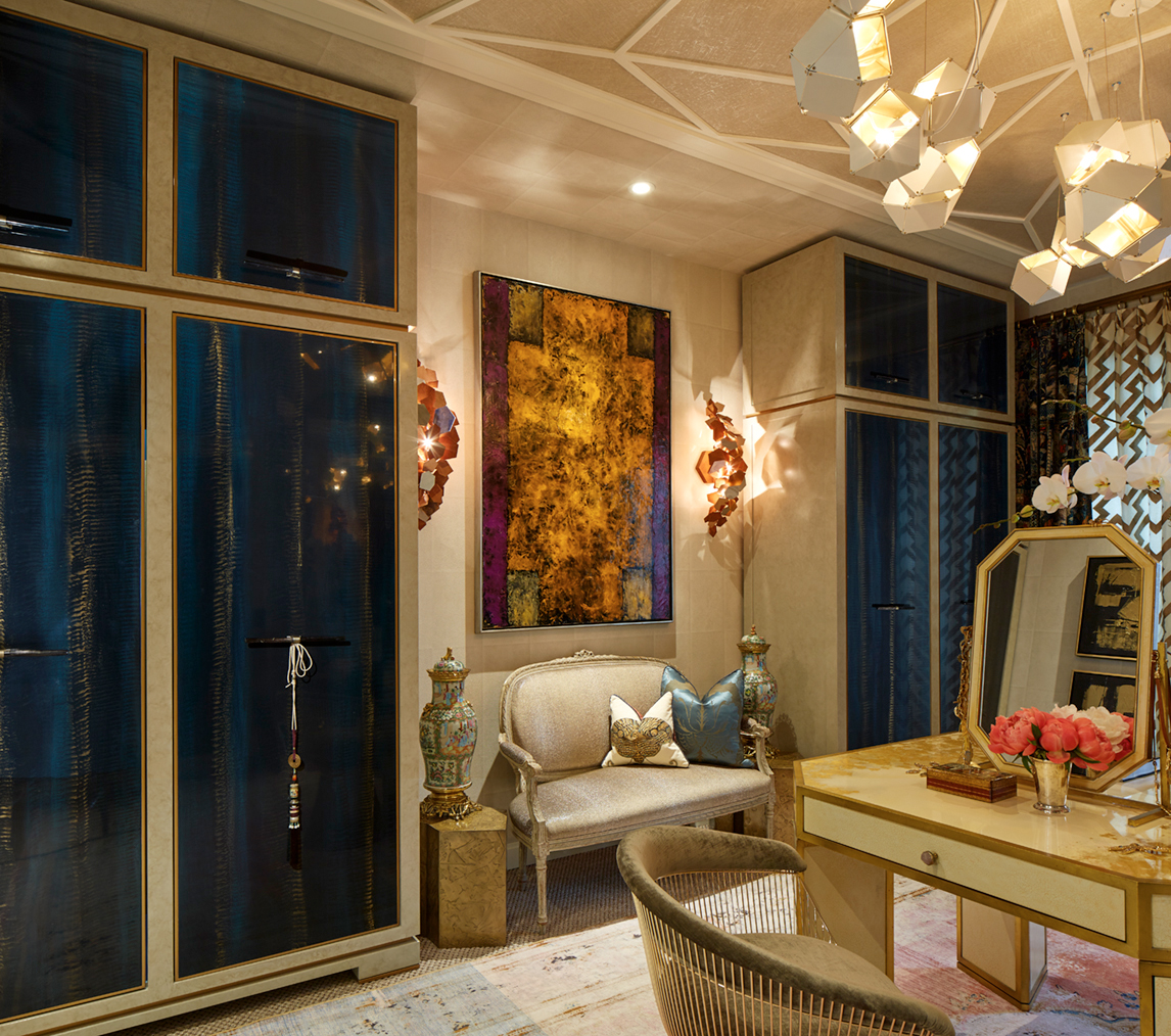
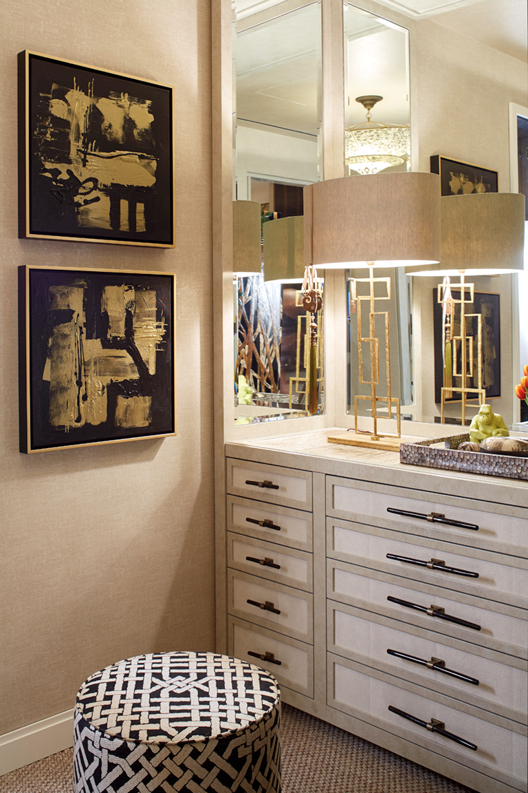
As with any highly treasured jewel box, exquisite finishes tell the story. With classical space planning establishing the room’s perfect proportions, Vandal and Ouelette turned their attention to the decadent Art Deco-inspired details. The narrative began with the spectacular peacock finish on the door fronts of the closets, a collaboration with the talented Pellegrino Ebeniste. Inspired by a fabric woven out of the plumes of more than 200 birds, Les Ensemblier took the more compassionate route by choosing to create this custom finish instead. I’m sure you’ll agree, the end result (as seen in the close-up image above) is truly magical.

KipsBay2016_LesEnsembliers_A_016_New

Were this the only stunning finish in the space it might read as too strong an element, but woven together with the Ralph Lauren Pearl Ray Shagreen wallpaper on the walls and the radiant Ralph Lauren Marella Plaster wallpaper in the insets of the ceiling treatment, it reads as a cohesive story told over time.

The ceiling treatment – one of my favourite design elements in the room – was inspired by a historically referenced Art Deco geometric pattern that Les Ensembliers then deconstructed to create the modern classic pattern. The elegant plaster work serves as the perfect visual balance to the strong geometry of the gorgeous Gabriel Scott light fixture.

Ceilings are often forgotten design opportunities, but in this case, the ceiling was designed to centre the room, making the space feel longer and taller by creating a focal point that lifts the eye (and the spirits) with a sense of wonder and delight.

KipsBay2016_LesEnsembliers_K_008

The stunning vintage rug from Joseph Carini, with it’s blush and turquoise hues, infuses the space with femininity, history and style, giving voice to the well-traveled life Les Ensembliers imagined for the lady of the house. Design choices like this one serve to evoke the Europe-meets-the-Americas aesthetic that Les Ensembliers understand as uniquely Canadian. It is an aesthetic that values design history while charting its own course for the future, and Les Ensembliers are firmly at the helm.

KipsBay2016_LesEnsembliers_D_014

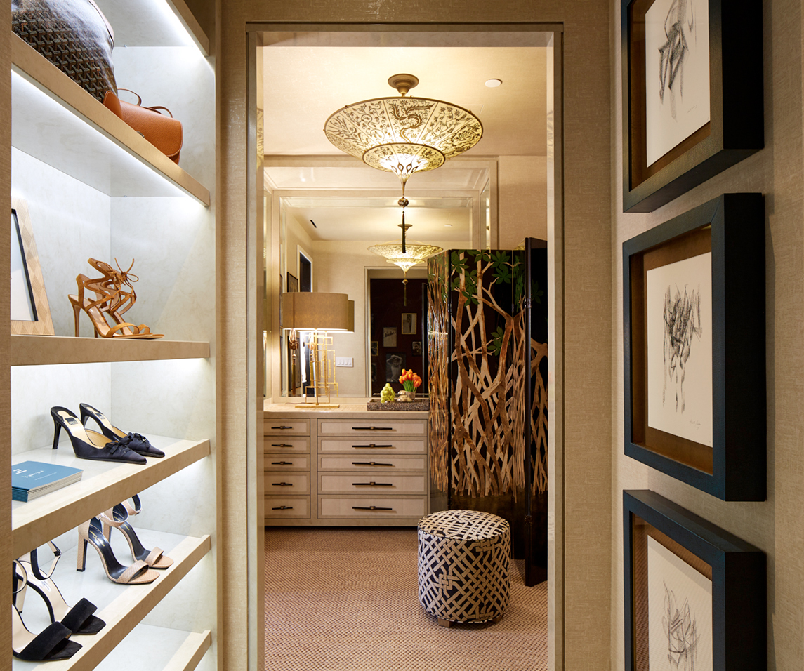
The antechamber to the lady’s dressing room continues to tell the story of a well-traveled life. Inspired by fine luggage from the house of Goyard in Paris, the built-in dressers speak to the luxury travel cases of a bygone era with their textural wallpapered insets, stunning black horn Ochre handles, and decadent purple-velvet-lined drawers. The Fortuny hand-painted silk chandelier – one of my all-time favourite light fixtures – creates a soft and elegant counter-balance to the fiercely fashion-forward style of the Gabriel Scott fixture in the adjoining space. I adore the mix.

KipsBay2016_LesEnsembliers_C_017_Build

Suffice it to say, Les Ensembliers stole the show at this year’s Kips Bay Decorators Showhouse. The buzz about their decadent space reverberated across every floor of the home as guests explored the showcase, and rightfully so. With offices in Montreal, Toronto and New York, you can expect to see their spectacular work finding pride of place across the globe. I, for one, am waiting with bated breath to see what this incredible dream team will design next.

Be sure to pop back to The Curated House next week for more inspiration on how interior design can tell your story. Until then, may your dreams be fuelled by wanderlust and your days be filled with love.

Sarah-Signature

By |June 29th, 2016|0 Comments

My One Room Challenge Favourites | Style Takeaways From The Spring 2016 Edition

So it’s been one week since the One Room Challenge reveals broke the internet, and I’m still not even remotely caught up on everyone’s gorgeousness yet. While I play catch up, I thought I’d share some of my favourites with you thus far along with a few design lessons we can take away from each one.

claire-brody-ORC-spring-2016-reveal

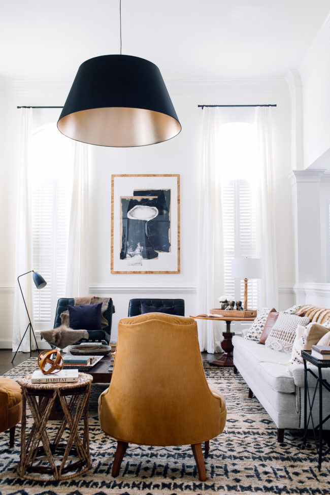
I love absolutely everything about Claire Brody‘s transformation (you must see the befores to truly appreciate it!). From the neutral palette to the layers of texture and pattern to mix of old and new to the bold artwork, light fixture and rug, this room has it going on. I also love that the room feels like it could have been this way for years – it’s inviting and approachable and feels like it tells a story. That takes talent. But the number one design lesson we should all takeaway from this room is: SCALE MATTERS. If that rug was smaller, if that art was smaller, if that light fixture was smaller…the whole thing would feel off. Balance isn’t just about symmetry. It’s about scale too. Brava, Claire. I feel like we should be design neighbours! I’d be visiting for tea or bringing over a bottle of wine on the regular.

JillSorensen_2710 JillSorensen_2717

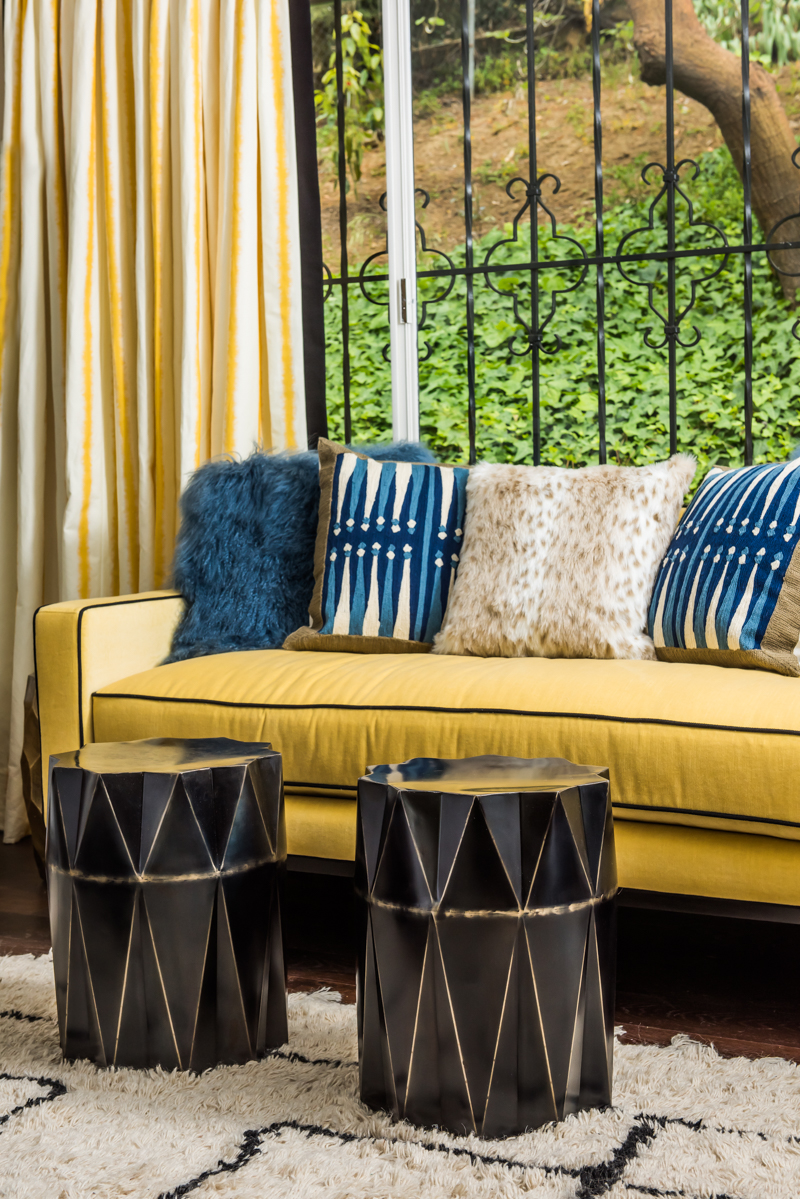
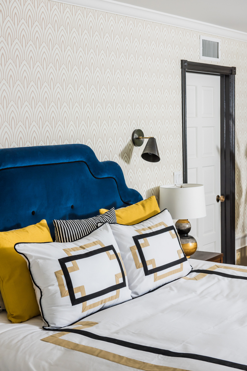
I love Jill Sorensen‘s space pretty hard. I had to show you two photos for the takeaway from her space, which is this: BOLD COLOUR SCHEMES REQUIRE DISCIPLINE. What does that mean, you ask? Jill’s palette is a mix of gold, royal blue, black and white, and she disciplined herself to repeat the mix in variations of dominance throughout the entire space. Repetition is KEY with a colour scheme that features more than one strong colour choice, and Jill absolutely nailed it here. Also, that greek key Moroccan-inspired rug from her collection is the bomb.

Design-Manifest-Kitchen-Black-cabinets-white-shiplap

I’ve had a fellow designer’s crush on Naomi from Design Manifest for a year now. What I love about her aesthetic is that she creates classic foundations with expressive details. And that’s really our takeaway from her space: GO CLASSIC ON THE BIG STUFF, GO BOLD WITH THE SMALL STUFF. That may not always translate literally. What I mean is this: cabinetry, countertops, backsplash and appliances are all big ticket items that you’re not likely going to change on the regular, whereas the paint on your counter stools, cabinetry hardware and the fabric used to make a small roman shade can easily be changed up when you tire of your current accents. Know where to be daring and know where to be timeless so that your space speaks to your personality but leaves you with the flexibility to evolve the look over time.

waiting-on-martha-spring-ORC-2016-reveal

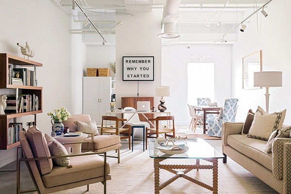
I absolutely love the layered, neutral-but-never-boring space that Mandy and the team over at Waiting On Martha created for their new office space. The number one detail that stole my heart is the sign behind the desk which reads, “Remember Why You Started.” And that’s our takeaway: ALWAYS INCLUDE SOMETHING THAT SPEAKS TO YOUR HEART. Good design should tell your story. It doesn’t necessarily have to do so with words as in this example, but it should ground you and remind you of who you are and what matters to you. Major props to Mandy for getting this so right.

christine-dovey-ORC-spring-2016-reveal

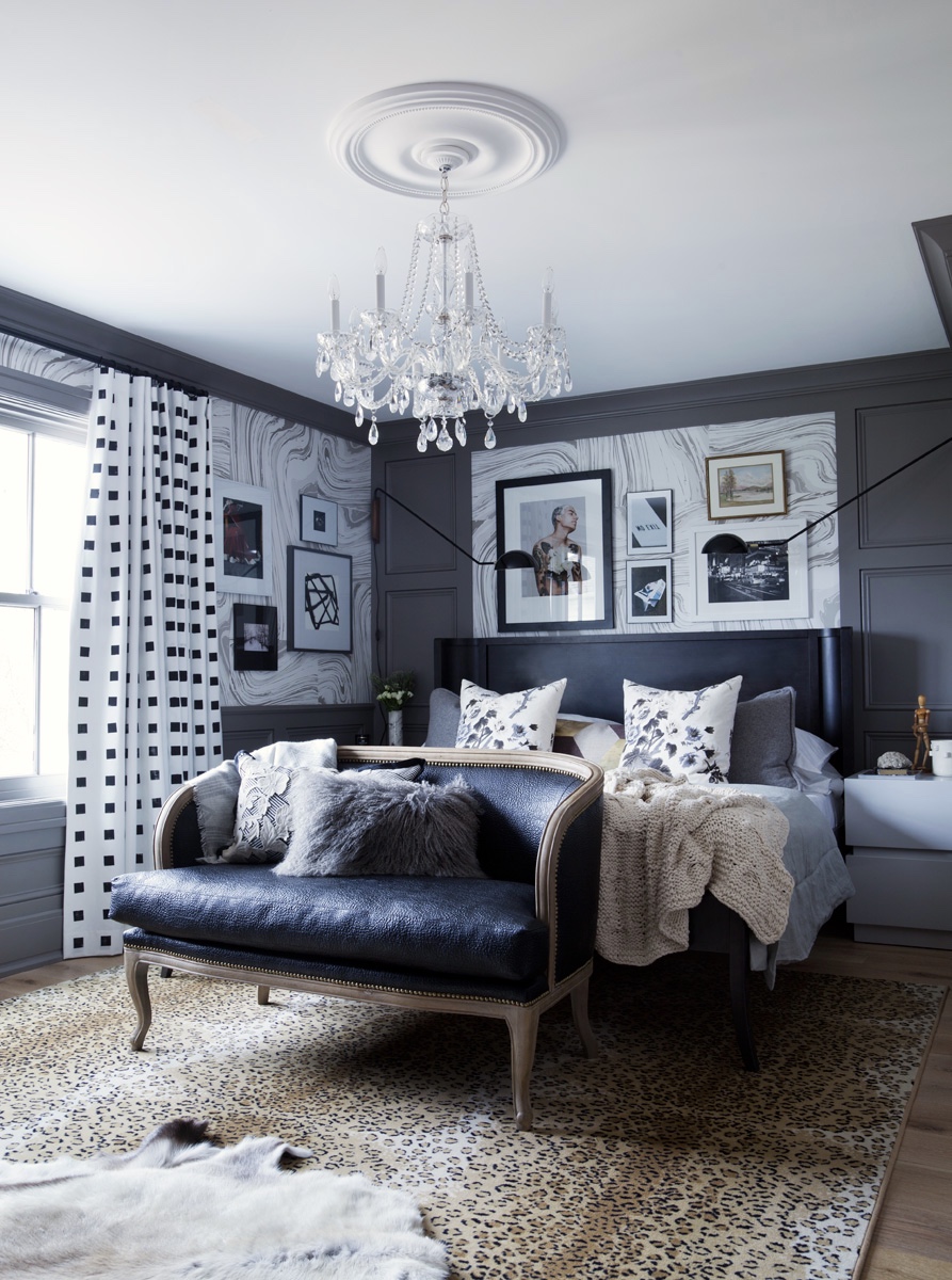
Christine Dovey refined the design plan for her master ensuite over two rounds of the One Room Challenge, and honestly, you can tell. There’s a lot of love in all those layers of texture and pattern play and the mix of modern and vintage. It’s sexy and sophisticated and glamorous. The takeaway from Christine’s space? MASTERING THE MIX TAKES TIME. Take the time to really work out your design plans and keep editing until your space goes beyond beautiful to something bespoke and unexpected. You’ll be glad you did.

simplified-bee-ORC-spring-2016-reveal

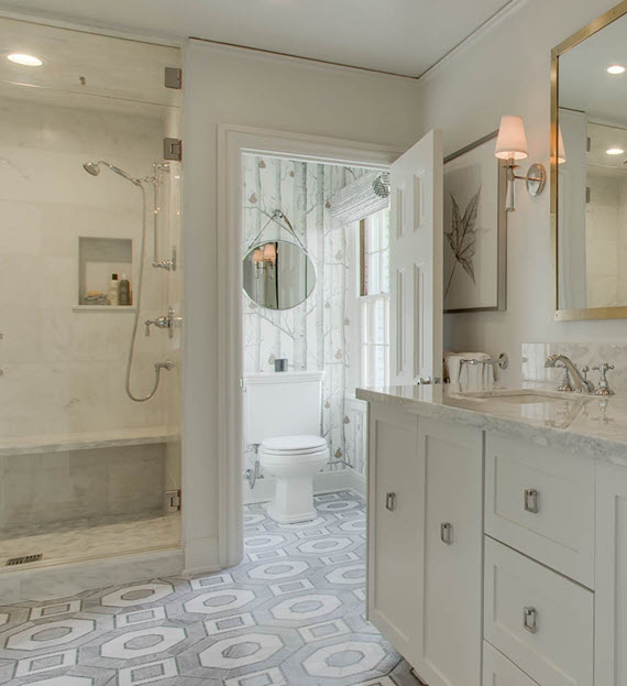
Cristin from the Simplified Bee‘s bathroom floor may just have made me stumble. That’s right, I’m here to confess to everyone listening that I am coveting that geometric marble gorgeousness with total abandon, and I don’t care who knows it. The design takeaway from this stunning bathroom makeover? MASTER BATHROOM FLOORS WERE MADE TO BE DROOLED OVER. If there is anywhere to embrace bold pattern in a big investment item, it’s on your Master Bathroom floor. This one happens to be bold and classic, sophisticated and timeless all at once, and that’s the benchmark for this kind of design statement. To. Die. For.

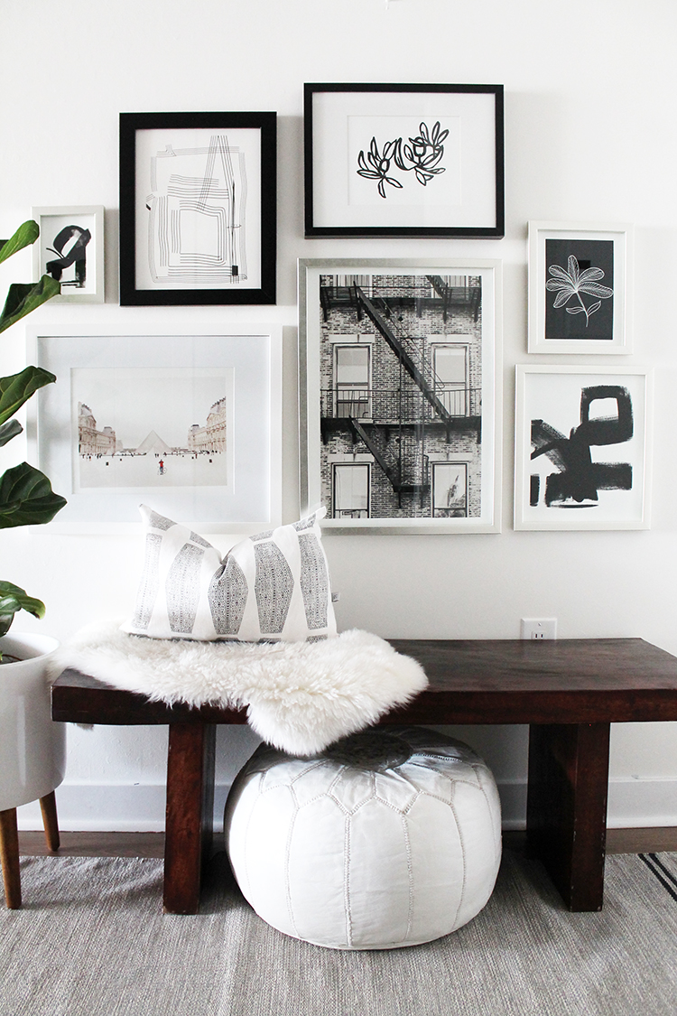
the-vault-files-ORC-spring-reveal-2016

I absolutely love the effortless cool of The Vault File‘s front entry. That Moroccan pouf and lambskin layered on the warm wooden bench add a touch of bohemian comfort for me, and the gallery wall is totally my jam. And that’s where our takeaway lies with this space: CHOOSE ONE ELEMENT TO CREATE COHESION IN A GALLERY WALL. In this case, all of the art is black and white (with the exception of the photograph of the Louvre on the bottom left which has so much white that it doesn’t fight the scheme). This is a really easy way to make it work. If you’re ready to dive into installing your own gallery wall but don’t know how to hang it without sweating right through your shirt, go get this downloadable guide to installing art like a pro.

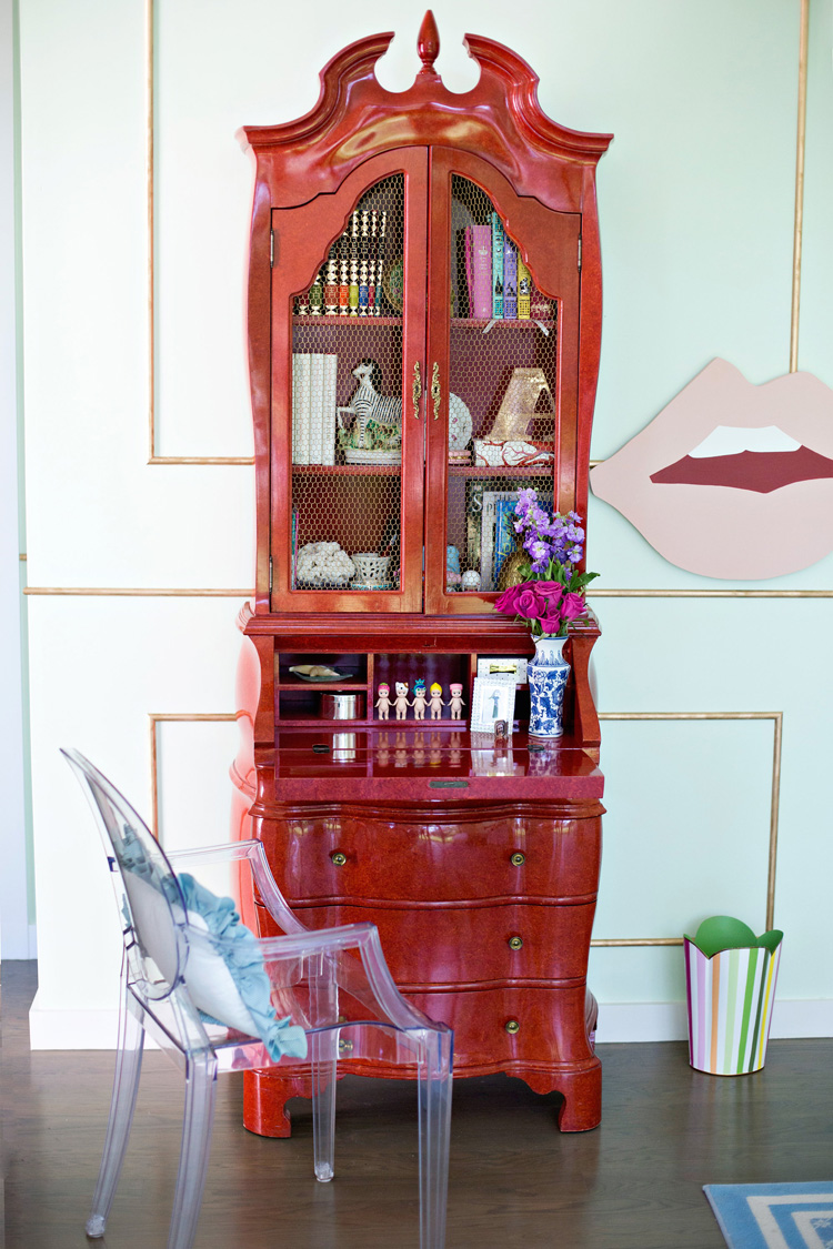
mimosa-lane-ORC-spring-2016-reveal

The mint, pink and red colour palette of Mimosa Lane’s kids’ room makeover is all kinds of fun, but that Chinese secretary in lipstick red next to the giant pink lips? Genius. Total styling genius. And those luscious lips are telling us exactly what we should be taking away from this room: ALWAYS TRY TO INCLUDE SOMETHING QUIRKY. As designers it can be really easy to take ourselves too seriously. Okay, as human beings it can be really easy to take ourselves too seriously. Including a necessary dose of quirk keeps things fresh and interesting and keeps us from getting too stale.

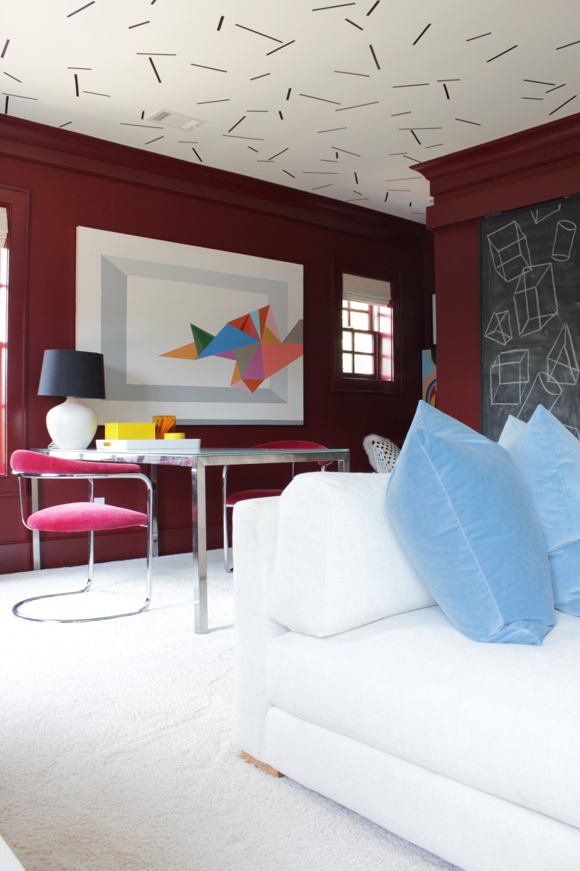
the-painted-house-ORC-spring-2016-reveal

I’m totally crushing on all of the geometry and colour-blocking going on over at The Painted House‘s playroom makeover. It’s not just anyone who can pull of this mix of bold colours, but Angela has nailed it with her signature offbeat style. She’s also heralding a truth that is showing up in all kinds of corners of the design universe: THE 80’s ARE COMING BACK, BABY. You don’t have to get on board with it, but if you decide to, consider Angela your expert guide on how to go back in time with style.

I want to give myself the freedom to post, oh I don’t know, a dozen more of these ORC round-ups because I seriously haven’t scratched the surface of all the linking participants yet. In the meantime, I hope you got something out of these design takeaways! Be sure to come back next week for more inspiration for living a beautiful life.

Sarah-Signature

By |May 18th, 2016|4 Comments

One Room Challenge Spring 2016 | Week 6 | THE BIG REVEAL!

“Good things come to those who wait,

But better things come to those

Who work for it.”

DSC_4800a

Hello darlings, and welcome to my virtual “The One Room Challenge Is DONE!” dance party! You may not be able to see me dancing, but believe me, I am dancing, and I’m singing Sia’s Alive at the top of my lungs! I’m not gonna lie, It. Feels. Good.

My photographer jokes that I really should have called this one the “One Floor (And A Bit) Challenge.” He’s right. Because our main floor is so open concept, our living room makeover spilled over into zhushing the kitchen and dining room a bit, and even crept up the stairs with our lovely gallery wall. The good news is this: ONE, we did it! And TWO: we love it! I couldn’t be more grateful to be on the other side of this design dare, and I’m thrilled to be sharing the reveal with you today.

For simplicity’s sake, I’ll share the source info with you below each photo. I can’t wait to hear what you think, so please share your thoughts in the comments below!

DSC_4810a

SOURCES

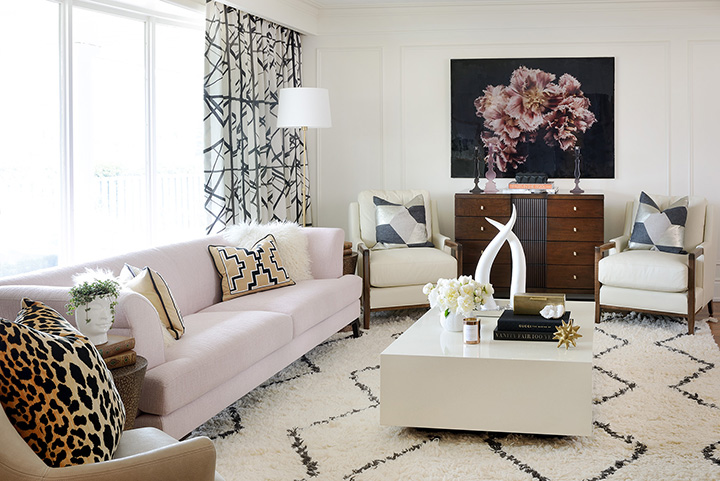
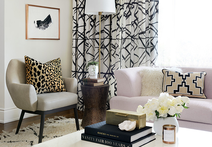
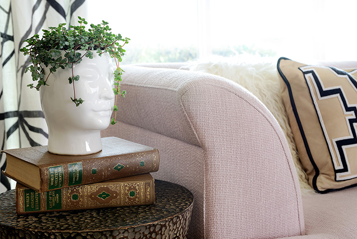
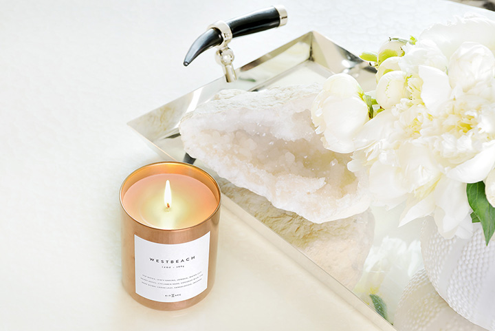
DRAPERY FABRIC: Groundworks for Lee Jofa / UTTERMOST COPPER DRUM TABLE: Bellacor / BRASS FLOOR LAMP WITH LINEN SHADE: LampsPlus / COPPER FRAMED ARTWORK BY JAIME DERRINGER: Minted / GUMI ARMCHAIR BY BRUNO MOINARD: Avenue Road / VELVET LEOPARD PILLOW: Arianna Belle / BABY TEARS PLANT: Sweet Woodruff / PINK SOFA BY HUGUES CHEVALIER, PARIS: Emily Quinn / VINTAGE BEADED LEATHER TRIBAL PILLOW: Stone Textile / PEARL COFFEE TABLE: Bernhardt / SOUK RUG: West Elm / BRASS BOX ON COFFEE TABLE: Pottery Barn / COPPER CANDLE: Kit + Ace / QUARTZ GEODE: Centro Garden

DSC_4846a

SOURCES

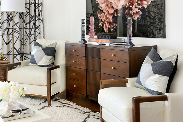
ESSEX CREAM LEATHER CHAIRS: Industrial Storm for Whittington & Co. / KUBUS ARGENT PILLOWS: Arianna Belle / FRINGE FLOROGRAPHY PRINT: Ashley Woodson Bailey via Citizen Atelier, finished with ArtResin / MODERN RESIN CANDLESTICKS: Creators Of Objects / DWELL STUDIO BLACK DECORATIVE BOX: AllModern / COFFEE TABLE BOOKS: Emily Quinn / HAVEN SMALL DRESSER: Bernhardt / BRASS SHIFT KNOBS ON DRESSER: Upper Canada Specialty Hardware / DWELL STUDIO GOLD URCHIN (on side table): AllModern / SILVER TRAY WITH HORN HANDLES: AllModern

DSC_4842a

DSC_4839aDSC_4847a

SOURCES

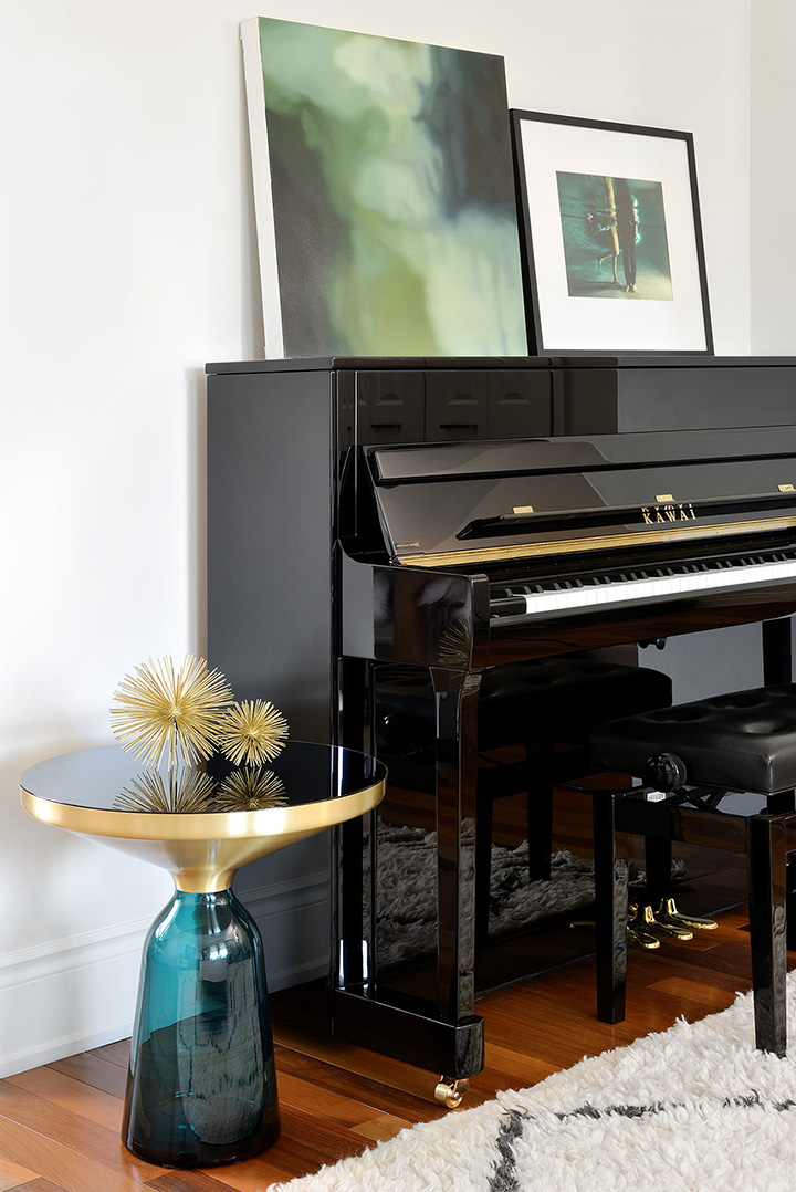
PAINTING ON PIANO: David Gillanders via ArtInteriors / “LEGS” PHOTOGRAPH: Jeremy + Claire Weiss via ArtStar, framed in Framed & Matted frame / SEBASTIAN HERKNER BELL SIDE TABLE: Avenue Road

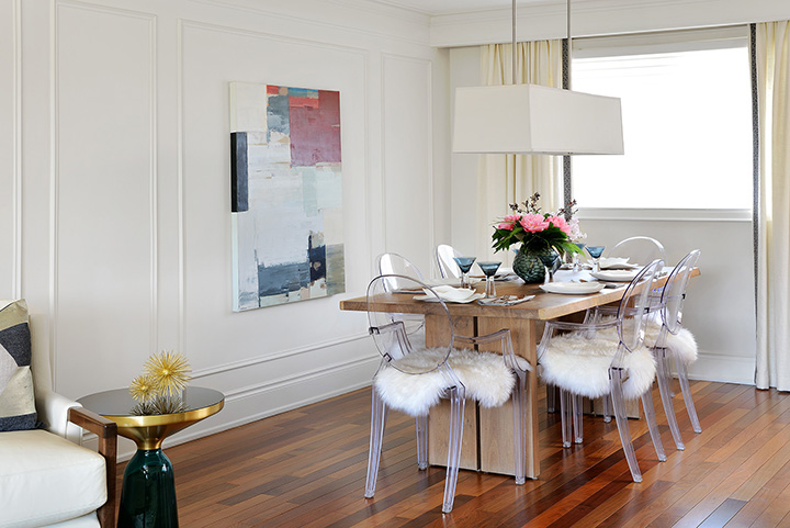
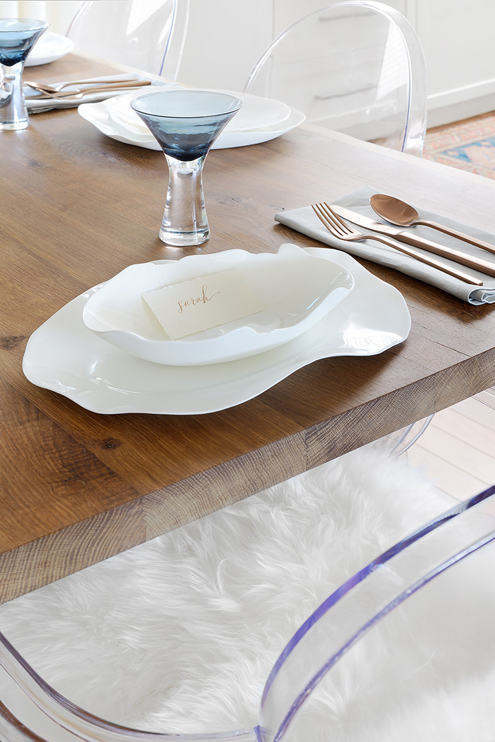
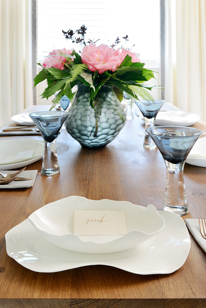
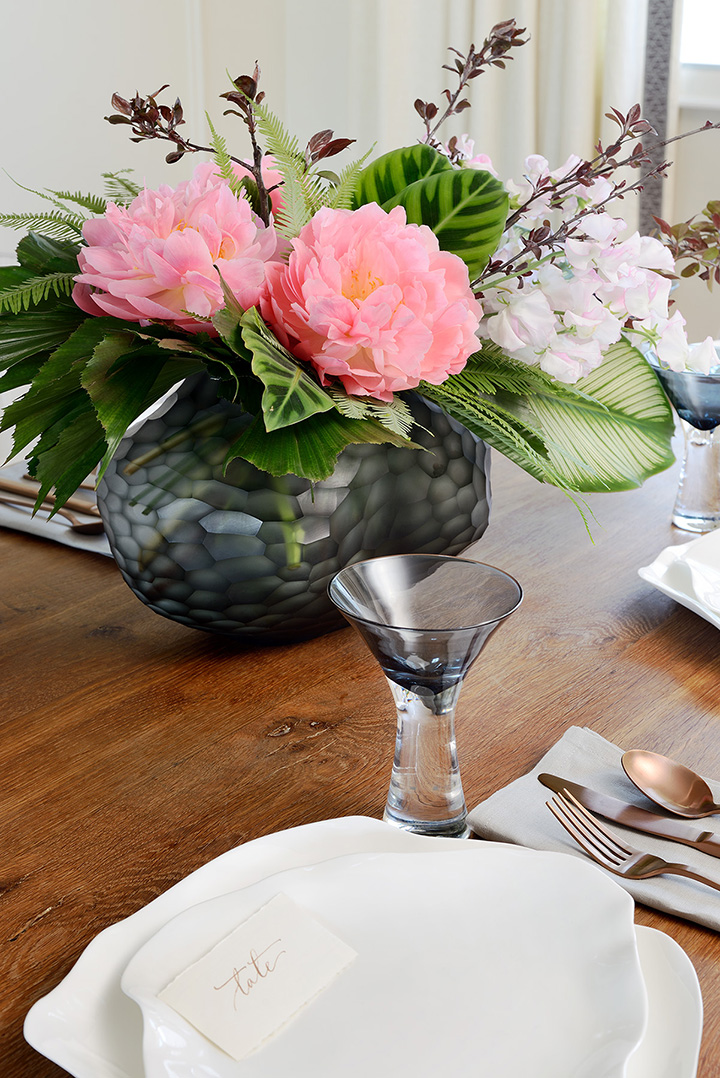
And now, on to the dining room refresh! I can’t begin to tell you how much I love the softness added by the simple Kravet linen drapes, made sophisticated by the elegant trim detail banding the leading edge of each panel. As it turns out, softness was the theme for this room’s update, and the lambswool seat covers communicate that in both look and feel, making our Ghost chairs a much more comfortable perch for long, lingering dinners with family and friends. Also adding to the feminine edge is the stunning floral arrangement by Lisa Gray of Sweet Woodruff in the centre of the table. In my dream life, I’ll have arrangements from Lisa in my house on a weekly (or at least monthly) basis! Also on my dream life wish list is the stunning Serax Belgian tableware from Emily Quinn. So organic, so elegant, so unexpected. I couldn’t love these pieces more!

DSC_4849a DSC_4850aDSC_4856aDSC_4859a

SOURCES

PANEL MOULDINGS: Metrie / BLACK HONEYCOMB VASE: Joss & Main / FLORAL ARRANGEMENT: Sweet Woodruff / ORGANIC FINE BONE CHINA DINNERWARE: Emily Quinn / STEMWARE: Emily Quinn / COPPER FLATWARE + LINEN NAPKINS: West Elm / CREAM LINEN DRAPERY FABRIC + GREY DECORATIVE TRIM: Kravet Canada / ARTWORK: Kathleen Weich via ArtInteriors

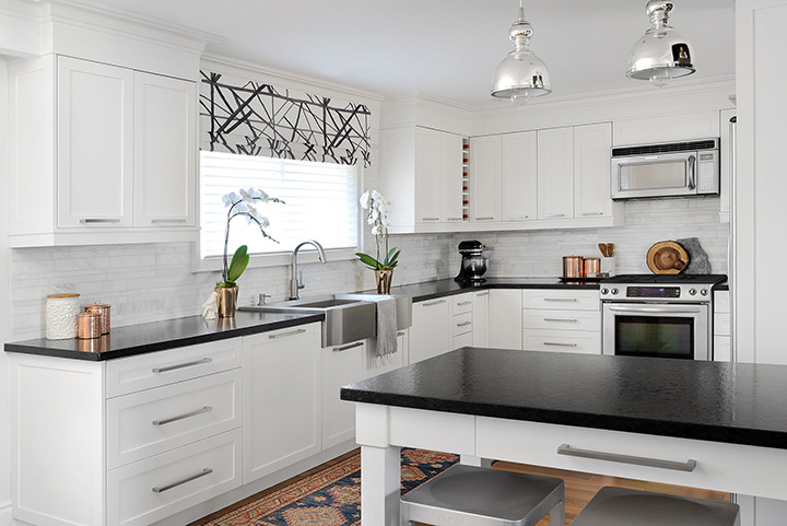
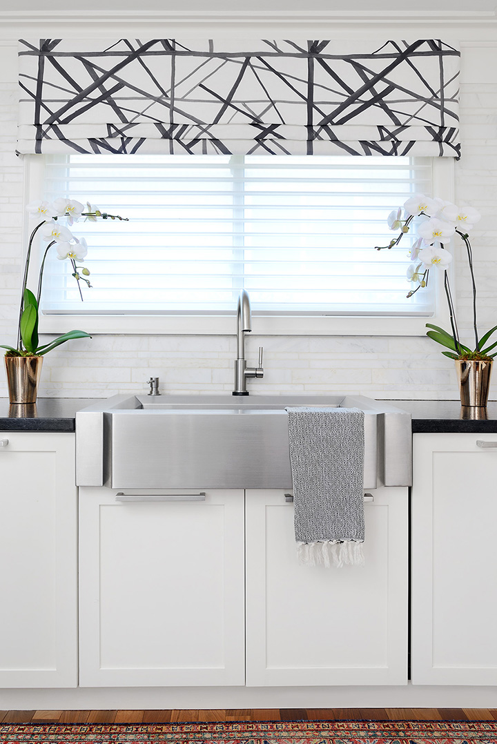
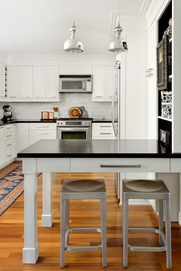
Up next is the zhush of the kitchen which was one part pretty and one part practical. The practical came in the form of an upgrade to touchless technology with our amazing Brizo faucet and matching soap dispenser. Practicality also came home to live with us via the glorious arrival of our Bosch dishwasher, the silent, panelled-in wonder that has made our lives forever better. The pretty is all about the transformation of the bookcase, the gorgeous Groundworks Channels linen faux roman valance, and the gorgeous copper accents from Wayfair.

DSC_4870a DSC_4878a DSC_4864a

SOURCES

COPPER CANNISTER SET: Wayfair / HAMMERED COPPER TRAY: Wayfair / POTTED ORCHIDS: Fiori Oakville / TURKISH TEA TOWEL: Pamuk & Co. / CHANNELS EBONY LINEN FABRIC FOR FAUX ROMAN: Groundworks for Lee Jofa / SOLNA TOUCHLESS FAUCET + MATCHING SOAP DISPENSER: Brizo / PANELLED-IN DISHWASHER: Bosch

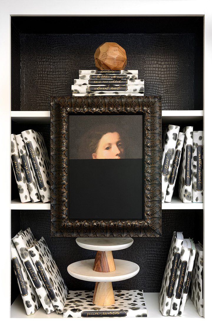
I’m not going to lie, the bookcase makeover is my favourite change in the kitchen. The tension between the sophisticated and edgy Thibaut faux alligator wallpaper on the cabinet back, the more feminine leopard wallpaper-wrapped books with their calligraphy labels, and the Anewall portrait of a lady, elegantly framed and dipped in Farrow & Ball paint sets up my favourite kind of juxtaposition. It is both modern and traditional, a mix of masculine and feminine, a touch of classic and a dash of unexpected whimsy.

DSC_4874a

SOURCES

FAUX ALLIGATOR WALLPAPER: Thibaut / LEOPARD PRINT WALLPAPER: Thibaut / PORTRAIT OF A LADY: Anewall DIPPED IN PITCH BLACK PAINT: Farrow & Ball /

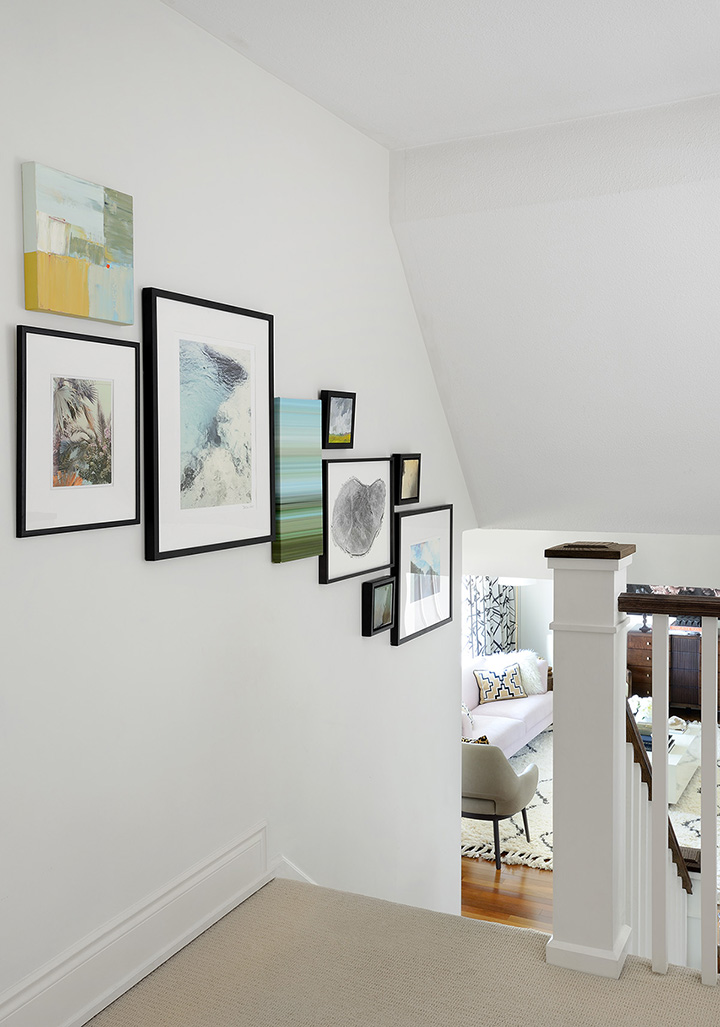
And last but not least, the gallery wall seen from a different angle than the one I shared with you last week. If you’re planning to create a gallery wall yourself and want to know my sweat-proof method for getting it done in no time flat, be sure to pop back to last week’s post and download your guide to installing a gallery wall like a pro!

DSC_4885

ART FROM LEFT TO RIGHT: ABSTRACT PAINTING BY KATHLEEN WEICH: ArtInteriors / CALIFORNIA WALL: Art by Melody Hansen in Framed & Matted frame / BLUE MONDAY SIGNED PHOTOGRAPHIC PRINT: Minted, framed in Framed & Matted frame / ABSTRACT PAINTING BY TREVOR CRAIG MCDONNELL: ArtInteriors / SMALL LANDSCAPE WITH CLOUDS PAINTING: Etsy, framed in Framed & Matted frame / SIGNED + FRAMED TREE RING PHOTOGRAPH: Minted / PAIR OF MIXED MEDIA SMALLS BY JAY HODGINS: ArtInteriors / MANUEL ANTONIO ROCKS SIGNED PHOTOGRAPH: Minted

I don’t know about you, but I cannot wait to see the reveal posts from all of my fellow One Room Challenge daredevils! Be sure to check out the links to their blogs below, and come on back here next week for more fuel for your beautiful life!

For now, I’m signing off with a heart bursting with gratitude for the amazing people who made this edition of the One Room Challenge possible: my incredible husband, Linda from Calling It Home, my supportive network of friends and incredible brand partners, and all of you amazing friends who have chosen to come along for the ride. Thank you for joining me! I hope you’ve come away feeling inspired for how you can tell your own story through designing your home one room (or perhaps one floor) at a time.

All photographs by Larry Arnal


Sarah-Signature

Claire Brody | The Curated House | Design Manifest | Driven by Decor | Honey We’re Home | Hunted Interior | The Makerista | Making it Lovely | My Sweet Savannah | Pencil and Paper Co. | The Pink Clutch | Simplified Bee | Sketch 42 | Jill Sorensen | Orlando Soria | Thou Swell | The Vault Files | Waiting on Martha | The Zhush | Media Partner House Beautiful | TM by CIH 

By |May 11th, 2016|85 Comments