/kitchen

Tartine | Part 1 | San Francisco

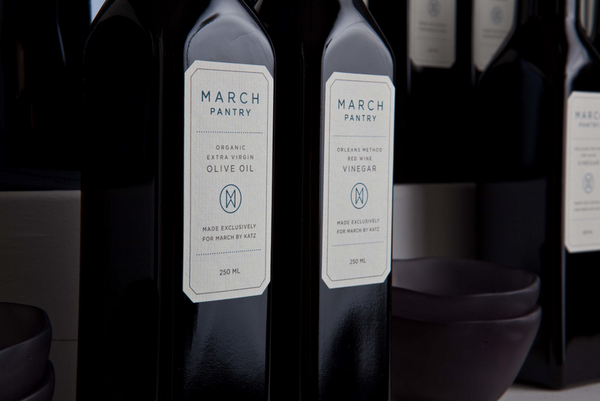
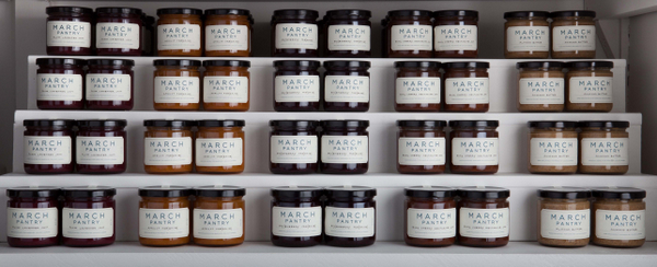
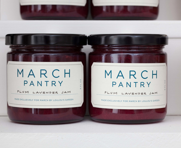
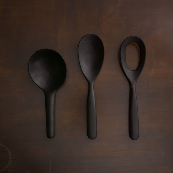
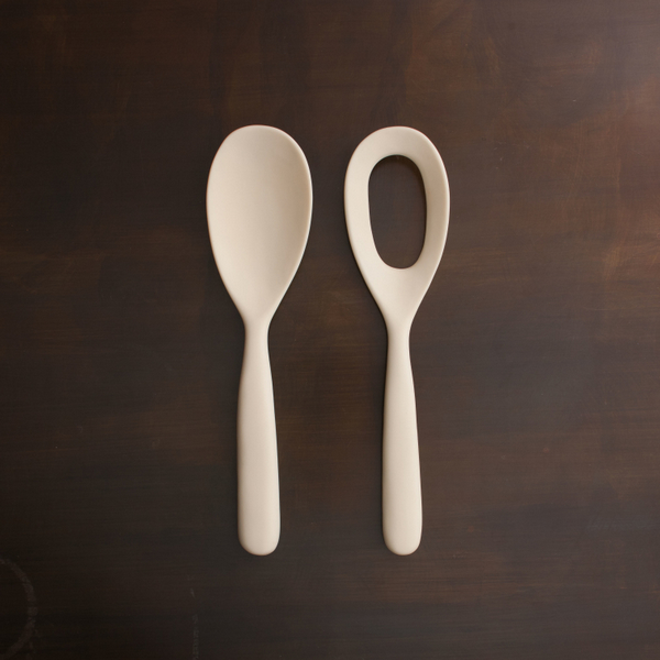
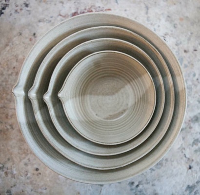
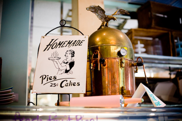
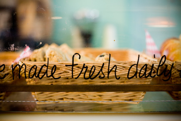
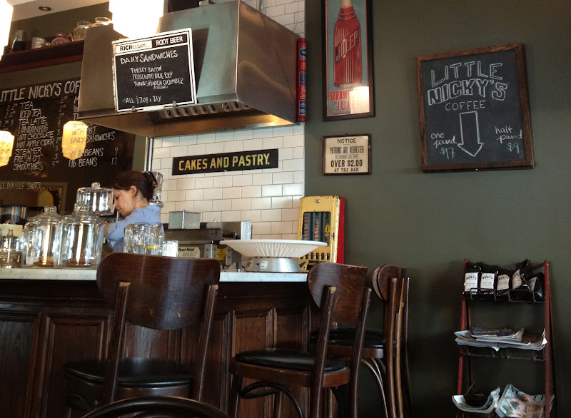
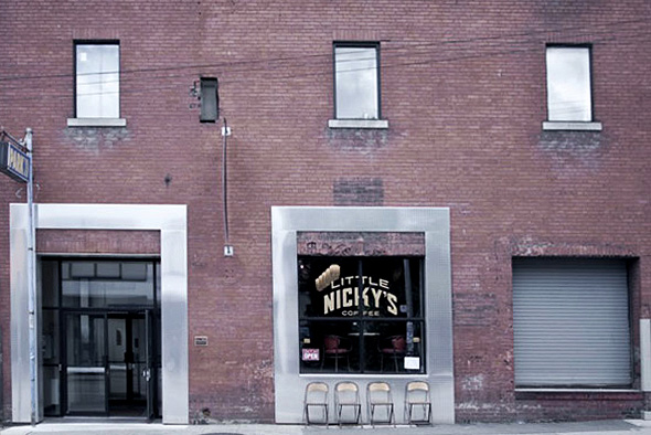
I love a good story. The kind with a rhythm, with a persistent protagonist who perseveres and finds a way to push through challenges to overcome and create the things that legacies are made of. And today I am excited to share just such a story through the journey of a humble, magical bread-maker. Chad Robertson and his wife, pastry chef Elizabeth Prueitt, have created what can only be described as an iconic bakery and café in the heart of the Mission District in San Francisco. I recently had the delight of visiting their aromatic corner of the earth with my son. The perfect mother-son date. {After all, the way to any man or boy’s heart is indeed through their stomach.} This video will help you to understand why we were completely won over. They truly embody my motto: “beautiful process, beautiful product.”

No doubt I’ve whetted your appetite for further delicious details! More soon. I promise.

xo
s.

By |September 11th, 2012|0 Comments

Using Typography to Tell a Story

Today I have the pleasure of introducing you to the delightfully talented Melody Hansen, graphic designer extraordinaire and our guest poster for today! I have no doubt you will enjoy her thoughts on the branding of the cafés featured in Gabriela’s post.

Have you ever noticed the font used in a window display, or perhaps the posters that may decorate the walls of a restaurant? As a graphic designer, it is only natural that my eye would be drawn to the design that surrounds us. Everything from the choice of type to the placement of an image will affect the experience in great ways. Let us take the 3 coffee shops mentioned in Gabriela’s post.

Wanda’s Pie in the Sky, for instance, is in the heart of Kensington Market and if you are a Torontonian reader or familiar with the area, you know that it is a quite unique and whimsical world of its own, if I may so myself. And so, the design that surrounds this café and pie shop is just that: whimsical.

Photos by Alyssa Bistonath

Typography is an art that plays an immense role in design and in our every-day lives. The way a letter connects to another will reflect the story it is attempting to tell. Yes, I do believe each letter – of any typeface ever created – tells a story, and the role of a designer is making sure the right story is being told for the right occasion. Through the type found in this little Kensington café, we are taken right back into our grand-mother’s kitchen with a youthful twist. The combination of the handwritten signs, the vintage posters, and the bright colors all work together to create an inspiring magical space.


Little Nicky’s, a coffee shop telling a slightly different story, creates an environment through its design choices, as well. As soon as you enter, you know you are somewhere unique.

Photo by Cory VanderPloeg
Surrounded by bold and tall sans-serif type and wall decor from the 1950s, it certainly does not fail in creating an experience beyond the norm. I should also mention their packaging is one to swoon over, if you are like me and love anything stamped. Little Nicky’s is truly a must-see for any vintage design lovers.

Last but certainly not least, Nadège Patisserie. You are welcomed in by the open white space, the very modern touches, and of course, by the pastries. The color focus is exactly where it should be: in the greens and reds of the macarons, the yellows and blues of the tarts, in the croissants and the pains-au-chocolat.

Photo by Dar Mustafa


Photo by Dennis Marciniak

It’s evident that Nadège’s branding has been well thought out, and appeals in a way that can’t keep us away. A story of simplicity, sophistication, and refreshment in what it tells, and through the geometry (a fun reflection of the pastries and croissants if you might notice) and type choice of the logo, along with the website, everything is consistant and complete. A true successful design!


I hope these reflections have brought your attention to impact of design on our everyday lives. Perhaps along with me, you will find the story of each letter, shape and white space speaking to you even more clearly as you take note of these details.

– Melody 
By |September 6th, 2012|0 Comments

MARCH | San Francisco

Today I had the privilege of stumbling upon a true gem in the city of San Francisco. Nestled in Laurel Heights, MARCH‘s bright, clean and beautifully edited interior feels as much like a gallery as a high-end kitchen, pantry and table purveyor.

All interior photographs by Angie Silvy

Their curated and collaborative collections include items from Ted Muehling, Brickett Davda, Christiane Perrochon and Jasper Conran. I was particularly enchanted by the constellation-like glazes on some of the smaller, handcrafted ceramics from Victoria Morris, not to mention the stunning, bespoke butcher block tables which would be quite a welcome addition to almost any of my clients’ kitchens.

MARCH’s in-house line of spices and sea salts – handcrafted in the city by Le Sanctuaire – are beautifully branded with the store’s exquisitely simple typographic labels wrapped around apothecary-esque blue glass jars. The full collection would look stunning in the neatly ordered spice drawer of any truly epicurean kitchen. MARCH’s evident love of wood is just one of the reasons they feel like “my people,” as seen in the stunning, hand-carved kitchen tools, cutting boards and gorgeous, live-edged presentation boards.

I have no doubt that the good folks at MARCH subscribe to the beloved philosophy that food should look as good as it tastes. Their stunning space and beautifully curated products speak to that philosophy with great attention to detail and utterly sophisticated delight. No doubt they are on their way to iconic status in this fine city – well worth a visit the next time you are in town.

xo
s.

By |September 5th, 2012|0 Comments