The Best of High Point Market | Fall 2017 | Part II | Brass Is Still Boss + Bold Organic Minimalism Reigns

High Point Market Fall 2017 Design Bloggers Tour Kelly Wearstler EJ Victor

If you saw last week’s post, you’ll know that my design mind is bursting at the seams with inspiration following the Design Bloggers Tour of High Point Market I took part in a couple of weeks ago. Apart from logging almost 10Km of walking each day, we had the opportunity to see the best of the best in home furnishings, and today I’m going to share two more categories that stood out to me.

But first, a reminder of that quote from Carolina Herrera:

“I don’t like trends. They tend to make everybody look the same.”

Keep that in mind as you drink in the latest and greatest, always looking for what speaks to you and tells your story. Good design is never about keeping up with anyone. Your home is the canvas upon which you paint your life’s memories, so good design should feel like a custom palette and set of brushes, lovingly made to express your unique story and lifestyle.

1/  BRASS IS STILL BOSS

The debate over warm and cool metals has been raging in the design world in memoriam, just as it has in the jewelry world. While I believe we are embracing more than ever a bespoke mix of metals that is more timeless and less about trends, brass is indeed still boss right now. We’re seeing that expressed in more subtle ways, however, with brass details like inlays on furnishings, frames on chairs or accents on household accessories bringing that golden warmth to light. Check out just a few of my favourite “brass spottings” from the Fall 2017 High Point Market Design Bloggers Tour.

High Point Market Fall 2017 Design Bloggers Tour Brass Still Boss

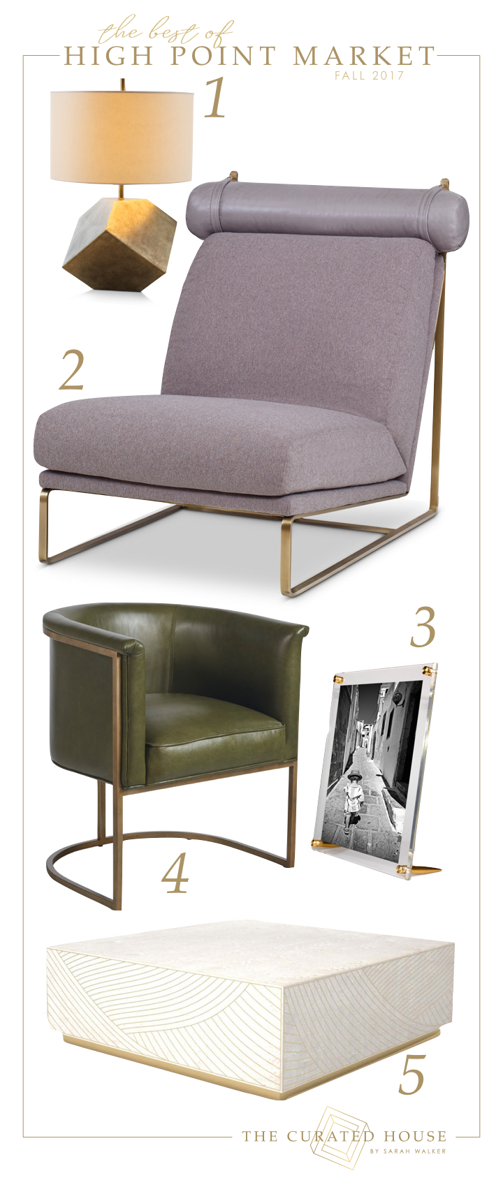
ONE/  As you learned from last week’s post, anything that puts an unexpected twist on classic geometry tends to grab my attention. The style and substance of Century’s Modrian brass cube table lamp, playfully tipped on its axis, is totally my jam. Bold yet restrained with its antique finish, it’s modern classic luxury at it’s finest.

TWO/  Another fav Century find is this incredibly stylish and ridiculously comfortable armless chair. The delicate brass frame sets the perfect stage for the mix of wool, fur and leather elements that embody livable luxury and casual sophistication. I love the thoughtful details like the leather head bolsters that are attached with equestrian-inspired straps. These are the kinds of details that can tell a story, and let me tell you, these chairs sit like a DREAM. Totally on the wish list for our next house, they’re the ultimate elevation of beanbag comfort for classy kids and grown ups alike.

THREE/  I totally fell in love with the bootstrap-to-business-success story of the ladies behind Wexel Art. Not only did they allow passion and innovation to lead them down the path towards a blossoming business, but they did so in true mom-warrior style, starting out at dining room tables and expanding as the demand outstripped the space available in their own homes. I love the bullet-style brass supports on this tabletop frame (I was lucky enough to bring one of these beauties home!), and am also a huge fan of their wall-mounting systems, brilliant for families looking for a way to display their kids art on a rotating basis while taming the visual clutter.

FOUR/  Another great example of a subtle but sophisticated way to invite the warmth of brass into your home, the Wells Accent Chair from Universal Furniture meets the needs of city dwellers living in small spaces at a surprisingly affordable price point. Its tidy dimensions make it a “go anywhere” kind of chair, and I love it in this pistachio green leather. The best part? Despite its petite scale, the Wells sits very comfortably, perfect for long conversations with friends over a glass of wine (or two).

FIVE/  Perhaps my favourite use of brass spotted this Market, the inlay on this stunning Dhow Block Square Coffee Table from EJ Victor is sheer artistry. A marriage of classic woodworking and ancient Muscat inlay techniques, the Italian-dyed birds eye maple veneer paired with the Oman brass details make for a timeless piece of art in furniture form. The wave-like shapes in this brass inlay were inspired by the traditional Dhow sailing boats of Oman, and I find there’s something quite soothing about their undulation. This is the kind of furniture that gets passed on for generations.

2/  BOLD, ORGANIC MINIMALISM

As I toured through some of the best showrooms to be found at High Point Market with my fellow Design Bloggers Tour mates, I found myself drawn to what I’m calling a bold, organic minimalism. When it comes to making a statement, finding that one artistic piece that calls to something inside of you is essential. For me, gestural brushtrokes, tribal inferences and organic shapes are a brilliant way to do just that, and these are some of my favourite pieces that fall into that category.

BEST HIGH POINT MARKET DESIGN BLOGGERS TOUR FALL 2017 BOLD ORGANIC MINIMALISM

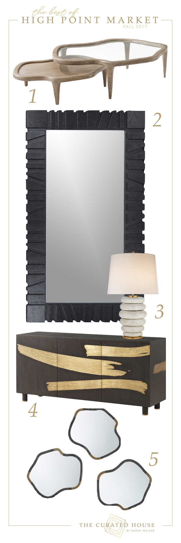
ONE/  As I mentioned in my last post, Michael Berman‘s collection for Theodore Alexander is out-of-this-world gorgeous. I sense his love of nature and his playful creativity met with artistic refinement in every piece. I believe that details are a love language, and I see that in the careful attention to finishes and textures to be found in this collection. I really could have shared ALL THE PIECES with you, but in the interest of restraint, I’ve just included three today. First is this lovely duo of Tide Cocktail Tables. The simple elegance of this duet really speaks for itself.

TWO/  When embracing bold, organic minimalism, scale is EVERYTHING. Large scale statement pieces allow you to embrace the “less is more” philosophy with courageous expression. The four foot wide by seven foot high dimensions of Kelly Wearstler’s Pacific Floor Mirror for EJ Victor are both expansive and oddly restrained in the confident real estate they occupy in a space, reflecting light while framed by a tribal-influenced wire-brushed black oak frame. This is a timeless, edgy piece with a rock-and-roll sensibility that will never date.

THREE/  Also Kelly’s, this Phoebe Stacked Table Lamp by Visual Comfort feels somehow whimsical to me. It’s generous rolls and 30″ high stacked statement offer a fresh and simple texture in patina’d white ceramic.

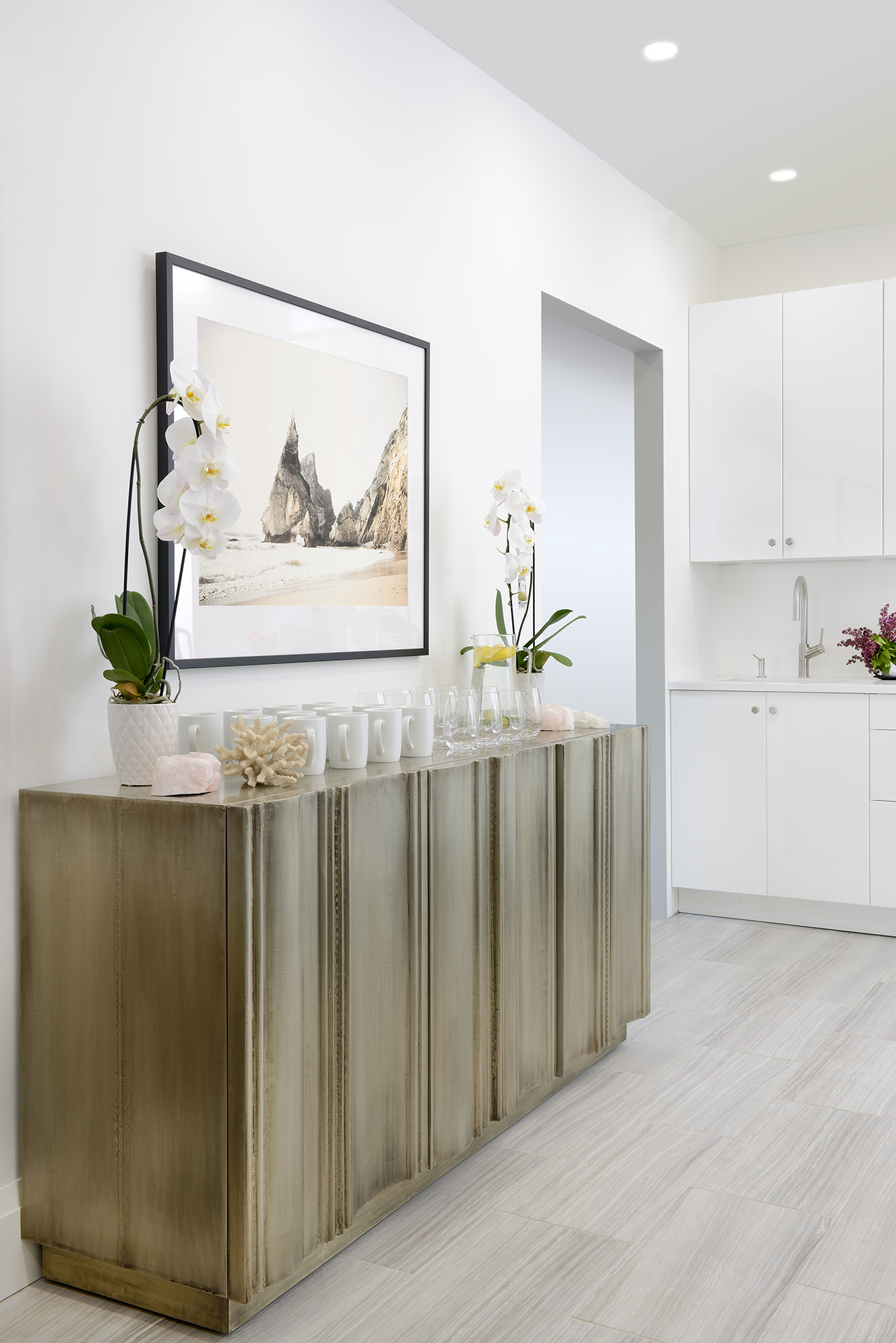
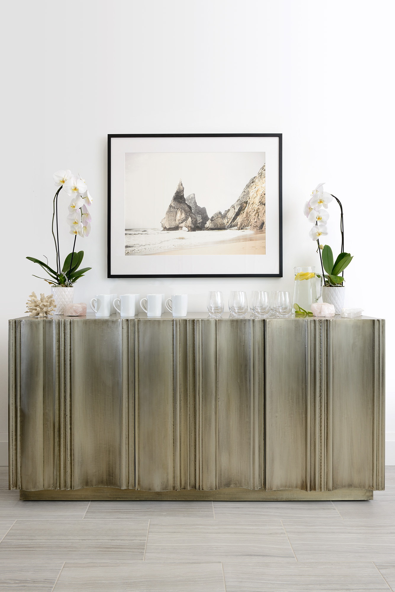
FOUR/  The ultimate in gestural brushstrokes, Michael Berman’s Washi Console for Theodore Alexander was newly released in this smaller scale this Market, and confession time, it makes me a bit weak in the knees. The craftsmanship involved in creating this brass inlay – which feels as though it was effortlessly brushed onto the wood – is truly phenomenal. This is the kind of statement piece that MAKES a room.

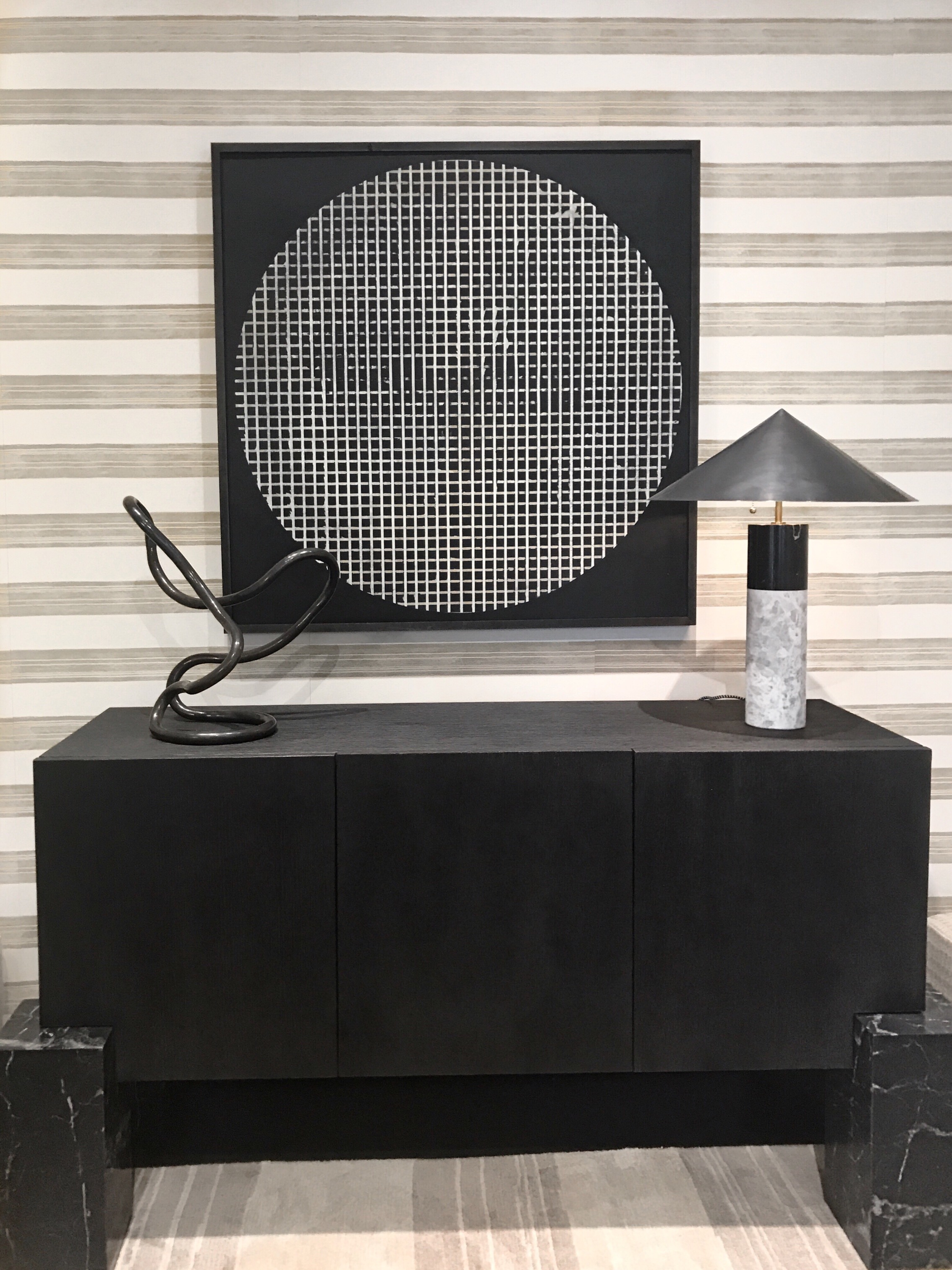
FIVE/  Also from Michael (can you sense the design crush here?), these Tide Mirrors by Theodore Alexander feel classic and utterly fresh all at once. Classic thanks to the mix of black cerused oak and brass inlay details. Fresh thanks to the totally organic and unexpected shape for an otherwise often ubiquitous accessory. This is the kind of wall decor that can transform a space with it’s bold and simple statement.

I hope Part II of my Design Bloggers Tour Roundup from High Point Market has your head dancing with design inspo! I know it does mine, and I’ve only shared half of it with you! Check in next week when I’ll do my best to share two more roundups with you. So much design goodness! Now to find the perfect projects for all these gorgeous pieces…

Until then, happy weekend, friends!

Sarah-Signature

By |November 3rd, 2017|0 Comments

The Best of High Point Market | Fall 2017 | Part I | Deconstructed Geometry + Echoes of Deco

Design by Les Ensembliers for the Kips Bay Decorator Show House

It’s been a long time since I’ve updated you here on the blog, and much has happened over the Summer and Fall in both health and design. In addition to being shortlisted for the best Luxury Design Blog for the Amara Interior Blog Awards, I was invited to take part in Esteem Media‘s Fall 2017 Design Bloggers Tour of High Point Market, and I’m going to share Part I of my Market Roundup with you today.

Identifying what we as designers consider to be the latest trends can honestly be dizzying. With the veritable flood of beautiful products being unleashed to the design trade every six months at the over 1 million square feet of showrooms to be explored at High Point Market, one could easily become overwhelmed.

The truth is, I’m never looking for trends. As fashion designer Carolina Herrera says, trends tend to make everyone look the same. I’m looking for inspiration, and for unique pieces that can help me tell my design clients’ unique stories. If those inspiring pieces can be sorted into categories to keep my mental design catalogue organized and sane, that’s what I’ll do.

So today I want to share two (of several) categories of design inspiration I came away drooling over after our whirlwind Design Bloggers Tour of High Point Market.

1/  Deconstructed Geometry

Do you remember the stunning space that Richard and Maxime of Les Ensembliers designed for the Kips Bay Decorator Show House? (See drool-worthy photo at the top of this post.) Of the million and one design details to fall in love with in that space, one that I still haven’t gotten over is their Art Deco-inspired deconstructed geometric ceiling. That ceiling fanned into flame my previous passion for all things deconstructed geometry, so I was a bit of a moth to the flame whenever I spotted this distinctive pattern at Market. Here are a few of my favourite pieces that showcase what I’m talking about:

Design Bloggers Tour High Point Market Fall 2017 Deconstructed Geometry

ONE/  There are few current day designers making quite such an iconic mark on the design industry as Kelly Wearstler. Her newly released large scale Ardent chandelier should give you some idea as to why. Bold. Edgy. Sexy. Minimalist. A total design statement. Kelly merges these worlds with an artistry that is uniquely recognizable, and this chandelier’s angled glass fractals and brass finish are truly lust-worthy.

TWO/  I love the sense of torsion and movement that Darryl Carter’s Fold Round Dining Table for Milling Road connotes. At 48″, it is the perfect size for a kitchen or breakfast nook and can easily seat 6. The whitewashed mahogany top is both warm and clean, and this stunning table is now firmly planted on my wish list for our next house.

THREE/  By far one of my favourite showrooms at Market this year, Century Furniture really wowed me with their beautifully diverse offerings for almost every style and budget imaginable. I love this perfect little night stand from their Cracked Ice collection. It showcases just one of the many creative ways that we designers can totally customize casegoods for our clients using their Details Visualizer. Between their highly customizable collection and their promise to offer some of the best customer service in the industry, Century is firmly planted on my “ones to work with” list!

FOUR/  Last but not least, the fabric that was inspired by the ceiling at Kips Bay Decorators Show House, this luxe La Tortue velvet in petal pink is definitely my favourite textile in Les Ensembliers‘ new collection for Brunschwig & Fils. The whole storybook of textiles they released is both classic in its roots yet forward thinking in its fashion sense, and if you haven’t checked them out already, you simply must.

2/  Echoes of Deco

Design Bloggers Tour High Point Market Fall 2017 Echoes Deco

If you’ve been following me for awhile, you’ll know that I’m fairly obsessed with all things Art Deco, so I was thrilled to see so many tips of the cap to this iconic design period. Far from a trend, these pieces are calling upon history to inform the beauty they represent.

ONE/  This burled wood 3 drawer dresser from Century Furniture‘s new Bowery Place collection truly stopped me in my tracks. It, too, is firmly planted on my wish list for the new house. Can’t you see a pair of these flanking our king sized bed? I sure can, and I’ll be dreaming about them tonight as I drift off.

TWO/  Another showroom topping the Must See List is Theodore Alexander. The designer collections inside this showroom are truly outstanding. I could have wrapped up half the showroom and happily brought it home with me, and many of those pieces would have come from Jamie Drake‘s stunning collection. Jamie does a brilliant job of marrying feminine and masculine in his lines, forms, textures and use of colour, and this beautiful newly released bench is just one example of his Deco-inspired designs. Jamie is of course as charming as they come (and so debonaire!), and I am truly head-over-heels for his entire collection.

THREE/  A favourite discovery on my very last day at Market was Maggie Cruz Home. There really wasn’t a single piece in this Deco-inspired, utterly fresh collection that I didn’t love, and the caned Alexandra bench is no exception. Architectural lines and Miami-fresh colours make an unexpected and brilliant pairing with the traditional technique of caning. When I learned that the designer Maggie and her sister (and business parter) Suzette have their beautiful pieces made in Peru, I fell even harder. I spent two months in Peru when I was 16 and was dreaming in Spanish by the end of the summer. The people there are some of the warmest I’ve ever met, and you can feel that warmth and love in this gorgeous collection. Expect to see more from Maggie Cruz Home in a post to come!

FOUR/  Chartreuse velvety curves? This St. Germain Chaise from ModShop is like a songstress whose dulcimer tones woo you back to a bygone era. The entire collection from ModShop was bursting with echoes of Deco and rich, saturated colour, and they are definitely onto something with that design direction. Mark my words, a richer and more European-inspired palette will be very strong in the year ahead, especially in anything velvet.

I have so much more to share with you from High Point Market and the Design Bloggers Tour, and I hope this has whet your appetite! Check back next week for Part II in my High Point Market Roundup! Until then, happy weekend, friends!

Sarah-Signature

By |October 26th, 2017|0 Comments

One Room Challenge | Spring 2017 | The Big Reveal!!

Beauty reminds us to slow down, to become more mindful, more grateful, more present to each moment, more focused on the good, more connected. Beauty in our outer environment invites us to create an inner environment where we can heal.

docere-reception-the-curated-house-orc

As we were taking a moment to sit and savour the finished product together on Tuesday, Amber asked me if I do a lot of design work for businesses. The truth is, I’ve chosen to focus almost exclusively on residential design over the last 14 years for one specific reason: A sense of meaning.

You see, I believe design has the power to create a transformational environment that supports relationships, creates personal sanctuary, and can become the context where dreams come true and powerful life stories unfold. In my experience, this purpose has been harder to connect with on corporate projects. Until now.

Through my own health journey, I’ve become passionate about the belief that spaces intended for healing should welcome the senses. Every touchpoint should be considered for the way it contributes to the experience. Does it invite inspiration? Relaxation? Calm? Hope? Aspirations for a healthier, more beautiful life? These were my goals for Docere, and thanks to our incredible sponsors, I think we did it!

docere-bernhardt-coffee-table-rove-chairs-the-curated-house-orc docere-coffee-table-overhead-the-curated-house-orc

Levine Cocktail Table – Bernhardt | Ghost Side Chairs – Rove Concepts |

Crystal Drum Shade Chandelier – LampsPlus | White Wolf Ledgestone Marble Wall Treatment

ErthCoverings | Black Textured Tray – Renwil Decor | Vase, Amethyst Geode, Selenite Tea Light Holder –

HomeSense | Baseboards – Metrie | Aspens At Altitude fine art print – Minted | Black Frame + Matting –

Framed & Matted

RECEPTION DETAILS

I have to say, I am absolutely thrilled with the massive impact the ErthCoverings White Wolf Ledgestone panels have made to the welcome for the senses in the reception area at Docere. The two feature walls now clad in this stone feel natural yet luxurious, textured and organic yet refined and elevated. The envelope they create is both dramatic and understated in its elegance, and the texture of the walls plays beautifully with the larger scale striation in the floors, the radiant texture in the stunning Bernhardt Levine Cocktail Table, the gloss of the Rove Concepts Ghost Chairs and the shimmering and delicate crystals on the LampsPlus chandelier.

docere-feature-wall-ghost-chairs-chandelier-bernhardt-levine-cocktail-table docere-reception-desk-rove-bernhardt-minted-framed-and-matted-erthcoverings-winners-the-curated-house docere-stone-feature-wall-erthcoverings-white-wolf-ledgestone-rove-ghost-chairs-the-curated-house-orc

All of these natural textures and materials pay homage to the natural approach to medicine that Amber offers at Docere: a functional, holistic way of supporting the body’s own God-given ability to heal.

THE IV SUITE

docere-iv-suite-metrie-paneling-annie-selke-renwil-perlick-top-knobs

There is a significant amount of trust involved in the practioner-patient relationship, especially when regularly poking one’s arm to infuse the body with the nutrients it needs to heal. This trust requires a level of professionalism, empathy and compassion on the part of the practitioner that is rare. That’s why I wanted the IV Suite to feel both highly professional and carefully considered as a reflection of Amber’s approach. She doesn’t just throw nutrients at her patients arbitrarily, but rather carefully tests and retests them to ensure they are getting just what they need when they need it. This is a safe place, and I wanted the design details to communicate that well.

The featured wall of Metrie panel moulding, painted out in Farrow & Ball’s All White No. 2005, really sets the stage in my mind. The look is clean and elevated while feeling carefully considered and thoughtfully detailed. The panel moulding and crisp white paint make an otherwise blank wall feel polished with nothing else on it, and it will make for a supportive backdrop when Amber opens up the moveable glass wall for educational presentations in this space.

The larger lozenges of paneling anchor the comfy chairs, which are made all the more welcoming thanks to the luxurious Annie Selke Nodo Zinc Shams. These soft and elegant pillows will support patients’ arms during their IV infusions which is why they are standard sized pillows and not decorative throw pillows. They are both practical and decadent at the same time as the 500 thread count cotton sateen feels almost like silk. The Renwil Hearth Side Tables that nestle in between the chairs make for the perfect spot to rest a cup of tea and a good book, again making each patient’s space feel thoughtfully considered and welcoming.

docere-perlick-fridge-drawersdocere-fridge-drawers-open

Significantly adding to the sense of professionalism in this space is the Perlick 15″ Signature Series Refrigerator Drawers. Amber is over-the-moon thrilled with how functional these drawers are in the IV Suite, making the access to her injectables effortless and adding ease to her workflow as she serves her patients. “I seriously love that fridge” she told me with a grin as we sat and took it all in on Tuesday. And I can see why. It is a professional grade product that seamlessly integrates into the space for a beautiful, highly functional work space.

docere-blanco-top-knobs-renwil

To top it all off, Amber now has a beautiful Blanco Urbena Faucet, Blanco Torre Soap Dispenser and Blanco Quatrus 15 U1 Undermount Sink to anchor the Nurse’s Station. The edgy elegance of the Top Knobs Lydia Knobs and Pulls with their hexagonal shape adds dimension and subtle sophistication to the clean look of the glossy white cabinetry.

THE HOSPITALITY CENTRE

One of the areas of great concern to me was the Hospitality Centre in the IV Suite. I wanted this to feel truly welcoming and nurturing in its simplicity, offering green tea and infused water as a gracious invitation to exhale and relax. I can think of no better way to set the stage for that welcome than Bernhardt’s extremely handsome Winston Credenza. A visual anchor that offers practical storage beneath and a generous surface above for beverage service, the Winston makes a strong and refined statement of elegance that significantly elevates the entire aesthetic of the IV Suite.

docere-bernhardt-credenza-minted-framed-and-matted-homesense-the-curated-house

Also central to the Hospitality Centre was the selection of artwork, and I love the mental escape that Minted’s Praia da Ursa by Hi Uan Kang Haaga offers. The tones in the art – a mixture of warm and cool – work beautifully with the tones in the Bernhardt Credenza, creating a metaphorical harbour for the eye to rest upon while receiving treatment.

docere-hospitality-centre-the-curated-house

AMBER’S OFFICE NURSE’S STATION

Amber offers many kinds of treatment, including holistic dermatological treatments, so having a functional washing station in her office was just as important as at the Nurse’s Station in the IV Suite. Once again, the combination of Blanco’s beautiful Urbena Faucet and Torre Soap Dispenser with the Top Knobs Lydia Collection of hexagonal pulls and knobs are a match made in heaven. The artwork by Melody Hansen and Amy Friend via Citizen Atelier framed in a classic Framed & Matted frame to me tell a story of healing waters and letting go. The aqua glass vase from HomeSense ties it all together with vibrant yellow forsythia branches joyfully reminding us it’s Springtime.

docere-ambers-office-blanco-top-knobs-homesense-citizen-atelier-framed-and-matted

THANK YOU’S

This special project would not have come together so beautifully without our incredible sponsors, and Amber and I could not be more grateful! A thousand thanks are not enough, but we offer them with our deepest appreciation to:

Annie Selke | Bernhardt | Blanco | ErthCoverings | Farrow & Ball | Framed & Matted | LampsPlus | Metrie | Minted | Perlick | Renwil | RoveConcepts | TopKnobs

Thank you for your trust and partnership. I truly believe your products will offer beauty and a context for healing for many lives in the years ahead.

Our great thanks also goes out to Larry Arnal for so beautifully capturing the space for us with his photography.

In the spirit of acknowledging that it takes a village, Amber and the team at Docere would also like to thank the many trades that helped to make this space a reality:

George and the team at Elite Stone for their excellent customer service in fabricating and installing the quartz counters | Hal Graham of Hal T Graham Contracting for framing, insulating and drywalling | Bruno Baglioni of B&B Construction for installing the tile floors and ErthCoverings Ledgestone marble wall panels | Marc Ingraudo of AMI Electrical for installing all of the electrical including the LampsPlus chandelier | Scott Boden for painting (even during the Leafs’ season).

And lastly, I would like to thank all of you for coming along on this journey, for believing in the power of design and for joining me in the quest to make the world a healthier, more beautiful place one space at a time.

HUGE thanks as always to Linda of Calling It Home for creating this epic online design event, and the fine folks at House Beautiful for being the official media partner of the One Room Challenge. Be sure to drink in all of the design goodness that has been poured out over the last couple of days by checking out all of the links here and here.

And with that, I wish you a weekend ahead filled with inspiration for designing a healthy home and life you love! Be sure to pop back next week when I’ll share my favourite spaces from this round of the One Room Challenge. Until then, be well my friends!

Sarah-Signature

By |May 11th, 2017|16 Comments