
I must apologize for not posting this last week as I’d promised. Real life got all kinds of “real” and…well…you know what they say about best laid plans. But it’s Monday morning, the sun is shining, and there is a fresh and happy week ahead of us! What better way to start that week than with some inspiration on how to use original art in your nursery design?
The lovely Patricia from Art Interiors sent me some wonderful inspiration images showcasing pieces from their gallery installed in children’s rooms, and let’s just say I’m in l-o-v-e. I know I might sound like a broken record here, but I really do believe in carving out room in your decorating budget for original art whenever and wherever you can. Original art has the ability to transform a space from pedestrian and boring to personal and dynamic in a way that little else can. Just feast your eyes on these inspiring spaces and you’ll see what I mean!
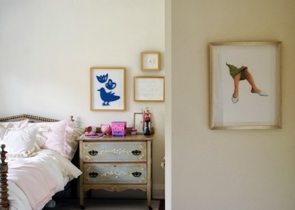
This little girl’s room {below} is all kinds of charming, and the solo piece that greets you as you enter suggests she will grow up into a very interesting and sophisticated lady.
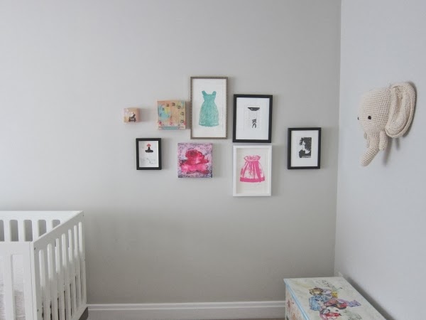
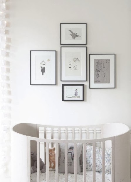
I’m totally crazy for the grouping in this sweet baby girl’s nursery {above}. The diversity and juxtaposition of the pieces creates such an interesting sense of story, and the pieces they have collected can easily be built upon and rearranged over time.
Is it just me, or does the art totally make these spaces come alive?
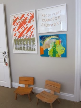
Not only did Patricia send over some inspiration of art groupings that have already been installed in children’s rooms, but she also kindly pulled together three fresh groupings for us – all created with a baby boy’s nursery in mind – to get the creative juices flowing using pieces that are currently available at The Festival of The Smalls.

Grouping Number One {above} is a delightful mix of hip and fresh with a healthy dose of vintage throw-back for good measure. I particularly love the hockey player by Patrick Lajoie {left} and the hipster playing with the viewfinder by Kelly Grace {top right}.

Grouping Number Two is given a more modern edge with the photograph by Emilie Rondeau {left}. My favourite piece in this grouping is the cyclist by Sara Caracristi {bottom left}, but I love the play of colour and texture that keeps the eye moving and engaged amongst all the pieces in this dynamic grouping.

Grouping Number Three {above} is really a marriage of the first two. Anybody remember Marigold? Oh my goodness that takes me back! And the vintage Fisher Price record player {top right by Kelly Grace} was seriously one of my all-time favourite toys when I was a kid! The abstract colour-blocked piece by Richard Herman is fresh and lends a modern edge to the nostalgic vibe of some of the other pieces.
Today’s visual design lesson really builds upon last week’s 3 Tips For Buying Original Art: buy what you love; start small and build over time; and be open to diversity! As you can see from the groupings above, an interesting mix will add energy and intrigue to a space in refreshingly unexpected ways. And remember what we learned from the gents at Madcap Cottage? Gallery groupings are totally where it’s at.
Can’t wait to get working on my groupings for Project Debonaire Young Sir and Project Nursery. Goodness, I have so much to do! But believe you me, the art groupings are already floating around in my head like happy little dreams. Just have to get the spaces ready so I have fresh walls on which to hang the art!
Wishing you a happy Monday, brimming with inspiration and fresh perspective.
xo
s.


Leave A Comment