/Search: fireplace

Need a new search?

If you didn't find what you were looking for, try a new search!

2014 Brian Gluckstein Princess Margaret Lotto Showhome | PART ONE

I’ve been putting a lot of thought of late into what my Dream House Wish List looks like, assembling mental pictures and thinking through styles and historical periods for reference. There are really three architectural periods – Georgian, Regency and Art Deco – that most speak my language, and this year’s Princess Margaret Lotto Showhome is a beautiful interpretation of a modern day Georgian classic.

Designed by Canadian Design Icon Brian Gluckstein, the house is awash with details and delights around every corner. I had the opportunity to chat with Brian as he graciously toured a small and privileged group of designers and design bloggers through the house before it’s grand opening. I loved hearing Brian’s insights into the nuances and design details of the process behind this beautiful South East Oakville home, and now I’d love to take you on a little tour as I share with you some of the details that are firmly planted on my personal Dream House Wish List.

SIGHT LINES

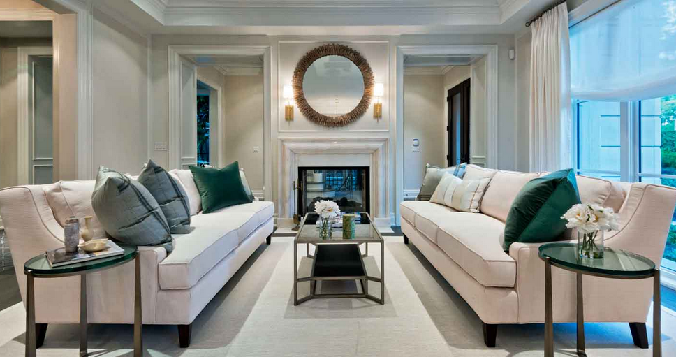
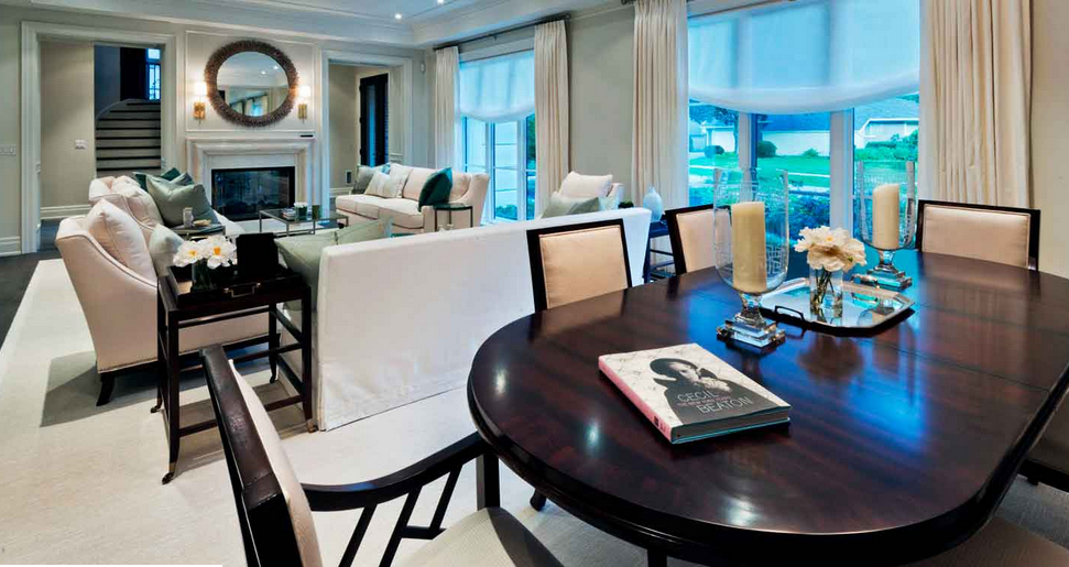
To make a house truly engaging for the mind – and to make it feel open and embracing of the hum and buzz of daily life – a dream house should have really beautiful sight lines. What does that mean, you ask? It means that when you look down a hallway or through a room, the place at which your eye comes to rest should be interesting, ideally extending to you an invitation to come in and see what is around the next corner. For me, this includes an abundance of natural light to draw you in and open you up to the possibilities. That is what an inspiring space should do, after all, isn’t it?

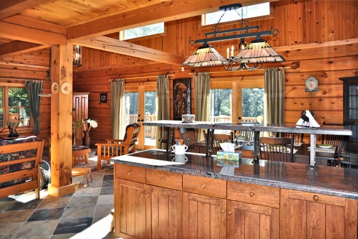
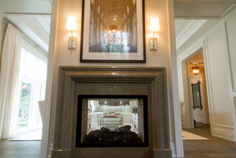
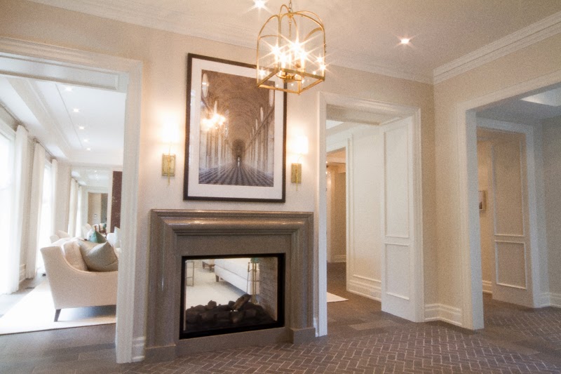
It was actually the view from the mudroom through to the Conservatory {see below} that first had me catch my breath a little. Yes, I just said Conservatory. Here’s a sneak peek of that beautiful sight line.

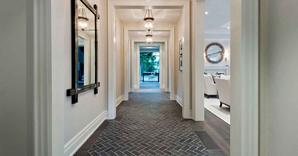
Note the rhythm created by the repetition of archways, the tray ceiling details and repetition of light fixtures down the hallway. Yep, you guessed it. Dream House Wish List details.

I’m going to make you wait for more details on the Conservatory {you can just make it out at the end of the hallway}. Just a glimpse for now, but we’ll come back to it, I promise.

The gracious curved staircase also offers beautiful site lines at every level of the house, and the window that extends through all three floors floods the staircase with natural light.
NATURAL LIGHT
For me, one of the ultimate indulgences on my Dream House Wish List is simply a house that is drenched-to-the-point-of-drunken with natural light. I think Brian and I speak the same design love-language in this regard, because wherever and whenever possible, he insisted that the windows come right down to the floor or function as garden doors to keep the flow of indoors to outdoors as effortless as possible.
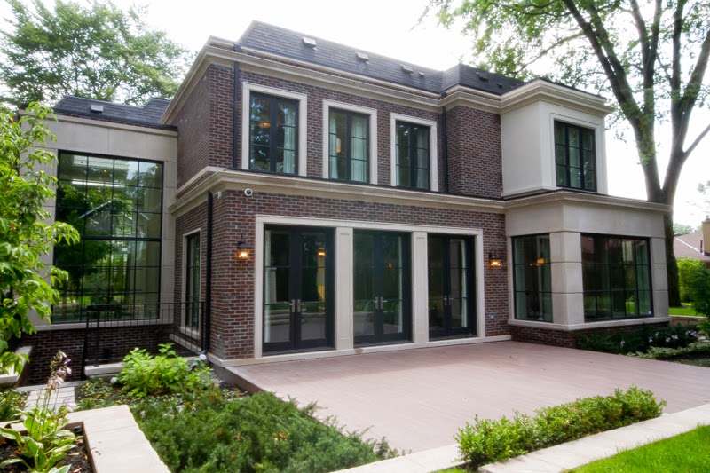
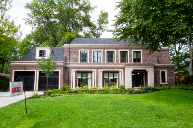
Isn’t the rear elevation of the house gorgeous? Totally a modern classic. 
These doors were swung wide for the little fête we enjoyed together, showing off this house’s true design destiny: a lifetime of effortless entertaining. Dream House Wish List? Check.
HANDMADE CRAFTSMANSHIP

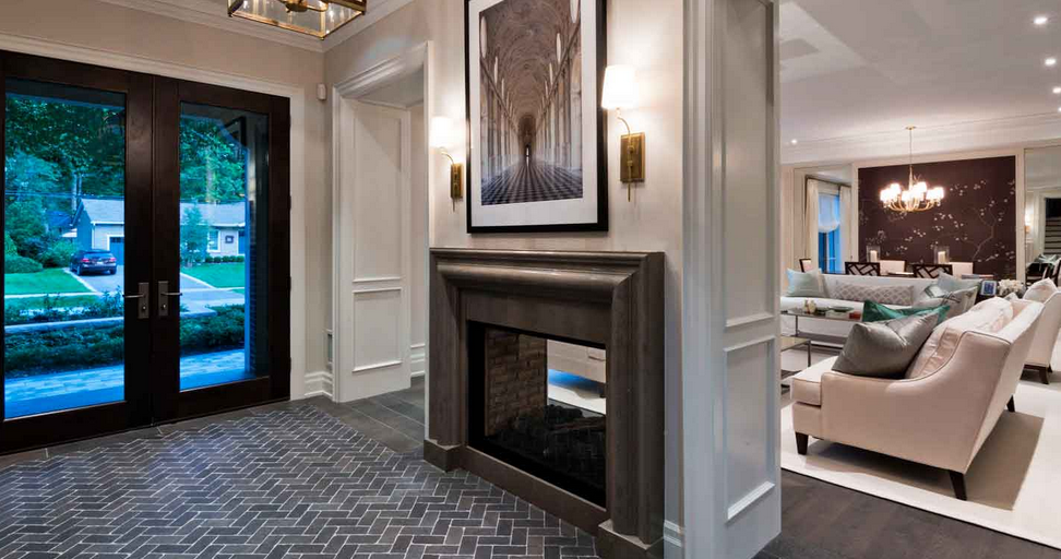
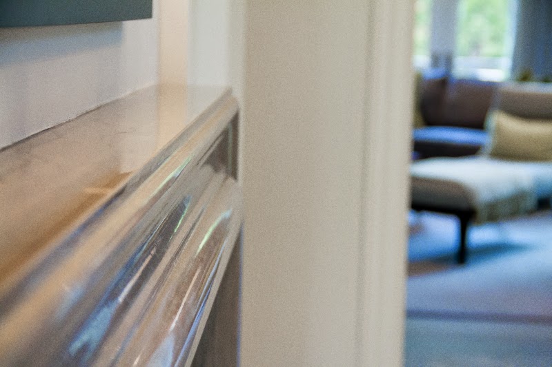
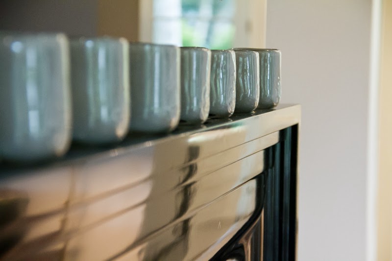
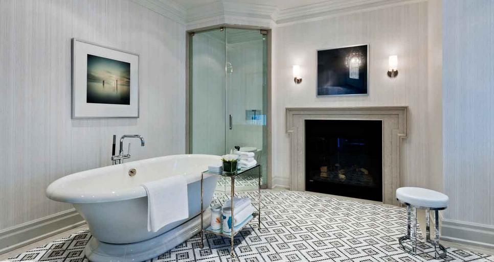
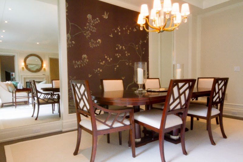
There are a couple of ways in which this year’s Princess Margaret Lotto Showhome exemplifies my personal passion for handmade craftsmanship. The first is the fireplaces. Not only did Brian design a beautiful two-way fireplace for the front hall entryway and living room to share as a warm Canadian welcome on a cold winter’s night {pictured below}, but he also appointed a decadent and refined marble fireplace to serve as the focal point for the family room and the Master Ensuite. All of the fireplaces in the house were hand-carved in Portugal. {Note to self: Design trip to Portugal for inspiration = a must!}

Detail of the Art Deco inspired fireplace surround in the Family Room.
Is unwinding at the end of each day in a classic cast iron tub while mesmerized by the hypnotic sway of flickering flames on your Dream House Wish List? Yes? Me too. Check and Check.
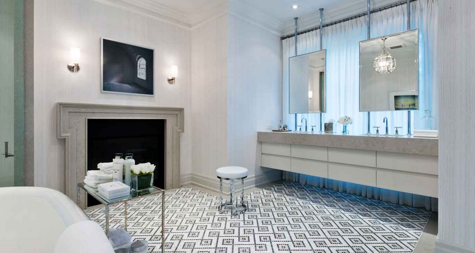
Note the master vanity floating in front of a large window – the perfect spot for flawless makeup application!
The second brilliant touch of hand-made craftsmanship in this house is found on the wallpaper in the dining room. From afar you might think it is “just pretty,” but this wallpaper is anything but “just pretty.” It’s actually the secret gem in the house, which you realize when you get up close to it. The beautiful chinoiserie of flowering branches and birds has been painstakingly hand embroidered onto the silk paper by artisans from England’s Fromental. The colour palette was customized just for this house. It’s truly exquisite! Just look at the feathers on the bird in the second photo below.

FLOOR PLAY
One of my design signatures for many years has been detailed floors – specifically with the use of mosaics inset as tile carpets and with the use of larger tiles to create herringbone and chevron patterns. Naturally, Brian features both in this spectacular Showhome. 
{I’m beginning to think he has been reading my Dream Home Diaries!}

I particularly love the use of these simple subway tiles {above} to create the striking yet subtle herringbone pattern featured on the main floor of the house. The tiles look like natural stone but are in fact a quartz composite called Technoquartz, making them perfect for high traffic areas.

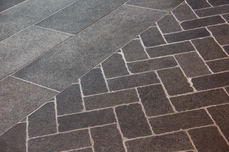
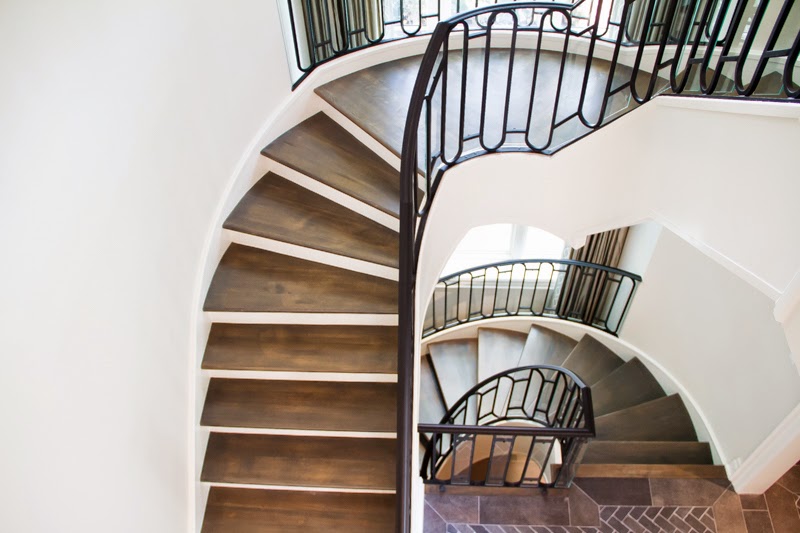
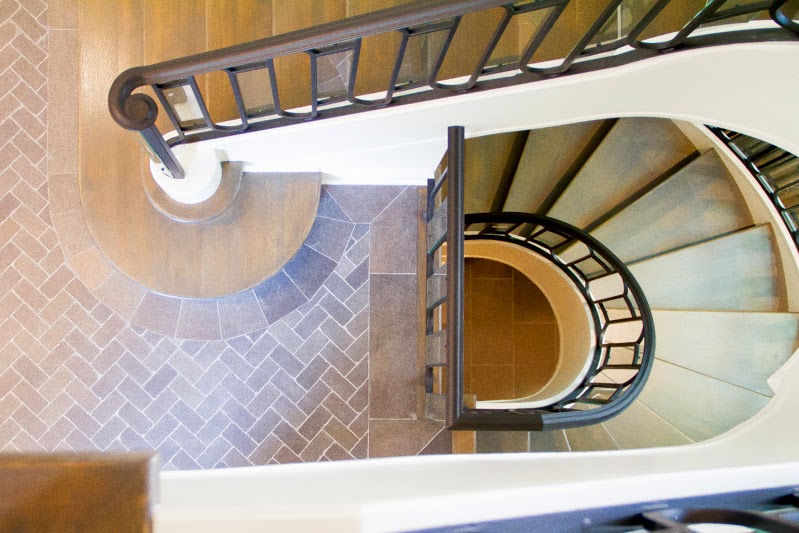
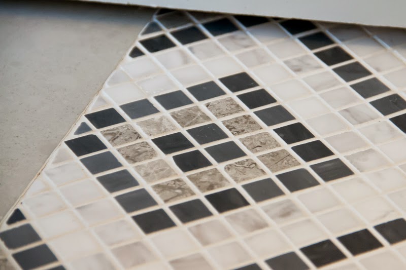
The herringbone pattern, as you know, is my all-time favourite and I feel it grounds and elevates the main floor all at once with an approachable sophistication that is just my cuppa. Brian shared that he found these tiles stacked in a discounted section of the showroom and started playing with them while everyone else was chatting. He knew they were the perfect choice the moment he’d laid out the herringbone pattern. Now, you’ve got to love a man who scoops up a deal and creates something as beautiful as this with it!

I hate to be a tease, but I’m going to leave you hanging on until tomorrow for the next instalment of details from this gorgeous house! There’s truly too much to squeeze into one post, and I want to do it justice. I hope what you’ve seen so far will fuel some dream house dreaming tonight.

xo
s.

All images courtesy of The Princess Margaret Welcome Home Sweepstakes

By |September 30th, 2014|0 Comments

A Design Find for Foodie Friday | Stunning Manmade Marble Slabs | Apparently There IS Something Like The Real Thing, Baby

I must apologize for not offering any new recipes to you over the last couple of weeks. Getting ready for Christmas and a baby has made things a little extra busy around here, so getting inventive in the kitchen has hit the back burner for a bit. There’s just less time for inspiration to strike when you’re busy trying to get everything on that to-do list done! I’m sure you all know exactly what I’m talking about.

That does not mean that I haven’t had my head in the kitchen, though! Our kitchen really is the heart of our home, as it is for all of the houses I design. It’s where we gather, where natural conversation unfolds about the meaningful stuff of life, where we create together, where we nurture each other with sustenance. Perhaps that’s why I love designing kitchens so much! It means a lot to me that the heart of the home is a happy one…and one that is as functional as it is beautiful.

With all of that said, you’ll understand why I am swooning to the point of needing a fainting couch over today’s Design Find. You think I exaggerate? I do not. Whenever a product is released that marries luxury with practicality, I get rather animated. And with this new product find, I’m basically giddy and jonesing for my next kitchen design project {or my next house so I can use this for myself!!}.

We all know and love the look of a white marble slab kitchen counter. It’s been a classic for literally centuries, but it’s also been a practical cook’s biggest dilemma. Here’s the thing: White marble + red wine, balsamic vinegar, tomatoes or anything else acidic and staining = disaster. Like, instantly. Marble is so porous that it immediately absorbs whatever you place on it, meaning that a pristine and beautifully veined white marble kitchen counter will quickly become mottled and stained if you actually cook in your kitchen.

Man made substitutes abound, but nothing has come close to replicating the natural veining and beauty of real stone. Until now. In fact, what if I told you that the kitchen pictured above was finished with manmade marble slabs? Yep. They are totally beautiful and totally not the real thing, baby. And I bet even my most discerning designer friends would never have known it if I hadn’t told you!

{Manmade Calacutta marble slab}

These incredible slabs – made and imported from Italy – are seriously this designer’s dream come true. With all of the performance of a man-made product – impermeable, anti-microbial, anti-bacterial, totally stain resistant and beautifully hard wearing – these slabs are also as close to the real thing as I’ve ever seen. They can even be bookmatched to achieve the decadently custom look you see in the images below:

{Image via Pinterest}
{Image via Croma Design}

These revolutionary stone slabs are being made in a variety of stone replicas, including marbles and travertines. The slabs are 1/4″ thick, but can be mitred for as big an edge build-up as your sweet-loving heart desires.

Availability will start to increase as of January 2014, so get out the AutoCAD and start designing, friends! Those previously inaccessible kitchens just became a reality, proving dreams really do come true. This might just be enough to make me want to move so I can create a whole new kitchen. Oh boy. Those are dangerous words!

For more information on product specs and availability, contact Luis at Trends & Trades.

xo
s.

By |December 6th, 2013|2 Comments

High Point Market Highlights | Wesley Hall

One of the things I loved about exploring the showrooms at High Point Market was discovering the diverse “personalities” of the lines that were presented. Each showroom definitely had its own mood or vibe, and I would describe the vibe at Wesley Hall as sexy. Why sexy? Because more than anything, I fell in love with the curves and sumptuous lines of their pieces. I’m kind of a curvy girl myself I’d say, so it felt like they were speaking my language! And the truth is, if you get the lines of a piece right you can really upholster it in anything and take it in a thousand directions that will all end in fabulous.

 Here are my top four picks from their new releases at this October’s Market:

ONE: The Barber Curved Banquette is all kinds of femme-glam with her hourglass figure and her button tufting and nailhead trim details. This is the kind of piece I would build a sophisticated breakfast nook around as the heart of a happy home. Here’s a shot of her live and in person nestled up to a round dining table in the showroom:

TWO: The Sway Accent Ottoman feels like it is extending an invitation to me to have my backside cradled by the warm embrace of its contoured shape. I look at it and immediately want to sit on it with the feeling that the curvaceousness of my badonkadonk will not be judged, but rather welcomed into a piece that was designed just for me and my backside. Any piece of furniture that can make me feel like being curvy is where it’s at has my number. I loved seeing this piece upholstered in this chartreuse chevron {below} in the showroom. Dee-lish.

THREE: The Foster Tufted Sofa is a beautiful marriage of traditional and modern. The tufted back and roll arms feel very debonaire English traditional, while the fully upholstered deck and legs and the nailhead detail that highlight them have a very modern edge, making this the perfect transitional sofa. I also kind of want to bite my palm seeing it finished in that decadent navy velvet. Truly a forever investment piece, Foster is the kind of handsome gentleman I would love to see with a dashing twin, the pair facing one another and flanking an oversized and dramatic fireplace.

FOUR: The Dunham Bench? Well, she’s got legs, and she knows how to use them. Between her leggy details, her button tufting and the gorgeous trim details {all customizable, of course} she is my kind of girl. I also fell in love with her kissing cousin, the Dunham Ottoman {shown below bunched as a group of four for a flexible, functional and fabulous alternative to a coffee table. Don’t you just love the contrast between the velvet and the linen? Yummy.}.

There were many other pieces in the Wesley Hall collection that put a glimmer in my eye, and my guess is they’ll be showing up in future posts. I’m also particularly intrigued by the rumour that headboards are in Wesley Hall’s fabulous future. I will most definitely be keeping my eyes open for that kind of gorgeousness when it makes its debut!

Hope this finds you warm and well on this Wednesday morning. Thank you, Wesley Hall, for such sexy and sumptuous inspiration to get our motors running!

xo
s.

By |November 13th, 2013|1 Comment

Project Lake House | Introductions

When your favourite client of all time calls and says she’s just purchased a new Lake House and would like your help with a bit of decorating, the qualifying questions to get to “yes” are few and far between. Add to that a beautiful post-and-beam structure as the starting point, and you can understand why it’s not too much of a burden.

One of the first rooms we will be addressing is the kitchen. I’ve recommended that the clients paint out the wood cabinets to provide some relief and contrast to the wood ceilings, log walls and post-and-beam structure of the cottage. It’s always a tough one for people to consider as we’re all a bit precious about wood, aren’t we? I understand that, but I really do think this seemingly courageous move will help to define the kitchen area and break up the visual monotony of all that wood. 
That said, there are other changes we will be making to transform the space either way. We will be installing a rustic splitface slate grey backsplash to tie in with the granite countertops and the floors; the cabinetry hardware will be replaced with something with greater contrast; the super-high raised breakfast bar {it’s almost chin height when you stand in front of it} will be coming down; and the lighting will definitely be addressed as well.

The previous owners had a serious love for all things green, but green is not my client’s favourite colour. Gratefully, the floors and granite counters in the kitchen are a more neutral palette, and in almost all of the rooms of this beautiful property we can remove the green accents without great effort and take things in a much more modern direction, befitting of my very sophisticated clients.

{All “before” cottage images via Royal LePage}

I actually love all of the grey and sandy tones in the natural slate floors, so we will be using that as our jumping off point for the colour palette for the soft furnishings, starting with a custom rug.

In fact, we’ve already got our strikes back! Strikes are samples that are made up before finalizing the order for a custom rug. Allan has taken very good care of us as usual. We fell in love with a more contemporary feeling Ikat pattern and customized the palette on site at the Lake House using wool and silk poms to reference the colours in the floor. We chose to have two strikes made up – one a combination of wool and silk, and the second 100% pure bamboo silk.

You can definitely see the dark and the light side of the bamboo silk rug more clearly than with the wool and silk in this case. The image above shows the light side of the bamboo silk, and the image below shows the dark side.
Here are the initial fabrics we are working with…

…which led us to the obvious winner: the 100% bamboo silk. The client and I both prefer the lighter side of the rug, so it will be installed such that it is what you see when facing the focal point of the stone fireplace. We love the airbrushed, softened effect of the striation the weavers used on the silk piece. It is still modern but bridges the masculine and the feminine very well. I can’t WAIT to see it in place!

In the meantime, the furniture is on order, including some custom designed pieces that will suit the rustic and organic vibe of this cottage while elevating it with more of a modern aesthetic. I’m so looking forward to updating you on our progress in the weeks to come!

xo
s.

By |October 24th, 2013|0 Comments

A Chair Worth A Stare | Taylor Llorente

Inspiration comes in all shapes, sizes and price tags – some accessible, some just dreamy-worthy. Today’s inspiration is certainly the latter variety for me as the über-luxe sticker attached certainly puts it well out of my reach. But no price tag can prevent me from taking great pleasure in admiring it from afar and drooling over it with you, my friends.

Feast your eyes, if you will, on Taylor Llorente’s Cane Chair Design 5610.

This extremely sculptural and modern reinvention of a traditional wingback chair first captured my attention as I was perusing images I had stumbled upon of a stunning hotel in Paris, La Hotel Maison Champs Élysées. I am in love with so many details of this chair: the large scale honeycomb, faceted panel construction; the strong nod to the traditional wingback in a fiercely modern silhouette; the use of traditional caning {in use since the 1600’s in traditional European furnishings} made utterly fashion-forward, edgy and anything but commonplace. This chair gets it so right in so many ways and is the ultimate statement piece to punctuate a space with soaring ceilings and abundant natural light. Just look at how it shines like a diva on stage in these images of it in situ at La Maison Champs Élysées.

It must be said that the architecture and finish selections in this hotel are unspeakably fabulous, and yet this singular chair still managed to leap out and grab me by the lapels and say “Look at me! Look only at me. Love me.”

Of course, I couldn’t help but take some time to admire the other spectacular design details in the space. Sophistication and humour seem equally honoured with the impeccable juxtaposition of modern and traditional at La Maison Champs Élysées.

Traditional wall paneling and fireplaces are made far less serious when installed as wallpaper murals. The application over bi-fold doors opening into minimalist and restrained modern vistas {seen below} is simply brilliant, as if an invitation to walk through design history as easily as passing through a doorway. The balance of sophistication and whimsy is positively delicious.

And all of this, of course, serves as the perfect stage to spotlight today’s design inspiration and Chair Worth A Stare, Tayler Llorente‘s brilliant Cane Chair Design 5610.

Standing O, Tayler Llorente. Standing O.

xo
s.

By |June 20th, 2013|0 Comments